Browsed by
Tag: Studio challenge

Making Waves

Making Waves

At the Waltham Textile group we have a biennial exhibition with a main theme, supported by any other smaller works we’ve produced during the two year lead up. Our current theme was launched in August and I was really happy to get a thumbs up when I suggested we have a nautical/coastal vibe…..if you know how much I love to create rockpool themed work you will know why I chose it! Within this theme we each get a metre width of wall space for a large hanging or several smaller ones and we’ve agreed a few specific group projects such as we all make a 3D fish, a 3D jelly fish, a decorated box and contribute to creating an Octopuses Garden.

Coming up with a title is always going to be tricky when it’s done by committee and, believe me, we debated many of them! Eventually we settled on “Making Waves” as its catchy, links to the ocean/shoreline but of course it can also be interpreted as rocking the boat or doing something subversive. Strange but no one in the group has mentioned this meaning so far, surely I can’t be the only one who’s planning on being subversive with (at least one of) the group challenges?

The general consensus is that the fish be attractive but my immediate thought was “angler fish“ due to its dramatic and sinister appearance. However a bit of Google research has opened up a whole new world of ugly fish, these are just a few that grabbed my interest. The red lipped batfish is probably the weirdest one of them all, I can’t help thinking it looks like someone’s added a face and four legs to a mushroom! That really is a face that only a mother could love! Collecting images of ugly fish is a whole new rabbit hole opening up so best to get back on track…..

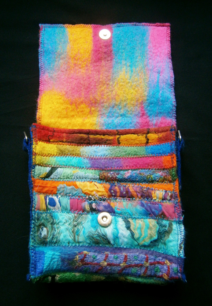
It’s been a busy time recently with shows and workshops, plus playing catch up after being knocked off my feet for a couple of weeks with Covid. This has meant I haven’t made much progress but I have at least started one exhibition piece. If you visit the Felting and Fibre Community Photo page you may already have seen this as it’s made entirely from materials I had to hand and therefore fulfils the criteria set for the last challenge.

Making Waves vessel.

My aim was to create a wet felted vessel with a blue/green colour theme, an undulating surface and lots of texture. A student had recently commented on one of my necklaces saying it reminded her of rocks and coral and this passing remark inspired me to use the same technique and materials for my “Making Waves” vessel.

Detail of the felted necklace that inspired the vessel.

Using differential shrinkage is a great way to manipulate the surface of your felt. Thin areas have the potential to shrink much more than thick areas thereby creating hills and valleys in your work. These can be symmetrical, as in the yellow/grey bowl, or asymmetrical which was my aim for the necklace and this vessel.

The grey and mink fibre used is mostly World of Wool 23 micron Merino although, because I was using up left over short lengths from previous projects (remember the F&F challenge), I think there’s oddments of superfine in there too. The thicker areas are prefelt covered with hand dyed silk fabrics, printed viscose paper towels, sari yarn and wool yarns to create a variety of textures and after felting it measured 36cm x 17cm.

The eagle eyed might spot two pieces of lace which are on the layout but not the finished vessel, these didn’t look right so were pulled of. I’m now looking forward to some spare time next month to complete it with more hand embroidery, beading and shells.

Hexagons and Holes

Hexagons and Holes

OK, I have to hold my hands up yet again….I hadn’t looked at my diary yet this month and so completely forgot about today’s blog post!! It’s funny how it’s so easy to forget what you should be doing when you really don’t have anything much to remember anymore, thanks to Covid!

Thank goodness for our quarterly challenges….always a handy blog subject when you’re caught out last minute! I’ve really enjoyed the first one of 2021 which was to make something inspired by the decade 1900-1909. Lyn gave us lots of examples of people, events, etc from that era which could be used as a starting point to fire our imagination and get us thinking about what we were going to create. As soon as I read the dates I knew instantly that I would be using the book Art Forms in Nature as my main source of inspiration. The book is a compilation of illustrations by the German botanist and zoologist Ernst Haeckel.

I’d bought the book about a year ago having accidentally come across Haeckel’s illustrations during an online search. Although based on reality they are very stylised and have an instantly recognisable quality which has led to them being used as inspiration by artists and designers from the Art Nouveau period through to the present day.

A recurring shape seen throughout this book is the hexagon, hardly surprising as it’s everywhere we look in nature……from the basalt pillars of the Giants Causeway to honeycomb, it’s also found in the eyes of insects, tortoise shells, fish scales and as a cloud formation around the North Pole of Saturn…..the list goes on and on!

There are lots of fascinating facts about hexagons in nature which I hadn’t ever given a thought to in the past, but that’s a great thing about doing these challenges…..you never know where they might lead you or what you might discover.

I like working in 3D so decided to use the hexagon as a raised surface decoration for two wet felted samples. They were both made with the same size resists using Bergschaf fibres and each piece is approximately 32cm across and about 5cm high.

The first was a very simple form which can be open or closed. The second was created using exactly the same template but what was negative space on the top layer in the first sample became positive space in the second, creating a totally different look.

The domed shapes were created using differential shrinkage so didn’t need padding but I’ve added it anyway so I could get a little more height in the centres. I’ve also added a few Colonial Knots to one of them.

I don’t do enough sampling so I’m now working on some more designs of this size but, rather than keeping the backgrounds circular, I’m thinking of cutting them into hexagons so I can join them together without gaps as one large “sampler” Wallhanging.

Another challenge I’m currently making for is titled “Filled Holes” and this is one I’ve set for my local Belchford group. It came about during a Zoom meeting when Lucy showed us a project she had done for her college course. As you can see from this image Lucys is very small, the holes have been made from magazine pages and some contain found objects.

I set off with the intention of making circular holes in fabric and using a soluble backing to fill them with free motion stitch. As often happens before I knew it I’d veered off and ended up with something completely different! I found some fabric I had stamped with leaves and acrylics and another piece that I’d rust dyed ages ago and done nothing with. The one painted with acrylic was quite stiff and so perfect for creating raised domes (this must have been at the back of my mind since the hexagon samples). The other had small rust marks from washers and bolts which could be framed by allowing them to peep through the holes.

I’m really happy with how these three pieces turned out, and each little hole does have a rust print “filling”, but are they “Filled Holes”? I’m not totally convinced I’ve met my own brief so next time I will show you what I did when I returned to my original idea of using the soluble fabric and the free motion stitch.

Source of images.

Giants Causeway: https://discovernorthernireland.com/things-to-do/giants-causeway-p696331

Insect eye: https://nautil.us/issue/35/boundaries/why-nature-prefers-hexagons

Tortoise shell: https://www.tortoiseowner.com/can-tortoises-turtles-live-without-their-shell/

Honeycomb Cowfish: https://www.floridamuseum.ufl.edu/discover-fish/species-profiles/acanthostracion-polygonius/

Saturn: https://www.countrylife.co.uk/nature/hexagon-abounds-in-the-natural-world-153183

Monet Challenge

Monet Challenge

I came across a couple of these pieces recently when I was packing up for a craft fair. It’s one of my favourite Challenges (My favourite was Ann’s Stewert Stephenson one) and these are some of my favourite pieces, so I thought I’d do a Throwback Post for anyone who missed it:

I didn’t get a chance to do any felting for a while until this week because we had a ridiculous heatwave here. I did manage to make a few batts for the Monet challenge though. After choosing some of my favourite paintings, or ones which I thought I might be able to use as inspiration, I made a simple montage:

OLYMPUS DIGITAL CAMERAI then messed about with it in Photoshop:

Using this for inspiration I made a couple of green batts; a purpley one; a purple and yellow blended one which looks kind of mustardy/mossy, and a mixed blue one. Looking at Monet’s style he mostly had a straight/dashy style, but some paintings or certain areas of paintings had a softer swirly style. For the first piece I made using the batts I laid out areas of different colours then added softer wispier swirls of wool and fibres:

OLYMPUS DIGITAL CAMERAI made this piece using the batts too. Neither of these first pieces copy Monet, they are just inspired by the colours.

OLYMPUS DIGITAL CAMERAI wasn’t very confident I could do an actual ‘copy’ of a Monet painting, but I thought I’d have a go of at least doing an impression of a Monet piece 🙂  I chose Morning On The Seine In The Rain.

Morning-On-The-Seine-In-The-Rain-largeI was actually quite surprised when this started to dry and it actually looked like something! I don’t know if it’s because I’ve stared at the original so much that I can see the similarity and that it’s meant to be it, but I’m pleased with how it turned out.

OLYMPUS DIGITAL CAMERAWhen I was fluffing up the fibres for the swirly piece, I thought I might have a go at needlefelting a piece too. Since I had all the colours out, and had really started to like it, I thought I’d do another based on Morning On The Seine In The Rain. I used a piece of thick commercial Merino prefelt as a base, and blended some texturey wools like Icelandic, carded lambswool and Devon longwool with Merino to get the colours and texture I wanted. I like the way this turned out too 🙂

OLYMPUS DIGITAL CAMERAIf you ever want or need some inspiration to get your creativity flowing, click on ‘Challenges‘ in the Categories drop down menu on the right hand side. We have new ones every quarter, but you might find something you prefer, like this Monet challenge, in our archives 🙂

Mindless and Ugly

Mindless and Ugly

We made some ‘mindless’ pieces at the Well Being Centre this week. They’re basically pieces without any planning whatsoever, we just grab some wool tops, start the layout, start nattering and just ‘mindlessly’ grab some embellishments and start adding them until we feel like we’ve finished 🙂 The weather hasn’t been great for taking photos, today it was so windy the clouds were covering and uncovering the sun so quickly it seemed like it was flashing! This is the full piece that I made:

I turned it 90 degrees to get an angled shot, it seemed to show off the different fibres better that way, which is good because most of the close ups were blurry:

This is some Nylon staple I dyed, it kind of has a ‘wet’ look when it isn’t fluffed up/teased apart much:

This is some viscose fibre and black viscose top:

I was thinking about Lyn’s first quarter landscape Challenge. I’ve always liked taking photos, especially interesting landscape ones. I was thinking of looking through my photos to find a really nice one, but when I struggled to take photos today, I thought I’d try and take some inspiration photos while I was out. The only problem being, I was going to a retail park. But that made me wonder if an ‘ugly landscape’ could be inspiration too! This was the view when I got off the bus:

I zoomed into the glass/mirrored buildings:

This was the retail park:

The clouds were impressive as I was leaving, dark and moody one way:

And a bit brighter and fluffier the other:

I’m not sure the retail park has inspired me much, but it’s got me thinking outside the box a bit! How are you getting on withthe first quarter challenge?

4th Quarter Challenge Sample

4th Quarter Challenge Sample

I thought I’d try an idea out for the 4th Quarter Challenge. The basic idea was to use wool tubes with fabric, some under, and some over. Because they are quite thin and hollow, I thought they probably wouldn’t have much effect on the fabric, other than visual. I did use a couple of wool twists too. This is the finished piece:

When I’d rinsed it and squeezed the water out, I didn’t roll it in a towel or try to flatten/smooth it, like I usually do, I wanted to keep the texture. You can see it from this angle:

And this one:

This is a strip of cotton gauze:

This is some synthetic chiffon. I’m guessing I used twists under this piece because there seems to be more of an effect:

The close up photos of the silk strip didn’t turn out, but here’s where silk, cotton gauze and silk taffeta all meet:

This is a close up of the Silk Taffeta, I used twists over and under this:

I used some heavier synthetic chiffon. I know this fabric doesn’t attach very firmly, but I like to use it because it does ripple nicely and looks good:

I love my camera! I can see inside the ripple here:

It’s given me a better idea of what I might do on a bigger piece. How are your ideas coming?

4th Quarter Challenge Part 2

4th Quarter Challenge Part 2

I felted the Prefelt and Fibre paper Suprematist pieces that I showed you last time. I think the pieces shifted a bit, but this is the first one:

It didn’t have much texture after felting and is quite flat. The colours didn’t blend where they overlapped, but the underneath colour migrated through at the edges:

For some reason the burgundy piece was a lot fuzzier on the edges:

I did alter the second coloured one slightly, I noticed all the triangular shapes were pointing in the same direction on the same angle.

This piece was mostly flat too, the only part which isn’t is at the bottom where I used a piece of the white which is thicker/heavier prefelt:

The white piece was far more interesting before felting:

You can see from an angled photo the different textures, colours and shine better:

A close up:

The different thicknesses are more obvious on the Black and White one:

You can see how shiny the white bamboo is compared to the ‘black’ bamboo from this angle:

Close up:

I know I’m always complaining about how hard it’s been to get decent photos, but I’d forgotten how small the time frame is at this time of year where I live. I know it’s not a huge deal, no one’s expecting ‘professional’ shots on the blog, but when trying to show fibre comparisons for example, or like this week-white on white, you get massively different results depending on the time of day, or whether someone in the flats opposite opens their window just enough to direct the sun right on to your desk! So, here’s a slide show of comparisons for you of trying to photograph the white piece this week: Too late in the afternoon; Too early in the morning; Just right; Just right until neighbours open the window!

This slideshow requires JavaScript.

2017 4th Quarter Challenge

2017 4th Quarter Challenge

My first thought for this quarter’s challenge was to choose something very old, like very first cave paintings etc, but it isn’t really an art ‘period’ and it was hard to come up with something that wasn’t too wide or too narrow a topic. Then, like Marilyn, my instinct was to choose something to do with abstract art, I was thinking abstract non-figurative, bold patches and sweeps of colour, but after a bit of searching and researching decided on: Suprematism

Kazimir Malevich – Airplane Flying

According to Wikipedia, Suprematism “was founded by Kazimir Malevich in Russia, around 1913, and announced in Malevich’s 1915 exhibition, The Last Futurist Exhibition of Paintings 0.10, in St. Petersburg, where he, alongside 13 other artists, exhibited 36 works in a similar style.” Suprematism followed the Futurism Modern Art Movement. Looking through the work of the artists featured in the first Suprematism exhibition I found I was more familiar with a lot of their work than I’d realised. Even if you don’t know the artists mentioned, you’ll probably find their work or style is familiar too. For more info about Modern Art Movements in relation to each other, I found this timeline: http://www.theartstory.org/section_movements_timeline.htm

Ivan Kliun – Suprematist Composition

The Art Story website explains some of the ‘Key Ideas’ of Suprematism: “The Suprematists’ interest in abstraction was fired by a search for the ‘zero degree’ of painting, the point beyond which the medium could not go without ceasing to be art. This encouraged the use of very simple motifs, since they best articulated the shape and flat surface of the canvases on which they were painted. (Ultimately, the square, circle, and cross became the group’s favorite motifs.) It also encouraged many Suprematists to emphasize the surface texture of the paint on canvas, this texture being another essential quality of the medium of painting.”

Kazimir Malevich – Supremus 56

Other geometric shapes such as triangles, semi-circles, arcs and all kinds of regular and irregular quadrilaterals were also popular. The more I looked at Suprematist works, the more I thought how interesting it would be as a Challenge topic, because, even though the shapes and colours are ‘simple’, and in the case of some pieces, very minimalist, I thought their idea of emphasizing surface texture would appeal to many of us 🙂

Yakov Chernikhov – Suprematist Composition

Enjoy researching it and please share any of your projects with us on the Forum 🙂

Fourth Quarter Challenge

Fourth Quarter Challenge

How did you get on with saving all your bits of threads, yarns and unravellings ready for this Quarter’s Challenge? In case you missed it, I gave a heads up earlier this year that the challenge for this quarter would be to use things people* usually throw away, such as little snippings of sewing or embroidery thread, the last few inches of yarn or those annoying bits of unravelled thread which get everywhere when you tear fabric. (*Not fibre people apparently, I realised pretty much all of us save every little scrap!)

I made a few pieces to help get the ideas flowing, this first piece is some unravelled knitting with some wispy layers of Merino. I’m not sure of the wool content of the yarn, though I think it’s possibly 40% ‘British Wool’. I just put the tangle of yarn down on my netting, then added the wispy layers on top (working upside down/back to front):

OLYMPUS DIGITAL CAMERAThis next piece also uses some unravelled knitting. I made some handspun yarn earlier this year, then knitted a little square. It was too small and chunky to do anything with, so I unravelled it. Using the same Merino as above, I laid out two layers, then pulled apart some lengths of the yarn. Where it was extra loose, I teased it apart. Once the top was covered, I felted it:

OLYMPUS DIGITAL CAMERAI used the golden tassley fringe of a charity shop scarf for this next piece. I’ve used bits of this scarf before, a weird thin pinky fabric, which had loose soy-like fibre trapped between layers in parts. I’m not exactly sure  what the wool I used with it was, it was from a Botany Lap Waste bag from World of Wool, it feels like fine Merino with a tiny bit of silk in. I laid out the tassel strip, added some wisps of wool, rolled it up and placed on top of a couple of layers of the Merino ‘blend’:

OLYMPUS DIGITAL CAMERAI used the same Merino wool blend as the base for this next piece, which is just embellished with lengths of embroidery thread and floss:

OLYMPUS DIGITAL CAMERAThis piece is also embellished with emroidery threads and floss. The top part is untwisted strands of cotton perle 5. The multi coloured lengths on the right side are from one multi length of floss. Most of the rest is single strands of floss, but over on the left I used some untwisted thread with the fibres fanned out, and also balled up some little pieces of floss.

OLYMPUS DIGITAL CAMERAI used some threads from my tub of ‘mixed threads and unravellings’ for this next piece. I spindle-spun some wool also from the Botanly lap waste, which felt like 23 mic natural Merino, with the threads, just picking up bits, teasing them out a bit and spinning them with the wool. I left it on the spindle overnight, then let it unwind/loosen before using it. I used the finer Merino ‘blend’ as a base, then added lengths of the thread-yarn on to the top and felted:

OLYMPUS DIGITAL CAMERAThese next two pieces were made with a wool I hadn’t used before, Charollais. I got the tops from WoW fairly recently then forgot about them. It makes really spongey felt. For this first one, I just got a handful from the same tub of ‘mixed threads and unravellings’  I used on the previous piece, and put them on top of two layers of Charollais:

OLYMPUS DIGITAL CAMERAThis next piece was laid out the same, except I used bits from my ‘threadbare scarves and fabric pieces’ tub. I just ‘sprinkled’ them on top, then felted.

OLYMPUS DIGITAL CAMERASo now you’ve seen a few simple ways of the scrap pieces being used, get your thinking caps on, get out all your tubs of leftover threads, yarns and unravellings, and come up with some creative ways of using your ‘free’ embellishment fibres!

Second Quarter Challenge

Second Quarter Challenge

I know it’s taken me a while, but I finally got around to doing Ann’s 2nd Quarter Challenge! One thing I like more than colourful felt, is lots of colourful felt! So, when I have a nice collection of offcuts, I like to put them together in a collage and make something out of it. I’d been wanting an ‘alternative’ bag to my little drawstring bag for a while now, and I’ve got a canvas satchel which I really like, but I wanted something a little bit smaller, so I thought I’d go with a smaller version of that. I worked out the dimensions for the length and width I’d need it, marked out where the front, back and flap would be, then pieced all my strips together:

OLYMPUS DIGITAL CAMERAThe middle section with all the nuno pieces would be the back, I positioned them there because I know from experience that felt, especially Merino felt, can bobble/pill easily when it rubs a lot, like bags do around the hip area. When I trimmed the edges and folded it into shape, I realised the front flap was a bit too long to add satchel straps, so I went with a magnetic closure. This is what it looked like from the front when it was finished:

OLYMPUS DIGITAL CAMERAThis is how it looks when it’s open:

OLYMPUS DIGITAL CAMERAThis is the back (with the front flap open):

OLYMPUS DIGITAL CAMERAFor the side panels, I tried quite a few felt pieces, One which looked really good was a piece I’d made from woven pencil roving, but I knew it’d be too thick once the hook straps were added, so, and I don’t know why this is still hard to do after all these years, but many will understand, I cut up a piece of nuno felt I made a while ago. I’m not sure I ever showed it because it’s blue and I have a hard time taking photos of blue, but here’s one end of it:

OLYMPUS DIGITAL CAMERAI cut strips for the sides, and thinner strips to make the straps to hold the bag hooks in place:

OLYMPUS DIGITAL CAMERAI got the findings from another bag I bought from a charity shop just for them. I recently bought 10 metres of rainbow webbing with a bag in mind and it went perfectly with this bag, I even got the findings attached the right way around the first time!:

OLYMPUS DIGITAL CAMERAAnd on the rainbow theme, if there are any Mancs out there, Happy Pride weekend! 🙂

Looking For Dimension

Looking For Dimension

I thought I’d try out a couple of things inspired by Marilyn’s challenge. A while ago, I bought some ‘budget filling‘ from World of Wool, with the intention of using it to make texturey felt or try it as a weird texturey surface effect, but I’d never got around to it. I thought I’d just try a smallish sample piece to see how it worked. I laid out a couple of regular layers of an Olive Merino, then added a pile of the filling:

OLYMPUS DIGITAL CAMERAI covered it with another 2 layers of Merino in greens and browns, I’m not sure you can tell there’s a mound from this photo:

OLYMPUS DIGITAL CAMERAI think the wool content must be quite high, because it flattened quickly and didn’t ‘bounce back’ after drying, it’s not very obvious (not as obvious as that face on the right!):

OLYMPUS DIGITAL CAMERAIt’s a bit more evident at an angle, though most noticeable is the migration of the fibres through to the top:

OLYMPUS DIGITAL CAMERAEven looking along the surface there’s not much thickness, though the wavy edges show it did have an effect overall:

OLYMPUS DIGITAL CAMERAThe other thing I tried was using organza. I had a tangle of strips, bits and unravellings in the bottom of my organza box. I laid out some of the separate strips onto some netting, and added the shorter/tangled bits in between:

OLYMPUS DIGITAL CAMERAYou can see the tangle of fibres here:

OLYMPUS DIGITAL CAMERAAnd here, too:

OLYMPUS DIGITAL CAMERAThen I added a couple of regular layers of Merino over the top and then felted the way I usually do. I was expecting a bit more texture and more loose bits:

OLYMPUS DIGITAL CAMERAThere is a lot of rippling:

OLYMPUS DIGITAL CAMERAThese bits were loose at the ends:

OLYMPUS DIGITAL CAMERASome sparkly golden bits:

OLYMPUS DIGITAL CAMERA
Maybe I should try combing the filling with the organza? 🙂