Browsed by
Tag: prefelt

Penquin’s 2017 Christmas Card

Penquin’s 2017 Christmas Card

Penquin (Anne Hickley) made me a beautiful Panda card for the holiday exchange.  For some reason I was stuck on the idea of a Poinsettia.  You may have already seen it on the Forum.

I made one for myself last year to hang as a decoration and wanted to do another.  Of course, making a card became more complicated than I had anticipated.  But I enjoyed making it.

I started out making thin red prefelt and cut out 5 or 6 layers of different sizes, putting plastic wrap between each layer leaving a hole in the center so they’d all felt together.  I had some green for the leaves and laid those underneath.  Unfortunately, I didn’t take pictures before I felted them.  But here is the flower after felting with beads for the center.

I stitched each petal and leaf.

Then I felted a white background with some sparkly fabric for a snowy effect.

I did another without the sparkle to be the back.  On the back I used Luminescent paint to write the words.

Now it was time to put it all together.  I used stabilizer on the back of the sparkly piece and sewed the flower on by hand.

Then the fun part was putting them together using the blanket stitch.

I’m happy Penguin enjoyed it and hope everyone is ready for the holidays!

Pre-Felt Samples and Nuno Scarf

Pre-Felt Samples and Nuno Scarf

While I had my pre-felt out doing the Suprematist pieces, I thought I’d try a few more samples using it. I’ve only used it a few times, but the suprematist pieces were so quick to felt, I thought it might be quite handy for making small pieces for greetings cards. The first one I tried was using some fibre and cotton gauze ‘paper’ I’d made a few years ago. The pieces were already cut out, I carefully peeled off the gauze and laid them on a piece of prefelt:

I can’t remember which fibre I used, but it looks shiny and metallic in real life, like copper, bronze and graphite, not dull brown, pink and grey! The piece is quite flat:

I used some dyed Silk Carrier Rods for the other two pieces, this first one has ‘whole’ layers peeled from the rods before dyeing:

There’s a bit more texture on this piece:

I used small bits of dyed silk rods on this piece, bits which fell off during peeling or after dyeing:

This had more texture too, probably because the pieces overlapped more:

I’ve been into making scarves lately, or more precisely endlessly carding wool and ironing scrim for making scarves, but I have finished a couple. This is a white one I made a few weeks ago:

I used rose fibre for embellishing:

I cut the scarf wider than my template, and scrunch gathered it to size before adding the wool, so it’d have some texture on the back:

And it only took about half an hour to do the photos this time!

4th Quarter Challenge Part 2

4th Quarter Challenge Part 2

I felted the Prefelt and Fibre paper Suprematist pieces that I showed you last time. I think the pieces shifted a bit, but this is the first one:

It didn’t have much texture after felting and is quite flat. The colours didn’t blend where they overlapped, but the underneath colour migrated through at the edges:

For some reason the burgundy piece was a lot fuzzier on the edges:

I did alter the second coloured one slightly, I noticed all the triangular shapes were pointing in the same direction on the same angle.

This piece was mostly flat too, the only part which isn’t is at the bottom where I used a piece of the white which is thicker/heavier prefelt:

The white piece was far more interesting before felting:

You can see from an angled photo the different textures, colours and shine better:

A close up:

The different thicknesses are more obvious on the Black and White one:

You can see how shiny the white bamboo is compared to the ‘black’ bamboo from this angle:

Close up:

I know I’m always complaining about how hard it’s been to get decent photos, but I’d forgotten how small the time frame is at this time of year where I live. I know it’s not a huge deal, no one’s expecting ‘professional’ shots on the blog, but when trying to show fibre comparisons for example, or like this week-white on white, you get massively different results depending on the time of day, or whether someone in the flats opposite opens their window just enough to direct the sun right on to your desk! So, here’s a slide show of comparisons for you of trying to photograph the white piece this week: Too late in the afternoon; Too early in the morning; Just right; Just right until neighbours open the window!

This slideshow requires JavaScript.

Printing and Stenciling on Felt Part 1

Printing and Stenciling on Felt Part 1

I’m sorry for the duplicate post. I accidentally hit publish while creating it.  So, now that I have your attention…

I am taking Ruth’s Printing, Stenciling with Thickened Dyes class, so I’ve been practicing.

I made nine different colors using acid dyes and two thicknesses.  I have several stencils laying around so I couldn’t wait to get started.  The feather was the most open so I started with that using three different colors with different thicknesses and brushes.

I used commercial prefelt for the feathers.

The midnight blue feather was created with a thicker dye mix and stencil brush.  But I found the brush kept pulling up the fibers.  So, on the yellow I used a thinner dye, with a foam brush, but I didn’t get as much definition and more running.  For the red, I used an old stiff paint brush with a thicker dye and I got a little better definition.

Now I realize this is all new and practice will help me learn to manage the process better.

I tried a plastic stamp with a thin silver and thick purple on prefelt.  But neither stamped well.  I think  the surface of the stamp was too smooth.

Then I tried a butterfly stencil (which was too detailed) with commercial felt.  The gold ochre was done with a thick dye and thin brush.  While wet it wasn’t too blurred.  However, after setting the dye and drying it was blurrier. This was while it was still wet.

The  teal butterfly was done with a brush, again on the commercial felt.  Same result after drying. Plus the dye and felt were very hard.  I had thought I’d do some stitching, but I think it’s too stiff.

Then I tried a Stencilgirl stencil I had purchased for the Paper Lamination Class.  I decided to use two separate colors on prefelt.

I will felt all the prefelt ones to see the results and how it changes, if it does.  I used a second piece of prefelt to tie the feathers together in one piece.

Next I’ll try making my own stencils and stamps and continue to play with different tools and dyes.

Hopefully, I won’t give you an early preview next week.

Pandagirl’s Maneki-Neko for 2017 3rd Quarter Challenge Part 1

Pandagirl’s Maneki-Neko for 2017 3rd Quarter Challenge Part 1

I’ve still been in the mood to explore the Edo Period.  I remembered when my oldest son was in high school and brought home a Japanese exchange student who gave us a little kitty statute to bring prosperity to our home.

Of course, when I looked for it I couldn’t find it, but found plenty of pictures on the Internet.  It is technically called Maneki-neko which means “beckoning cat.” Of course,  there are many stories behind the cat.  You can read a few of them here:

https://www.tofugu.com/japan/maneki-neko/

There are also different meanings and results for different colored cats.  I chose black since it helps with good health (or getting rid of evil spirits).  Different writings have different meanings.  I did see one for green for good health, but I just wasn’t ready for a green cat.

Normally the traditional white cat brings wealth and prosperity and is seen in Asian restaurants and shops.  There is also confusion as to whether it is Japanese or Chinese.  It was the Japanese in the Edo period who developed this character.

I knew it was going to be a bit more complex than just making a resist for a pod.  Since I didn’t have a particular size in mind, I just made a resist I felt I could get enough detail on and manage.

I used prefelts for the first layer and merino wisps for the sides.  I also added needle felted noses, cheeks and prefelt and cotton batting for the one arm. Then added three layers of corriedale putting the eyes under the last two and prefelt for the ears.  On the back I also made a small tail using needle felted Jacob wool.  Not much of it is visible on the wet cat.

Then I added some silk with throwsters waste to add a little bling.

Then I fulled it and stuffed it with bubblewrap to give it some shape.  I did forget to open the eyes.

I rewet it and opened the eyes. So, next I will have to add all the details needed to finish.

Stay tuned!

Pandagirl’s 2017 3rd Quarter Challenge Part 2

Pandagirl’s 2017 3rd Quarter Challenge Part 2

This challenge became more of a challenge than I expected.  If you  missed part 1,  you can see it here:  https://feltingandfiberstudio.com/2017/09/01/pandagirls-2017-3rd-quarter-challenge-part-1/

I had intended to use a combination of free motion and hand embroidery to add details  to finish it.  However, when I tried to use the sewing machine the felt was too thick and the stitches were just buried and I couldn’t control the machine.  So, after an hour or more ripping out teeny stitches, I started the hand embroidery.

Embroidery is not my strong suit. My goal was to give an impression of ruffled petals and a hint of stamens.  After looking at pictures of Sakura, I decided to keep it simple.

I made stars in the center of flowers with a knot in the middle on some.  I didn’t want them to all look alike.  Here I was getting started.


At first I tried using the stem stitch for the flower petal, but that proved to be hard to do in the felt and it really didn’t give it a ruffled look.  so, I settled on a satin stitch. I varied the tightness depending on how close or far away it was.   Then added some stem and back stitches to show differences.

Here are some closeups.

Another goal was to keep it subtle as if it was a 17th century scroll or painting that had faded over time.  I originally had wanted to give it a scroll texture, but I had purposely didn’t felt it hard and it was thick so that wasn’t going to work.  Best laid plans, right?

I also varied the color of the floss sometimes using white, pink or a strand of each to vary the depth.  I also didn’t want all the flowers to look the same. I loved the dimension, colors and texture of the merino/silk scraps I used for the branches.

After I finished and wove in the threads, I steamed it to try to get the lumps out. I tried.

I know everyone had a an idea of how to position it.  I liked Leonor’s idea to change it up occasionally so the same pictures looks different. Thanks Leonor!

Have you finished your challenge piece yet?


Pandagirl’s 2017 3rd Quarter Challenge Part 1

Pandagirl’s 2017 3rd Quarter Challenge Part 1

It took me a while to decide what I wanted to do for the challenge of the Edo period in Japan.  I was drawn to the simple scrolls with flowers and branches.

https://feltingandfiberstudio.com/2017/07/07/3rd-quarter-challenge-2017/

I scoured the museum sites and Pinterest.  I’ve been to Japan during Sakura (Cherry Blossom) season and particularly love the trees and flowers so it wasn’t too hard to narrow it down.

Since the scrolls seemed to be pale yellow, I made a batt backing then made another light batt using the Osage hand dyed merino and corriedale as a background. I added some darker fibers randomly to give the effect of lines in a scroll.

I had some left over merino/silk scraps from a scarf I had made for my son years ago.  They were supposed to be tassels, but I didn’t like them and cut them off and saved them.  But they make perfect tree branches.  Here is my first layout.

But something was off.  It didn’t feel right to me.  So, I rearranged the branches.

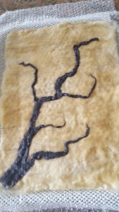
Next was to make white prefelt for the flowers (commercial wasn’t white enough) and cutting out the shapes in several sizes.  This was not an easy process. Here it is a wet look. The neat thing about the layout is that the branch can be down or up.

I didn’t want to felt it too hard.  But I may have to steam it before or after I add either hand or machine embroidery for details.

Actually the photo shows more texture than with the naked eye.

How do you like the branch, down or up?


The Hummingbird and the Tiger Lily

The Hummingbird and the Tiger Lily

I know a lot of people are experiencing different seasons around the world.  Here in the U.S. summer has finally arrived.  One of the things I always look forward to is seeing the hummingbirds fluttering around my flowers.

While the hummingbirds haven’t been seen yet, I decided to make my own.  I started with making a base with Domestic 56 batts, then I added a thin layer of batts and silk hankies as a background felting it slightly and letting it dry.

I decided to make the bird and flower in three dimension.  I shaped the bird first by doing some needle felting and putting it in place then covering it with handmade prefelt and silk hankies. I did a little needle felting on the wings to get the detail of the wings.  The beak was made like a spike and attached before the final wet felting.

The Tiger Lily petals and stamens and stem were made from prefelt and again the stamens were added right before the final wet felting. I used little resists under the petals and needle felted the stamens to stay in place.

A little plastic wrap around the stamens  and beak to keep them from felting to the petals or background.

The felting was slow and I tried not to get it too hard. I wanted a soft look.

I added more needle felting for detail.

Here are several different angles to see the dimension.

Looking at it from above it doesn’t show the dimension.  I may have it framed in a shadow box.  What do you think?

Connected Paths

Connected Paths

I told you in another piece about an art show my guild is having to celebrate Canada’s 150th birthday . This is another piece I made for it. It is called connected.

As usual I started with  2 pieces of prefelt with a piece of cheese cloth in the middle for strength without bulk.

Then I added some multi coloured top I had. I didn’t want the path to be a solid colour.

I cut out prefelt pieces to make all the different houses. I tried to get houses from around the world. I didn’t place them in any particular order and every section got an apartment. I tacked all the pieces down using  felting needles. I didn’t want them to move.

Then bushes and trees were added.

I started this project back in December. I spend along time hand stitching ( and unpicking and redoiong) the windows and doors. I tried to use different yarns for every house and apartment. Then I signed up for Ruth’s free motion embroidery class.  I didn’t have much time to practice before I had to do the trees and bushes so it could go to be made ready for the guild show. The stitching is perhaps not the greatest but I think it goes well with the style of the picture.


I did get it in, in time and it has now been catalogued and properly photographed. The Guild art show celebrating Canada’s 150th birthday will be open on May 9, 2017 in Ottawa, Ontario, Canada. Here’s a link to the invitation. https://www.facebook.com/events/282526522160719/?active_tab=about

Unfortunately Facebook will not let you create a 3 week event so it only shows as a 2 week event. The actual dates to see all 150 12×12 pieces ( many are for sale)   are May 9-28. We are having a reception on the last day so if you would like to meet some of the artists join us for refreshments on the 28th  between 1:00 and 3:00.


First Quarter Challenge Done.

First Quarter Challenge Done.

It’s not even the last day of march and I have my First Quarter Challenge piece done. Here is the link to the challenge if you haven’t see it yet. https://feltingandfiberstudio.com/2016/12/31/2017-quarterly-challenges/

It took me a long time to figure out what I wanted to do. I didn’t want to remake an existing Fauvist painting. Then I remembered a couple of pictures I had when I was a child that had ballerinas in them. One was them dancing at night and one in a French garden. I doesn’t know where the pictures are now but what I remember is that they felt very happy. Fauvism should express emotion with simplified form and bold colour so that was the choice.

I did what I usually do for back grounds, a piece of cotton gauze between 2 pieces of prefelt. It measured about 14×14. Then I positioned my ballerinas. I used silk hanky pieces for the dresses.

I used prefelt, merino top and the large blue piece is a small left over piece of batt I made last year.  I then wet it all down and felted it down to 12×12. For an art piece this seems to be enough shrinkage. the size lets me use it for my guilds upcoming art show celebrate Canada’s 150th birthday. https://www.facebook.com/events/282526522160719/

Here it is after felting I think it qualifies as Fauvist.

It was ok but I wanted to emphasise the ballerinas more so I made their skirts 3D by needle felting some more silk hanky on to them.

I liked it before but I like it much better now.


I hope those of you that haven’t made anything yet will be inspired to so something before the end of the month. It was fun.