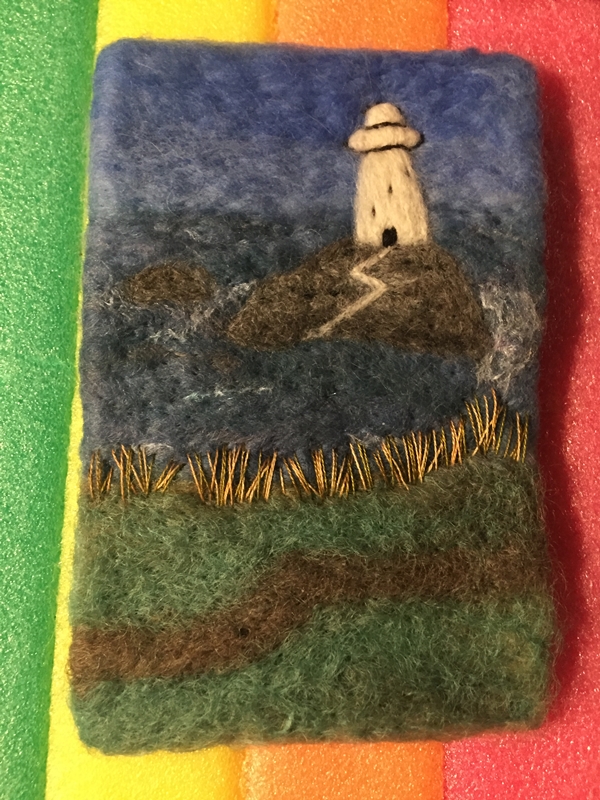
When I posted last time, I showed you the felted portion of my 1st Quarter Challenge piece. The next step was to start free motion machine stitching to add more detail.
First to find some thread that would work with the colors of the felt. I used all of these except for one of the reds.
I started with dark green thread and worked on the stems, leaves and bud. I kept the inspiration photo by my sewing machine so it was easier to see where I needed to add stitching.
Next was the light green thread. I just used it for a few highlights on the stems, bud and top of the big leaf.
Now on to the poppies. I used a light pink for highlights. Somehow, I always forget how much the machine stitching compacts the felt. It makes the unstitched portions feel very puffy.
Then I add some yellow for the centers of the poppies.
Next is the medium value red. You can’t see it very well because it is the same value as the main poppy color. But perhaps it gives a bit more definition of the edges.
Then on to adding a little more dark value where it was needed. Afterwards, I put it up on the design board and stepped back a little. Looking for anything that didn’t look right or drew the eye too much in one place. The areas that bothered me were the top poppy there seemed to be a straight pink line coming down to the bottom of the flower. And the bottom poppy, I thought the pink at the bottom center was a bit too much.
So I added a bit more burgundy in those two areas to tone down the pink just a little. So it’s complete. You can click on the photo to see it up close. Thanks for the challenge, Lyn and Annie!
This is a guest post from a new contributor to our site. Please welcome Ildi Klozsi!
I’m Ildi Kolozsi from Romania, Europe. I live with my family in a small village in Transylvania. I started working with wool about 18 years ago, and from then on I have had a special connection with this material.
The wool is part of my life, sometimes I dream of my next project or work. I love to try new techniques.
I also teach adults and children, I think that it’s very important (for everyone) to recognize the beauty of this natural material.
The project that I have showed you in this post was made for a custom order, she wanted something with birds, not too much color and inspired from nature.
I love to felt bird designs, maybe because I live close to nature, I’m part of this.
Don’t we all wish we could be children sometimes? The freedom to be creative, taking inspiration from anything we see. Maybe that’s what is so appealing with an art such as wet felting. It gives us all the opportunity to create!
Alex and I were talking about nature, and reflecting on a project we did in the summer when we turned golf balls into ladybirds (or ladybugs as you may call them). It was then that I got thinking about how many children love ladybirds! We had been thinking about our next felting project and we thought it would be fun to incorporate ladybirds into the mix! Felted soaps are really easy for children to make, there are so many different ways you can be creative. So – we thought about combining felted soaps with our favourite little creatures….ladybirds!
Red and Black Wool Batt and Soap
In order to prepare the soap, I trimmed the hard edges using a potato peeler. I find these really good for this job, as you can cut a thin slither of soap without digging into it too much. We like to collect the soap chippings, which we then add to our bowl of hot water. We use this for the felting, and the scented water adds to the scent of the felted soap.
We chose to use wool batt to make our felted ladybirds as we already had this at home. I would also like to try making them with Merino wool, to see if they come out softer. We used 3oz of red wool first, which we wrapped around the soap to make the ladybird’s body. The black wool was put aside for later, when we came to needle felt the spots!
The soap is all nicely wrapped in it’s warm woolen jacket!
Once we had wrapped the soap in the red wool, we put it inside a cut off pair of tights to keep the wool in place when we started to felt it. You might notice our two soaps are different sizes. That’s because one contains a baby soap, which although it was the same make as the larger soap, it was slightly smaller.
And then the fun starts! We begin wet felting our soaps.
I like this part Mum!
You can see by Alex’s face, he really enjoys this activity! The only thing I had to watch is that he got a little overzealous and I had to watch we didn’t end up with a squished ladybird!!
Felting the soap
We felted away for about 10 or 15 minutes. After a while, we removed the tights and felted direct with our hands. We also tried using some mesh and also some bubble wrap to help things along.
And then there were four!
After the soaps had dried, we needed to add the spots and faces. We used the black wool batt for this. We think they came out pretty well!
Alex is very pleased with his ladybirds!Two little ladybirds
For time constraints, we only managed to decorate two ladybirds in time for the blog. But we are looking forward to making some more. We also plan to make lots of other soaps, both for adults and children. They make lovely gifts for friends and family!!
This past week in Ottawa was cold, with a few days that were not overcast and gloomy. We even had a little snowstorm and lost power for a few hours. Since I couldn’t work on the computer and the lighting was off for colour work I tried to wash the dishes, no hot water…. Ok, how about cleaning up the dust bunny I spotted in the dining room the vacuum is right there… oh….. I will get the broom… Well, it was not all bad, I didn’t have to vacuum and Glenn brought home Fish and Chips as a treat for dinner!
1 Ice on the window to inspire you!
So when the sun came back I made the most of the good light and blended some yellow-ish skin tones for Mr. Mer. I was focusing on his hands and building up his forearms (lots of arm curls and extensions to build up the biceps/Triceps now wrist curls to build up the extensors/flexors in the forearm) I suspect he would just like me to add a bit more fibre to him so he can skip the exercising!
2 Mr. Mer, Miss Mer and Mrs. Mer.
It has been a while since you saw the understructure for Mr. Mer but the armature for the hands is floral wire doubled over and twisted. The rest of the body is 12 gauge aluminum. The armature was then wrapped in part of an alpaca bat I had used with all the Mer’s.
3-8
The top layer is blends of Corriedale in cream, yellows, greens, blush and browns aiming to be similar to the underside of a northern pike with a suggestion of skin tone. I want to layer over a few more tones but I think he is heading in the correct direction.
9 its hard to see with the wet window but there are gusts of snow on the other side of the glass
Today has been bleak and snowy, but not as cold! So I finished off my notes for the study group on armature wire. I have the outline written. It took a while to try to source locally some of the wire gauges we will be investigating. I also made a list of some of the online options. I wound up with five pages for the outline and shopping notes! I got them off to the registrar so she can send them out as registrations come in. The OVWSG study group web page is now live! The first few fellow studiers have signed up! I hope the rest of my wire orders come in soon!! We are starting 23 February 2021 running weekly on Wednesday (Zoom meeting 7:30 pm to 8:30 pm Local Ottawa time) until 17 March 2021. Because we are Zooming we can be accessible to more people. Please take a peek if you would like!
10 Mr. Mer is demonstrating how well his new fingers work by holding the first wire order that has arrived. (Approximately 10 gauge Aluminum.)
11 This is an assortment of wire collected locally in Ottawa at; Dallerama, Home Depot, Walmart. I also found some 12 gauge aluminum wire at McBead Creations but it’s not in the picture! (the 11 gauge steel is what I used in the Quadra-dents and is too stiff for most armatures. But does make excellent weapons!)
I hope this will inspire others to try study groups as a way of learning remotely while we are still stuck at home. At least the commute to work is quick for some of us? And hopefully, the rest of us are having fun felting!!
I seem to be in picture mode. I wanted to do something with water but not necessarily as the main feature. I thought about a beach and that was my intention as I started but as was looking for pictures and some of the cliff-top pictures really took my eye.
I used a nice thick piece of wool prefelt that I bought at the Almont Fiberfest a few years ago. It is 4inches by 6 inches, 10cm by15cm I think it is wet felted on a flatbed machine. It is course wool and more solid (felted) than the thin needle felted prefelt we usually get. It is much closer to being felt. I would love to get some more but don’t know where to find it. If you know let me know.
I start with what is farthest away, sky and water. When I do sky, it’s always cloudy and I have to do a google search to remember if the sky is darker or lighter near the horizon. The wool I used for the water has a few bits of sparkle in it. I think that’s what is making the white dots in the picture.
Then some land and the rocks. I used a mix of 3 grays so the rock wouldn’t be flat.
Added the lighthouse and the path
Then I used throwers waist to make the white water around the rocks and some whitecaps. At this point I gave it a light felting mostly to sink the silk into the felt so it didn’t look so much on the surface. . There was still more needling to do though. I added the top of the lighthouse and started the stitching.
And as usual when you start stitching you start unstitching. The grass stitches here were much too small. The path needed changing as well as being far too straight it was much too wide. you can see how all the extra stabbing pulled the piece in even though I was poking up and down and not sidewise. I stretched it out.
Back to stitching. I am using 4 colours for the grass, 2 shades of gold and 2 of green.
I added some small blue dots for flowers.
Then the foreground grass
Then some french knots for more flowers. I used a couple of shades darker blue for the foreground.
This is a close up of the stitching.
That’s a lot of pictures but I hope you enjoyed seeing the progression. Stitching really helps a picture pop. And as I promised picture without Sheep. I can do it. LOL
So a week has gone by since I wrote up this post ready for the 4th of February. After a comment from a friend, and looking at it after a break from working on it, I decided to fiddle with it more. First I ripped off the path it was far too white, I remade it with some light gray. I did want it to be distinct but not a lightning bolt from Zeus. I added a tiny little dock, not easy but that’s what I get for working small. And the sky was too much open space so I added some birds, again very fiddley. I did add some slight shading to the lighthouse but it doesn’t really show in the picture the wight really reflects.
Lyn and Annie posted the 1st Quarter Challenge at the first of the year and I have been considering what I wanted to create with 1900-1909 in mind. Then I remembered the Antique Pattern Library. This is a free online resource that has PDF’s of interesting antique patterns and magazines. There are a lot of different categories to explore. If you haven’t checked it out before, you should take a look. There is loads of inspiration to be found there.
So I put embroidery in the search box and then looked through the options. I found this magazine from 1902-1903, perfect! If you click on the link, you can view the entire PDF. I had decided that I would use one of the patterns in this magazine to create a felt piece and then add free motion machine embroidery for the details.
So I chose the poppies. This was originally intended for silk embroidery in a traditional long and short stitch. I decided to use the photo for inspiration and go from there.
My studio is piled with stuff all over the place as I am working on a large wall hanging for my Level 3 Stitch course and I didn’t want to climb over a bunch of stuff to look through all my wool. So I used what I had already out. I can say I was challenging myself to a limited palette or it could be I was being lazy.
I used prefelt that was left over from Christmas ornaments and some other bits of green that were still out from some of my differential shrinkage projects. Hmmm…. perhaps I should clean up the studio a bit? Here’s the layout. I am planning on adding all the details with stitching after felting. I also decided to leave out the separate stem on the design and just go with two open poppies and a bud.
Here’s how it looks after felting. I didn’t full it heavily since it will end up being framed. I will have to use a stabilizer for free motion machine stitching as it is quite thin. It’s drying now and I will show you the added stitching in my next post.
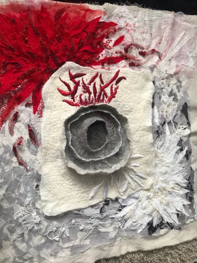
I simply had to develop one of the pieces from my play with multiple resist further. This particular piece intrigued me, and after we spent time together ie me staring at it for a considerable time, I knew where we were going. The centre felt like something had fractured, a cell broken apart. Having recently lost both my parents it felt like a metaphor for my grief and the feeling I was going through, emotions of pain and detachment. These became the red, pain, anger, hurt. The white, detachment, cold, an emptiness. And do our journey began.
To the original felted piece, I added some shaped prefelt which I added with a couching stitch. This gave me the raised effect. I then added beading from the centre of the “cell” out to either side. Throughout the whole piece, I chose a palette of white red black and grey ( there is a little exception to that but I will go further later ).
I wanted to use a material other than felt for the background of the piece and decided on mixed media. As a base, I used calico which I coloured with acrylic paint. As I turned out I needn’t of done this as I covered the whole piece in materials. I knew from the very beginning how the piece was going to turn out but wasn’t sure of the materials I was going to use to achieve the textures I wanted. So I had a play. I got several different materials and heat treated and used my embellishing machine to see the effects I could achieve.
For the red area, I decided upon prefelt with red satin added with the embellisher, heat treated tulle, crocheted wire and beads.
Arranging composition
In the white area, I decided upon prefelt embellished with satin I also heat treated a mixture of materials lutrador, plaid plastic bags and plastic netting (from a cheese sac) doing this gave the texture of ice which is what I wanted to achieve.
Developing the white area
For the other surrounding area, I cut up an old silk dress that had wonderful shades of grey. These were added with the embellisher around the edges. It had many shades of grey going to black so I could shade the composition. It did take the whole dress to complete it.
The base layer was now laid down so next I added the beading As part of the white area I wanted some raised beading so I beaded small clusters of beading on the net and glued the back. When dry I cut them out and arranged them on the piece.
In these little parts, I added only a couple of golden seed beads. My little sign of hope I suppose.
In the red area, I added beading in shades of deep red and dark green also many sequins which reflect light wonderfully. wire crocheted flame-shaped pieces were added radiating out into the grey area. I also embroidered with daisy chain stitch.
And so our journey ended. I have never worked on a piece that felt like a part of me more than this. Because of the lockdown here I am unable to get it framed but it will be. Then it will go on my wall
I haven’t properly picked up my felting needles in quite some time. I can’t tell you why, but my mind just hasn’t been “in the right place” to make anything particularly unique.
Things changed when I got commissioned to make a mushroom sculpture. It was just simple yet challenging enough for me to see if this would finally open those creative doors. The client wanted something similar to what I’d made before, so all I had to do was look at an old photo and start felting. I’m not copying something that needs to look exactly like something else, but it’s also not mindless felting. Perfect.
This is the old mushroom she saw in my online shop and wanted another of (sorry the resolution isn’t the best):
I really enjoy looking at past work because I’m often surprised at the fact this is mine. Do you get that feeling with things you created a long time ago? I am particularly chuffed when I get that “oh, that’s pretty” feeling before it registers it came from my brain.
Now, for the new sculpture. I gave my client a few fabrics to choose from, but she went for the same as the first one. Not surprising, as she really liked the original item and was very motivated to have a mushroom like it.
I started with wire wrapped in wool to make the stem. The top was created with leftover wool felted into shape, then I sewed the fabric to the top and some tea-stained gauze to the bottom.
The base looks very messy, so I’ll be adding some wool to cover it.
Then comes the fun part: assembly!
I chose some hand dyed mohair locks, plus some natural Wensleydale ones and put it all together. After that, I sewed the beads and stones here and there. Here’s the finished item:
The finished object is just different enough for me not to feel I made a complete copy, and the familiarity helped make the felting process easy enough for my Lockdown Brain to not feel too flustered.
Finally, not related at all, but here’s a photo of a lovely Edinburgh sunset for your enjoyment.
I am not as far along on my challenge as Ann is. She was showing hers off last night at the social (on Zoom). I hoped you might be both curious about my research progress and may find inspiration for your own challenge. I am looking at Art Nouveau, which starts before our challenge period but extends through to 1910. It draws influence from the arts and crafts movement, craft revivals and the introduction of Japanese prints to England and Europe.
Art Nouveau, “ornamental style of art that flourished between about 1890 and 1910 throughout Europe and the United States. Art Nouveau is characterized by its use of a long, sinuous, organic line and was employed most often in architecture, interior design, jewelry and glass design, posters, and illustration.”
in Architecture one of the earliest to use the art Nouveau style was Victor Horta who’s most famous town home in Brussels predates the challenge, but Hôtel Tassel is a particularly good example of the organic fluid style of Art Nouveau with structure and patterning inspired by nature.
1-5 Victor Horta; Tassel house Brussels. Exterior 1893, Railing details, Staircase, Stained-glass.
Another example of this style is in commercial illustration, (for which I have a particular fondness) was the work of Alphonse Mucha. He was a Czech painter, illustrator and graphic artist, living in Paris during the Art Nouveau period. His distinctly stylized and decorative posters often encompass organic flowing lines. He often used circles or arches to highlight his subject and embellished them in lavish flowing fabric, flora and hair. He is most famous for his Theater posters, particularly of Sara Bernhard. He also did other commercial art designs and large murals for the exhibition of 1900. He produced portraitures in New York while getting backers for his work the Slavs but this is just after our challenge time period.
I purchased prints of his while I was at University and again after graduation. I only have one of them up at the moment, Media, since I have many bookshelves and little wall space. In grade 13 I was one of 2 girls who read the part of Medea in English class. The teacher suggested the boys should be careful of both of us since we both seem to have enjoyed reading the role.
in Laurel of 1901 and some of the top decorative elements of the Pen 1899, you can see the arts and crafts inspiration from the textiles and wallpapers of William Morris.
10-11 William Morris; 1896, 1897
In Art Nouveau, I also get to see some of the Norse art of the Urnes and Oseberg style. this may be why I am so captivated by its flowing linear quality.
11.1 Urnes Style Norse art on Stave church
While I have been delving into hours of looking at the amazing graphic linear design I also was finishing off the main guild library lists for 2021; Topic, Magazines, Author and Title, submitted the outline for the armature study group and am finalizing the supply list for it.
Then I got a message reminding me I had promised to get a photoshoot done for the armature study group sign up page. Ooops, OK change of plan where did I put the wire, oh yes in the white bucket beside the computer desk! I re-piled my partly cleared desk with various packages of wire, so much for cleaning up my desk. Now, how can I display all that in an aesthetically pleasing manner? Mr. Mer volunteered again (I suspect I will never convince him he should be a fisherman after this.)
I used my chair as the backdrop and draped a throw Glenn gave me over it. I selected the 11 gauge steel (grate for quadra-dents not so much armatures), the 12 gauge aluminum and 20 gauge floral wire. I suspended the 11 gauge wire with a piece of kumihimo I had just finished since it was too heavy for even a Mer-man of his excellent physique to lift.
I suspect all that looking at all the Art Nouveau may have unexpectedly influenced the photoshoot! I had not been thinking about it at the time I set it up but see what you think.
Here are a couple of shots from the photoshoot.
12-13 Mr. Mer Posing with Armature and Quodra-dent wire
I pulled one of the photos and stuffed it into “PhotoPad” which is a free photo editing software and started to play using the Cartoon edit feature I got this.
14 Cartoon edit from PhotoPad
With a bit of stretching of the image, it changed to this.
15 added stretch to JPEG to create proportions of the theatre posters of Mucha.
When I played around in Microsoft Word, I did a bit of artistic photo editing and got this.
16 Microsoft effect “Photocopy” with increased contrast and saturation.
I have gone from 3D felt to 2D flat, like the prints by Mucha. I’m not sure this is it. It’s a bit too stylized and abstract but I like the flow. Is that frothing sea foam crashing behind him? There is definitely something here. I will think about this for a while. Now I wonder where this will take me as I continue to consider the first challenge of the year.
Lyn and Annie have set us a challenge for this quarter to make something inspired by the decade 1900 – 1909. The challenge is here If you would like to see it and maybe you could join in. first-quarter-challenge
They gave us examples of what was going on and what caught my eye was the aerial photography. It made me think of some wonderful works by the fibre artist Chris Cullen of As theCrow Flies. https://www.facebook.com/cbdasthecrowflies/. She uses mostly recycled knits and yarn in her amazing pieces. she sells mostly through galleries but does commissions through her Facebook page. for sale at https://www.facebook.com/Blue-Bramble-Gallery- in St Ives, and https://www.facebook.com/a2gallery.wells Also from Spring, Baxters Gallery in Dartmouth.
These are 2 of Chris’s recent pieces
I have in the past thought about doing a piece inspired by her amazing work. Lyn and Annie have given me the push I need. I thought I could do something similar in felt for my own farm. First a prototype. This is a flat piece and not of my farm but just a farm. I used an old sweater that I ran through the washer then dismantled and ran through a couple more times. I wanted a nice sturdy base.
I did this picture by needle felting into a square cut out of the sweater. I have one of the little 6 needle holders that I used for most of it. Then switched to a single needle to put in the details. It is done in a very minimalist way with
The sweater piece.
The background and the road and the start of a field.
Added the fields and the house and barn.
Then some sheep of course.
I folded all the wool
Lastly used some green curls to make the trees.
It was a lot of stabbing, too much stabbing. I think I will try to do all the main features like roads and the fields by lightly needling them into place and then wet felting them. Just adding the detail and features with needle felting. The next one will be more 3D. I have some ideas for the house and barns. Have you started thinking about his challenge? We would love to hear about it on the felting and Fiber studio Forum. Here’s the link to the place to post pictures. https://feltandfiberstudio.proboards.com/thread/4247/2021-first-quarter-challenge. or use the Forum button on the left to get there.