I told you in my last post that I had created a handmade book from deconstructed screen printed fabric and paper at our retreat. We followed this free tutorial by Jeanne Oliver. She has lots of free content on her site and some wonderful online classes. This is the book I created.
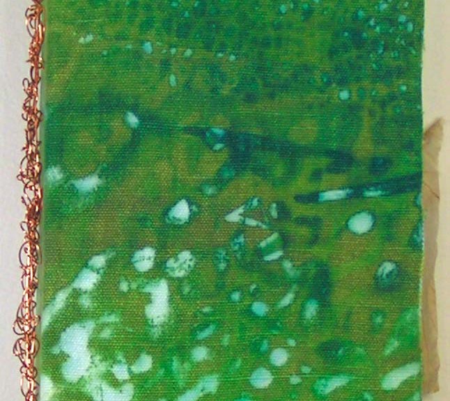
Here’s the book from the front. I used hemp canvas fabric that I had screen printed. The cover was constructed from the hemp canvas, book board and deconstructed screen printed paper.
The book was bound with pamphlet stitch and copper wire. I have created many books with pamphlet stitch but had never used wire. It was a bit tricky but I like the result, plus it’s very sturdy.
Here are the inside front cover (L) and inside back cover (R). I really love the organic feel of the screen printing. I made three signatures and used plaster on canvas pages plus additional pages of various papers and a bit of fabric. The main pages were created with canvas, plaster and gesso.
I didn’t take photos of all the page spreads but wanted to show a range of what was included in the book. The brown paper on the left is a “faux rice paper” that I made with tissue paper, walnut ink and matte medium. The photo on the right shows the inside of the copper wire binding.
These next photos shows a variety of papers that I used in addition to the plaster and canvas pages. Some were painted, some eco printed and I used some specialty rice papers as well.
Here are a few more page spreads. Besides paper, I also added in some hand dyed canvas as well. The book is fun in itself and could probably be left as is. But I want to make it into a book about the forest with sketches, additional ephemera related to trees and whatever else reminds me of the forest. So I will be working on this slowly and adding bits and pieces to it over time.
These are a few of the types of things that I might add. Paula kindly gave me the pieces with definitions and the labels. She has loads of ephemera and is very generous. Thanks Paula! You could easily make this type of book with felt as the cover fabric. I would love to see your results if you give it a try. You can submit photos of your work here and we will post them.
My local group had our annual retreat in early September. We go out to a lovely lodge on Little Bitterroot Lake and spend a couple of days creating and playing with art stuff. This photo is from sometime in the past. Sadly, this year, the air was full of smoke and you could barely see the mountains across the water. This year, our activities included deconstructed screen printing, making a book and creating some “faux” rice paper.
These are a few of the paper prints that I created. Deconstructed screen printing is done with a previously prepared screen in which the thickened dye has been left to dry. Then you use more thickened dye or plain print paste to release the dried dye from the screen. It is a serendipitous process and you are never sure what you will get in the final prints. I teach this process on felt in my online class.
I usually use fairly thick paper so that I can wash out the thickener that is left on the paper. That way I can do other processes on top of the paper without it running. These are similar to some of the papers that I used in my recent collage challenge.
One of the fun things about the paper is that you can end up using either side. The photo on the left shows the front side of the printed paper and the right photo is the back side.
Here are some of the fabric pieces that I printed. If you click on the individual photos, you can see what type of fabric I used. The little scraps on the top left photo are what was left over after I used a piece of printed hemp canvas for the cover of my book.
These prints are all on silk. The left side is silk habotai, the middle is silk organza and the right side photo is the silk organza layered over the habotai. You could print on many types of silk and this would be a great way to create your own fabric for using in nuno felting.
I will be using these for my upcoming classes that I am taking as backgrounds for stitching, in collages and wherever else suits my fancy.
Next time, I will show you the book that I created while at the retreat. It’s not entirely finished but you will be able to see the deconstructed screen printed canvas as the cover and a piece of printed paper as the inside covers.
Today I am looking forward to having a little time to do some felting….well in the not-too-distant future. Today is the last day of the regular farmers’ market. There will be a bit of a break before we need to bake for the Christmas markets. I will need to make more meat pies and stock up the freezer with uncooked but ready-to-bake items but that is not as much of a rush.
One thing I want to do is make a big pullover/sweater/coat sort of thing. See the bad sketch below. I would like to be able to pull it on over my head but may have to opt for a zipper up the middle. all the squiggles in the second picture are scrunched-up silk…maybe.
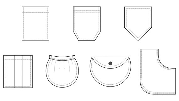
Hopefully reversible. I think I want pockets. I am wondering if I should try side pockets like you get in a skirt seam or patch pockets inside and out.
I know I won’t get it done anytime soon, but I would like to do some sampling, and try out some different fabrics for backing and embellishment. I also want to try a sandwich of cotton/wool/silk, silk/wool/silk and cotton/wool/cotton along with the traditional wool on one side and fabric on the other. I need to try some different wools too. I know merino is likely to pill a lot if not covered in something and I have Corriedale and some BFL that I should try.
Colour is another variable of course. My fallback would be grey with accent colours (I really like grey and red together) or purple, I don’t know.
I’m learning to print onto felt so I thought I’d show you some work in progress. I’m following Lindsey Tyson’s course ‘Transfer Printing onto Felt and other Fabrics’ so I’m focusing here on what I’ve made rather than how. Lindsey’s been printing on felt for some years and has developed her own techniques. She’s now moving away from felt-making and printing to focus on painting so has produced a comprehensive course to share her expertise. I first saw her work a few years ago and have been really intrigued ever since to know how she produces such lovely images on felt.
I do quite a lot of sales and exhibitions in my local area. I’ve long thought I’d like to develop some smaller decorative items I can make relatively quickly and so sell at a lower price than some of my other work (because it’s more time-consuming). I thought printing might provide an opportunity to do this.
I hummed and hawed for some time before signing up as it involves quite a big investment – not only in the course itself but also in equipment, software, space (for the equipment) and time. I’ve just had a milestone birthday and as my mother wanted to give me a milestone gift, I decided that this was it. I do love learning new skills and developing ideas so I was pretty sure I’d love the course. Thank you Mum!
My first venture was to source some free online images (this is covered in the course) and, along with a little oyster shell sketch I drew, prepare them for printing and print some samples onto scraps of felt.
Small test pieces
I was pretty pleased with the results. However, some of the prints had a rather plastic feel and very visible edge.
Poor quality printBetter quality print
Lindsey was very helpful with her suggestions on how to improve – including highlighting that I’d overlooked one of the steps when using the paper I’d chosen, doh! That is now largely resolved though I’m still wrestling with myself about whether I should buy a new printer as I have an inkjet and apparently laser prints work better.
I made a little tea light holder cover using some commercial prefelt. I’ve never used bought prefelt before (I’ve always made my own) and although it produced a very lovely fine felt, I also managed to create a line in the cover where the sheet of prefelt joined that I wasn’t happy with.
line where prefelt joinedSame line with light behindPrinted back of tea light holderAvocet (with some unwanted fluff!)First tea light holder attempt – using commercial prefelt and one of my own felted bird images
I now know (from the course) that there’s a way round this but I’ve decided for the time being to stick with making my own felt from scratch rather than introducing new variables.
The course covers, in a lot of detail, how to design and manipulate images. It includes tutorials on using free software as well as paid-for software like Photoshop. I decided to buy Photoshop Elements ( a basic form of Photoshop with a one-off purchase rather than a monthly subscription). I have to admit I have not taken to it like a duck to water! Some of that is doubtless me (remember that milestone birthday!) but I’ve seen lots of reviews that agree that it’s not very intuitive and so not particularly easy to learn to use. Fate intervened with (as far as I know) my first dose of Covid-19 during which I confined myself entirely to staying at home for 5 days (as per our current guidance) and until I tested negative. After the first couple of days I started to feel better so decided this was my time to make Photoshop Elements work for me. In spite of sometimes getting very frustrated, I actually quite enjoyed the learning and have to be impressed with the things I can now do with it (however slowly) let alone all the things it can do that I can’t yet. There are some really good free YouTube tutorials too, which helped, and I have certainly put in the hours. Many, many hours.
Back to the felt-making. I made two more little tea light covers – one from 2 fine layers and one from 4 fine layers of 21 micron natural (undyed) merino. I wanted to see how they’d look with a lit tealight inside. Surprisingly they were both OK.
By then I’d thought of using my own felted bird images which I expertly (!) extracted from their backgrounds. I like the redshank and curlew as they both have feet. Often my felt pictures have birds (like the avocet) whose feet are in water or behind pebbles – both because that’s how I saw the wild birds they’re based on and because I find felting bird feet quite hard!
2 layers 21 mic merino4 layers 21 mic merinoBack of the 2 layer one; tealight litRedshank and Curlew on 21 mic merino
I then tried out 18.5 mic undyed merino and decided this was what I’d use as it has a lovely smooth surface, light colour and a fine translucent appearance. Perfect both for printing and for tea lights.
I started to dig into my vast collection of charity-shop-bought silk scarves and added silk strips to the lower part of the designs. This was partly because lit tea lights’ metal cases cast a shadow at the base of the cover (see the lit one above), partly because it adds to the decoration and partly because it can ‘ground’ the images – i.e. give those birds’ feet something to walk on. Oh, it also eases my conscience about quite how many second-hand silk scarves I own.
Redshank with recycled grey silk scarf strip
And so here are some more of the results. I’ve printed a design on the front and the back (apart from the one with a flock of birds – that goes all the way round). They also look nice as plant holders, ‘thought they’re not quite the right proportions for most plant pots so I have to add some small pebbles to the bottom of the glass container if I want to show them as plant holders.
Some of them are free images I’ve found on the internet; some are from my own large felted pictures and one (the honesty seed pods) is from photos I’ve taken of the seed pods and worked on in Photoshop Elements to create a composite picture.
And here are the first 6 I put in the gallery shop at Creek Creative in Faversham (it’s a gallery, café, shop and studios where I rent my studio), just over a week ago. Inside each there are comprehensive warnings about lit tea lights, some felt care instructions and the name of the image.
First shop display at Creek Creative
The redshank on the left sold within a few days – I don’t know about the others yet.
I’ve also made some cards – initially to use up all the little test prints….
Square cards made using test samples
…..and then some I made specifically to become cards
Long cards
And finally a couple of bigger purpose-made plant pots with metal pots inside, using 21 mic merino in green and white.
Side 1 – ladybirdsSide 2 – Butterfly and flowerSide 1 butterfliesPlant pot holders
Next steps? I’m looking forward to a couple of in-person sales / exhibitions I have coming up so I can gauge people’s reactions. I will keep building a stock of tealight holders, plant pots and cards and developing new images so I have plenty of both stock and variety. I will keep extending my knowledge and skills in both printing on felt and using Photoshop. And I will definitely keep working through Lindsey’s excellent course and drawing on her extensive and generous one-to-one and group support to help me on my way.
Here’s a link to a promotional video for Lindsey’s course, in case you want to check it out.
As soon as I saw what Lyn was setting as our next Challenge I thought “but I can’t do that”. I have always stumbled when trying to understand Design because, although I can see pattern in a lot of things, I fail entirely in translating what I see into my work. I am very literal in my thinking, and when I see abstract pieces (usually “modern” embroidery pieces) based on images of say, a broken brick, or the reflection in a window, or a rusty piece of metal, or a “fractal”, I think to myself “yes, very clever, but why?” and “what would I do with it?” and “I can’t see that on my wall” (and just occasionally “I wouldn’t give that house room!”). This is why I tend to make my pictures or 3D sculptures as realistic as I can.
I was going to just not bother with this Challenge, and then I remembered that some years ago I had attended a course on Design – I had forgotten all about it and it is relevant to this Challenge.
In August 2015 the Association of Guilds of Weavers Spinners & Dyers included in it’s week long residential Summer School syllabus a course by Alison Daykin – “Design for the Terrified” and I was lucky enough to be allocated a place – most courses were usually over-subscribed. Here is the introductory list of available courses from the brochure for you to drool over!
The course was described as offering “help to ‘painting and drawing challenged’ weavers, spinners, dyers, or other textile practitioners, in understanding Design and using this in their chosen medium”. The brochure went on to say: “This course will provide simple, but effective guidelines in design, without the student feeling overwhelmed by theory. The tutor will also leave plenty of room for participants to express themselves in their chosen medium.
“By the course end students will have at least one sketchbook and understand the basics of: colour studies; textural studies; shape; line/stripes.
“Students are encouraged to make samples appropriate to their own textile skills. They may choose to bring their loom or wheel with them, or to develop further sketchbooks if they prefer.”
Frankly this description of the course frightened the life out of me and I nearly didn’t apply, not least because I would be foregoing the chance to take the offered very interesting felt making course. (It’s headline description was “… an ‘adventure with fibres and fabrics’, combining colour, texture and layering to produce felted fabrics for decorative purposes or garments” and that was what I was most interested in at the time.) However after exchanging a few emails with Alison, and reading the three blogs which she sent out about the course I decided to bite the bullet. The first blog post puts emphasis on your “Inspiration” and resulted in a further flurry of emails with Alison, since I had no idea what it meant or what my “Inspiration” should be in this context. She basically said that I should pick a subject which I found really interesting. I was undecided whether to plump for trees, which seemed a very big subject, or sea shells – almost as big but of which I had recently started a collection. In the end I went with sea shells.
Sea Shell collection with Sea Urchin “ skeletons”
The second and third blog posts and a “round robin” email from Alison encouraged us to bring along as many different types of art media as we might be able to lay our hands on, including different types and colours of paper and “mark making” equipment. In addition we were asked to only bring one image of our inspiration, but as many copies of it as possible. (As I hadn’t been able to choose just one shell my image consisted of most of my collection, which also included sea urchin “skeletons”.) We would also need to take a notice board (if we hadn’t already made a mood board – “Er …. what’s one of them?”) so that we could pin up various bits and pieces as we went through the course. We would also need the equipment and materials required to make samples in our chosen technique. As I didn’t know which shell would be my inspiration the “materials” consisted of most of my stashes of fibres, fabric & yarns! I’m sure you’ve all heard of the saying “everything but the kitchen sink” – very apt, my poor car was groaning when I set off with all this stuff plus clothes etc., and I had yet to fit in the friend I was giving a lift to, plus all her stuff and her walking aid. (She was still a bit frail after an illness.)
The Summer School was based at Moreton Morrell Agricultural College in Warwickshire, where (after we got lost twice on the way) I met Alison and the rest of the class members. There were weavers, spinners, an embroiderer and a felt maker – me. Alison showed us her own work, and took us through her process for designing woven fabrics for specific purposes, showing us her mood boards and pictures of finished fabrics “in situ”. Here is a much abbreviated view of how she followed one inspiration from an image of ancient ruins to cloth samples.
She then started us off on our own design journey. Alison suggested to me that I should pick my favourite shell from the picture of my collection and make an enlarged drawing of the shell, both in monochrome and in colour and using different media. I had a go at this, although my drawing skills are minimal. This was before she had found that we would be able to have access to the college’s print facilities, where we could get photographs printed, and colour and monochrome photocopies made on a copier, which was capable of enlarging. We all made great use of this facility – zeroing in on just part of our inspiration image and having multiple copies made on different colour papers as well as plain white – which enabled us to speed up our progress through the stages of the design processes that Alison had mapped out for us.
One of the “tricks” which Alison showed us was to take two images, cut (or tear) them into strips (leaving one side of the paper still intact, and then to weave the two images. This did produce some interesting results.
We also cut strips across an image and used this to reference yarn (in my case fibre) wraps. Using this method enabled us to achieve a colour swatch giving combinations, quantities and placement of harmonious colours.
Showing the progress from picture strip to felted swatch
Once we had all played around with these ideas for a day, we were encouraged to get on and start creating samples in our chosen techniques, keeping in mind how we might use the finished work. As I was interested in making felt for clothing and accessories, I had brought with me copies of designs from specific sewing patterns and tried to pick the patterns that would best suit. I had by this time branched out to using as inspiration two different Sea Urchin skeletons, one Cone shell (and when no-one was looking I did a bit of crochet based on the end of a Conch type shell).
Large Sea Urchin
Small Sea Urchin
Cone
As you can see, I’m still leaning towards the literal/representational side of designing.
Alison also encouraged us to take our cameras and go out around the college grounds and look for more inspirations for design. At this stage we had all got used to looking beyond the obvious and came up with some unusual images. This was the one I chose to do something with – don’t ask me why – it’s just a picture of the wood surround (and my toes) to a raised flower bed outside the portacabin which was our workshop, where we all congregated for coffee, snacks and chat.
Being full of enthusiasm for the project, I cut down the photograph to a corner and then cut out the image of part of the surround.
which I then had enlarged and with several copies started to develop the design
This is the design I finally ended up with.
There are five versions in this picture, the basic design on top with four colour changes of the small “pops” of colour. And here is the jacket pattern and a tracing of the design.
The last day of the course was mainly taken up with visiting the rooms where the other courses had been taking place for a grand Show & Tell. To this end, we had packed up all our equipment and materials and set up our notice boards and work tables as displays of what we had been doing. Here are mine
And here are some of the displays of other class members’ work. Not all of them I’m afraid, I had camera shake by then so I’ve only included the less blurred ones.
The whole Summer School experience was great, with evening entertainments, a fashion show, a display of entries for the Certificate of Achievement “exams”, a traders’ market (I spent too much money as usual) and a trip to Stratford Upon Avon for a tour of the Royal Shakespeare Company’s Theatre with a chance to see some of their costumes “up close and personal”.
We inhabited a bubble, with little contact with the outside world. (There wasn’t even a signal for our mobile phones, short of climbing a hill and standing in the middle of the road.) A wonderful experience and I’ve enjoyed revisiting it.
I am afraid that by the time I got home again I reverted to type and have not made any fabrics, felted or woven, from any of the designs. I just did what I usually end up doing after returning from a workshop – I put everything away and forgot about it! So I still don’t have a 2nd Quarter Challenge piece to show you; though as a result of writing this post and after seeing some of the pieces which FFS members have posted, I do feel better about the possibility of designing from random observations and images.
I am looking forward to seeing what the next quarter’s Challenge will be.
This piece is large, somewhere in the 30″ length and 18-20″ width. This is the layout and I have sprinkled the cut up orange nuno felt over the base layer of green wool. I made sure that the orange bits were roughed up so they would stick down better.
Here is the piece after felting. I have pinned some larger poppies in the foreground made out of painted silk paper. I was distracted by the yellow in the direct center in the sky. I decided to add more yellow so that the one area wouldn’t stick out as much.
I needle felted some yellow across the left portion of the lower sky and a few wisps up higher. I also added some lighter/paler silk paper to the poppies as I felt they were too dark in the first try. Then I added some green locks to the foreground for foliage.
And here it is after finishing and “matting” on green fabric. Now Remembrance is ready to go the framer. Now I just have to find a new gallery to carry my work, easier said than done.
A few weeks ago I experienced the delight that is the Auckland Fun Felter’s Retreat, 2 full days of felting bliss! 🙂
We were 13 like-minded ladies at a retreat centre, tucked away in a quiet and leafy corner of west Auckland, we had the entire centre all to ourselves and were blessed with some lovely weather.
Jenny, our organiser extraordinaire, asked if anyone would be willing to teach / lead a short workshop on Saturday morning. Due to the pandemic, I haven’t had the chance to teach face to face since 2019 so jumped at the chance and then immediately panicked that I had nothing to teach this incredibly creative and experienced group (most of the members have been felting at least as long as I have!).
After several weeks mulling it over and talking to other AFF members I settled on “animal textures in felt”, I thought this would lend itself to a series of pre-prepared samples that we could discuss the potential pitfalls and then each member could incorporate one or two into their own project. This group is so experienced I couldn’t imagine any of them wanting to waste their precious felting time watching me laying out fibre over a resist.
We all arrived on Friday afternoon, settled into our rooms and started playing with our fibres in the main hall. After talking to a few members I realised not everyone would be happy for me to share some samples and tips on how to achieve different effects, they wanted a project to follow…. my heart sank, I hadn’t planned for this, how was I going to come up with a project that included, fur, scales, eyes and locks before tomorrow morning?!!
So it was that Fugly was born….
A little pod critter, with eyes, scales on his back, a lambs tail and an unfortunate ear-hair problem – for the record I would never normally recommend trying to cram so many different techniques onto one item but now he is finished I do find Fugly quite endearing 🙂
To my surprise most of the group also made pods that incorporated most or all of the techniques and we ended up with a ?gaggle, ?fright, ?laughter <insert collective noun of your choice here> of funny little monsters:
A couple of members applied to techniques to small bags with great effect…
This weekend was such a success we agreed to do it all again in just 6 months time! 🙂
Where did the time go? I looked at the posting schedule and thought I have lots of time to get my post ready but here I am down to the wire,….. again.
I did manage this week to make some progress on my small picture. I started by adding some grass/stems/leaves/. Starting with a very Christmas green.
Then adding other shades
It looks ok but it’s way too short. What am I going to do with the other 2/3 of the picture? So, remembering Ruth’s advice on the last stitch project when I wasn’t very happy with it, she said “just keep adding more”, I decided I was not taking the stitches out. I would just keep going. The next batch of grass was longer.
At this point, I notice the bottom edge was starting to curl a little. This is because I was stitching into the bottom edge. I didn’t want the bottom of the stitches to show entry points on the top side of the bottom edge. I noticed some of the threads were a little loose too. To remedy this I ironed it with steam. I think it helped.
The next step is the flowers. I was originally thinking stitched flowers, then thought maybe seed needs would be good. I asked opinions at my guild social and everyone seemed to think I should do both. I probably will.
And now the Studio Progress.
The walls and floor have been painted. The place that hasn’t been painted is where the ductwork will go for the heating. It will then get drywall put over it and it will be painted. Notice one of my favourite things about this space. It has a center floor drain. The electrical box will get a cupboard built to hide it.
Yes, the floor is covered in blue speckles, for non-slip and to hide the floor repairs.
Next are the sinks, the ductwork, painting my selves, bookcase and small table. They will be boring white, once the books and wool are on them they will be colourful enough. The table gets the microwave so it will not be seen much either.
That’s it for now. I plan on doing the flowers for the next post but I am not sure what else. I am sure I will find something to keep me busy and out of too much trouble.
I have tried flour paste resist before and even wrote a tutorial about how to use the resist on silk scarves. My local group decided we wanted to try some experiments again with flour paste resists. If you are wondering how you could use this technique, it would work great for making patterns on silk fabric used in nuno felting. If you want to learn the full process, click on the link above.
Because we were going to try this in one afternoon, I had to do some prep work. It takes at least 24 hours x 2 for this process to dry. I started with hand dyed fabric and used a variety of colors and a variety of types of fabric. I started out trying to document the process but the documentation fell apart in the middle of the process. So, I can’t tell you exactly which pastes were used on which fabric. But I did figure out what works and what doesn’t work so well.
So I pinned the fabric down and applied different pastes. Instead of just using wheat flour (which I know works), I also tried potato starch, amaranth flour, corn meal, and coconut flour. I could tell after applying some of these, especially the potato starch, that some of the pastes were not going to work as wheat flour does. After you apply the paste, you let it dry and then crackle the surface. The corn meal pretty much fell off the fabric and didn’t stick at all. The only alternative flour that worked well was the amaranth flour.
After the surface of the paste resist is cracked, then paint or thickened dye is applied. I used black textile paint. You can see that I left some of the pieces unpainted, as these would be used by my group during our afternoon get together.
If it’s working, you can see on the back side of the fabric, the paint comes through the cracks on to the fabric. This example is wheat flour resist and overall, it definitely works the best. I think if I had mixed wheat flour with some of the other alternative flours, it might have worked better and still given different crackle results.
Here are some of the results of the pastes that didn’t work so well. The fabric is still useable as the results were still very organic but it was not the crackle look expected from this technique.
Here are the two that worked the best. The one on the right is from wheat flour paste and the one on the right is from amaranth flour paste. It is really interesting how different the crackles look between the two. I’m not sure what I will do with these samples yet but I’m sure eventually, they will get used in some project.
As some of you know I am moving my studio. I am not moving far, just from one end of the building to the other. I will gain some storage space, another room and a direct entrance. And importantly I will be closer to the bathroom.
I have packed 90% of my studio into boxes and they are piled up in the extra room. Consequently, I do not have a lot to work with. I did make a box with a blob of each colour of merino I have. and collected a bag of prefelts etc.
So there I was on Monday, wondering what on earth I would post about today. I was looking at my inspiration file and going through e bags of prefelt and I found this small odd-shaped one.
This is the back of it because I forgot to take a picture before adding wool to the front.
I added some sky
A blue sky is pretty much one colour. light at the bottom but not a mix of colours. The grass on the other hand is not one colour. so I mixed some up using my dog brushes.
this is the finished background. the needle is to give you an idea of the size. Jan thought it looked knife-shaped I thought it looked like a bullet train.
I want to add some flowers along the bottom. I wasn’t sure what thread to use. I hat unpicking so I grabbed a piece of fulled sweater off cut and covered it in green to try out some different threads.
the dark pink is Filtex. these are very old spools they are shiny rayon, like fake silk. the orange is 1,2 and 3 strands of embroidery thread., the blue is an embroidery cord and the green is a different kind of silk or fake silk embroidery yarn.
Here’s a picture of the back. You can see what each thread looks like a little better.
Next is doing the stitching. I think I will use the green to add a few bigger leaf shapes. the orange and blue worked well. I will try using 2 and 3 threads of the pink to see if they show up better. stitching on felt is odd. you have to make your stitch about twice as long as you want it to get it to show up the size you want. It must be because of how soft the surface is. Does anyone else also find this to be true?