Browsed by
Category: Inspiration

Some more interesting samples

Some more interesting samples

This week I made some more samples. The first is a sample of California red that my friend Bo gave me to try. the wool is an oatmeal colour with red hairs in it. There is only a small amount she had combed.

It felted quickly and well. It is fairly firm. I don’t like the hairs init. I am sure they will shed out. They are not held in the felt very well at all and slide out without and force. it might be good for backing a fake sheepskin.

Finished wet:

Finished Dry

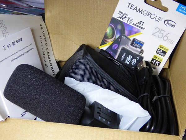
The next one I did was some wool I just got from Lithuania. Jan and I ordered some wool while there was free shipping. Jan will show you the unboxing in her next post.

This sample I am very happy with. It felted quickly and very firmly with no stretch. Usually, when a piece of felt is still wet you can stretch it this way or that to square it up. This one had very little give, perfect for some boots or some baskets.

Finished Dry. I think it would have been smoother if I hadn’t given it a really good scrunching.

The last sample was a new sample for my guild poker challenge. I used a much denser fabric. Even though is heavier it is still an open weave, and slightly wrinkled. On the front, I put some of the same cotton, scrunched up, then some sparkly nylon, silk and at the bottom some viscose.

This is what it looks like dry. There was lots of migration so everything was well stuck. I will leave these one big so you can see them well without having to click on them.

I think this cotton is just what I want. The next job will be to dye some of it for my project. It will fit right in with the 3rd quarter challenge. I am going to keep what I am making a secret for now.  😉


Sudden Change of Plans

Sudden Change of Plans

I have come to the conclusion that until I can acquire the appropriate topcoat for both the Pictish Shepherd and the mysterious creature I am temporarily stuck. (Oh if only I could go shopping!! <note wringing hands and serious whining!!> ) I could keep working on the understructures but the day is grey and raining, and I need to do something that is a bit more productive feeling (I already did the dishes.  That’s why I’m stuck sitting down again).

I should start thinking about what I want to do next as a picture. There were two shots that I looked at recently that caught my eye. One was a yak, but he has an odd feeling compositionally. On the other hand, the fur is so shaggy and has some interesting colouring to it that it would be fun to work on.

1 1

I could crop the shot.  I really do like that shaggy fringe. Let’s check out the 5×7 ratio and see what I can get.

23 4 2-4

It’s ok but doesn’t grab me as much as I thought it would. (It’s likely the rain) the other option is to just pick him up and move him to the left it would also get rid of that annoying tree in the centre of his head. That would likely work better as it would let me play with more shagginess. If I work from the original composition, I think I would like to erase some of the background trees, especially the one growing out of his head (as you can tell it’s really bugging me).  Let’s see if Photo pad, (that’s a free photo editing program) can do for a bit of deforestation.

5 5

I like the diagonals now and the weight of the composition feels better. I think it was the tree on the top of his head that was really bothering me but this looks much more comfortable and I added a bit of blue to the sky (we could use some of that blue sky here today.)


Oh No, as I was getting the second shot for you I just spotted another I had found earlier that could be cropped to be really fun too.

6 6 the original.

7 7

To get the composition I’m seeing in my head I have lost the 5×7 ratio. That would mean having a special mat cut which has gotten very expensive and isn’t easily available at the moment. (It’s much more frugal to work to a ratio that will fit in a mat and frame I already have so it’s 8×10 or 5×7 or one 4×6.) If you have an image, you can scale it up or down with a photocopier or use your computer and printer. With framing so expensive, if you can arrange to fit into a standard size it will help your costs if you are planning to sell your pictures. (I have not finished Xmass presents so I’m not selling yet! – it’s almost the end of APRIL!! I had better get working on those!)

8 8 this is 5×7 it’s not quite as intense but it still is very piercing. Yes, this would be fun.

Now let’s look at the other picture I was thinking about.

9 9

One of her relatives is a local resident. I’m not sure which neighbour has her as a non-paying renter that I have smelt but not seen yet this year. I particularly like this image but not, the cat food. So let’s see if I can get rid of that first.

10 10

not a great job but the offending cat food is gone. Yes, that’s better. Should it be a tighter focus?  That usually appeals to me. Better check.

11 11

I think I’m losing some of the small, fragile, youthfulness of the face when I get too close to her. It works compositionally but I don’t think it captures the hesitation and age of the upper one.

Now, which one should I choose? Let’s print out 5×7 versions of each and see what they look like. Which would you choose?

Have fun and keep felting!

3D wet felting experiments (part two)

3D wet felting experiments (part two)

In my last blog spot I showed how I made a sprouting seed pod as part of a group of 3D wet felted objects I’m calling ‘Lifecycles’ that I am submitting to an open exhibition.  You can see that blog here if you missed it or want a reminder https://feltingandfiberstudio.com/2020/01/13/3d-wet-felting-experiments-part-one/.

The second piece is a fallen tree branch with fungus and lichen. My ideas is that as one thing dies (the branch) it gives life to others (fungi etc). This will tie in with the sprouting seed pod (a new tree) and maybe I’ll add a couple of other things too, yet to be decided.

Wondering where to start with the texture I take myself off to the local park to look at different types of bark.

I am particularly taken with these very ridged examples and wonder how I’d go about creating that texture in wet felt.  I happen to have some off-cuts from the seed pod on my work table – a piece of fabric, probably linen, I found in a charity shop and felted –  so I decide to see what it looks like if I lay those under some new felt.  Keen to do things properly (and not waste time) I make a sample.

I am still experimenting with using wool batts from different breeds of sheep (rather than merino tops) so put together natural brown and grey Shetland and Finnish wools plus a little dyed green Perendale including a couple of bits of prefelt. You can just see the ridges when felted but I want more so try cutting into the surface. I really like that effect.

Sample of recycled scarf felted to become lichen

I try out some pieces of a (charity shop) hand dyed silk scarf for lichen and like those too so decide to get on with making the log.

I make a sheet of nuno felt using the recycled fabric which I cut into uneven strips.

Using a large rectangular resist I lay out 3 layers of wool on each side, wet it down, and add the felted linen strips on one side in what I hope is a bark-ish pattern. 

I cover these with two more layers of mixed brown and grey wool then add the surface decoration including prefelted discs for fungus and some marbles under the largest green section.

Surface of side one laid out

I would normally lay out the whole thing before starting to felt but there is a lot going on by now that I don’t want to disturb by flipping it over so I start working the first side to try to get it stable before finishing the second side layout.

On the second side I add yarn, locks, nepps, slubs, silk noil, nuno prefelt, pieces from a striped charity shop silk scarf….I am really starting to enjoy this. It’s a good job there isn’t a kitchen sink nearby as I might throw that in too. I’m thinking that as the log will be lying down, this will be the under side so it doesn’t matter if I don’t like everything. I could even cut bits out.

It takes quite a long time to rub and full this woolly smorgasbord, working hard into all the grooves. As I finish working it I decide it looks better standing up and so the log becomes a tree stump. 

Final tree stump from the front

In the end I decide not to cut into the surface as there is plenty of texture and I also leave the marbles in as I like the green knobbly bits (visible in top picture). 

What next? I’ve been mulling over how the pieces will be displayed together and decide to make a flat piece of ‘woodland floor’ felt for them to stand on.  I start with a piece of mixed leafy-coloured prefelt.

I cut the prefelt into rough leaf shapes and lay them on some layers of brown wool.  I can’t resist adding a little bit of 3D so felt some thick green rope to look like new shoots emerging from the ground. 

Finally I make an autumn leaf to highlight the annual cycle of a tree’s dying and renewal. 

Here’s the final piece.  Have I captured the idea of life cycles?

Final “Lifecycles” piece

And yes, Lifecycles has now been accepted into the exhibition so will be on display at Beach Creative in Herne Bay from 20 March to 2 April as part of the 3 gallery exhibition ‘Map’. If you’re in the Whitstable, Faversham, Herne Bay area do pop along to the Fishslab, Creek Creative and/or Beach Creative Galleries and check out how other people have responded to the Map challenge (dates vary slightly). I know some of my friends have fabulous work in the exhibitions so I think they will be hugely varied and interesting shows

Holiday Card

Holiday Card

Now that my partner has finally received her card I can tell you about it.

First I made a background using some prefelt and added some northern lights. I then wet felted it all together. they are not felted hard because it is small and is an art piece.

Next, I added the trees along the far hill and a nice big evergreen and a barn using prefelt again.

I added some snow to the tree and added some definition to the barn. I also added the fence wire using perspective so I could add the posts along the right line.

Then came the fence posts and some shading for the snow-covered ground.

and finally I added the sheep( I bet you are not surprised that I added sheep) and trimmed the northern lights so I could turn it into a card. I always do my card as a postcard so they can easily be framed if someone wants to. I just print off a postcard back from the internet and iron it onto the back with a fusible web. I was in a hurry to get it in the mail at that point and didn’t get a picture.

I made a second one at the same time. I like to have 2 to choose from when sending a card. This one I kept. I will frame it. I haven’t decided if I will keep the northern lights projecting over the mat board or trim them off as I did in the one I sent.

I wish I had a better picture for you but I have put it someplace safe and now I can’t find it. I am sure I will come across it when I am looking for something else.

In the Begining

In the Begining


In the beginning;

In 1989 I joined the OVWSG at their annual general meeting and became their librarian. I did tell them I was Severely Dyslexic and was assured by the executive that would not be a problem. I was given 5 boxes of books that had to be entered into the library before the September meeting which I did with a bit of help from Glenn. Things went on quite well until I built them a subject catalogue and they discovered what dyslexia was. Isn’t Urope always filed under U? E-Urope sounds like a burp not a continent. Annoying English! I think you should all convert to dyslexia and spelling would all be phonetic with occasional decorative letters you stick in because you likely forgot to use them earlier.

In 1993 I went back to school and Clara took over the library at the guild with the goal of fixing the subject catalogue by making cards with the “English spelling” -See – “Dyslexic version of the word”. I returned to Ottawa in 1996 and got the Library into a Database with fewer spelling errors or foreign languages.

I am pretty sure that somewhere between the 1989 start with the guild and the return to school I took my first felting class. It was with Maggie Glossop. She has had the starting of many of us into the addiction of fibre accumulation both for Spinning and Felting. When I checked on line to make sure I spelt her name correctly I found her resume http://www.convergenceart.com/Maggie%20Glossop%20Resume.htm Impressive!

The workshop I took was making a small bag in felt over a resist embellished with an image. Mine were Iris, a bit stylized, but definitely flower-ish. I discovered I was entranced by laying out layers of wool, making pictures and not so fond of wet hands. But it sparked enough interest I took more workshops with other teachers as they were offered but Maggie was the first to introduce me to this medium (so it’s likely her fault you are reading this).

This slideshow requires JavaScript.

1-4

I had thought she was a pretty amazing person but hadn’t realized just how many people she has touched with her teaching. To illustrate I should tell you what I was up to yesterday. Friday (which was yesterday) was the first day of a 3 day demo at the Carp Fair. I was organizer (Just don’t blame me for today’s weather. I didn’t ask for rain / drizzle and mist). Friday we had Elizabeth and Cindy who are both Master spinners (OHS spinning certificate) and myself, who is not one but does a lot of felting, spinning and occasionally weaving.

56 5-6

Maggie was at the Fair and stopped by the demo to say Hi! We were all very glad to see her. In her teaching career of both spinning and Felting Instructor, we realized she had taught all three of us.  For me she had ignited an ember of interest that grew to include wet and dry felting both 2D and 3D.  Without her would I have discovered this art form or would I have listened to myself “ick Water” and avoided wetfelting? I don’t remember what her workshop description was but it was enough to get me curious (maybe she omitted the part about getting your hands wet) and started me on this path.

I want to thank Maggie for her patience with this student and her obvious deep enjoyment of her art which has started the path of interest I am now following. Teachers can be such a strong influence on their students. By sharing their knowledge with a student their information can inspire them into totally new and interesting directions and adventures. Seeing Maggie made me think about my first class, my first time laying out wool, my first flower. I still have that piece and look at it as I walk by the bookshelf it sits on.


Photos as reference and inspiration Part 2

Photos as reference and inspiration Part 2

Part 2

(part 1 https://feltingandfiberstudio.com/2019/08/12/photos-as-reference-and-inspiration-part-1/ )


11

Thinking back to my earlier post on photos as reference and inspiration I was looking at the lilacs from my back yard and seeing inspiration for nuno felted scarves.  Using the flower petals for the ends (perhaps inverted with a block of the nondescript background for the middle. Moy MacKay’s technique with scissors may work with the petals or maybe bits and strands of silk. It would be a fun piece to try.


2 2

This is one of my Alum flowers in the front yard. Its starburst multi peddled flower reminds me of graphic design from the mid-century modern period (think of the sputnic patterns ~1950’s). Again it would be an interesting end to a scarf.


33,  44

Here I have started to crop flip and play with the image a bit more. Sometimes a fragment of a photo will be more interesting visually than showing the whole object. It is also much cheaper to play with a design with cropping copying flipping distorting photos on the computer then using all that wool and silk until you have a couple ideas you really like.


55

I think I would still elongate the sections in between the flowers. My brain then distracts me with what about adding the other 1/3 or the flower and making the edge round with little spiky bits like the flower itself. Oh you easily distracted brain you are going to get me into more trouble!

66

What If I add a frill to one edge? Or maybe 2 layers of frill but different lengths?

77

What would happen if I switched and made the longer frill patterned and the shorter one background colours?

88

These are all symmetrical options. What might an asymmetrical option look like? How would it drape?


99

I’m sure you get the idea try out the myriad of ideas that flit through the brain on paper or using the computer. A part of a previous idea may create an explosion of new ideas in a totally different direction or for a totally different completed idea.


What am I actually doing with the photos?

I have an old version of “Publisher” by Microsoft. Newer versions of publisher are available by subscription to Microsoft but this old version is working until I am forced to by a new computer and have to get into the 21st c with windows 10.


I am importing the photo to a blank work page and then make copies. I take some of the copies and flip them, invert them, crop them, stretch them. Then I start putting them back together.  I can take a pre-made shape and infill the image like this


Picture1410

Then add a second rectangle for the body of the scarf. There is a colour select tool that is helpful to select colours from within the photo.  Sometime the colour you think you see is not the colour you see when its isolated. (This is also helpful looking at landscapes or portrait.)


Picture1511

I have been enjoying “Photo pad” which is a free photo editing software for manipulating images too. It doesn’t have the ability to combine photos as publisher dose but there is always a printer, scissors and scotch tape!


Even importing images into word allows some photo manipulations;  Increase or decrease resolution, change colour. And there are a number of Artistic effects available.


1212 1313 1414 1515

12 Original photo, 13 “Photocopy”, 14 “Cut out”, 15 “Paint strokes”

There are a lot of other options including one that graphs the picture. An earlier version had an outline effect that looked like a colouring book this edition seems to have lost that.


If you are not already using photography to help inspire your felting I hope you will now consider it.  If you have some of these programs give them a try and explore what other features you can put to use.  If you have other programs that contain a photo editing option check them out too. You may have another tool in your design tool bag that you had not noticed were there.  Have Fun and Happy Felting!


1

Photos as Reference and Inspiration: Part 1

Photos as Reference and Inspiration: Part 1

Photos as Reference and Inspiration: Part 1

Photography and felting go together well. Whether you are doing a landscape, a portrait or adding flowers to a nuno felted scarf photo reference will help inspire you. You need not be a slave to what you see in the picture, you are the maker of your own world when you create. Change the colours, remove or add background, change your perspective, erase that offensive shrub. It’s your picture so you decide. When you use photos they can help you with proportions, give you a guide to colours, and inspire you to try something new.


Lets look at a few of aspect of photos we can use to inspire us to felt.

Composition (the layout of the picture):

When I look at images sometimes it’s the composition that attracts my attention. Many of the flower shots I take are about the shapes or repetitions within the composition.


1


Light:

4

Sometimes it the colours and effects of light within an image that are drawing me to take a photo.   This could be due to a contrast between light and dark colours or the way the light is playing across a surface.


The changing of the cast shadow changes the feeling you get form the flower. I find the middle most appealing but the last most dramatic.

8

The glow with in the poppy has an almost iridescent aspect.


Back lighting on a flower can change dramatically what colour you see too.  (My Black Hollyhocks are a spectacular purple if the light is behind them, but from the front they look black. this is there off year, so if I’m lucky they may be back next year. I hope I haven’t just lost them over winter.)

It Moved and caught my attention (Animals/ Birds)

Most of my animal shots I try for artistic compositions and usually get photo journalism, “Squirrel was here and he did this”.  Sometimes I can get a better composition from a shot by using a high resolution shot and cropping afterwards.

Combining shots often is effective put bird “A” with tree “B” and add Flowers from shot “C”. Just remember to make sure you light sources are consistent in the final layout. (There is only one sun unless your finished picture will be shown at and science fiction convention.)


Inspiration for colour ways

11

Sometimes photos from nature are a good source of colour combinations you might not have considered.


Depth of field

Having a foreground, a mid-ground and background will give more depth to a landscape.  Even a flower is more interesting if you have a shorter focal depth to enhance the interest in the flower and not be distracted by what is in the background.

The backgrounds in the lilacs is a good example. Some time looking at the blurred out sections of backgrounds will give you ideas for a neutral background to put a flower in front of. (so don’t trash all you blurry shots some may be inspirational for backgrounds or inspire new colour combinations for dyeing  or spinning) blurred backgrounds can be quite active or agitated to vary calm.

These Japanese miniature lilacs are from my back garden beside the patio. This is their first flowering in early summer. They will make two more attempts at flowers but not with as much enthusiasm.

In part 2 of this blog, lets chat about using photos as design elements by manipulating them.

Knitting and modeling a shawl

Knitting and modeling a shawl

After a big hiatus, my knitting mojo finally woke up, and it was craving complicated stuff, not just the customary stocking stitch pattern.
I’ve a soft spot for lace shawls, particularly those by British pattern creator Boo Knits (find her by searching on Ravelry). Bev also allows knitters to sell finished shawls, as long as they credit her as the pattern author – very useful for a fibre business owner like myself.

I set out to knit a shawl named Out of Darkness. The lace pattern is beautiful, yet simple enough to not drive me mad (as long as I pay very close attention to the instructions and count my stitches frequently).

Lace looks very underwhelming when you’re knitting it. The stitches don’t look defined or “pop,” it’s as if you’ve gone through a lot of trouble for not much.

6DA0253F-E699-4E3D-B695-C45DE89AE58D

Once you block it, however, the magic happens.

DSC_1861

Isn’t the transformation amazing? The pointy bits look on point (pun intended), the beads suddenly make sense and this is now a thing of beauty, luxurious even.

This was intended as the show stopper in my new online shop, so I went out of my way to create decent photos.

DSC_1865DSC_1874DSC_1868DSC_1873

Finally, I also gathered up courage to take some “lifestyle photos,” as they say. I even managed a straight face…

DSC_1845

You know how that classical novel ends with, “reader, I married him?” Well, my story ends with, “reader, I ended up selling this beauty before I finished setting up my shop!” Ah, well.

So here it is, my adventures in lace knitting. What have you created with your hands lately?

Inflicting Fibre Arts on Unsuspecting Relatives; Part 2 the Photos.

Inflicting Fibre Arts on Unsuspecting Relatives; Part 2 the Photos.

Inflicting Fibre Arts on Unsuspecting Relatives; Part 2 the Photos.  

Continued  from: https://feltingandfiberstudio.com/2019/07/13/inflicting-fibre-arts-on-unsuspecting-relatives/


We had a busy enjoyable visit with Glenn’s Parents, his brother Grant, Grants’ Wife Marg and one of their daughters, Jennifer. I had brought fibre arts with me to continue their indoctrination to Fibre Arts! I lured them in with Wellington fibre on the spinning wheel and colourful top spun on the DIY Turkish drop spindles. Then furthered the temptation by showing Jennifer (who would show her sister Fiona) the addiction that is portable Kumihimo on a Card stalk disk!


The final fibre arts supplies I had brought with me were for picture felting. We were going to check out the back yard and gardens to make a 5×7 sized piece to commemorate our visiting. Unfortunately we had too much fun visiting including with Bob and his wife Judy (Bob is another one of Glenn’s many brothers). I didn’t realize we were going to run out of time but I did the inspirational photography for the felt pictures.


When we realize our time was up Jennifer and I had a chat reviewing;

  1. Blocking out the composition with permanent markers.
  2. How to lay down layers of colours in thin layers like a water colour painting.
  3. How to mix colours exact to the photo reference like acrylic painting.
  4. (And to keep your fingers away from the pointy end)


She had just enough room in her suitcase for 2 pieces of felt and a selection of needles. The rest of her suit cases space was stuffed with Canadian Delicacies such as Ketchup potato chips and exotic chocolate bars not available in the USA. (Poor Americans don’t have Butter tarts, salt and vinegar chips, or real sweet tarts!!! As soon as the rest of the Americans realized their loss they will all immigrate to Canada! Just don’t mention the amount of snow we also have.)


I know my felting friends missed out on all the grate chatting and visiting but maybe you would be interested in some inspirational shots from my Mother in law’s garden. This year it was particularly impressive. We even had a parade of wild life some of which I am sorry that I missed (the extra-large raccoon and the extra cute rabbit). I hope you enjoy them as much as we did while we were there.  Some small part of one of the shots I hope will inspire you in your wet, dry or even damp (well what else could we call wet and dry felting used together?)  felting of the future.

This slideshow requires JavaScript.

The Plants of My Mother-in-Lawes Gardern 2019


This slideshow requires JavaScript.

Some of the Wild Life in Mary’s Garden

I think it would be a good addition to your fiber arts tool kit to include a note/sketch book to capture ideas before you get distracted by the next great idea and an easily portable digital camera with the most megapixels you can afford. Going for high megapixels allows you to zoom in after you have taken the shot. Using the camera to frame and capture the world around you can make you see your surroundings in a different way.  A back yard that has become “just the backyard” can be transformed by the camera and some interesting lighting into a Garden, an adventure or serious inspiration for your future artistic works.

I want to chat more about photos as reference and inspiration in the near future but I hope these will send you off to grab your camera and explore your surroundings.

A difficult Challenge Part 1 and 2

A difficult Challenge Part 1 and 2

A difficult Challenge Part 1

When the theme for this year’s challenge was announced of Landscape followed by Sea-scape I was very excited. I love landscapes! All those trees, fields, rocks, trees, hills, rocks… OK I live in Ontario just at the edge of the Canadian shield (mountains so old that they are worn down by a glacier to rocky hills lakes and trees) some areas can barely support sheep but I love the look. Not as majestic as mountains or as vast as the prairies but it feels like home. Grate first challenge was easy.

I started thinking about challenge #2, water that has proved to be more problematic.

I went to PEI when I was very young, I think I was 2 or maybe 3? I remember huge tall red sandstone cliffs that towered above my head quite clearly (they are really less than six feet tall). The Giant Adirondack chair I was trapped in and could not get out of! (I have no idea why I did not clime under the armrest I was small enough to fit through there and escape!) I remember being awoken to see the northern lights, but I don’t remember the northern lights.  I am also missing any image of the ocean (Water has always been a bit Traumatic, or maybe Horrific is a better description).

So my first musing over the image of ocean turned out not to be ocean but a river bifurcating over a cliff and falling off the image and into the sea. The format was very small so I could use it as name tag or broach or really tiny landscape.

1
1. water flowing over a cliff and falling into the ocean (the ocean is the part cascading out of the image)


First draft of sea-scape, the sea is what the river is cascading off the picture into…..ok so that sea is the part you cannot see. Hummm.. This may be a bit more problematic than I first thot.

I realized this is like PEI all over again, my mind doesn’t want to look at the ocean it wants to see the safety of the land.  Well that’s interesting but really I have to turn around and look at all that unpleasant wetness or I am going to flunk this assignment.

I tried my usual creative approach which involves a lot of photo reference gathering. What quality of water do I want to investigate? How do I approach something I don’t really feel comfortable looking at?

Can I approach it by colour? The Prussian blues of the arctic water did appeal but it was more the river running into Baffin Bay or the tiny lake behind Iqaluit rather than the Hudson straits which I had flown over and had held a lot of pan ice.

2
2. Arctic Sunset

3
3. Arctic Sunrise

I looked lots of images of beaches, I like beaches but only with the shallow parts of the water. I didn’t really find an image that jumped out at me. So I broadened the search. Let’s add some weather, OK storm ocean and beach into google image search…creepy! Oh well I cheer for Vampires (yeah!! non Garlic eaters!!) Defiantly more dramatic, but still having trouble finding an image that will work.

Horrific waves 4-6

Wild life! I like things that are able to move faster than a geologic time scale! Polar bears (yes l like those), narwhals (interesting horn but not as appealing at the moment), orca… they do make a big splash… ok better from a distance but has potential.

2 Poler bares and a Narwhal

I noticed most of the images that drew me were looking from the ocean back to the land. If only water was dryer and warmer!!! And maybe more solid.

My other option is to use the fiber I had collected for the project generally and see where that leads me. I have thrums, silk waste in silver and teal, many shades of various types of wool; blues greens rusts yellows ambers purples, handspun yarn, and the rest of the fiber stash to search. If I approach it from colour and texture I may be able to get in the water. (Really it can take me a long time to actually get into the water, I’m on the second page and all I have managed so far is a bit of cost line). This is a very stressful challenge!

Looking at my stash did not lead to any epiphany so back to the internet in hope of tripping over an image that would work.

Sunrise and sunset

I found a few more that looked like they were possibilities so I added them to the file. I waited a bit then chose a few to consider further. I finally came to the realization that no matter how dramatic the pictures with waves and storms were I just hated to look at them. witch would make creating a reasonable representation of them very difficult. The pieces with calm water and something that distracts from the ocean were much less stressful to look at.

12
Walrus

13
Muskox

A difficult Challenge Part 2

I narrowed it down to a bit of ocean hidden behind a walrus and an arctic seen with muskox. I consulted with Elizabeth, who insisted that the original muskox looked like a fat squirrel (it was a view from behind but I didn’t think it looked that much like a squirrel). So I looked back through my reference for a front or side facing muskox.  When threatened, muskox join ranks with any young in the center of a circle, the adults position their horns towards the threat. So I chose the front facing one replacing the butt view.

I used a sharpie to block in the background leaving an area for the muskox to be inserted.

I started as you would in a pastel or water colour; working from the background (sky) towards the foreground. Starting with the sky then adding ocean.

17

Finally blocking in the land. I added wisps of colour overlaying the base layer to add a bit more depth.

21

The original muskox (described as a squirrel)

Options to replace the original – I liked the vertical aspect of the one on the left

I pulled up the alternate muskox on the computer and lay in the general shape in dark brown, adding the lighter areas of feet and horns. Finally the nose was added.

I think it will need a bit more detailing but it’s almost done. I looked again this morning and didn’t like the way the horns were sitting, so puttered with them too. I did a bit more overlays of colour and added a bit of vegetation for the muskox to snack on too. I will likely reassess again but I am happy at the moment.

2627


It is good to push yourself with challenges, I will try oceans again but I don’t think I am destined to be a famous boat in harbor or storm at sea painter not unless the boat is hiding most of the water or the storm is so far out to sea you can’t see it! I will hopefully take a shorter time to get into the next challenge.

28