I have been thinking about creating a meadow themed landscape for a while so I decided to do a smaller piece (about 8″ x 10″) to try out some different ideas.
I found a nice background from my stash, that is nuno felted and has an upper plain felt portion. The only problem was it wasn’t 8″ wide. I want to be able to frame this piece with a standard frame so that it doesn’t have to have a custom frame. Looking through my boxes of felt pieces, I found the upper darker blue piece that would add enough to the total to get to 8″ in height. I think it is a screen printed piece but I really can’t remember. Some of the stuff in my stash is really old and needs to be used up.
Now to connect them together. The simplest plan was to needle felt them together. I made the light blue felt uneven by cutting it as I didn’t want to see a straight line working it’s way through. Then I needle felted the two together and this is the result.
Next, I looked through my many boxes of yarn bits. These are the ones that I decided to try. I want the scene to look like autumn grasses and seed heads. Some of the choices didn’t get used but now I needed to sample them and see how I wanted the stitching to look.
Luckily, I have more of the nuno background to use as a sample. This piece is about 3″ x 6″ as I only wanted to try out the different colors and practice a little free motion machine embroidery before I started on the main piece. I did put a thin interfacing on the back to stabilize the felt. I like most of these ideas for grasses and seed heads except for the one that looks almost white. I think I will skip using that one. The purple one on the far end is a small piece of purple felt that I stitched down with a lighter thread color. I’m only going to have a few flowers that are still blooming in this piece. The tentative name at this point is “Late Bloomers”. Hopefully, I will finish this before my next post.
More work on the ocean sunset. I got a few orange locks from Bernadette. I believe they are mohair, but she can correct me in the comments if I am wrong. They were nice and shiny so they went with the silk well
The next thing to do was to wet felt it. I popped it into a large freezer bag and added a little water. I have never done this method before. Well, a little is relative, right? After getting it all wet I drained out the water so it wasn’t swimming. Then I pressed it and it was still floating so I squished more water out and drained it.
The silk kept moving, no matter how gentle I was, so it ended up a bit stringy and not all in the right place. I still like it but it needs some fiddling.
I got out a fine felting needle and started lifting and moving the silk and flattening the horizon. Horizons are not wavy except in high seas.
This is how far it is now.
I was thinking of a boat silhouette but I may go with a whale tail this time. maybe a bird floating nearby. I am not sure. It also needs some colours reflected in the water. I may add bits of silk or maybe some of the coloured sparkle powder. I may not wait for them. I am wondering if I should spray the picture with something if I use the powder. Maybe a spritz of hair spray? Has anyone done anything similar?
More waiting now. I did do another small fast project I will tell you about next time to give you a break and build suspense.
Before I get started on my new nuno felted landscape, I wanted to share the changes that I made to First Light, which I posted about several weeks ago.
This is what it looked like on the last post. I had a comment from Ann B. that it lacked shadows. I had hemmed and hawed about adding shadows. I had convinced myself that the marks on the background could serve as shadows as it was a bit abstract. But the more I thought about it, the more I agreed with Ann that it was lacking something. So I decided I would audition shadows with sheer fabric. And once I saw it, I knew the shadows were necessary. How could I call it First Light if I ignored the shadows?
And here it is after adding shadows. What do you think? Better or worse? I would suggest that you don’t rush whether a piece is finished or not. It was a bit of a challenge stitching the shadows down after the piece was already laced to backing board 😉
Now on to this piece. It definitely had beautiful autumn colors, so I decided I would add some silver birch trees with their fall leaf color. You will notice that I turned this around so the darker area was closer to the top of the piece.
I cut out some tree trunks from silk paper that I had made a while ago in preparation for trees. I hand stitched these in place.
Then I added some branches so the leaves would have somewhere to live.
Next up, I needed some background foliage. I didn’t want it to be too dominant but just needed some texture. I decided to use nylon organza and then burn it back with a wood burning tool to give it a leafy feel. Then I stitched it in place. You can click on the photo to enlarge it so you can see the details better.
Next up was to cut out a bunch of leaf shapes in two colors of silk organza. I hand stitched these in place but the leaves were still too transparent and weren’t giving the effect I wanted to achieve.
I looked through my stash and had this bright yellow in silk habotai. That would perfect from a more opaque leaf. Once cut out, these leaves were stitched down. The photos above show the progression from left to right. Then, I put the piece up on the wall and studied it. That leaning tree trunk on the far left was bugging me. I didn’t like that it took your eye off the edge and it matched the same lean as the tree towards the middle. So I did a bit of unstitching and removed it.
So here is The First Leaf. I haven’t found the correct background fabric for it yet so I will have to go shopping for that. But that gives me a bit more time for it to hang in the studio and make sure that it is really finished!
Now hopefully, you’re not sick of them yet, another ocean picture. I plan on adding a sunset. The sky’s progress looks very similar to the progress of the other ones. I could probably just pick one and use the same picture over and over. This one is a bit darker as I am thinking it’s starting to get late with the sun going down.
For the ocean this time I wanted darker water and not so much sparkle so I peeled the top layer with the sparkle off and used the darker inside and back.
I have a nice pinky batt I think I can use to add the sunset to the sky and water. I think I am going to do it as the sun already being below the horizon but I am not sure. But I was back to a baking day so it will have to wait.
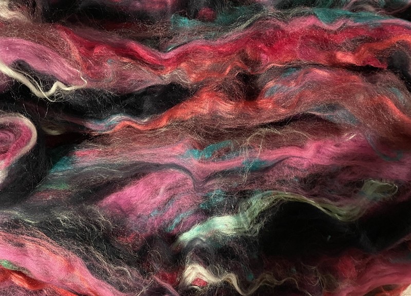
Now I’ve pulled the batt out to take a picture for you I am not liking it as much its got a lot of black and some blue in it. I think I need to look at what else I have.
That didn’t work well at all. What else do I have, Who knows, It’s all in boxes all stacked at the back of the storage area. so I must make do. I pulled a bit of corral pink and 2 shades of red silk ( probably but shiny anyway) out of the above batt and spread it out to be the sky.
I laid it on top and left a little spot for some orange sun.
Now as I said my stash is all in boxes and most of that is at the back. I did reach a small box or multicoloured silks in small bags. I found the right one I pulled a blob( technical fibre term) of dark purple from it. I don’t need much.
I pulled some fine bits ( another specialized fibre term)out and laid them across the top of the sunset sky.
Now I just need the shiny orange curl I have begged from Bernadette Monday night for the sun and that part should be done…….Except it’s not needled down and so it’s not really stuck. I look at it and it’s so wispy I think that if I try to needle it, it will end up pulling and being a mess.
I think I am going to have to wet felt it. I am planning to dig out some wet felting supplies. I think I can reach enough things for a small piece and some plastic wrap from the kitchen will work fine. That’s tomorrow’s job. Now if this ends here you will know I was unsuccessful at finding my supplies and taking them to the guild social to work on. Or possibly making tourtiere pie filling and waiting for and dealing with the livestock viewer took too long and I just ran out the door to do some spinning with friends. Hopefully, you won’t have to wait until my next post to find out how it goes.
I am still enjoying working with my water-themed bat to create ocean pictures. I finished the one that I was working on last time. I added some birds I mixed light grey and some white with so the seagulls wouldn’t look too bright. the 2 smaller ones looked ok but I tried to add black tips to the larger one’s wing tips and after some fiddling, and then more fiddling it ended up looking like a demented bat ( no picture of it at its worst) so I removed it and tried again. All the birds are going left. maybe into the wind? I tried to make the larger one go right just to be different but it started going left. I pulled it off and flipped it over and by the time I tacked it down properly, it was going left again. But at least it doesn’t look like a demented batt.
On its way to being a demented bat
And a sailboat. Not the best boat but one of those little dingy boats with only one sale.
It was kind of boring so I added a red flag and 2 stripes for the sale and boat.
Better but I added another strip and I like it much better. I guess the rule of three works.
Then I decided I wanted to use some of the sparkly section. and started this one. I started it on my standard needle felting pad a foam kneeling pad. then my tendentious reminded me why I don’t use 6 needles at once and why I don’t do a lot of needle felting. Normally I would lightly tack these down and wet felt them. Jan gave me a small wool felting pad last Monday and I didn’t have time to try it properly so I tried it here. Wow, what a difference in how jarring the jabbing is. I also took apart my tool and removed 3 of the needles. I’ve ordered one of the 10×10 pads. I have this one to this stage. All well felted down but not sure what to put in the picture to give more visual interest. Maybe some whale tails? Rocks? a bluff and some birds? Sorry to say I didn’t take any in-progress pictures of this. Though adding the blue sky looks pretty much the same on all of them.
I fiddled with this a bit to try to show you how much sparkle there is. I used a flash and then turned down the brightness. Turning down the brightness was counterintuitive.
Now I started another but that’s my next blog post.
This is the nuno background I showed a while back. Surprise, surprise, I created another landscape!
I started by adding some yellow orange sheer fabric to indicate the sky and then started auditioning trees cut from dyed silk organza. The trees went through many forms as I went along auditioning colors, sizes and placement.
I began making the foreground trees darker and the background trees lighter. It felt like the sun was coming from behind the hill. So I continued to emphasize that light perspective as I went along.
I was getting closer, adding more shadows and light.
Then I decided that the ground felt too light in the foreground. So I auditioned some sheer scarves in this area. These are light nylon scarves, you can see the edge hasn’t been removed here. Once the edge is cut off, the scarf can be easily frayed to blend into the background. Then on to stitching everything down.
Here’s the piece after I finished hand stitching the applique pieces in place for the trees. I also use a very small seed stitch to stitch down the sheer scarf pieces.
I decided I need something more in the foreground. The darker marks in the middle foreground reminded me of these plants. I think these are a type of wild orchid. This is a photo I took on one of my morning walks in the woods.
Here are the foreground plants. They are a combination of torn black tulle, couched yarns and pistol stitch in perle cottons.
I felt that the bottom of the orchids was a missing something so I added in some grasses which were couched down.
Here is the final piece on it’s fabric background. I have decided to call it First Light. The coloring in this last photo is the closest to the original. Now all it needs is framing.
I’m learning to print onto felt so I thought I’d show you some work in progress. I’m following Lindsey Tyson’s course ‘Transfer Printing onto Felt and other Fabrics’ so I’m focusing here on what I’ve made rather than how. Lindsey’s been printing on felt for some years and has developed her own techniques. She’s now moving away from felt-making and printing to focus on painting so has produced a comprehensive course to share her expertise. I first saw her work a few years ago and have been really intrigued ever since to know how she produces such lovely images on felt.
I do quite a lot of sales and exhibitions in my local area. I’ve long thought I’d like to develop some smaller decorative items I can make relatively quickly and so sell at a lower price than some of my other work (because it’s more time-consuming). I thought printing might provide an opportunity to do this.
I hummed and hawed for some time before signing up as it involves quite a big investment – not only in the course itself but also in equipment, software, space (for the equipment) and time. I’ve just had a milestone birthday and as my mother wanted to give me a milestone gift, I decided that this was it. I do love learning new skills and developing ideas so I was pretty sure I’d love the course. Thank you Mum!
My first venture was to source some free online images (this is covered in the course) and, along with a little oyster shell sketch I drew, prepare them for printing and print some samples onto scraps of felt.
Small test pieces
I was pretty pleased with the results. However, some of the prints had a rather plastic feel and very visible edge.
Poor quality printBetter quality print
Lindsey was very helpful with her suggestions on how to improve – including highlighting that I’d overlooked one of the steps when using the paper I’d chosen, doh! That is now largely resolved though I’m still wrestling with myself about whether I should buy a new printer as I have an inkjet and apparently laser prints work better.
I made a little tea light holder cover using some commercial prefelt. I’ve never used bought prefelt before (I’ve always made my own) and although it produced a very lovely fine felt, I also managed to create a line in the cover where the sheet of prefelt joined that I wasn’t happy with.
line where prefelt joinedSame line with light behindPrinted back of tea light holderAvocet (with some unwanted fluff!)First tea light holder attempt – using commercial prefelt and one of my own felted bird images
I now know (from the course) that there’s a way round this but I’ve decided for the time being to stick with making my own felt from scratch rather than introducing new variables.
The course covers, in a lot of detail, how to design and manipulate images. It includes tutorials on using free software as well as paid-for software like Photoshop. I decided to buy Photoshop Elements ( a basic form of Photoshop with a one-off purchase rather than a monthly subscription). I have to admit I have not taken to it like a duck to water! Some of that is doubtless me (remember that milestone birthday!) but I’ve seen lots of reviews that agree that it’s not very intuitive and so not particularly easy to learn to use. Fate intervened with (as far as I know) my first dose of Covid-19 during which I confined myself entirely to staying at home for 5 days (as per our current guidance) and until I tested negative. After the first couple of days I started to feel better so decided this was my time to make Photoshop Elements work for me. In spite of sometimes getting very frustrated, I actually quite enjoyed the learning and have to be impressed with the things I can now do with it (however slowly) let alone all the things it can do that I can’t yet. There are some really good free YouTube tutorials too, which helped, and I have certainly put in the hours. Many, many hours.
Back to the felt-making. I made two more little tea light covers – one from 2 fine layers and one from 4 fine layers of 21 micron natural (undyed) merino. I wanted to see how they’d look with a lit tealight inside. Surprisingly they were both OK.
By then I’d thought of using my own felted bird images which I expertly (!) extracted from their backgrounds. I like the redshank and curlew as they both have feet. Often my felt pictures have birds (like the avocet) whose feet are in water or behind pebbles – both because that’s how I saw the wild birds they’re based on and because I find felting bird feet quite hard!
2 layers 21 mic merino4 layers 21 mic merinoBack of the 2 layer one; tealight litRedshank and Curlew on 21 mic merino
I then tried out 18.5 mic undyed merino and decided this was what I’d use as it has a lovely smooth surface, light colour and a fine translucent appearance. Perfect both for printing and for tea lights.
I started to dig into my vast collection of charity-shop-bought silk scarves and added silk strips to the lower part of the designs. This was partly because lit tea lights’ metal cases cast a shadow at the base of the cover (see the lit one above), partly because it adds to the decoration and partly because it can ‘ground’ the images – i.e. give those birds’ feet something to walk on. Oh, it also eases my conscience about quite how many second-hand silk scarves I own.
Redshank with recycled grey silk scarf strip
And so here are some more of the results. I’ve printed a design on the front and the back (apart from the one with a flock of birds – that goes all the way round). They also look nice as plant holders, ‘thought they’re not quite the right proportions for most plant pots so I have to add some small pebbles to the bottom of the glass container if I want to show them as plant holders.
Some of them are free images I’ve found on the internet; some are from my own large felted pictures and one (the honesty seed pods) is from photos I’ve taken of the seed pods and worked on in Photoshop Elements to create a composite picture.
And here are the first 6 I put in the gallery shop at Creek Creative in Faversham (it’s a gallery, café, shop and studios where I rent my studio), just over a week ago. Inside each there are comprehensive warnings about lit tea lights, some felt care instructions and the name of the image.
First shop display at Creek Creative
The redshank on the left sold within a few days – I don’t know about the others yet.
I’ve also made some cards – initially to use up all the little test prints….
Square cards made using test samples
…..and then some I made specifically to become cards
Long cards
And finally a couple of bigger purpose-made plant pots with metal pots inside, using 21 mic merino in green and white.
Side 1 – ladybirdsSide 2 – Butterfly and flowerSide 1 butterfliesPlant pot holders
Next steps? I’m looking forward to a couple of in-person sales / exhibitions I have coming up so I can gauge people’s reactions. I will keep building a stock of tealight holders, plant pots and cards and developing new images so I have plenty of both stock and variety. I will keep extending my knowledge and skills in both printing on felt and using Photoshop. And I will definitely keep working through Lindsey’s excellent course and drawing on her extensive and generous one-to-one and group support to help me on my way.
Here’s a link to a promotional video for Lindsey’s course, in case you want to check it out.
I told you there would be another small picture. I wanted to do a night scene with water and a moon reflection.
I searched up lots of moon on water pictures. I won’t share them because even though I put public domain pictures in the search, I am sure they are not all in the public domain. Once I had done that, Pinterest sent me some more, some in weaving and other textiles.
I had this small offcut. I put my fingers in the shot so you can see the size.
I knew I had a nice really dark purple merino to make the sky but I had to ask Jan for some navy blue. She had some nice dark BFL, so it had a nice shine, perfect for water. This is the best picture I got of it. I had to fiddle with it because my camera on my phone wants the purple to be red and it’s more blue. Jan got some pictures for me too but her computer has died so I am afraid you’re stuck with my pictures.
I divided the picture into 1/3 sky and 2/3 water. I tried to keep the navy fibre running across the picture to give it a better water feel, like tiny ripples on the water. the hardest part was making the horizon straight and level.
For the moon, I made a disk separately and then added it. I think it makes it seem separate from the sky and closer than the sky. I then added the thin glow around it. the glow looks more transparent in person. I thought I had a picture of just the moon but I accidentally took a movie of it and I can’t figure out how to save one frame.
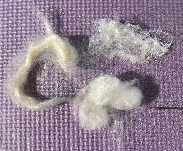
For the reflection in the water, I used silk. I tried throwster’s waste, some fluffy silk ( I think from silk hankies) and some top, it was a little yellow.
The throwster’s waste was too stringy
The fluffy stuff was too hard to work with. It wouldn’t stay put.
The top worked wet. and even though looked yellow as a blog of silk once it was spread out a bit it was good.
I laid it all across then needled the pattern I wanted and trimmed it then needled some more.
I like it, it’s ok but not great.
I tried adding some grey for clouds and some silk at the edge for reflection. I just tacked them down, I am not sure. It may be the silk reflections on the clouds that I don’t like. Maybe white wool would be better.
so I asked my son. He is more artistic than me but also observant. He said well the moons to big. So I showed him my examples and with the slightest glance says well they’re all photoshopped, to make the moon more magical. So much for that. I guess once I did it, my brain knew it was wrong. I will try thinning the glow and shrinking the moon and the reflectins and see how I like it. the trying may mess it up beyond repair and it will have to become dryer ball innards. I will let you know how it goes.
Post Script
I managed to fiddle with the picture last night. First I pulled up the edges of the reflection and tried it back then I pulled the moon haze off and made it smaller and more transparent. I think it is better. not great but it will do.
A while ago I bought some fine mica. the kind they use in cosmetics. I got this set and a blue set. I wanted to try adding a little blue to water in a picture just to see what it looks like. This water was far darker than the blues I bought but I thought the moon could use a little shine. You can see how fine it is. I left my fingerprint in it, from just a light touch.
I took a close-up of the moon. I think the camera picked up some of the sparkle.
As soon as I saw what Lyn was setting as our next Challenge I thought “but I can’t do that”. I have always stumbled when trying to understand Design because, although I can see pattern in a lot of things, I fail entirely in translating what I see into my work. I am very literal in my thinking, and when I see abstract pieces (usually “modern” embroidery pieces) based on images of say, a broken brick, or the reflection in a window, or a rusty piece of metal, or a “fractal”, I think to myself “yes, very clever, but why?” and “what would I do with it?” and “I can’t see that on my wall” (and just occasionally “I wouldn’t give that house room!”). This is why I tend to make my pictures or 3D sculptures as realistic as I can.
I was going to just not bother with this Challenge, and then I remembered that some years ago I had attended a course on Design – I had forgotten all about it and it is relevant to this Challenge.
In August 2015 the Association of Guilds of Weavers Spinners & Dyers included in it’s week long residential Summer School syllabus a course by Alison Daykin – “Design for the Terrified” and I was lucky enough to be allocated a place – most courses were usually over-subscribed. Here is the introductory list of available courses from the brochure for you to drool over!
The course was described as offering “help to ‘painting and drawing challenged’ weavers, spinners, dyers, or other textile practitioners, in understanding Design and using this in their chosen medium”. The brochure went on to say: “This course will provide simple, but effective guidelines in design, without the student feeling overwhelmed by theory. The tutor will also leave plenty of room for participants to express themselves in their chosen medium.
“By the course end students will have at least one sketchbook and understand the basics of: colour studies; textural studies; shape; line/stripes.
“Students are encouraged to make samples appropriate to their own textile skills. They may choose to bring their loom or wheel with them, or to develop further sketchbooks if they prefer.”
Frankly this description of the course frightened the life out of me and I nearly didn’t apply, not least because I would be foregoing the chance to take the offered very interesting felt making course. (It’s headline description was “… an ‘adventure with fibres and fabrics’, combining colour, texture and layering to produce felted fabrics for decorative purposes or garments” and that was what I was most interested in at the time.) However after exchanging a few emails with Alison, and reading the three blogs which she sent out about the course I decided to bite the bullet. The first blog post puts emphasis on your “Inspiration” and resulted in a further flurry of emails with Alison, since I had no idea what it meant or what my “Inspiration” should be in this context. She basically said that I should pick a subject which I found really interesting. I was undecided whether to plump for trees, which seemed a very big subject, or sea shells – almost as big but of which I had recently started a collection. In the end I went with sea shells.
Sea Shell collection with Sea Urchin “ skeletons”
The second and third blog posts and a “round robin” email from Alison encouraged us to bring along as many different types of art media as we might be able to lay our hands on, including different types and colours of paper and “mark making” equipment. In addition we were asked to only bring one image of our inspiration, but as many copies of it as possible. (As I hadn’t been able to choose just one shell my image consisted of most of my collection, which also included sea urchin “skeletons”.) We would also need to take a notice board (if we hadn’t already made a mood board – “Er …. what’s one of them?”) so that we could pin up various bits and pieces as we went through the course. We would also need the equipment and materials required to make samples in our chosen technique. As I didn’t know which shell would be my inspiration the “materials” consisted of most of my stashes of fibres, fabric & yarns! I’m sure you’ve all heard of the saying “everything but the kitchen sink” – very apt, my poor car was groaning when I set off with all this stuff plus clothes etc., and I had yet to fit in the friend I was giving a lift to, plus all her stuff and her walking aid. (She was still a bit frail after an illness.)
The Summer School was based at Moreton Morrell Agricultural College in Warwickshire, where (after we got lost twice on the way) I met Alison and the rest of the class members. There were weavers, spinners, an embroiderer and a felt maker – me. Alison showed us her own work, and took us through her process for designing woven fabrics for specific purposes, showing us her mood boards and pictures of finished fabrics “in situ”. Here is a much abbreviated view of how she followed one inspiration from an image of ancient ruins to cloth samples.
She then started us off on our own design journey. Alison suggested to me that I should pick my favourite shell from the picture of my collection and make an enlarged drawing of the shell, both in monochrome and in colour and using different media. I had a go at this, although my drawing skills are minimal. This was before she had found that we would be able to have access to the college’s print facilities, where we could get photographs printed, and colour and monochrome photocopies made on a copier, which was capable of enlarging. We all made great use of this facility – zeroing in on just part of our inspiration image and having multiple copies made on different colour papers as well as plain white – which enabled us to speed up our progress through the stages of the design processes that Alison had mapped out for us.
One of the “tricks” which Alison showed us was to take two images, cut (or tear) them into strips (leaving one side of the paper still intact, and then to weave the two images. This did produce some interesting results.
We also cut strips across an image and used this to reference yarn (in my case fibre) wraps. Using this method enabled us to achieve a colour swatch giving combinations, quantities and placement of harmonious colours.
Showing the progress from picture strip to felted swatch
Once we had all played around with these ideas for a day, we were encouraged to get on and start creating samples in our chosen techniques, keeping in mind how we might use the finished work. As I was interested in making felt for clothing and accessories, I had brought with me copies of designs from specific sewing patterns and tried to pick the patterns that would best suit. I had by this time branched out to using as inspiration two different Sea Urchin skeletons, one Cone shell (and when no-one was looking I did a bit of crochet based on the end of a Conch type shell).
Large Sea Urchin
Small Sea Urchin
Cone
As you can see, I’m still leaning towards the literal/representational side of designing.
Alison also encouraged us to take our cameras and go out around the college grounds and look for more inspirations for design. At this stage we had all got used to looking beyond the obvious and came up with some unusual images. This was the one I chose to do something with – don’t ask me why – it’s just a picture of the wood surround (and my toes) to a raised flower bed outside the portacabin which was our workshop, where we all congregated for coffee, snacks and chat.
Being full of enthusiasm for the project, I cut down the photograph to a corner and then cut out the image of part of the surround.
which I then had enlarged and with several copies started to develop the design
This is the design I finally ended up with.
There are five versions in this picture, the basic design on top with four colour changes of the small “pops” of colour. And here is the jacket pattern and a tracing of the design.
The last day of the course was mainly taken up with visiting the rooms where the other courses had been taking place for a grand Show & Tell. To this end, we had packed up all our equipment and materials and set up our notice boards and work tables as displays of what we had been doing. Here are mine
And here are some of the displays of other class members’ work. Not all of them I’m afraid, I had camera shake by then so I’ve only included the less blurred ones.
The whole Summer School experience was great, with evening entertainments, a fashion show, a display of entries for the Certificate of Achievement “exams”, a traders’ market (I spent too much money as usual) and a trip to Stratford Upon Avon for a tour of the Royal Shakespeare Company’s Theatre with a chance to see some of their costumes “up close and personal”.
We inhabited a bubble, with little contact with the outside world. (There wasn’t even a signal for our mobile phones, short of climbing a hill and standing in the middle of the road.) A wonderful experience and I’ve enjoyed revisiting it.
I am afraid that by the time I got home again I reverted to type and have not made any fabrics, felted or woven, from any of the designs. I just did what I usually end up doing after returning from a workshop – I put everything away and forgot about it! So I still don’t have a 2nd Quarter Challenge piece to show you; though as a result of writing this post and after seeing some of the pieces which FFS members have posted, I do feel better about the possibility of designing from random observations and images.
I am looking forward to seeing what the next quarter’s Challenge will be.
If you remember, I was debating removing the trees and last week, I was going to rip them off. This week, looking at it again, I decided to leave them. The foreground is going to be flowers. I started with some green Bluefaced Leicester curls. I love Bluefaced Leicester curls, they are small tight curls with lots of shine. I stretched them out so they would look more grass-like.
After adding a few of these, I started using pink, blue, and purple curls to make flowers. I just needled a blob down and cut it off.
I wasn’t very happy at this point. It was ok but not great.
I decided to follow the advice Ruth gave me when stitching my mixed media experimental piece a while back; add more, just keep going. So I did more leaves and more flowers. Now it’s a pretty little picture( 3.5 x2.5 inches or 9×6.5 cm). And the trees look good in the far distance I think.
I like it much more now. I think I will like it more later. I always seem to lake them more in a week or so. How about you? Do you like your work better when it’s first done or a little( or a lot ) later?