Browsed by
Author: Marilyn aka Pandagirl

Pandagirl’s 4th Quarter Challenge

Pandagirl’s 4th Quarter Challenge

I decided to take a little different direction with the Suprematist Challenge.  Ruth had used offcuts for her background.  I decided to use scraps for my shapes.

Zed had mentioned texture which is always my preference in creating most anything. So, I dumped out one of my bags of samples and scraps and started to cut shapes.

Sorry for the pic on my kitchen table, but I couldn’t help but start to organize them and wanted to save my tentative design.

Then I realized I’d better find a background. So, I used a piece of felt I made for a class with Fiona Duthie to layout designs. I pinned the pieces after I moved them around a bit.

Since most of the pieces had already been felted, I had to sew them to the background.  For most all I used a very, very fine black rayon thread.  For the lighter green pieces, I changed to a light green thread.  But I don’t think I had to.  It was felted on black prefelt ad probably wouldn’t have shown much anyway.

The pieces varied a lot in texture and materials used from nuno, throwsters waste, ribbon, silk hankies, locks, and some decorate fabrics.

It was also interesting that the pieces not only had lots of textures, but dimension.  Some of the shapes got a little distorted with the sewing.

The back was a negative of the front which looked like a puzzle to me.

Here are a couple of closeups:

Sorry my photo skills aren’t the best.

Depending on which way you turn the picture, you get a different feel.  This is the one I like the best.

Have you finished your challenge piece yet?  If I have time I may try using prefelt.

Printing and Stenciling on Felt Part 2

Printing and Stenciling on Felt Part 2

The first thing I did this week was felt the three feathers onto a another larger piece of prefelt. I didn’t loose a lot of color, but some of the definition was lost especially on the yellow.  I will probably embellish this at a later time.

I also made four large merino felt pieces to use stamps and found objects on.  I made several stamps and cut out a couple of stencils from Mylar.  Here are some of the found objects.

I don’t know what the orange thing is, but I bought it Kohls on clearance a while back.  There’s a scraper, bottle top, leaf stamp, tupperware lid, a piece of what I think was a vegetable tray liner, a felt ornament I glued onto a ceramic tile and a reverse stamp I had made out of clay a long time ago.  I won’t show the other stamps since its proprietary to Ruth’s class material.

I started with lighter colors like yellow and continued to try new stamps and objects with different colors and thicknesses.  I really had difficulty getting good prints. Its probably the operator and not the materials or classwork.

I had made one stamp with shapes another with leaves.  I basically painted the dyes on to get a decent print with some texture.  you can see them in teal and blue.

I used a commercial bird stencil with black and green dyes on the purple prefelt I had made.

It was unknown fiber and would stick to the stencil brush or foam brush.  You can see the fiber standing up in the second pic.

Then I had made a mylar stencil of a cat and stenciled that on a piece I had done last week.  I will felt that  and the birds later.

We were also encouraged to try printing on paper.  I have a bunch of handmade paper from my papermaking days, so I tried the felt snowflake again and got a good print, then went around the edges using up the dye and giving it a bit of texture for a background.

I set all the pieces except for the large piece and the paper. I also included the flower piece from last week.  Surprisingly it bled and I couldn’t wash it out.

I was very disappointed in this since it looked so nice before setting the dye.  I’m not sure what to do to fix it.

Printing and Stenciling on Felt Part 1

Printing and Stenciling on Felt Part 1

I’m sorry for the duplicate post. I accidentally hit publish while creating it.  So, now that I have your attention…

I am taking Ruth’s Printing, Stenciling with Thickened Dyes class, so I’ve been practicing.

I made nine different colors using acid dyes and two thicknesses.  I have several stencils laying around so I couldn’t wait to get started.  The feather was the most open so I started with that using three different colors with different thicknesses and brushes.

I used commercial prefelt for the feathers.

The midnight blue feather was created with a thicker dye mix and stencil brush.  But I found the brush kept pulling up the fibers.  So, on the yellow I used a thinner dye, with a foam brush, but I didn’t get as much definition and more running.  For the red, I used an old stiff paint brush with a thicker dye and I got a little better definition.

Now I realize this is all new and practice will help me learn to manage the process better.

I tried a plastic stamp with a thin silver and thick purple on prefelt.  But neither stamped well.  I think  the surface of the stamp was too smooth.

Then I tried a butterfly stencil (which was too detailed) with commercial felt.  The gold ochre was done with a thick dye and thin brush.  While wet it wasn’t too blurred.  However, after setting the dye and drying it was blurrier. This was while it was still wet.

The  teal butterfly was done with a brush, again on the commercial felt.  Same result after drying. Plus the dye and felt were very hard.  I had thought I’d do some stitching, but I think it’s too stiff.

Then I tried a Stencilgirl stencil I had purchased for the Paper Lamination Class.  I decided to use two separate colors on prefelt.

I will felt all the prefelt ones to see the results and how it changes, if it does.  I used a second piece of prefelt to tie the feathers together in one piece.

Next I’ll try making my own stencils and stamps and continue to play with different tools and dyes.

Hopefully, I won’t give you an early preview next week.

Odds and Ends

Odds and Ends

This past weekend, my husband and I drove up to Wisconsin for a weekend away.  I had hoped we’d see plenty of fabulous fall colors I could share.  Unfortunately, Wisconsin is suffering from the same drought we have here in Illinois and we arrived a week earlier than the peak.  Many of their trees have lost their leaves already, like ours here. But here is one fallish pic entering Wisconsin.

I haven’t been too productive this week.  But I do have a few projects I have put finishing touches on and haven’t shared.

I signed up for Ruth’s Printing and Stenciling on Felt class, so I managed to make a couple of handmade prefelts to play with.  I have plenty of commercial.  The purple was some unknown fiber batt. I decided to use a silk hankie to give it a little sparkle, but it didn’t.

The turquoise is commercial prefelt with some throwsters waste which isn’t very evident.

I think I will be able to use both sides just to experiment. I like the sides without the silk better.

I also made a thicker light blue batt with some mulberry silk.

I have no idea what I’ll be printing on any of these and have gathered a bunch of samples and other UFOs to experiment on.

Here is a failed coaster that had gold fabric felted in that I did a little free motion practice on.

A while back I had felted a bunch of samples from scarves.  I couldn’t find the post with the original scarves. One of them had dots which I wasn’t crazy about. I had done both sides and didn’t care for the inside either.  However, after felting the dots weren’t obvious, they looked more like flowers.  I made it into a little case and did a little embroidery on with with some silver floss for a little bling.

  The back:

The front has a little bit of black organic edging.

Nothing exciting this week, but I got to re-purpose a few things.


Nothing Spooky Here

Nothing Spooky Here

Update on Maneki-Neko:

I took Lyn’s advice and made the whiskers from wire.  Here is the new look.  I also decided to put her on a pedestal to see out the window rather than sitting on the windowsill.  I found an old pot and turned it upside down, but I’m thinking gold may be better.  Although, when she’s in the window you can’t see the pot.


I recently realized I needed to carry on my tradition of giving each grandchild a pumpkin wall hanging.  I have a new grandson, Ken who arrived early in April.

But I didn’t really have a nice orange to make the pumpkin.  So, I made a batt using hand dyed Corriedale, a funky orange pink merino, bright orange coarse commercial fiber, gold merino, hand dyed Domestic 56s with Logwood from Cathy and a touch of white.  You can see the batt in the back.  I think the color turned out well.  I also used the merino/silk mix for the stem that I had used in the Edo challenge with the Sakura branches.

I had made a sketch of how I wanted the pumpkin to look.  A bit different than his sister Lisa’s girly pumpkin from last year.

Of course, I got into laying it out and cutting the prefelts and forgot to take pictures.  But here is Ken’s dried pumpkin.

Then after a little shave.

Now I guess I’d better start thinking about the upcoming holidays.  Did you do anything for Halloween?

Maneki-Neko for 2017 3rd Quarter Challenge Part 2

Maneki-Neko for 2017 3rd Quarter Challenge Part 2

I never dreamed this project would take me almost two weeks to complete.  But it is finished.

If you missed part one, you can read about it here:

https://feltingandfiberstudio.com/2017/09/25/pandagirls-maneki-neko-for-2017-3rd-quarter-challenge-part-1/

It would seem adding the details to finish would be easy.  Not!

I needle felted blue roving around the eyes.  The gems underneath are actually blue, but because they were put over black it wasn’t obvious what color they were.

Then I spent time looking for a gold bell, but decided on using a wool ball instead.  When I added the ribbon I made a slit on both sides of the arm to pull it thru.

The nose and mouth are also needle felted.  But at one point, the nose fell off and had to be reattached.

I curled over the raised paw and secured it in order to show the paw and nails.

The nails proved to be a real challenge and after ripping them out at least a half dozen times, trying needle felting, then using floss and finally rayon thread.

I tried needle felting the arm in front and the tail in back to show the dimension, but it was negligible partly because of it being black. So, I stitched around them which helped.

Another challenge was the writing on the coin.  I made a gold prefelt and copied the characters I had translated from an app for Good Health and confirmed with my daughter in law, Mari. I transferred the characters to a stabilizer.

I thought using the satin stitch on my Pfaff machine would work, but its not a straight satin stitch, but the stitches varied.  So I decided to use a triple stitch which was fine until I reached curves.  I ended up finishing by hand. I’m hoping I haven’t butchered the characters too much.  After finishing the coin, I slip stitched it to the kitty.

The final addition were the whiskers.  They are a little funky and I had to use a little GAC to give them a little stiffness.

Now its time to find her place facing East in hopes of bringing Good Heath to my household.

What challenges have you had lately?


Pandagirl’s Maneki-Neko for 2017 3rd Quarter Challenge Part 1

Pandagirl’s Maneki-Neko for 2017 3rd Quarter Challenge Part 1

I’ve still been in the mood to explore the Edo Period.  I remembered when my oldest son was in high school and brought home a Japanese exchange student who gave us a little kitty statute to bring prosperity to our home.

Of course, when I looked for it I couldn’t find it, but found plenty of pictures on the Internet.  It is technically called Maneki-neko which means “beckoning cat.” Of course,  there are many stories behind the cat.  You can read a few of them here:

https://www.tofugu.com/japan/maneki-neko/

There are also different meanings and results for different colored cats.  I chose black since it helps with good health (or getting rid of evil spirits).  Different writings have different meanings.  I did see one for green for good health, but I just wasn’t ready for a green cat.

Normally the traditional white cat brings wealth and prosperity and is seen in Asian restaurants and shops.  There is also confusion as to whether it is Japanese or Chinese.  It was the Japanese in the Edo period who developed this character.

I knew it was going to be a bit more complex than just making a resist for a pod.  Since I didn’t have a particular size in mind, I just made a resist I felt I could get enough detail on and manage.

I used prefelts for the first layer and merino wisps for the sides.  I also added needle felted noses, cheeks and prefelt and cotton batting for the one arm. Then added three layers of corriedale putting the eyes under the last two and prefelt for the ears.  On the back I also made a small tail using needle felted Jacob wool.  Not much of it is visible on the wet cat.

Then I added some silk with throwsters waste to add a little bling.

Then I fulled it and stuffed it with bubblewrap to give it some shape.  I did forget to open the eyes.

I rewet it and opened the eyes. So, next I will have to add all the details needed to finish.

Stay tuned!

Ribbon Embroidery

Ribbon Embroidery

I recently  bought a book on Silk Ribbon Embroidery.  I saw something on Pinterest and it caught my interest.

I thought I had some silk ribbon but couldn’t find it. If I did, I would have had to dye it anyways.  So, I decided to use regular satin ribbon just to see how well it worked.

I originally wanted to use a  cotton type doily that I had dyed with indigo several years ago.  But no matter what size needle I tried I couldn’t get the ribbon thru the tight weave.

I purchased some cotton/linen material and used that instead.

I was concentrating so much on the technique I forgot to take pics at each step.  It was a bit harder than it looked. No surprise I chose Irises.

I used the Daisy stitch to make the Iris flowers.  The trick is to use the needle to position and fluff out the flowers and leaves.  I used my own design, so I tried to make each flower unique.

The stems were next.  I used some green floss that I positioned pulling it thru at each end, then couched the stem with the same color floss to give a bit of texture.

After I added the leaves, I felt something was missing. Then I added a bit of a bulb under each flower. The final touch was to add a little acrylic yellow paint for the beard on the petals.

The next challenge was to frame it.  Since the ribbon was so brightly colored, I wanted a more subtle mat.  I tried several and settled on a pale green with light specks.  I had to wrap the cloth around a board and secure it with double sided tape before putting the backing on.  That proved to be tricky getting the flowers centered in the mat. The picture colors are not true, the wall is a pale yellow, the mat a pale green.


Here are some closeups:

Then I caught a little sunlight on the couch which gives a different perspective.

In the future, I may make a series of flower pics and try the silk ribbon which I think will be a bit easier to work with.  But I’m pleased with the result even though at times the ribbon was a bit unruly.

Have you tried any new techniques lately?


Pandagirl’s 2017 3rd Quarter Challenge Part 2

Pandagirl’s 2017 3rd Quarter Challenge Part 2

This challenge became more of a challenge than I expected.  If you  missed part 1,  you can see it here:  https://feltingandfiberstudio.com/2017/09/01/pandagirls-2017-3rd-quarter-challenge-part-1/

I had intended to use a combination of free motion and hand embroidery to add details  to finish it.  However, when I tried to use the sewing machine the felt was too thick and the stitches were just buried and I couldn’t control the machine.  So, after an hour or more ripping out teeny stitches, I started the hand embroidery.

Embroidery is not my strong suit. My goal was to give an impression of ruffled petals and a hint of stamens.  After looking at pictures of Sakura, I decided to keep it simple.

I made stars in the center of flowers with a knot in the middle on some.  I didn’t want them to all look alike.  Here I was getting started.


At first I tried using the stem stitch for the flower petal, but that proved to be hard to do in the felt and it really didn’t give it a ruffled look.  so, I settled on a satin stitch. I varied the tightness depending on how close or far away it was.   Then added some stem and back stitches to show differences.

Here are some closeups.

Another goal was to keep it subtle as if it was a 17th century scroll or painting that had faded over time.  I originally had wanted to give it a scroll texture, but I had purposely didn’t felt it hard and it was thick so that wasn’t going to work.  Best laid plans, right?

I also varied the color of the floss sometimes using white, pink or a strand of each to vary the depth.  I also didn’t want all the flowers to look the same. I loved the dimension, colors and texture of the merino/silk scraps I used for the branches.

After I finished and wove in the threads, I steamed it to try to get the lumps out. I tried.

I know everyone had a an idea of how to position it.  I liked Leonor’s idea to change it up occasionally so the same pictures looks different. Thanks Leonor!

Have you finished your challenge piece yet?


Pandagirl’s 2017 3rd Quarter Challenge Part 1

Pandagirl’s 2017 3rd Quarter Challenge Part 1

It took me a while to decide what I wanted to do for the challenge of the Edo period in Japan.  I was drawn to the simple scrolls with flowers and branches.

https://feltingandfiberstudio.com/2017/07/07/3rd-quarter-challenge-2017/

I scoured the museum sites and Pinterest.  I’ve been to Japan during Sakura (Cherry Blossom) season and particularly love the trees and flowers so it wasn’t too hard to narrow it down.

Since the scrolls seemed to be pale yellow, I made a batt backing then made another light batt using the Osage hand dyed merino and corriedale as a background. I added some darker fibers randomly to give the effect of lines in a scroll.

I had some left over merino/silk scraps from a scarf I had made for my son years ago.  They were supposed to be tassels, but I didn’t like them and cut them off and saved them.  But they make perfect tree branches.  Here is my first layout.

But something was off.  It didn’t feel right to me.  So, I rearranged the branches.

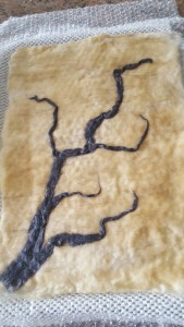
Next was to make white prefelt for the flowers (commercial wasn’t white enough) and cutting out the shapes in several sizes.  This was not an easy process. Here it is a wet look. The neat thing about the layout is that the branch can be down or up.

I didn’t want to felt it too hard.  But I may have to steam it before or after I add either hand or machine embroidery for details.

Actually the photo shows more texture than with the naked eye.

How do you like the branch, down or up?