
Another Art Retreat
My last post was about an art retreat and normally, I would just have one a year to tell you about. But this year, I had two only weeks apart. This is the annual retreat that my small art group does in late summer/early fall at the Kiwanis Lodge on Little Bitterroot Lake.

This is the view off the deck of the lodge. The weather was a bit cool and rainy but so much better than smoky skies from wildfires.


This year we decided to play around with making our own natural inks, printing and painting with the inks and then doing some bookmaking.
Before anyone points out that many of these types of ink are fugitive and might not last, we realize that. We were just playing around to see what happens and what colors we could get as a result. No “serious” artwork is being made from these inks.
We started by grinding up Haskap berries (Fly Honeysuckle) with a bit of water and straining the result. That is the bright red color on one of the acrylic printing plates in the foreground of the left hand photo. We also ground up beets, grass and kale and tried grinding choke cherries. The choke cherries were a disaster but Sally tried boiling them after she got home and got much better results than the fresh berries.


So Paula had gotten all of us some acrylic printing plates which we covered with ink and then let dry. We left watercolor paper in a baggie with water to get damp overnight and then printed the next morning. The two photos on the left show different prints and the photo on the right was painting haskap berry ink on to a page and soaking three squares of felt in the ink and laying these down on the paper. The ink changed colors depending on oxidization and what paper it was applied to.

This is the book we referred to for various recipes and what mordants or modifiers to use with different foraged materials.

I also added further ink (oak gall with ferrous sulfate) to one of my prints with my new fountain pens. I wanted to get used to using the fountain pens so this was good practice.


We then set about making a bunch of inks including hibiscus, acorn caps, acorn caps with ferrous sulfate, oak gall with ferrous sulfate, avocado, turmeric, blue pea flower and walnut ink. Paula also brought copper ink which takes several weeks to make but is the most beautiful blue. We put these in small individual jars with a whole clove to keep the ink from molding. These are now stored in the refrigerator in hopes of keeping them good a bit longer. These should be used fairly quickly. Paula had some that she had stored in the fridge for 6 months or so and they were mostly dull and brown and had lost their original color.


We then set about making little samples of the colors from these various inks. And then you can start adding the different inks together and see how they mix on the page. Such fun!

Our next set of experiments were with blue pea flower. Apparently, you can buy this as a tea. All you do is steep the blue pea flowers and then add different modifiers. The modifiers that we used were baking powder, baking soda, vinegar, cream of tartar and vinegar. The modifiers change the color of the ink.

Here is some lovely sampling of the different colors that you can get from the blue pea flower inks. They range from green to blue green to blue to purple.


Here are a couple of landscapes that I painted with blue pea flower dye. I love how they mix on the paper and the variations that you get.


You can also paint your paper with blue pea flower ink and then drop dry modifiers on top such as baking powder or baking soda. You really get some interesting effects with that.

We did put some ink on shibori folded tissue paper that could then be overlaid on previously inked watercolor paper and glued down to make bookmarks.

Paula supplied us with white paper coasters and we played with ink on those too. The left is a combination of walnut ink, acorn caps and oak gall. The right is blue pea flower and hibiscus with baking soda dropped on top while still wet.


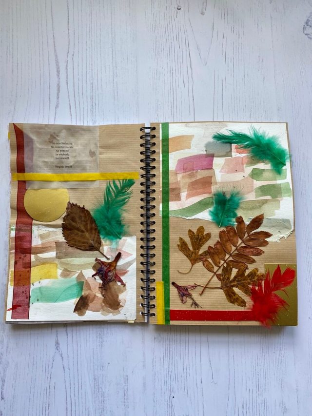
Here a three of the books that I created at the retreat. The middle one was using a bit too thin paper which had not been ironed so it is a little sad. But I learned how to fold the triangular pages which was fun. I was using papers that I had previously printed with deconstructed screen printing.


I took my tree specimen book with me and painted one of the plastered pages with oak gall. The photo on the left shows that page which was interesting. The photo on the right is Sally’s book where she has collage parts of the page and added oak gall ink to as well.
We had the best time and thanks to Paula for most of our supplies. We also want to thank the Kalispell Kiwanis Club for letting us stay at the lodge each year!


