Autumn is Coming
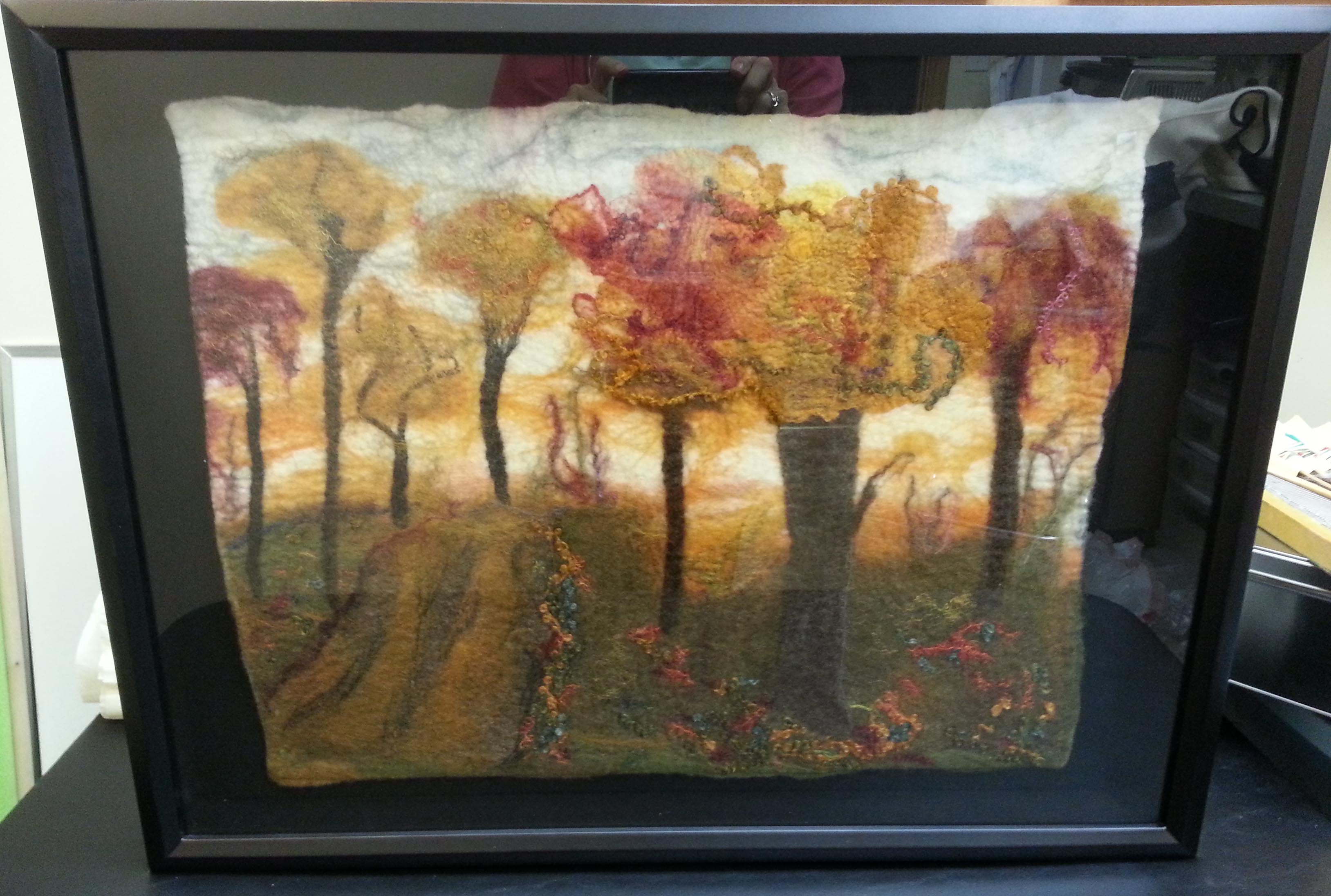
Last fall our challenge was Autumn. I created my autumn piece which is just shy of 16″ x 20″ (40.64 cm x 50.8 cm) with organic edges. I’ve played with different framing options on an off and finally decided it was time to take it seriously.
Here is the original.

I tried different colored mats.


Then I bought a shadow box, but unbeknownst to me the glass didn’t come out. Its not a very good picture because I was trying to take the picture without the frame falling and the picture falling out. I intended to return it so I didn’t want to fiddle with it too much.
I found another frame that supposedly had a 16 x20″ inset for a canvas. However, when I put the canvas with picture on it there was a gap all around. I decided to cover it with prefelt and attach the picture. There was still a gap. This would probably be perfect for a thick felt piece wrapped around the canvas.

When Michaels had a sale on canvas and frames, I looked again and found this burlap canvas. (On a black table)
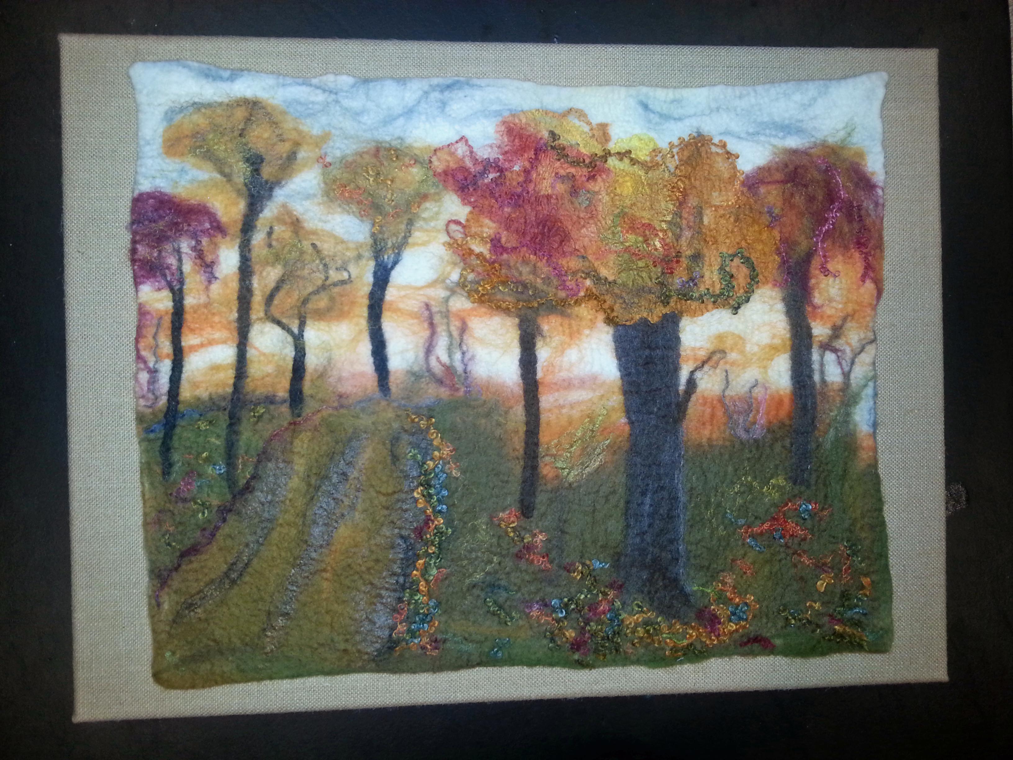
But when I put it on a dark bronze wall it made a big difference.
 I haven’t mounted it yet since after jiggling it around and trying to stretch out a little I have to make a few repairs. I’m amazed at how my felting has improved this past year. I can even make straight edges if I want. If I decide to start selling or gifting my artwork, I may have them professionally mounted and framed.
Which one do you like?
27 thoughts on “Autumn is Coming”
Was it really a year ago?
My first impression was that the black made the colours stand out well, then I decided it was too harsh for autumn. So my favour then fell on the light tan, which is autumnal. But having looked at the grey burlap a few times, I feel that would be the one for me.
The grey really brings out the best in the picture and a bonus is the lovely texture of the burlap.
I like the organic edges on this piece.
Thanks Lyn! The color of the burlap is actually a beige which I think is a better compliment, particularly against the dark green bronze wall. I know the photographs aren’t the greatest especially now that we don’t always have great lighting.
I like organic edges, too, but they do present challenges when framing.
Marylin, the picture is most beautiful and needs to stand out properly. If I may give my own opinion re framing, I think that the picture needs a little bit wider passpartout (I think you call it matting ) with even width all around. Since the picture contains autumnal colours I was thinking about jute, the fabric which is used to make sacks for packaging and has natural coffee colour (here you can buy it very cheap) and then I would put in in a framework , maybe dark brown colour. ____
Thanks Nada! The burlap in the last two pics is a little softer than jute but is also used for sacks. Since I wasn’t sure where I was going to put this, I hadn’t considered a larger mat and frame. However, the dark green bronze wall in the last pic is very large, but I think a dark brown would be lost there. I could play with it in photoshop and find a lighter color wall to mount it if I had another large space. Thanks for another option to consider.
I know how difficult it is to find the right framing process. Don’t forget that you can paint a blank canvas. Create your own mat with paint. I sometimes paint a mat color rectangle in the center and the outer edges a color that compliments my fiber art. I sew my artwork in the center. I instantly have a float mounted look. I use the 1 1/2 inch deep gallery wrapped canvas. Needs no frame.
All great framing suggestions from Lyn, Nada, and Judy; and I can’t really add any suggestions.
However, seeing your beautiful artwork in different framing modes is making me re-think my framing efforts. When I exhibited my 5 pieces at the Midwest Fiber Fair, I either mounted on canvas (per Judy, but without the “painted mat,”) or I wrapped the felt piece (backed by fabric or felt) on stretcher bars.
What gets tricky for exhibiting fiber artists is that various galleries have different standards for framing. Some want plexiglass covers, particular hangers, and there are wire specifications, as well as specific canvas or frame sizing.
Look forward to seeing your finished piece, Marilyn!
Thanks Cathy! I think framing is an art in itself. I thought your framing for the fair was wonderful. I know you spent a lot of time and angst getting them ready. If I start selling or exhibiting, I guess I’m going to have to do the same. A year ago when I did the autumn piece it wasn’t even a consideration. I’m still learning.
Thanks Judy! I have tried painting canvas for other works, but not the deep canvas. I’ve seen your finished pieces and they are beautiful. I will definitely try that technique. Since this piece was large to begin with it didn’t occur to me to try a much larger canvas. I’d better keep a list of all these great suggestions!
I like the orangey tan background I thought it brought out the colours in the trees. It seems to me larger peices either have to have no mat or a big mat.
Thanks Ann! That one would also look good on that dark wall. It actually was my first thought to compliment the autumn theme. I just wasn’t sure if it was too much orange.
Looks really good, Marilyn! It never fails to impress me what one can do with wool 🙂 The burlap looked best, in my opinion.
Thanks Leonor! I could same about your Felt Buddies! (Not the burlap) 😉
Haha!
I’m not a felter, just a painter. First it’s a beautiful piece, Marilyn! I agree with shepherdessann regarding a mat. At least 2″ to 3″ around the piece on top and sides and if there’s anything more additionally, it should be at the bottom of the piece. It looks a little cramped otherwise. This requires a large wall space. I personally like the black because it always makes a piece pop more and doesn’t compete for attention like a color can. But that’s just my personal opinion and of course depends on the wall where it will hang. I’m wondering if you bought a thick pre-stretched canvas (min. 20″x24″) and painted it black (or whatever color) and mounted your piece on that. Then you wouldn’t need a frame additionally. (I wrote a whole lot more than I intended.)
Thanks Jacquie! I was thinking the entry wall with the dark bronze color, but black kind of fades into that. I could put it on a lighter colored wall with black. I do like black. I guess it’s back to the framing board. :-). So many good possibilities!
It’s hard to decide, they all bring out something different in the piece, which is gorgeous. I agree that a wider background/border would look good. If you want any help trying different colours, I can mock something up on Photoshop for you?
Thanks Zed! I agree it’s hard to decide which is why I’ve probably procrastinated so long. I appreciate your generous offer. I agree a wider frame around it is a good idea. Now which wall do it put it on? 🙂
This is a beautiful piece of work. I also agree with Jacquie re the wider frame and the fact that the black really makes the colours ‘pop’. Zeds offer of mocking up in Photoshop sounds a great way of trying out different frames to see how they look.
Thanks lincsinstitches! Black is always my fallback, but I’ve been given some interesting possibilities. Perhaps some mockups are in order. 🙂
Looks like you got some good advice Marilyn – framing is an art for sure. Let us know what you finally decide upon.
Yes, all good advice. Now I’m confused again. 🙂
The black background and the shadow box. Looks great.
Thank you! I’m sorry I missed your reply.
I would like to buy it. Have you sold it yet?
Thank you Annie! I’m sorry the picture is hanging in my living room and not for sale. But I appreciate your adoration.
Oh yes. I loved looking at it. Maybe take a picture in your living room and post results.
The last picture is the one hanging in my living room. Thanks for your interest!