Browsed by
Author: ruthlane

When I discovered felting in 2007, I finally found the creative outlet for which I had been searching. I love that the versatility of fiber allows me to “play” with a wide variety of materials including wool, silk, fabrics, yarns and threads. Creating one of a kind fiber art pieces to share with the world fulfills my creative passion.
Abstraction – Taking It Further

Abstraction – Taking It Further

I was really inspired by Zed’s use of Photoshop to “abstract” her photos. So I decided to take my sketches from my last post about Ann’s challenge and use Photoshop to see what the results would be. I mainly used filters and I didn’t really keep track of what I did. But if you have Photoshop, you can just play around with the filters until you come up with something you like. If you would like to compare the original pen and ink sketches, go to this post here.
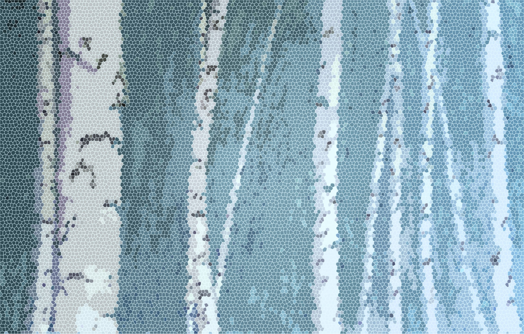
You can click on the photos to see better. This one is the mosaic filter. I really like how the background moves from light to dark. I didn’t really see that in the drawing itself.
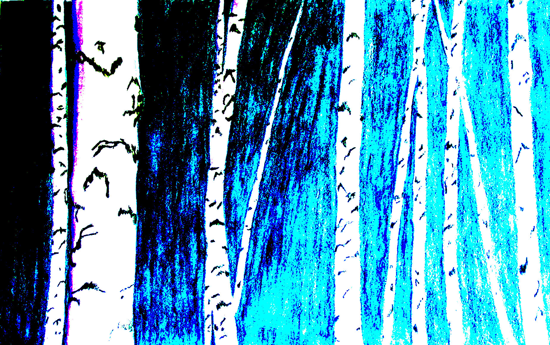
I can’t remember what I did to this one but I really like the dramatic contrast between the background and the birch trees. This to me is a much striking composition.

This gives an almost impressionistic feel to the dogwood branches. It looks kind of cool but I think the element that catches the eye in this composition is the lines of the red dogwood branches against the background and this doesn’t really improve that.

I thought this was an interesting effect and it might be the embossing filter. I like the way the blue and the red play off each other in this one.

This is one of the outlining filters, I think. I like the contrast of the darker hill in the background. I also like the outline of black on the dogwood branches as it seems to give them more implied shape.
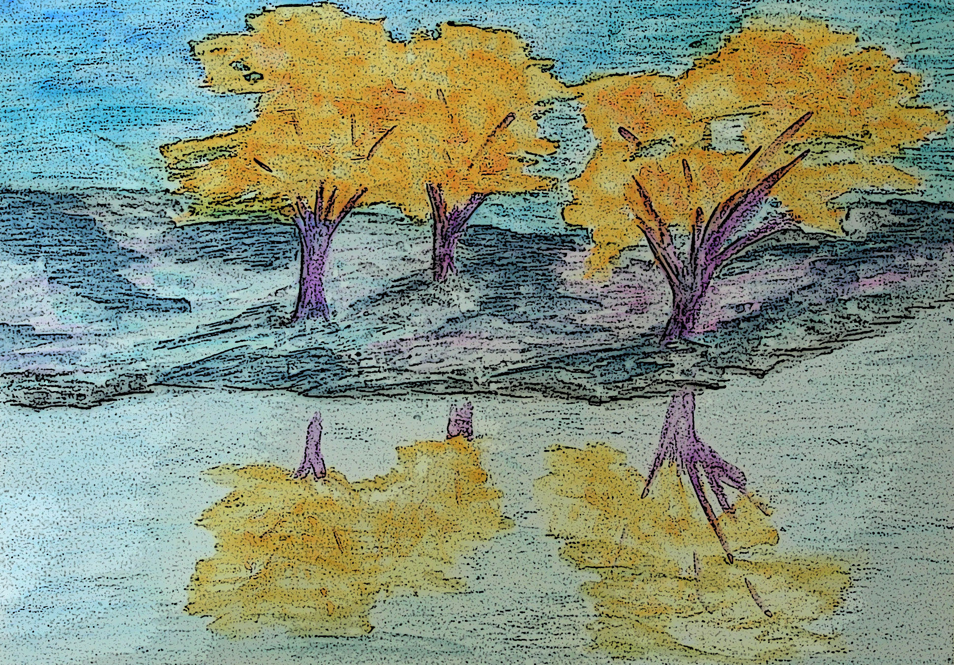
This one isn’t that changed but does give more outlines than the original and makes it a bit darker. I think this helps to ground the trees.
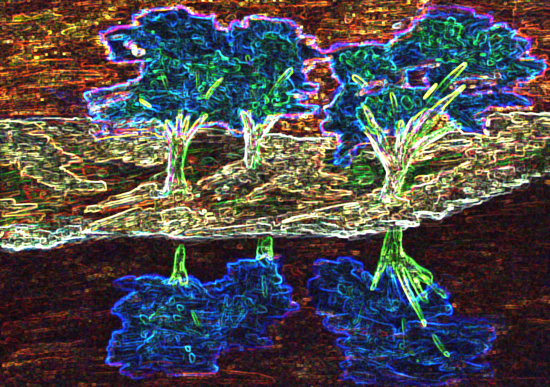
Now this is abstract. I’m sure I never would have come up with this idea on my own when I was drawing the willows. But I kind of like it. What do you think?
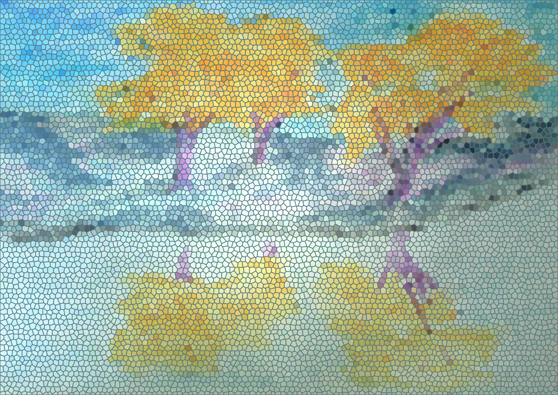
This is another one where I used a mosaic filter. I do like how this filter works. You can see it better if you click on the photo to enlarge it. I don’t think that you could repeat this effect very easily in felt though.

I really enjoyed playing with my sketches in Photoshop. There are a million options and it can give you some ideas that you might not come up with on your own. Which of the sketches do you like now? Which one do you think I should use to make a piece of felt? If you played with abstracting a photo or a sketch in Photoshop, I’d love to see it.

A Real Life Example of Product Presentation

A Real Life Example of Product Presentation

Amanda from FeltFinland has graciously offered to do a guest post for Marketplace Mondays. Take a look at her website to see some of her delightful creations that will really put a smile on your face. So here’s Amanda.

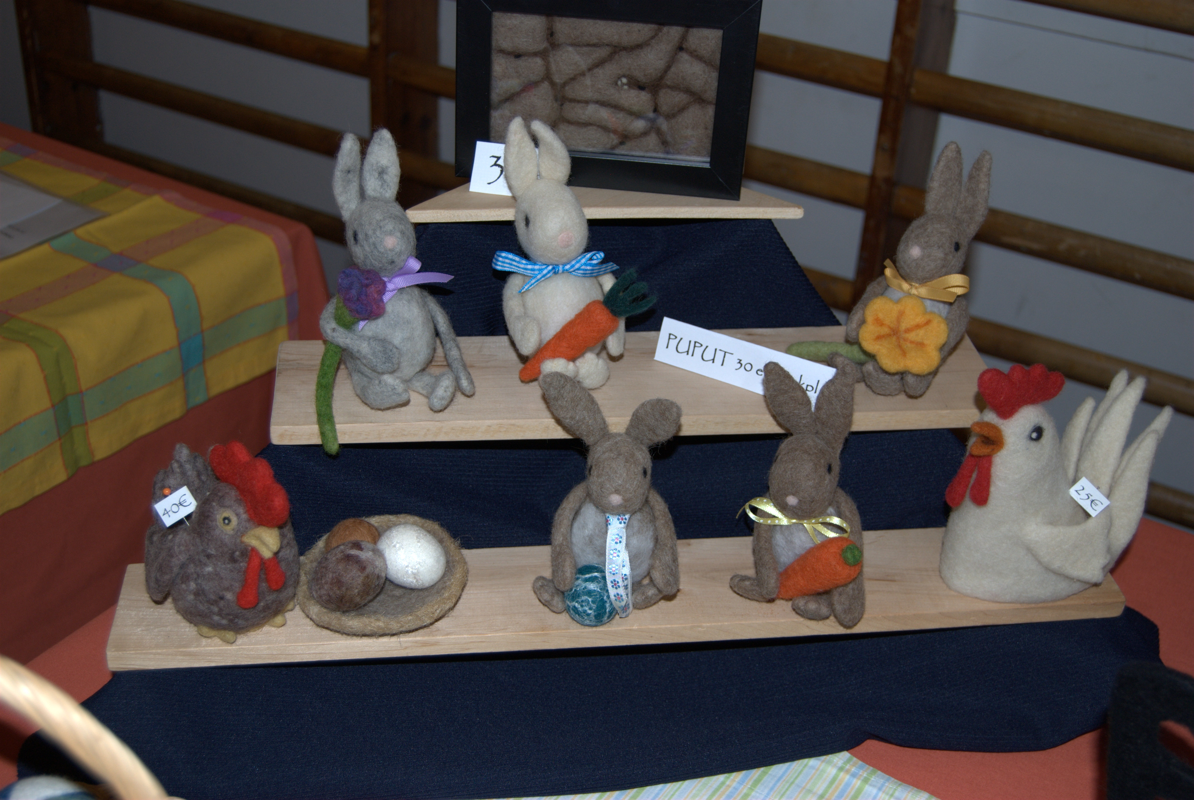
You have worked hard to make some great felted works of art. You have an opportunity to sell them. What you need are those extra little touches that will catch the eye of the buyer and also encourage them to return and buy again another day. Product presentation is a key part of selling. No matter how stunning your creations, if they are haphazardly piled on a table, not many people will give them a second glance. I have developed and learned a few ideas over the last 3 years of selling at craft fairs which I am happy to share with you.

Make use of all the space on your table without overcrowding.

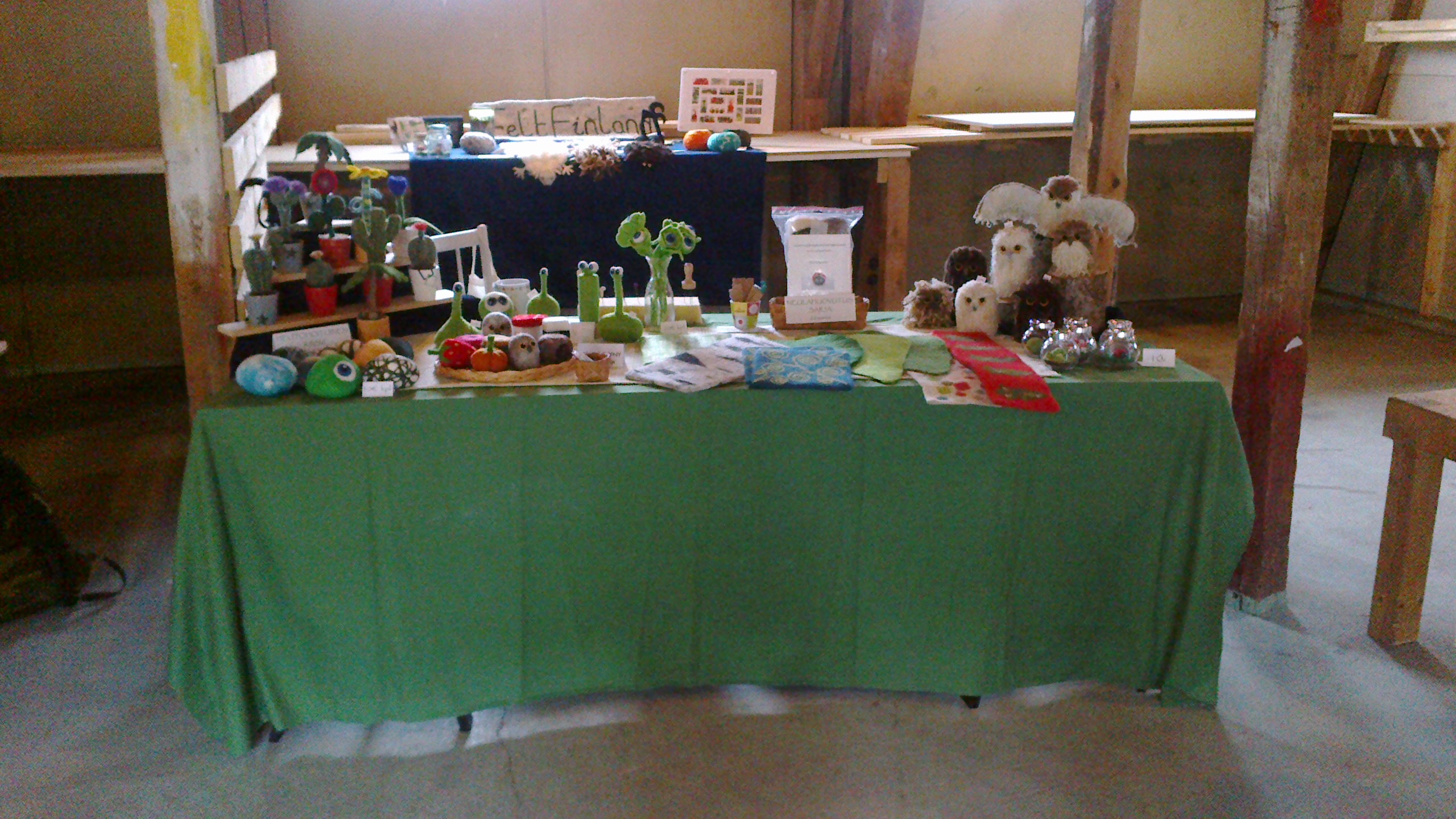
Don’t forget you can add height – a small set of shelves, an upturned box, branches, logs are a few things I have used. I have always liked wood and wool together. 

Choose an appropriate coloured cover (sheets and old curtains are cheap options) for your table, one that won’t detract from your work. Make sure it is big enough to fall down and cover the front open side of the table. This allows you to store your boxes and bags under the table without the world seeing them! One of the photos shows how not to do it – pink cover which is too short – all the tables were set up the same by the folks organising the fair!

I also like to use baskets and basket weave trays of various shapes and sizes to display my products – this also helps to keep things together and prevents products getting all muddled.

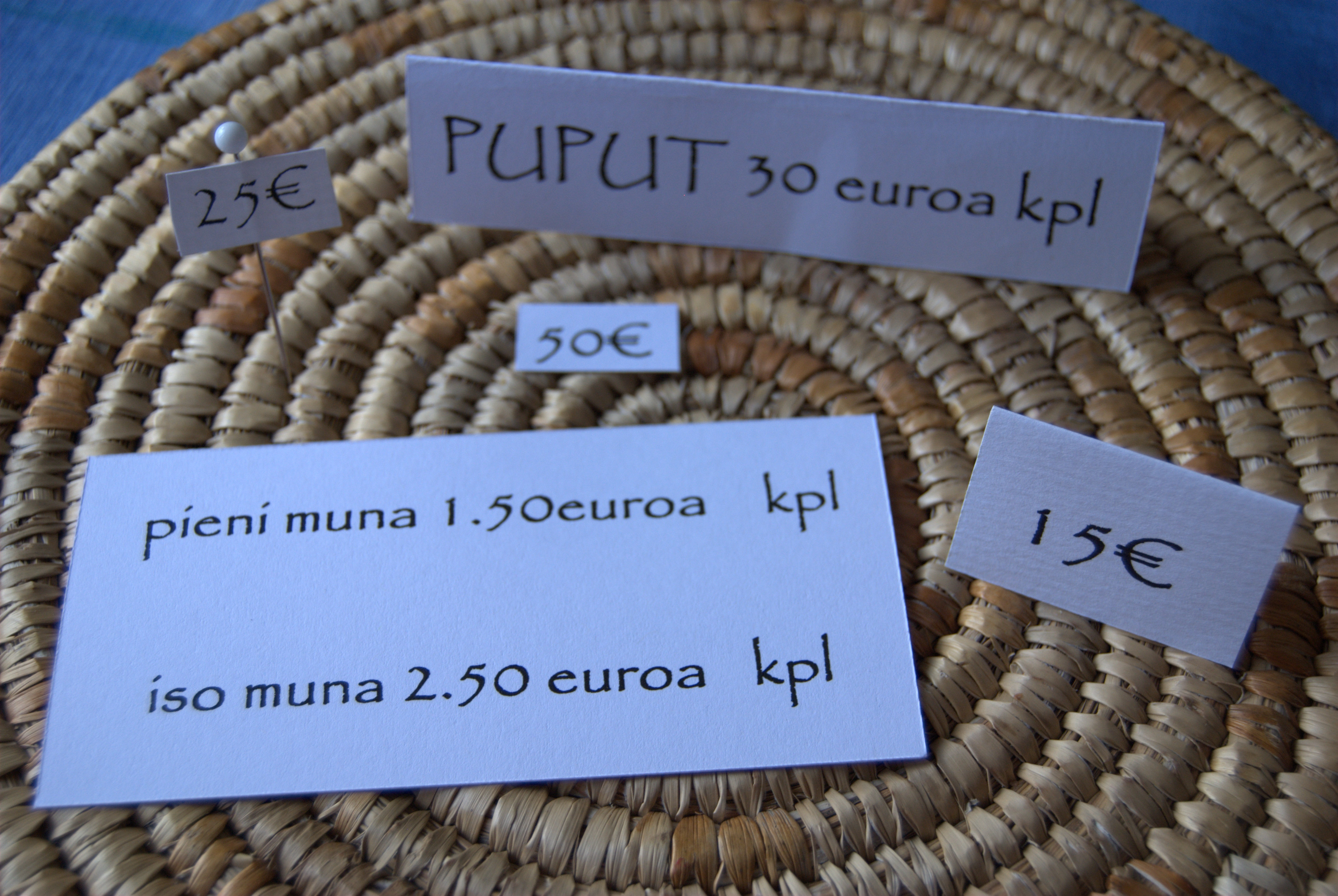
Pricing – personally I like to individually price my items, using free-standing labels on the table top next to the items or small price tags stuck on pins then stuck in the relevant item. I do not like to put sticky labels directly onto the felt.

If you do not want to show your prices, have the costs of each item readily available (in your head!) for when a customer asks. Print prices on stout card from your computer using a clear bold font – these can easily be reused too.

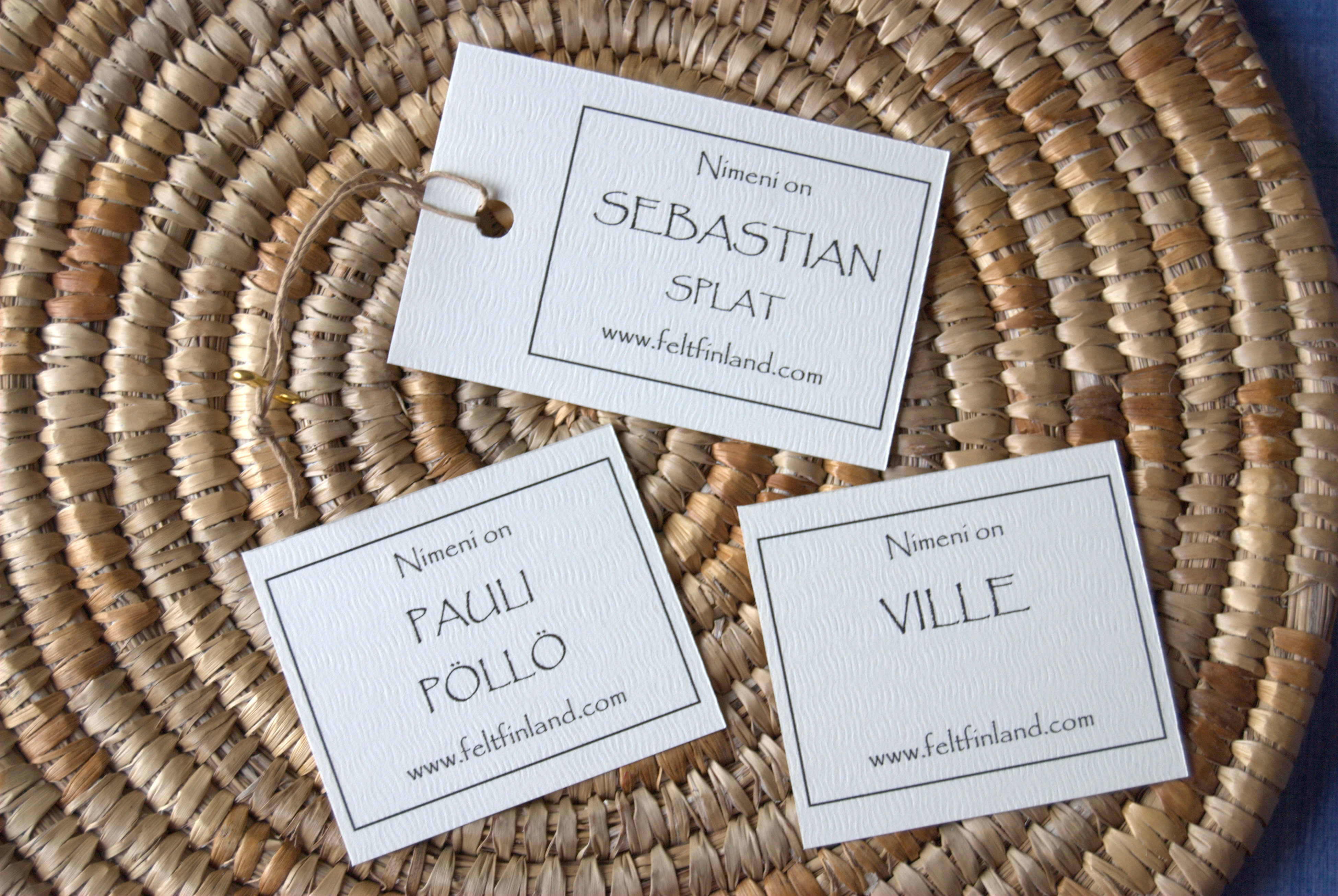
Add your own personal touch – I give names to a lot of my creatures such as Aliens, Owls etc. I print them onto good quality card from my computer and these go home with their owner. Don’t forget to add to the label your company name, website etc. 

Pop one of your business cards into the bag the sold item is going home in. 

Cellophane bags work really well with small felted items and can be sealed with customised stickers. Bags are available in different sizes and cellophane wrap can also be used. Paper bags have their place but will hide your creation! Plastic bags have their use if it is pouring with rain to keep your sales dry on their way home!

I hope these few pointers will help. I found it useful attending craft fairs as a buyer and seeing how other people presented and packaged things. It gave me some great ideas but also showed me what not to do!

Guest poster: Amanda Heikkinen


Second Quarter Challenge – Abstraction

Second Quarter Challenge – Abstraction

I have been attempting to work on Ann’s second quarter challenge but I have a really hard time with abstraction. I guess that most of my work ends up being realistic. I find it difficult to take an idea and make it more abstract. Do you find it easy or hard to do abstract work? At least with felt, it is harder to do very fine details so the process kind of lends itself to abstraction.

So I decided I would do some sketches with watercolors and ink. I looked online for photos and found one of birch trees. I took out all the background and just picked a dark blue. Then I was planning on painting the birch trees with pinks and oranges to represent the sunlight hitting them. I got to this point and just couldn’t add in the pink and orange. I tried it on some scrap paper and hated it. So this isn’t really abstract. What do you think?

Next I tried abstracting a photo of red twig dogwood in winter. Again, I really simplified the background and I used red paper cut into tiny slivers for the dogwood. I think this is a little better but I’m still not all that happy with the composition.

My local surface design group has been doing a monthly challenge where we pick an artist and then do something based on that artist’s style. This past month was a local artist, Marshall Noice, so I looked him up and lo and behold, he works in an abstract manner. I could take care of both challenges with one project. 🙂 I printed out two of his pieces and pasted them into my studio journal.

I had never really examined Noice’s work before and both of these examples are pastels on paper. I love the rich, deep colors and I do like the abstract nature of his work. So I decided I would try a photo of willow trees in winter to see if I could achieve a similar effect. Again, I used watercolors and ink in my studio journal.

Here’s the result. It seems a little anemic to me. Especially the bottom portion. But it is somewhat abstract, perhaps. I’d love to hear your critique. I am thinking of doing one of these pieces in felt. Which would you choose and why?

This last photo is definitely not abstract. Just thought I’d throw it in since it was the next page in my studio journal. So that’s what I’ve been working on in my spare time besides my stitch homework. I’ll keep plugging along with the abstract challenge. And it is a real challenge but I guess that’s the point, right?

First Quarter Update

First Quarter Update

I try throughout the year to review my intentions and make sure I am “focusing” on the essentials. My word for the year is focus and it has been a helpful word so far. You can see my original post about my goals for 2012 here. I have a tendency to see something new or see someone else’s projects and want to dash off and start trying out that new technique or idea. This year, before I veer off course, I say to myself “focus” and then I step back for a moment and determine if I should really try out this new and exciting idea, or just write it down and save it for later.

One of my biggest focus points this year is my Level II Hand and Machine stitch class. I have been working very hard on my homework which was mainly Kantha stitch. When I first tried this stitch I wasn’t too impressed and thought I wouldn’t really like it. But after a bit of practice, I have to say I’ve really enjoyed it. Now I when I see a pattern, I think, hmmm… that might work well for Kantha stitch. I will be off to our third session at the end of this month and we’ll be concentrating on machine embroidery.

In regards to my other intentions for the year, I have started teaching classes at my local yarn store and that has been amazing. I find that I love to teach felting, it’s such fun to share my passion with others and encourage them to get hooked by the “felting bug”. I did preliminary investigation into teaching at the community college but I think that needs to wait until I’m finished with my stitch course.

I mentored several artists in my gallery and went over some of the same information that I have been writing about in my Marketplace Monday articles. Again, it is rewarding to be able to pass on information I’ve learned over my 14 years as a shopkeeper to artists that are just starting out. I’m sure I’ll continue with this mentoring activity.

I have been keeping up with our blog here and the forum. That really isn’t a chore at all as I love the interaction between felt makers all over the world. It’s great fun. I have been struggling with Ann’s latest challenge of abstraction but I’m sure I can work something out in the next couple of months.

I have started on a bit of planning for the yurt project and that will be ongoing. I also did a bit of exploration into the combination of machine stitching with felt and hand stitching with felt. Our surface design group continues to play with various techniques. Our latest activity was making hand-made paper. I’ll show the results of that soon.

The two things on my list that I have not started on at all are making video tutorials and learning more about Photoshop. I did get a video camera but I haven’t even turned it on or looked at how it works. I plan on starting work on the videos this summer. Zed inspired me with her videos that she posted on the forum.

We’re already four months into 2012. I think I have done fairly well on keeping my focus. I have found the best way to meet your goals is to just get started. Don’t keep studying what you plan on doing, just begin. That is the most important step for me. That and turning off the television and ignoring the computer. How are you doing on meeting your goals or plans of what you want to accomplish this year? I’d love to hear how you’re doing.

How to Approach a Gallery or Store to Carry your Artwork – Part 1

How to Approach a Gallery or Store to Carry your Artwork – Part 1

As a store owner, I really hope that you pay attention to this post if you’re thinking about approaching a gallery or store about carrying your work. One of my pet peeves is artists showing up without an appointment. Take a few minutes and find out the gallery’s policy for taking work, either on consignment or wholesale and follow that process to a T. Starting out on the wrong foot by just stopping by can really reduce your chances of getting your work accepted.

Do a little research first. Find several businesses in your area that you think might be good possibilities for your work. Look at their websites and see if they have a submission policy listed. Print it out and read it carefully. While you’re on the website, look at other artist’s work that they carry. Do they have work that is very similar to what you do? If so, you probably need to find another place as they will have their loyalties with that artist first and most likely will not take in work that will directly compete with something they already carry. Do they only show paintings? Unless your work is two-dimensional and a “wool” painting, the gallery will most likely not be interested in carrying work like felted soaps or nuno felted scarves. If the gallery doesn’t have information online about their submission policy, call and ask what it is. Again, make sure to follow whatever instructions you are given.

Once you’ve found a few businesses that you feel might be a fit for your work, do a reconnaissance mission and check out the gallery before trying to make an appointment. Don’t try to talk to the staff about your work, just go look at the gallery. Does it seem like a good fit? Do you know some of the artists whose work is in the gallery? Does the gallery carry your type of media and if so, what kind? Do you have work that you think will be a good addition to the mix that the gallery carries? If you do happen to know any of the artists, contact them and ask them how it has been working with the gallery. How has their work been selling? Do they get paid in a timely manner?

Next, you need to do a little planning and thinking about your work and what you think will interest the gallery the most.  If you are submitting photos of your work, make sure to get good clear shots with a white or neutral background. If you will be showing your work in person, think about which pieces make a nice set and plan on taking enough work so that the owner or buyer can get a feel for what you do. Most galleries carry work on consignment basis which means that you don’t get paid for the work until after it sells. The gallery will take a percentage of the retail price since they are the ones selling the work. An average percentage rate is 60% of retail paid to the artist and 40% of retail paid to the gallery. Make sure to take this into consideration when pricing your work.

If you are submitting your work by e-mail, write a nice letter to accompany the photos and price list. Tell the gallery about yourself and your work process. Explain why you think your work would fit well in their gallery. Ask them to reply to the e-mail so that you know they received it. You could also include your artist statement and resume if that seems appropriate. Again, make sure that you follow all the directions you were given for submission.

In Part 2, I’ll discuss visiting a gallery with your work, what questions you should ask and what to do if you get accepted. The worst thing that can happen if you approach a gallery is that they say no. Don’t let that scare you off from trying. There are many reasons for the no and it isn’t always because your work isn’t good enough. Ask why your work was rejected. You might be able to learn from the situation and improve your presentation with your next try.

Felting Around the Web

Felting Around the Web

Felt Alongs Lamp/Vessel

Deborah’s March Doorstops

“Ordinary” Face by Mattie van den Heuvel

Felted Hand Puppets by Frauke Walder

Felted cords/ropes

http://anajskreativestagebuch.blogspot.com/2012/04/sowohlalsauch.html

Flextile’s Shibori Dragonfly

Deborah Schlegel’s Post of Kelsey V. Wiskirchen’s Thread Sketching Exhibit

Kay Susan’s Slow Cloth with TAST stitches and a second post about it

Louise Saxton’s Reclaimed Needlework

Paper Sculpture by Anna-wili Highfield

Fabric and button flower brooch tutorial

How to make an owl from felt pieces

Whitney Matalone’s Time Lapsed Video of the IKAT weaving process

Kantha Embroidery Homework

Kantha Embroidery Homework

I had a request for further photos of my Kantha embroidery homework from my stitch class. Although my initial tries at Kantha weren’t all that enjoyable, I have really learned to appreciate the stitch. It takes a bit of practice but is well worth the effort.

This first two photos are NOT by me. The photo above is a stitched sari from Penny Peter’s collection that we got to study in class. I just wanted to remind you of what elaborate patterns Kantha can make.

This is another sari from Penny’s collection. I just love the endless possibilities of pattern that Kantha involves.


Here is one of my samples showing different ways to make a Kantha circle.

Here is a leaf pattern.


And this is bending stitch. I used a stencil pattern that I made several years ago in the shape of a nautilus.

This last sample is showing shisha stitch and flat stitches and is technically not Kantha but still based on Indian embroideries. I used Canadian pennies as I didn’t have any shisha mirrors. I’ve enjoyed learning how to use the Kantha stitch. If you have tried it, I’d love to see your samples.

The Top Ten Ways to Improve Your Booth Displays

The Top Ten Ways to Improve Your Booth Displays

I’m sure there are more than 10 ways you can improve your booth display but these are some major issues that you should address when displaying your products. You will be amazed at the difference a little change in your display will have on increasing your sales. It is worth your time and effort to create the most eye-catching and welcoming booth to attract more customers to take a closer look at your work.

  1. Neatness – Make sure that everything is neat and tidy. You should have table coverings that reach all the way to the ground so that you can use the space under the tables for storage. Make sure all boxes, gear and anything that isn’t a display or your product is hidden from sight.
  2. Warm and Welcoming – Your booth should be welcoming to your customers. Try to avoid the “cave” appearance.  Do you have room to add any cozy touches such as a floor lamp? You should also have some type of flooring, even if it is an indoor show. For someone who has been on their feet for a while, it is nice to have something soft and cushy underfoot. For outdoors, you  might try the interlocking foam squares and for indoors perhaps a piece of remnant carpet or carpet squares.
  3. Full Displays – The displays in your booth should be full but not overcrowded. Avoid cramming pieces in but you also don’t want only one or two pieces alone. Bring enough product to refill your displays immediately after making sales. If you run out of something, then remove that display or shelf entirely or fill the lower displays with silk flowers or driftwood so the displays don’t appear empty.
  4. Group Products – Have enough of each type of product that you carry so that you can group them together. If you have a choice of colors, make sure that the group of products shows these color choices. Grouping products also helps with your signage so that if a product needs explanation, then one sign can be placed by that group.
  5. Match Displays to Products – Everyone has different products and so no one type of display will work for all. The display should show the product to its best advantage. Does it need light shining on it? Should the item be propped up? Does the product need to be filled with paper to give it shape? The key to the right display is visibility. If it can’t be seen right away, then the customer won’t see it. Can you display your work vertically? What type of display makes your work the most visible?
  6. Bring Products Forward – The less distance the customer has to travel to be able to touch your products, the better. If you are selling small items such as jewelry, perhaps all the display cases need to be at the front of the booth. Use shelves that are shallow and avoid deep cabinets. With deep shelves, the products towards the back will be less visible and in the shadows.
  7. Eye Level Displays – Put as many of your products at eye level as possible. Things on the floor/ground will be missed. Make it easy on the customer, so that they can see all of your beautiful work without having to work at it. Also use different levels in your displays to give interest.
  8. Branding Banner – Use a large banner in the back of your booth with your “brand” on it. Make sure it is easy to read from a distance and includes an eye-catching color or photo.  The banner will help to draw customers from a distance. If you are selling small products, it would be wise to invest in posters with blown up photos of your work that can be seen from a distance.
  9. Improve Lighting – Color sells. If a customer can’t see the colors or details in your work, you will lose sales. Lighting is the key. Be creative with your lighting. There are many types of battery-powered lights these days. Perhaps your products would look good with under lighting. Use a piece of plexiglass with a battery-powered light underneath to add light to your displays.
  10. Tell the Customer What to Do – Use simple signs to let your products speak for themselves. Perhaps your sign will say “Felted merino scarves, the softest scarf you’ll ever feel”.  Or it could be “Scented felt soaps – Smell me!” Get the customer to use some of their other senses besides sight. Encourage them to pick up the product and you will see more sales.

Once your made your improvements, continue to tweak your booth displays and designs. See what works and what doesn’t. Look at what other artists do that works. Can that be adapted in some manner to improve your displays?

I’d love to see some photos of your booth at a craft fair. If you have some, please feel free to add it to our Flickr group or start a post on the forum.

Dyeing a Color Wheel

Dyeing a Color Wheel

Usually, when I dye, I don’t have the patience to dye the full color wheel. I end up picking colors at random and mixing a variety of colors, usually ones that I neutralize. Then I either end up with threads or fiber that’s all in the same color range or colors that I probably won’t use ever.

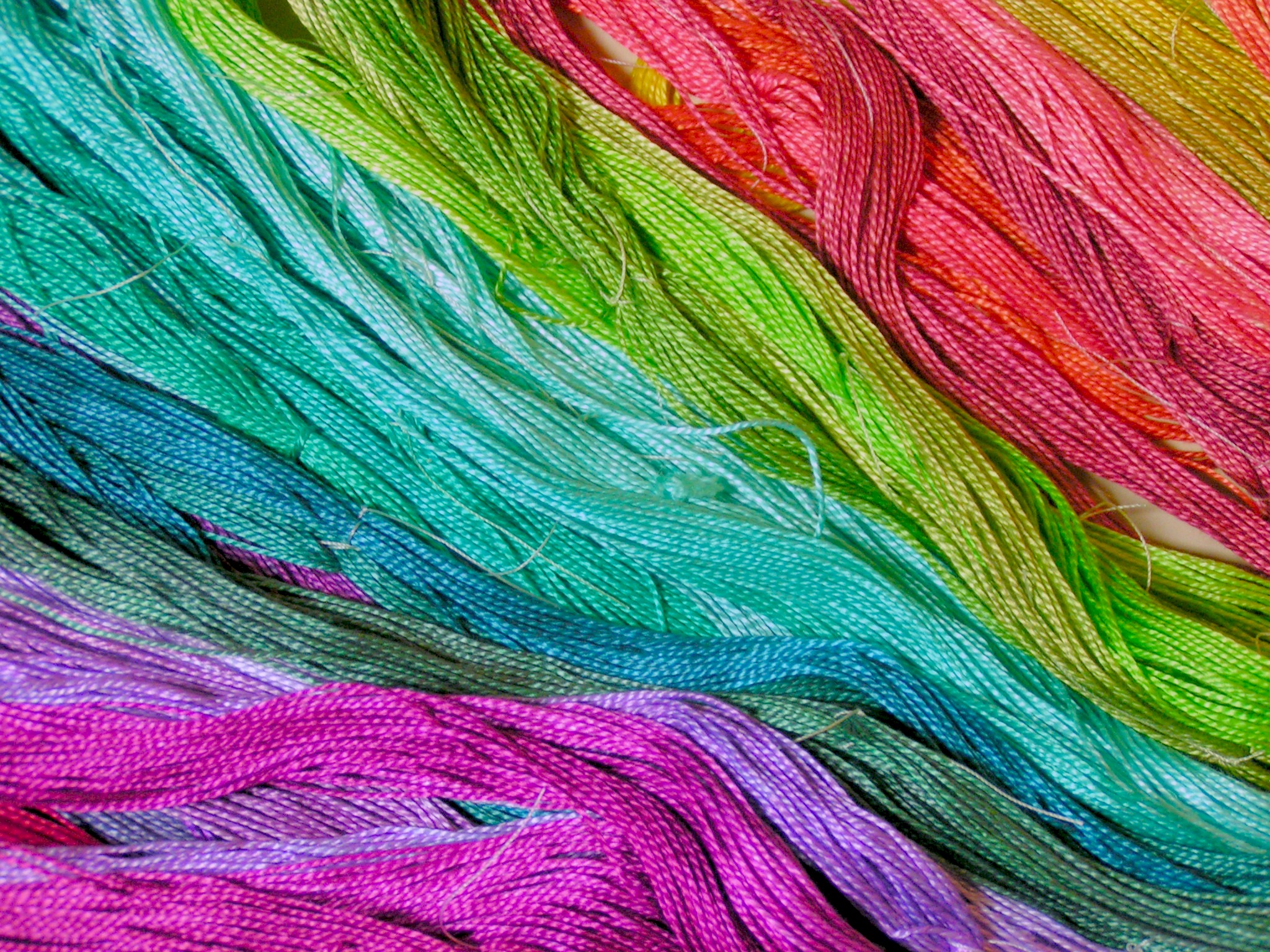
Recently, my friend Carole gave me 60 skeins of #5 Perle cotton threads. What an amazing gift, thanks Carole! When I was considering dyeing the threads, I decided that since I had so many threads, I would try dyeing a color wheel. I already had the Procion MX Dyes mixed up and had all 12 colors of the color wheel mixed from turquoise, magenta and lemon yellow.

So I finally did it! I dyed the full color wheel. I had 5 skeins for each of the 12 colors. So what I decided to do was do the full strength color for a dark value, a half strength color for mid range value and a very watered down color for a pale value. Then for the other two skeins I added black to one to make a shade and I made a neutral color for the last skein by adding that colors complement. You find the complement of a color by looking on the opposite side of the color wheel. It took me all day to dye these threads and a few pieces of fabric but I’m pleased with the outcome. If I mix colors again, I think I need to add more blue to the blue-violet and more blue to the blue-green. The blue is the slowest of the dyes to set and attach to the fiber. Therefore, it seems you need a bit more than you think because the other dyes mixed in will attach to the fiber before the blue even starts.

Here’s a close up of some of the threads. Aren’t they delicious? Now the only problem is that I am so enamored with all the colors that I’m hesitant to use any of the threads because then I won’t have my full color wheel. I’m sure I’ll use them but for now I just like to admire them 🙂

Developing a Sample for a Nuno Felting Class

Developing a Sample for a Nuno Felting Class

My friend Paula and I have been working on a nuno felting class we’ll be teaching soon. It’s a nuno felted jacket based on the Cocoon Jacket that was featured in Felt Magazine by Polly Stirling. Essentially, you nuno felt yardage and then turn up the short ends of the fabric to make a seam for the jacket shoulders and sleeves.

Here’s the back of the jacket. I used 5mm silk habotai with a batt that I carded containing merino wool, Tencel, Seacell, silk noil and soy fiber. I then added wisps of  black merino pencil roving and some preyarn in green.

Here’s the piece after felting but before I dyed it the deep red color.

Here’s the front of the jacket. I sewed the seams before I dyed the jacket. I used acid dyes so the Tencel, Seacell and soy fiber didn’t take the dyes giving a beautiful contrast of fibers.

You can see how the plant-based fibers stayed closer to white and give a nice contrast from the deep red and black. The green preyarn is now a deep brown.

Here’s a closer view. I really like how this jacket turned out and hopefully, I’ll get some photos of Paula’s jacket today to show you later. Hers is completely different from mine as she used already dyed wool and silk fabric to start the project. We wanted to show the students different options and ways to do different designs. I’m planning on making more of these in the future as it is a simple way to make a jacket.

I got a photo of Paula’s jacket to show you. She hasn’t sewn the seams yet but isn’t it cool?