Browsed by
Author: ruthlane

When I discovered felting in 2007, I finally found the creative outlet for which I had been searching. I love that the versatility of fiber allows me to “play” with a wide variety of materials including wool, silk, fabrics, yarns and threads. Creating one of a kind fiber art pieces to share with the world fulfills my creative passion.
Do Your Displays Complement Your Products?

Do Your Displays Complement Your Products?

For the next couple of Marketplace Mondays, I will be focusing on product display. The display of your work can be the difference between excellent and dreadful sales. Planning your display in advance and doing a little research, will go a long way in your success.

To get an idea of what options there are for display, look at other booth displays to see what you like or dislike. You can do this at local craft shows or there are several Flickr groups, Craft Fair Displays and Arts & Crafts Fairs are two examples, where you can find booth and display photos online. When you’re looking at the various displays, think about the following:

  • What colors draw you in?
  • What makes certain displays stand out?
  • Does the signage catch your eye?
  • Do you like the arrangement of the booth space?
  • How does lighting affect the displays?
  • Do you immediately know what product is being sold?
  • Does the display complement the product line?

Once you’ve gotten some ideas on what you like and what works well, you need to start considering what you want your booth to look like. Remember that your booth should help to draw people in but shouldn’t overshadow your products. If customers are frequently complementing you on your beautiful displays and booth, you need to rethink your display ideas as the displays are outshining your work.

Consider all of the following when working up your booth design:

  • Space – how will the floor plan be laid out?
  • Theme – can you use a theme to reinforce your brand?
  • Color – what colors will work with the color palette of your products?
  • Levels – how can you place your products at various levels to create depth and interest?
  • Signage – how much signage do you need and for what purposes?
  • Lighting – how can you use lighting to emphasize your products?
  • Simplicity – how do you create a display that doesn’t overwhelm your product?

Answer these questions to get started on designing your booth. I’ll discuss these ideas and more in the next article. If you have some great display ideas or photos of your displays, we’d love to hear about them and see how you display your work. Feel free to add your display ideas to our Flickr group photos.

Felting Around the Web

Felting Around the Web

The Trouble With Crafting’s Post about Embroidery Basics

Making a Beaded Tassel by Shawkl

RosiePink’s Repurposed Felt

http://anajskreativestagebuch.blogspot.com/2012/03/willkommen.html

Ruth O’Leary’s Stitched Nautilus Shell

http://ohohstitcher.blogspot.ca/

http://www.strongfelt.com/

http://sharit.posterous.com/

More of Jana’s felted notebook/calendar covers

Rainbow Acorn Color Wheel by lilfishstudios

Deborah’s Petroglyph Wall Hanging

Arlene’s Blue Nuno Felt Wall Hanging

Loco Lindy’s High Tech/Low Tech I-pad Cover

How to Make a Stealth Witch Hat by Frances Barker

Flextile’s Indigo Dyeing

Jana’s Egg Dyeing

Silent Sales People – Do You Use Them Effectively?

Silent Sales People – Do You Use Them Effectively?

Does your product packaging and point of purchase display sell the product? You are missing out on an important opportunity if your answer is no. The way you present and package your product can help to sell it, even if you aren’t there to explain and sell your product. The packaging can be a silent sales person and help to increase your revenue and promote your overall brand.

Like a book is judged by its cover, your products will be judged by their packaging and presentation. This doesn’t necessarily mean that you should box up your hand-made fiber pieces, but adding a band of paper around a felted soap, for example, gives extra space and opportunity for you to draw interest to the soap, build your brand and ultimately close the sale. If you’ve already developed hang tags for your products, that may be enough “packaging”, but some items may need more explanation than you can fit on a small card.

When you’re developing your packaging, remember to keep it consistent with the rest of your presentation of your artwork. Some of other points to think about are:

  • Can you make your packaging “green”? Try to use recycled materials or a package that can be re-purposed.
  • What about adding that little something extra? Perhaps a small piece of yarn or ribbon tied around the product. For our gift wrapping at The Purple Pomegranate (my store), we use purple boxes, raffia to tie around as a ribbon and a small pick to go in the bow made with a purple dried pomegranate and a piece of eucalyptus. Customers love the extra touch of the pomegranate and the wrapping is instantly recognizable as being from The Purple Pomegranate.
  • When you develop your packaging, keep you target audience in mind. The packaging would be different if your items were intended for children as compared to products sold for men.
  • If you can, take a look at what your competitors do. Can you develop packaging that is completely different from what your competitions does? Use colors or textures that make your product stand out from the rest.
  • Make sure to give as much information as you can. Remember that this information is helping to sell your product. Give instructions on how to use the product, tell what the “ingredients” are and most important tell a story. Give the consumer enough information to make a decision about buying.
  • Finally, make sure that your price is showing clearly. This is very important in a retail environment as many customers are hesitant to ask about price.

For those of you who sell your products online, “packaging” is how you show your product online, the quality of your photographs and also the presentation when the customer receives the product. Even though they might not see the packaging before they buy, a customer who receives a product with that “something extra” in the packaging, will be more likely to buy again and tell all their friends about you. So spending a little time and extra money on the packaging is well worth the effort and gives you an opportunity to create a dynamic “silent sales person”.

Kantha Embroidery

Kantha Embroidery

I recently attended the second session of Level 2 Hand and Machine Embroidery at the Gail Harker Creative Studies Center in La Conner, WA. If you are anywhere in the area, I highly recommend that you take a look at their classes. They have just moved into a new location and the barn studio is amazing. For this session, we concentrated on Kantha embroidery. It was developed in Eastern India and primarily uses running stitch to develop pattern, texture and line. The first set of photos are all from the collection of Penny Peters, who kindly let us study them, take photos and get up close and personal to these beautiful saris.

I particularly liked this pattern and the sheer number of stitches is amazing. These saris are approximately 3′ x 7′ and completely covered with running stitch.

We spent the first portion of the class studying and sketching from Penny’s collection into our sketchbooks.

Many of the designs featured birds or other animals.

In between all the dark-colored threads and stitching, this one had white background stitching. When viewed up close, this really gave life and movement to the piece.

You can see the background stitching here. Isn’t that a cool fish?

I loved all the variety of motifs in this sari. The background fabric is usually a solid colored silk and all of the patterning is done with Kantha or running stitch. Originally, none of these type of embroideries were meant for sale and were considered personal wealth. Each of the young girls would begin stitching at the age of 4-5 and being working on their dowries soon after that. I’m sure I would be a very old woman before I got married as each woman had to have multiple pieces of clothing, bags, table linens etc. embroidered before they married.

After we studied the various saris, we then began to try out Kantha samplers. This one was done on one piece of cotton muslin and held in the hand not a hoop. It is harder than it looks trying to get your stitches even and lined up appropriately. This sample took me about 4 hours.

This sample shows a variety of ways that you can fill a square. The one where the stitches go in a diagonal manner is called bending stitch and it is quite challenging.

This last sample is Kantha stitching in a circle. After the two above which were so regimented, this one was easy. Stitching in a circle without having to line up the stitches was very freeing. The texture of the piece can be changed depending on how tightly the threads are pulled.

We then developed our own Kantha design and tried our various ways of filling our design with stitches, what the colors were to be etc. I am still working on this project and I’m about ready to start stitching my little bird.

I now have a new appreciation for Kantha. I knew very little about it before the class. It is wonderful the number of designs that can be made with a simple running stitch. I’d love to see other Kantha examples, so if you’ve done some, please give us a link to see what you’ve made.

A Visit to the Buyers Market of American Craft

A Visit to the Buyers Market of American Craft

My partner and I recently attended the Buyers Market of American Craft held at the Philadelphia Convention Center. This is one of the shows that we attend regularly to buy hand crafted merchandise for our fine craft gallery. There are hundreds of craft artists that attend the show to sell their wares in the categories of Glass, Ceramics, Mixed Media, Jewelry, Wearable Fiber, Inspired Interiors and Premier Jewelry. No photos are allowed inside the show so I’ve borrowed the show photos from the Buyers Market site.

It’s always interesting to see what’s new and look at the variety of hand crafted work that is available. If you’re a buyer, it’s important to know what you want ahead of time. This has gotten easier over the years and hopefully, we’ve selected products that will just fly off the shelves. We often are looking for specific types of items and we use what’s called an Open to Buy plan so we know how much money we have to spend in various categories in each month. That way we don’t overspend and end up with too much of one type of merchandise.

As an artist selling at a wholesale show, you need to think a little differently than you do at a retail show. Wholesale shows are a large investment and you should be prepared to produce your work in large quantities. One of the potters we ordered from said that her daughter was helping out for the first time. Unbeknownst to her, she was taking her first order from a gallery owner who owned four galleries. He started asking for large quantities and the order came to thousands of dollars. They were delighted with the order and the daughter handled the order well. A large order sounds wonderful, but if you aren’t prepared to make those many items and can’t follow through, galleries seldom give you a second chance.

I will be writing many more columns about wholesale shows and how to prepare for them. I just thought you might be interested in a glimpse of what a wholesale show entailed. I couldn’t resist snapping the photo above. The Philadelphia Convention Center has many pieces of wonderful art inside. This is a mosaic of cups on the back of the escalator.

Right across the street from the Convention Center is The Fabric Workshop and Museum. I loved the window decor of large lace patterns. That’s what caught my eye. I didn’t realize it was there and we’ve been attending this show for 13 years. We did go to the exhibit which was called Soft Village. Next time, I hope to be able to schedule a tour of the visiting artist’s studios. I’d love to hear any questions you might have about wholesale shows, just leave a comment.

Book Review – The Embroiderer’s Handbook

Book Review – The Embroiderer’s Handbook

I bought this book mainly because it was on sale when our local Borders closed but also because I wanted a stitch dictionary. You can check it out on Amazon. The reviews there are positive and the one complaint I saw was that there weren’t any patterns for the finished projects shown. This book is a stitch guide and is not meant to show you how to do specific projects.  It does show hand stitched pieces for examples and inspiration but its main strength is that it has photographs of all the stitch steps with written instructions for each step.

The first portion of the book is about getting started and it goes over fabrics, threads, needles, transferring designs, how to begin and end and hoops. Throughout the book there are tips about using the stitches  and solving common problems. The book includes over 150 different stitches and variations of a variety of stitches. All of the stitches are in alphabetical order making it simple to look up one stitch easily.

The photographs of each stitch are very clear and the instructions are easy to follow. If you have difficulty following stitch diagrams, this book is for you. It shows many more steps with photos than a stitch diagram does and makes even complicated stitches easy to understand. I am not particularly interested in ribbon embroidery, but for those that are, there are quite a few examples of stitches used in ribbon embroidery.

I recommend this book if you are looking for a stitch dictionary that is reasonably priced and shows step by step photos. This book does not give you any embroidery patterns and is not experimental embroidery. It shows the basic stitches and how to do them. I refer to it when I’ve forgotten how to do a stitch (who me, forget something???) or when I want to learn a new stitch and I’ve found it very helpful.
Is Your Business Card Attractive?

Is Your Business Card Attractive?

Many times, the first impression a customer sees of you may come from your business card. Is it attractive? Have you included photos of your artwork on your card? Printing costs for business cards are surprisingly low these days. There are many printers online and if you find quotes online for printing, check with your local printer to see if the online price can be matched. Price, however, is not the only consideration. Many of the online printers make it easy to set up your card and offer very attractive options for layouts without extra design or layout charges.

Many artists use Moo cards. Moo cards are inexpensive, provide color printing on both sides of the card and will even send you a free sample pack of cards that you design with your own artwork. They also sell postcards and mini cards. Another website I found that looked promising was Uprinting. Uprinting sells business cards, post cards, hang tags, letterhead and even banners that could be used for a booth sign.  There are hundreds of options online for printing and doing your research ahead of time is important. Shopping local is also important so do get a bid from local printers as well. If you are printing a variety of promotional and packaging items, ask to see if you can get a multiple item discount. (I have no connection to these companies and have not ordered from either of them.)

Your business card should include all your contact information so that people can reach you. Give them more than one option. There are people out there that don’t use computers much and giving only an e-mail address will prevent that customer from reaching you. Do you have a tag line? A tag line is a short phrase that summarizes your product and what it can do for the customer. If you have one, it should be on your business card. Other information that can be included is your website or ETSY address, your name, your company name and even if you don’t include a physical address, listing your town or region lets people know your general location. If you have a logo and use it on the rest of your presentation package, it should be included on your business card. Two sided printing is great because you can have photos of your artwork on one side and the informational bits on the other side.

Carry your business cards with you. If you meet someone who is interested in your work, handing them a business card is the first step towards making a sale. However, if you are doing a retail show, you don’t necessarily need to give everyone who steps in your booth a business card. Many times, someone who comes into your booth may not be interested in purchasing your work. If you offer them a business card, you are giving them a way to exit without buying anything. They will tell you that they “will think about it”, take your card and you’ll never hear from them again. Instead, tell them about your work, answer any questions they may have and if they are not interested, they will move on. Save your cards for customers who buy something or for someone who shows real interest.

Spending a little bit of extra money on professionally printed materials usually pays off in the long run. If this is your job or your business, treat it like a business, design an attractive business card and present yourself professionally.

Stitch Homework

Stitch Homework

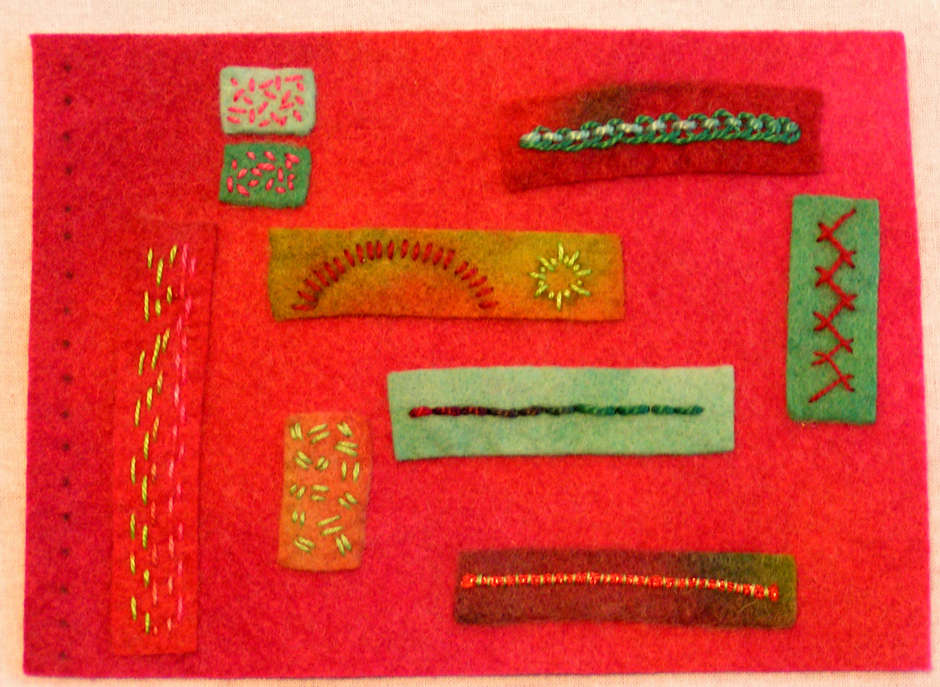
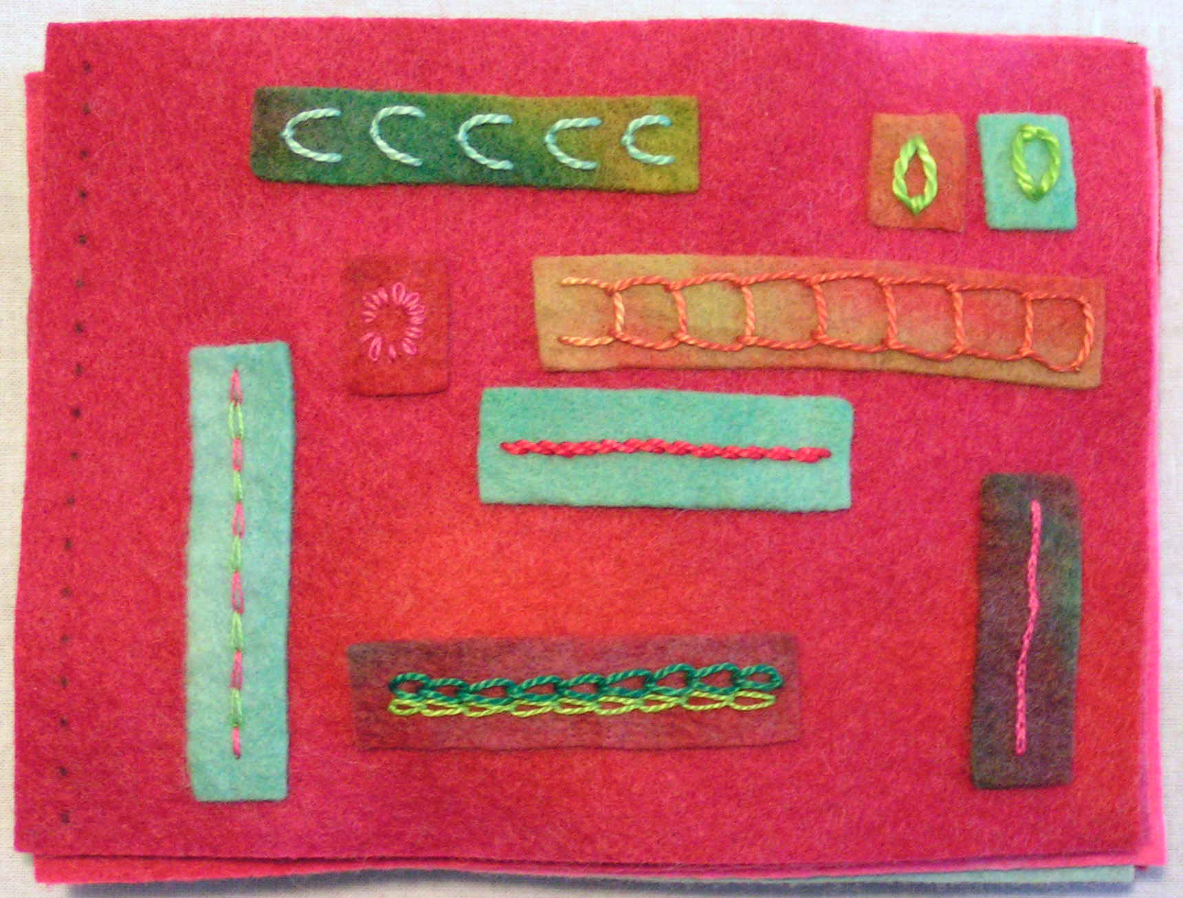
I am heading back to La Conner, Washington at the end of the month for my second class in my Level 2 Stitch Class at the Gail Harker Creative Studies Center. For part of the homework after the first session, we were assigned to make pages for a felt stitch book. The felt is hand dyed as were the threads. My color scheme was  a triad of red, blue-green and yellow-green. The red is really hard to photograph. I have two books with 8 pages each. The pages are marked where the book will be bound. We’re learning the binding method in session 2. The covers of each book has a sample of each stitch that is included in the book. I had run out of enough felt to make a rectangle so I just used scraps. I thought it might pull the book together better as the color scheme is a bit over the top at times! Click on any of the photos for a closer view.

Second Book:

Does your Hang Tag Tell a Story?

Does your Hang Tag Tell a Story?

In product presentation, one of the first things that a customer will notice is the hang tag. That is the tag that is attached to the product that gives information about it. Telling a story on your hang tags will engage the customer and encourage them to spend a few minutes longer examining the product. The longer they have it in their hands and the more engaging the story, the more likely it is to sell.

During my 13 years as a gallery owner, I have seen a number of hang tags. Some that worked really well, others not as much so and then some products with no information at all. Not including a hang tag with your work is a mistake, especially in a gallery setting. That small piece of paper is an excellent selling tool and will sell your product for you even if the gallery staff doesn’t. Most hang tags are business card size although depending on the size of your product, it could be smaller or larger. The card can be flat, folded, printed on one side or printed on both sides.

Consider what information you should include. The hang tag should include your name, business name, tell a story about the piece and leave space for a price tag. If you are selling the work yourself in a retail or online venue, the tag should include your contact information. If you are selling your work through a gallery, you should check with the gallery about contact information. Most galleries do not want to have your contact information listed as customers will try to buy directly from you instead of from the gallery. If the piece is to be worn, you should also include care instructions for the product on the hang tag. In the US, the law requires you to include care information as well as “ingredients” and where the piece was made.

Hang tags may look different for a wearable as compared to a piece of wall art. With wall art, you might want to include the dimensions of the piece. Many people look for certain sizes of art to fill a specific space. If you include the dimensions, that is one less thing the customer has to discover before purchasing. The more information that you are able to give about yourself and your artwork, the better. Customers love to hear a story about you and what you do.

Here is an example of a “hang tag” that really works. These cake testers are made by Paula Penrod of Apt Designs. This is larger than business card size and measures 5 1/2″ x 8 1/2″. It holds the cake tester and tells its story at the same time. I have carried these for years and sold hundreds of them. The reason they sell is this tag. If the testers were arranged in a bowl or even stuck in foam so that they stood up, people would be asking all kinds of questions. What is this? Why would you buy a cake tester when you can just use a tooth pick? $11? Why would I spend $11 on a cake tester? Click on the photo so you can read the story. Paula answers all the questions the customer would ask and does it in a humorous way. In the US, there really aren’t that many people who bake anymore. But I still sell lots of these cake testers. That is what your hang tag needs to do for your products. I can’t tell you what to write on them, only you know that. But tell a story with your words. Answer any objections before they come up and then your hang tag will really work for you.

Inspired by Hans Hoffman

Inspired by Hans Hoffman

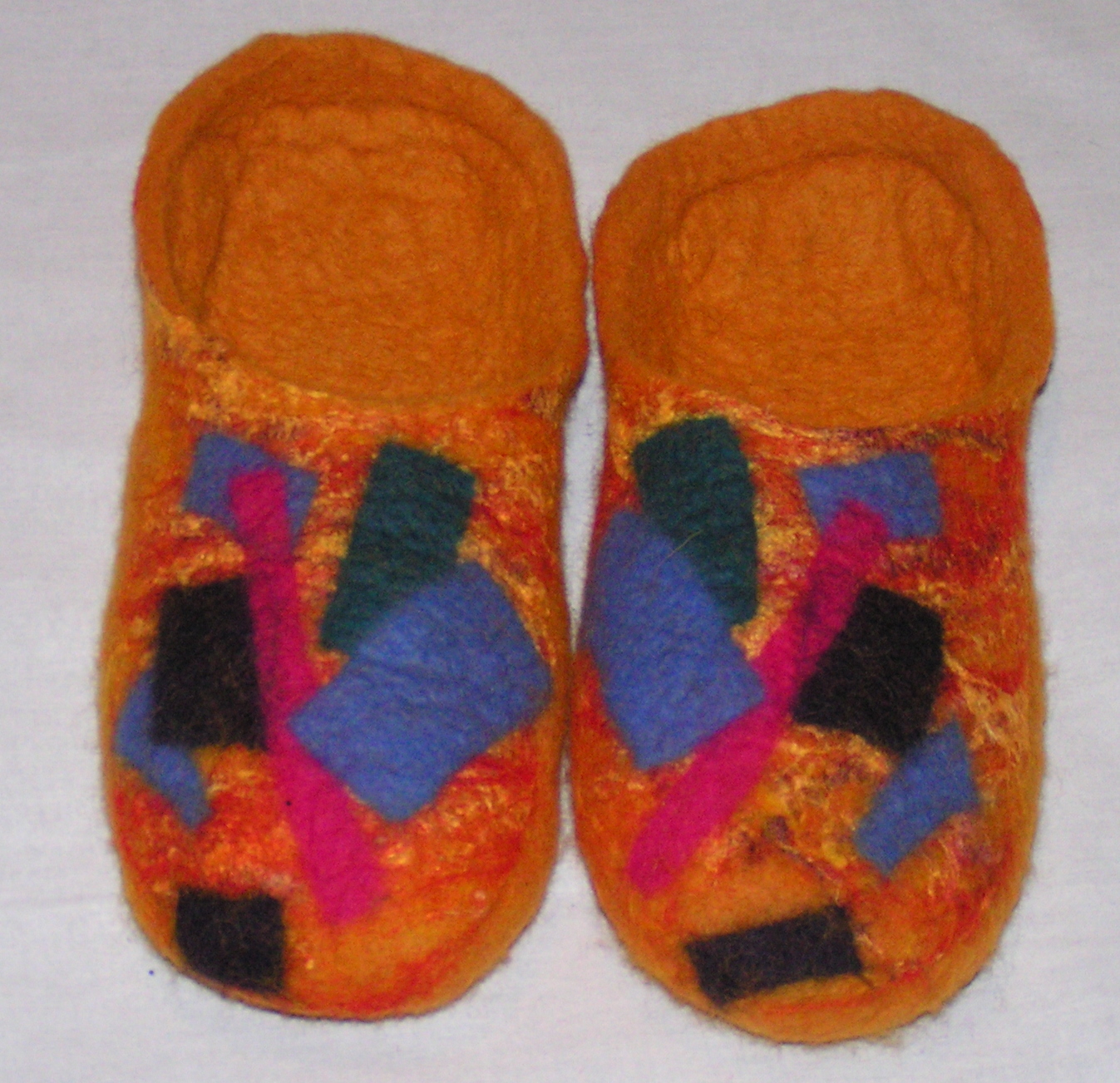
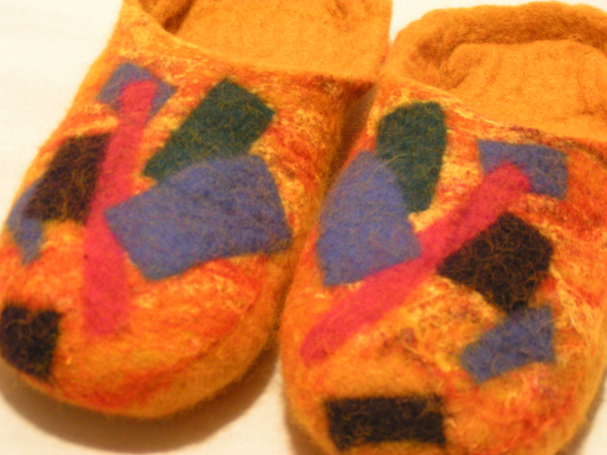
I’m involved with a group locally that meets once a month and works on a variety of surface design techniques. We decided that this year, each of us would pick an artist and then the group would each do some sort of project inspired by the artist. We didn’t set any specific guidelines as to what the project had to be as we all do different types of work. The first artist that was picked was Hans Hoffman. I took a look online to find a bit more about him and to find some photos that would inspire me. He worked with color and did mostly abstract paintings. I like the painting above so I decided I would make something with this photo in mind. I needed a new pair of slippers so what could be better than Hans Hoffman inspired slippers? 🙂

I made a few batts on my new drum carder from wool that I had previously dyed. Two of the batts were just plain wool (mixed 56’s) and the third batt was several different shades of wool and a few different colors of silk noil for the tops of the slippers. That gave me a nice mottled background and I then added different sized rectangles of pre felt to give the look that many of Hans Hoffman’s paintings include.

When I’ve made slippers in the past, I always used one resist for both slippers and then the slippers have a cuff. I wanted this pair to be more like clogs. So I used two separate resists and then cut out the opening on top. The last pair of slippers I made was too small for me as they somehow shrunk more than expected. These fit like a charm and even though my last pair of slippers was grey, I love the bright colors.

I enjoyed learning a bit more about Hans Hoffman and I certainly wouldn’t have come up with this design on my own as it isn’t really my style.  Challenges are always fun and push you to try things that are new. Have you tried anything out of your comfort zone lately?