Browsed by
Tag: Stewart Stephenson

Second Quarter Stephenson Challenge

Second Quarter Stephenson Challenge

I’ve been working on the challenge on and off for a couple of months.  My first impulse was to chose his Blue Vertigo. 

blue vertigo
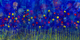
I made some batts and used them to make the circular design. I pulled strips off the batt and laid them out.  Then added bits of colors as needed.

batts design of purple


Stephenson
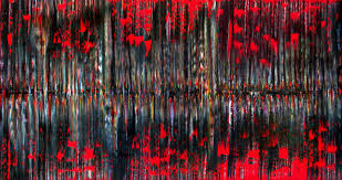
This piece worked out well, but I wanted to try another of his watercolor like pieces.  So, the next one was based on his Purple Rooftop. 

purple rooftop

I used some black pencil roving in the middle, a black background underneath in the center of the piece to help shadow the reflection in the pond and some mulberry silk for a reflective effect.  Unfortunately, the purple wasn’t as obvious in mine after felting.

Stephenson 1
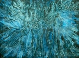
Stephenson’s Green Love reminded me of the carving technique I learned in Fiona’s class, so I wanted to try that, too.

GreenloverSM

The background is black prefelt and with a white center of merino over cotton batting and some of the radiating lines with different colored roving.  The carvings weren’t as wide, but I like the effect.

Stephenson 3a Stephenson 3


I enjoyed the challenge and the variety of techniques I was able to use to achieve the different effects.  Have you done the challenge yet?


Second Quarter Challenge Finally Done.

Second Quarter Challenge Finally Done.

That’s right I have it done and with days to spare. 12 whole days at that! Here are the details of the challenge if you missed them.  Challenge

I have know what I was going to do for ages I just hadn’t done it. I like Stephenson’s mirror pieces but I also liked the flower pieces so I decided to combine them.

stevenson 1  stevenson 2

I used a thin piece of black prefelt I had and doubled it up for the back ground. I then used my own handspun for the stems. I added silk throwers waste for the flowers and then more hand spun for the spirals. I wasn’t sure how everything would stick. There was not a lot of fuzzy about any of it. It worked out fine though.

I forgot to take a picture of it before felting but here it is finished. I like it a lot more than I thought I was going to.

stepnenson picture

I found this frame on my front porch ( have no idea why it was there) and laid it over the picture and I like it even more.

stepnenson picture frame

If you haven’t done a piece, go ahead and give it a try, you still have time.

Don’t for get to visit the Forum to see how others have interpreted the theme.  Challenge

Second Quarter Challenge – Barbarous Elly

Second Quarter Challenge – Barbarous Elly

The artist chosen by Ann for the 2nd Quarter Challenge as you all know by now is Stewart Stephenson. I had not discovered this artist before and he certainly has a wide array of styles although most are pretty abstract. It took me a while to find a piece that inspired me as I wanted to try some different screen printing techniques on felt in creating my challenge piece. Then “Barbarous Elly” caught my eye. I’m not sure about the name but I immediately thought of a way to recreate this piece with screen printing. Plus it had circles in it and since I just finished up a lot of circles work with my recent online class, it was appealing.

Barbarous Elly by Stewart Stephenson

My original thought was to make a couple of book covers from the finished piece of felt. I’m not sure about that at this point though.

MINOLTA DIGITAL CAMERA

I laid out red-orange wool in a subtle gradation. I added blue silk noil to the surface.

MINOLTA DIGITAL CAMERA

This is the piece after felting. Can you see the gradation of color from left to right? Lighter orange to darker red-orange. I didn’t want a big change, just a slight one.

MINOLTA DIGITAL CAMERA

This is a little better color representation of the silk. It’s blue tending toward purple.

MINOLTA DIGITAL CAMERA

Then I silk screened a very dark blue-green dye on to the felt.

MINOLTA DIGITAL CAMERA

And here’s the finished piece. The dye changed the color of the silk noil so it stands out very nicely adding the blue-green color I wanted.

MINOLTA DIGITAL CAMERA

Here’s a closer view. I really like the result and like Zed and her challenge piece, I’m not sure I can cut it up. It may have to be a wall hanging. I have considered if I should add more to this piece, like stitching or even beading, but for now, I’m leaving it as is. It’s not quite as dramatic as the original painting but it will do. So now to come up with a name, what do you think?

2014 2nd Quarter Challenge

2014 2nd Quarter Challenge

At the beginning of last month, Ann posted her 2nd Quarter Studio Challenge, the work of artist Stewart Stephenson. His work is very diverse, and I must admit I prefer his more abstract works, maybe because they are similar in style to my own oils and acrylics. I played it ‘safe’ with the first piece I made for this challenge, using one of his ‘sass’ flower paintings: Sassy Wildflowers:

sassy wildflowersI drew myself a little sketch, marked down which colours to use where, then laid out the wool. I did a similar thing for both pieces and the colours were quite a bit off! This is before felting:

OLYMPUS DIGITAL CAMERAAnd this is what it looked like after felting:

OLYMPUS DIGITAL CAMERAThe other Stewart Stephenson pieces I quite like are his mixed media ‘line’ pieces. I’m not sure which mediums are used, some look to be just paint, some seem to be digital images or at least digitally altered. They all seem to be based on the idea of having a centre and working out from there. The one I mostly used for reference was ‘Line Up Now’.

lineup nowAgain, my colours were a bit off, and also his works don’t appear to be mirror images, but I liked the idea of that, so that’s how I did mine. This is a close up of one part before felting:

OLYMPUS DIGITAL CAMERAMy girlfriend suggested I use some very dark blues and black on it, to give it more depth, so just before felting, I added those colours. This is what it looked like after felting.

OLYMPUS DIGITAL CAMERAI really like the way both pieces came out. I made them of a size big enough to make notebook covers, but I think they’ll stay as they are 🙂 We’ll be adding the entries to the Challenge Galleries, so if you’d like to be included just let us know. We also have a post on the forum where you can see other entries too.

Second Quarter Challenge: Stewart Stephenson

Second Quarter Challenge: Stewart Stephenson

As you probably know we have decided to pick a different artists for our quarterly challenges this year. This quarter I have chosen Stewart Stephenson http://www.stewartstephenson.com/home He is a Canadian artist that has a large body of work in a variety of mediums and styles. I think there is something for everyone here.

He has a gallery in Vancouver British Columbia Canada

gallery-img1 stevenson 1 stevenson 3 stevenson 5 stevenson 2stevenson 4

It says he did some sculptures but I couldn’t find any pictures. I even sent them an email asking about them but got no response. If you find some please share them with us. Have fun with this.

Don’t forget there will be a post over on the felting and fiber forum where you can ask questions, discuss and post pictures of what you where inspired to make.


%d