Hand Stitched Cover
I suddenly realized that it’s already March and nearing the end of the first quarter. So I needed to get going on my entry for the 1st quarter challenge. Did I have something that needed a cover? Perhaps my tablet needs a little felt surrounding it and keeping it safe.

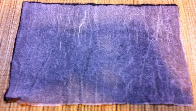
I found these two pieces of nuno felt in my stash that were already cut to approximately the right size. I found a copyright free design of two entwined trees that I decided would be nice to embroider a design on the cover. I traced the design on tracing paper and pinned it in place.


Then I used machine thread in dark brown with a running stitch to follow the design. It works for a fairly simple design but might be an issue for really complex designs. I used brown thread so that if it showed on the edges of the stitching, it wouldn’t stand out. You can remove any of these threads if the embroidery doesn’t cover them. I have found with thin pieces of the design such as branches, that it works best to have just one line of running stitch and it takes less time to stitch the design.

The next step is to remove the tracing paper. I saw this on a YouTube video but don’t remember who to credit for the idea (Sorry!). Use your needle to run along the line of running stitches and that will tear the tracing paper so that it is easier to remove the paper without pulling on the stitches as much.

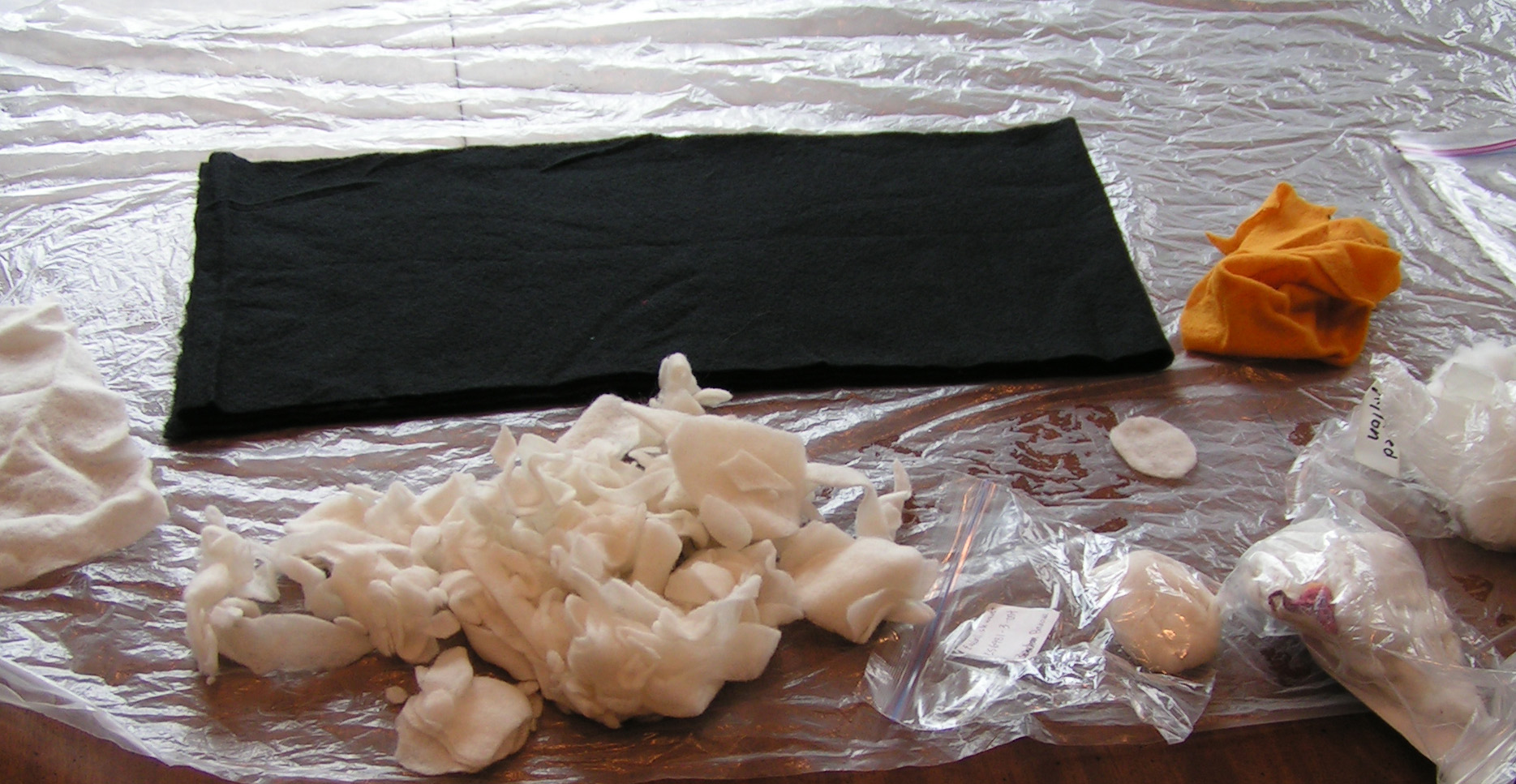
Here’s my design now transferred on to the nuno felt and ready to embroider. I considered using various brown yarns to couch down but they were too large a scale for this small of a tree. So back to my stash to find brown perle cotton thread. I ended up deciding that #8 perle cotton was the size that worked best and that I had the right colors in.

So I started with the darkest brown threads and started couching them down with the brown machine thread. I did a little bit of this on a recent car trip but did most of the couching after I got back home.


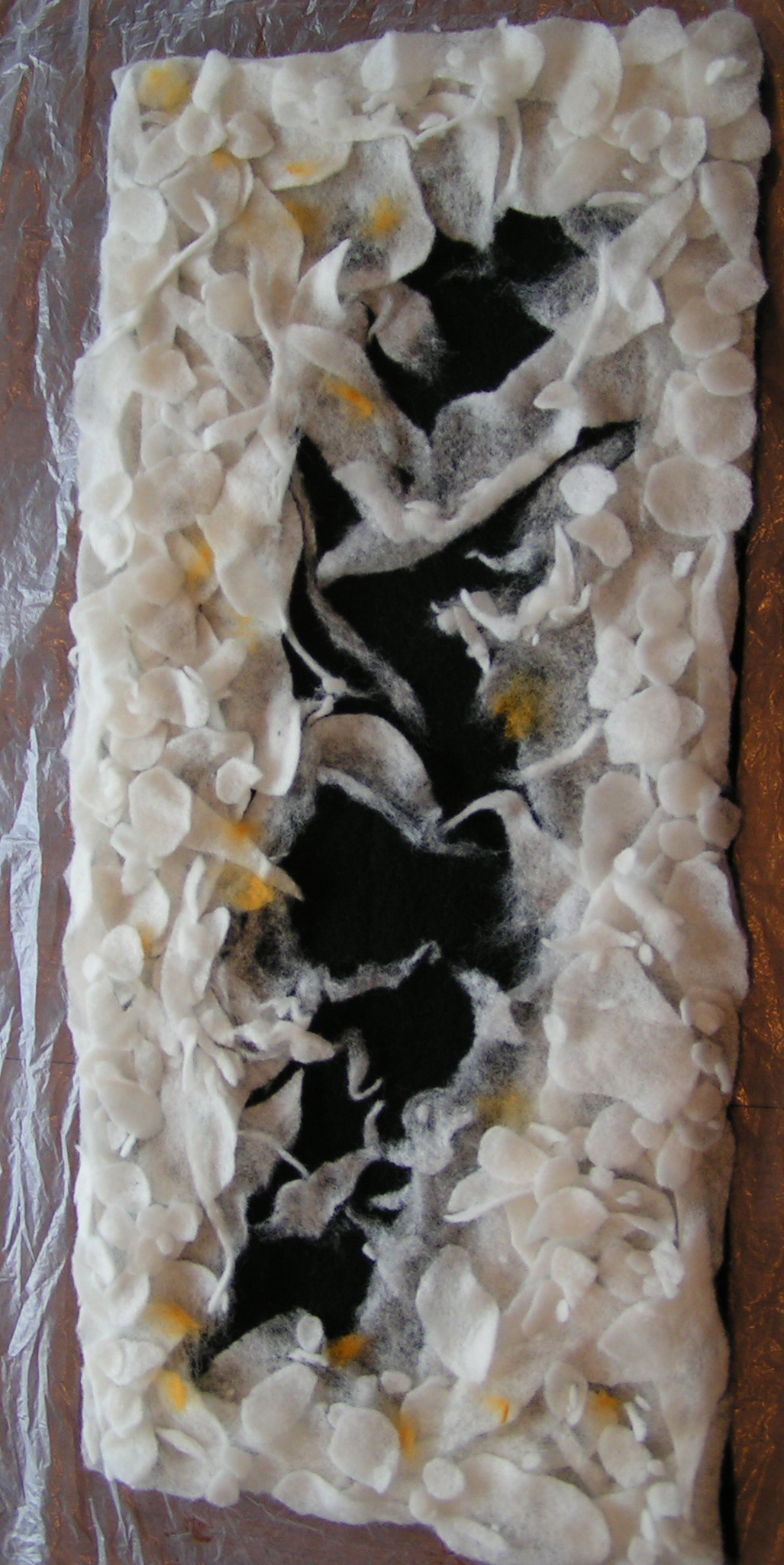
So here’s the finished tree trunk and branches. Now to add some leaves. Once I have finished with the embroidery, I will work on construction of the cover.
Have you made any covers lately? If so, we would love to see what you have created. You can submit your challenge entry here.