Color Mixing with Drum Carder
Experimenting with color mixing by drum carder was on my list of to do’s and I got around to that this past week. I created a sample with similar colors when color mixing by felting alone in this post.


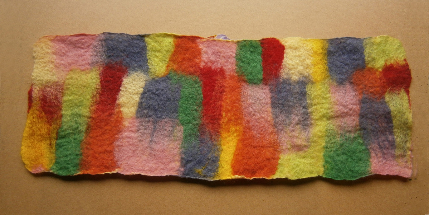
First off, I had to get the drum carder out and find a space for it on my studio table. The chosen colors were blue green and red orange. I wanted to see how the drum carder mixing differentiated from the felted layers of the same colors. I used the same proportions of colors that I used in the prior sample, which was about 3 to 1 red orange to blue green.


Here is the batt that I created with those colors. The photo on the left is one run through on the drum carder and the photo on the right is two runs through the carder. I then tore the batt in half as I didn’t need that big of a felt sample. So I still have another sample I can make in these colors.

I wanted to try a different way to texture the bark so I used some cut up pieces of heavy interfacing (Pellon). It’s probably about a quarter of an inch thick. I peeled apart a layer of the batt, put the interfacing pieces down and covered with the rest of the batt. After felting, I should have split the batt into two equal pieces, that would have worked better than a thinner layer on the bottom.


The front is shown on the left and the back on the right after felting. As you can see, the interfacing came through the ends as I didn’t have enough wool covering the ends. And the back shows that I had too thin a layer under the interfacing pieces. But it was easier to see the interfacing to stitch around. The interfacing was not thick enough to feel through the wool and didn’t give a good texture. (Doesn’t the photo on the left remind you of a short rib?)

I then added some free motion machine stitching so the texture was more evident from the interfacing pieces. I also trimmed off the ends that were showing and did a little needle felting repair in those areas.


Here are the two pieces side by side. The one on the right does have silk nuno felted on the top too. Which do you think works better? The carded sample is more homogeneous in neutralized red orange but I do like the mottled appearance of the layered color mixing on the right. The carded sample definitely needs more value contrast than what it has now. How do you mix your colors of wool? We’d love to hear about over on the forum.