Browsed by
Category: Mixed Felting Techniques

Making lots of felt pictures

Making lots of felt pictures

In my last post I was talking (among other things) about a 6-week residency I have in a local Michelin-starred restaurant that starts on 2 April.  Here’s a link in case you missed it or want a reminder.

https://feltingandfiberstudio.com/2024/01/12/pictures-and-plant-pots/

In this blog I’m offering a quick look at the pictures I’ve made (or am part-way through making) since then. I don’t have the space (or time!) to describe the making processes in a lot of detail but do ask questions in the comments section if you want to know more about something.

The restaurant owners suggested I’d need about 40 pictures to fill the 3+ rooms.  I don’t have a lot of spare pictures kicking about – my felt picture making is usually fairly hand-to-mouth – so I really have my work cut out to make enough new work to fill the restaurant walls.

At the time of my last blog, I’d made 1 large and 3 smaller pictures.  I then did a series of 4 slightly impressionistic ‘estuary water’ smaller pieces.  I live on the north Kent coast of SE England and although it looks like ‘sea’, the stretch of water at the bottom of my road is technically the Thames estuary.

Top left to bottom right: Spring, Summer, Autumn & Winter

Spring is lightly pre-felted cobweb felts in blue and white laid on a pewter-coloured layer of wool that has a green layer underneath it.

For Summer I made some prefelts which I cut into shapes to try to give the impression of the shifting colours of calm water.

Dry layout for ‘Summer’; a combination of merino prefelt and tops

Autumn is altogether more turbulent with a lot of pewter-colour in the water.  The estuary is often quite murky-looking. I’ve used either or angora or wool locks for the small wave crests.

And winter, like spring, is white and blue cobweb prefelt on a pewter background, but this time with more of the pewter showing and with pewter for both base layers, no green.

While rummaging through my extensive fibre collection, I came across a lovely hank of hand-dyed wool and silk fibres that I’d bought while on holiday in the USA.  I decided to use this for a larger water picture.

Large sea pattern 2: final picture waiting to be framed, the layout and the fibre. The colour representation isn’t very good – the colours in the finished picture are warmer than they look in the photo.

I thought it was time to have a go at a larger bird picture.  I’ve previously featured lapwings in a felt picture and thought I’d like to have another go at those.  Lapwings are beautiful birds with iridescent feathers that appear to change colour depending on the light.  I’d seen a large flock of them at a nearby nature reserve at Oare Marshes. Sorry the quality of these photos is poor, and you can’t see the birds’ colours, but I wanted to show you the lapwings I saw and what their environment looks like.

I started off with some nuno prefelt for lapwing 1 to try to capture that iridescence.  These are mostly silk but the black is velvet devore, which I thought might work for the neck feathers.  I laid out a bird-shape in white then cut the coloured prefelt to make wing feathers.  While I was on a roll, I made another 2 lapwings, testing out different ways of trying to capture the birds’ colours.

Left to right: the layouts for lapwing 1, prefelt for lapwing 1, lapwing 3 and lapwing 2.

Here are the wet-felted bodies that I will needle felt into 2 backgrounds as I add the features: eyes, beaks and legs.

Top to bottom: lapwings 1, 3 and 2.

Oare Marshes is a fantastic place to see birds – with a great variety of migratory, overwintering and breeding wetland birds. However, as you can see in my photos, it’s not a conventionally ‘pretty’ place. I want to locate the birds properly so there’s a challenge in making a picture that is appealing while also being representative of the nature reserve.

This is the background for the solo lapwing (lapwing 2!).  I’ve used 2 different sections of recycled silk scarves for the land section and merino wool for the water – with a few strips of one of the scarves to look like pebble and mud outcrops. Next comes the lapwing which will be needle felted into place and have its features added.

And here is the final picture

Lapwing, Oare Marshes

For the other two lapwings I decide to focus on the water rather than the land.  Here’s the finished picture, with the lapwings needle felted into place.

I really love watching the birds that visit or live along the coast here.  Oystercatchers are very distinctive black and white birds with bright orange eyes and beaks. This is the layout of a coastal background for an oystercatcher. The foreground is made from cut-up prefelt pieces that I’ve made, including some recycled silk fabric; the background is a piece of a beautiful charity shop silk scarf, and I used mostly kid mohair for the wave foam, with a few wool locks.

Here’s the oystercatcher’s body, needle felted into place, then given its eye, beak and legs. The beak is some orange felt I’ve made previously and the legs are recycled tapestry wool. I like how the kid mohair has a wiggly texture.

With an eye on getting the picture numbers up, I branched out a bit and decided to make some smaller monochrome pictures using a commercial merino and silk prefelt with a recycled wool scarf for the foreground.  I then printed tree silhouettes onto them.

Once I’d pretty much used up the wool fabric, I tried out some pieces of monochrome silk. This is work in progress as I haven’t yet printed trees onto the other pieces.  These aren’t my usual style but it’s good to mix things up a bit and they are comparatively quick to make. I may not put all of these into the restaurant but it’s good to have some options.

In the interest of continuing to mix things up, I then made a larger sea pattern, trying to capture the light and reflections that dance across the water.

And then, most recently, another big bird picture, this time of a curlew.  Curlews are the largest European wading birds. They have long, curved beaks and very patterned feathers. Like oystercatchers, curlews can often be seen within a very short walk of my home. The best time to spot them, and lots of other birds, is as the tide starts to go out. They feed along the line of the retreating water. They have a very distinctive call and you can often hear them before seeing them.  Unlike oystercatchers, curlews’ (and lapwings’) UK conservation status is ‘red’, which means they are either globally threatened, have a long historical UK population decline or there’s been at least a 50% decline in the UK breeding population over the last 25 years.

Here’s the final curlew picture: cut up prefelt for the pebbles; blue cobweb prefelt over a pewter background for the water; the bird wet felted separately then needle felted into place and given an eye, beak and legs. The beak is made from short lengths of variegated wool yarn and the legs from tapestry wool. The yarn, tapestry wool and silk fabric in the pebbles were all bought in charity shops. I really like the idea of recycling whenever I can, and it’s great that the charities benefit as well.

In the last couple of days I’ve been making 3D oyster and mussel shells.  I haven’t decided exactly how I will use these yet, some kind of pictures.

Today I made a light background for one of the mussel shells. It’s still damp in this photo. I think the sea foam area will become lighter as it dries.

I’m still a long way from 40 pictures, although I did have a few already made before I started this picture-making marathon.  Now I’ve more or less cleared my diary and I’ve got the rest of March to make more pictures, and to frame them all. I wonder what I’ll do with my spare time?!

I’d be really interested to know what you think so please do leave comments if you have them.

The Bull

The Bull

We have three public houses in Sturminster Newton (at one time there were 11 in our small market town!) and The Bull Tavern is one of the oldest. The building consists mainly of a 3 roomed 17th Century cottage with an attic room, built of old timber infilled with wattle and daub. Some additions were made in the 18th Century. Records show that the cottage was definitely an alehouse by the late 1700s. Apparently there was a slaughter house at the rear and a Pound where straying animals were kept until collected – upon payment of a fee of 1 shilling (which must have been a fortune when you consider that a married man’s weekly wages at the Town’s Workhouse were all of 9 shillings and a single man’s only 6). Part of the C18th additions was a stable block (which eventually became a skittle alley and later part of the restaurant of the pub). It is rumoured that the horses stabled there were used to help get carriages and carts up the adjoining steep hill leading to Sturminster Common and the small community of Broad Oak.

The building, known to Thomas Hardy (one of our famous inhabitants) as The Old Bull Inn,  is shown on the earliest known map of the area dated 1783, as being part of the Pitt-Rivers Estate.  You can learn more about the Pitt-Rivers family here: https://www.dorsetlife.co.uk/2012/04/sturminster-newton-and-the-pitt-rivers-family

About 18 months ago, after our then favourite landlords moved from the White Horse Inn in Hinton St Mary, the pub was closed for refurbishment. Hinton is a village about 1.25 miles away, where the Pitt-Rivers manor house is situated.  We used to walk there 3 times a week – our exercise with benefits – but since the benefits had disappeared we decided to patronise The Bull – for our exercise of course.  The only trouble with that was that it’s uphill on the way home whereas it was down hill from the White Horse.

During that time we had come to enjoy the chats with Marianne and Lance, the Bull’s managers.  Lance being the very good chef, and Marianne “Front of House”.  Early in January 2021, they announced that on Christmas Day they had got engaged.

One of my felt paintings – commissioned by a mutual friend –  had been given to the White Horse landlords as a wedding present a few years ago, and Graham, my husband, suggested that I do something similar as a wedding present for Lance and Marianne.

Felt picture of sepia tint image of old public house
My interpretation of an early image of The White Horse, Hinton St Mary

Although The Bull itself is a very interesting building, I wondered if I should do a picture of an actual bull for them. No date had been set for the wedding at that time, but I thought I should at least start collecting reference pictures, both of the pub itself, including some of their Pub sign and of some animals. I thought about breeds that might have been around in the 16th Century – White Park Cattle and black Gloucesters; and also looked at Herefords since that was the breed on the Pub sign.

image of Bull Tavern sign with hereford bull above image of the public house
The Bull Tavern and it’s sign

image of black bull with winners rosettes and image of large white bull
Gloucester and Park White Bulls

image of hereford bull head, image of bull grazing, image of bull in field
3 Hereford Bulls. I eventually picked the one at top left.

In the end I decided on a Hereford bull. After a lot of thought and manipulation of pictures, and also starting on a background field for the bull to stand in, I still could not come up with a layout that I was happy with. One idea was to surround the image of the bull with cameo pictures of nearby local landmarks – the water mill and the mediaeval bridge – with perhaps an image of the pub itself as well.

Then, just after Christmas 2022, Marianne said that they had set the date for the wedding – 10th June 2023.  Now I had to get my ideas together and get on with it.  The picture would need to be simplified if I was going to get it done and framed in time.

It was about then that my picture of the horse on the hillside in Devon was finished and it occurred to me that I could use a similar method of producing a figure with more depth.

image of felted horse on background of trees and stream
Detail from my Glorious Devon picture showing the horse added to the finished landscape.

  I finally decided upon a cameo type picture of the bull’s head and shoulders and I would use the background which I had made back at the beginning of this saga.  I would paint (with wool) the shoulders and neck and outline of the head on to a piece of flat wet felted core fibres.  With a separate face and ears, and a further separate set of horns and the nose on another piece.  I would cut all of the pieces from the backing when these were substantially finished.  I would fix the torso and neck onto the original background and layer on the face and ears, horns and nose, then I would do the final titivating and framing.  I made a start and here are the initial progress pictures:

This slideshow requires JavaScript.

As I said earlier, it was intended that this picture would be a wedding present for Lance and Marianne, but at the beginning of April this year, they told us that, because of various unforeseen difficulties arising out of successive pandemic lockdowns (which included them catching Covid between lockdowns so having to shut the pub again)  they had decided to give up the tenancy of the pub.  They had obtained a job, with accommodation, managing a Touring Caravan Park in Cornwall.  Marianne was leaving almost immediately and Lance would stay on for a couple of weeks, with his last trading day on the 19th April.  So the picture was going to have to be a leaving present.

That caused a bit of a panic at home as you can imagine, so I had to get my head down and finish it NOW!  These were the final steps;

This slideshow requires JavaScript.

I managed to finish the picture and, with Graham’s help, I mounted it in a deep box frame in time to hand it over to Lance on the 19th, when we went in for a final lunchtime meal.

So here’s the completed and framed picture – my entry for the 2023 Third Quarter Challenge – Something Special About Our Town.

image of felted bull head and torso on a field and sky landscape in wooden box frame
Finished and framed.

Ideas for the F&FS Challenges

Ideas for the F&FS Challenges

A wonderful 4-week holiday in Australia, Christmas markets and hosting lots of family visitors mean I’ve done very little news-worthy felt-making since my last Felting & Fiber Studio blog.  ‘Production felting’ is my own term for making lots of similar things for shops and markets.  I did a fair bit of this in November and December: mostly printed tea light holders, printed wool ‘pebbles’ and Christmas cards. These were my 2022 cards: handmade felt with hand-printing. I extracted the tree from a larger, royalty-free, public-domain image and added the heart before printing onto fine flat felt.

Handmade Christmas card showing a black spruce tree outline with a red heart on the top by Lindsay Wilkinson Artwork
My 2022 handmade Christmas cards

I sold these through various outlets and sent a small number myself.

I’ve enjoyed making felt ‘pebbles’ for some years. Since learning to print on felt from Lindsey Tyson, I’ve been able to adapt photos of some of my Mum’s watercolour paintings to print onto the pebbles.

Here’s the link to a previous blog post, which shows the tea light holders and includes a link to Lindsey’s excellent course https://feltingandfiberstudio.com/2022/07/21/learning-to-print-on-wet-felt/

So, as I don’t have a lot of new stuff, I thought I’d contribute a few of my past makes and current thoughts as ideas for the first quarter and year-long challenges.

You can find the challenge details here

https://feltingandfiberstudio.com/2023/01/01/2023-first-quarter-challenges/

Thinking about the year-long tree challenge brought to mind a 3D tree stump I made 3 years ago.

The tree stump was part of a set of pieces I made to represent lifecycles.

More information here. https://feltingandfiberstudio.com/2020/03/01/3d-wet-felting-experiments-part-two/

Alas, I left the base alone for a long time during a pandemic lockdown and it was attacked by moths.  In a way, being eaten by moths was rather fitting: lifecycles in real life, but the moth holes meant I ended up cutting it up to make bookmarks (after some very hot washing). I did, however, recently sell the tree stump on its own and it now lives in Canada.

Pondering future projects for the tree challenge: I have a very tall, beautifully coloured ‘silver dollar’ eucalyptus tree in my garden.

eucalyptus tree top in a garden in Whitstable. Variety silver dollar
My eucalyptus ‘Silver Dollar’

I previously made a eucalyptus seed pod at a workshop with Gladys Paulus. Link here to find out more https://feltingandfiberstudio.com/2019/11/14/a-felting-adventure/

3D wet felted sculpture of a eucalyptus seed pod in grey and white wools with a surface of mohair locks

The eucalyptus tree has potential for lot of other projects, including maybe using the leaves for eco printing onto felt. Eco printing is something I’d like to try, though whether I will get round to it remains to be seen. I don’t recommend any breath-holding for this.

Contemplating Caterina’s quarter-one challenge of making something practical that you can’t buy: one of my favourites is this case I made for my iPad mini. Nuno-felted with sections of recycled sheer silk scarf.

I know you can buy iPad cases but I like that this one is unique and fits perfectly without any fasteners. Because it’s an exact fit, the iPad stays put until you need it, then slides out easily.  It’s getting rather battered now as I carry it around all the time so maybe it’s time to make a new one.

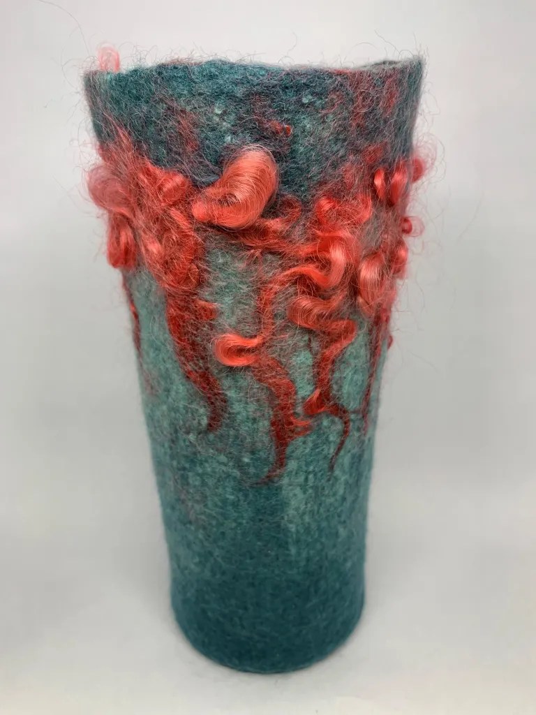
Felted vases and plant pots are also both unique and practical. Here are a few. I like that you can co-ordinate them to your décor, or to a specific plant or flower, or just go for colours and patterns you like.

https://feltingandfiberstudio.com/2022/03/15/9-vases-a-plant-pot/ for more information on how I made these.

And finally, here’s something that meets both last year’s challenge to complete some UFOs (un-finished objects) and this quarter’s challenge to make something that you can’t buy.  

Here’s a pair of earrings that I started making a while ago using hand-dyed 14.5 micron Merino wool. I incorporated the earring post into the felt and some black sequin fabric inside using resists. These were inspired by the work of Aniko Boros and Judit Pocs.

two tear drop shaped wet felted 3D earrings in marbled greys. One smaller with tear drop cut in front revealing black sequins inside. One larger with no cut
The sequin section is more sparkly than in the photo

As you can see, I got quite a long way along, but while I finished fulling the one on the left, I stopped with the right-hand one in the pre-felt stage. I’m not completely sure why: probably it wasn’t quite what I had in mind. But it surely can’t take more than about an hour to finish that one, so I’m promising myself here that I will complete that second earring. The world will be minus one small UFO.

I hope I’ve given you a few ideas about different ways of taking on the challenges.  How are people getting on with them? If you make something in response to these or any of our previous challenges, please do post your photos on the forum. We all love to see and be inspired by what other people are making.

In the meantime, wishing everyone a very ……

PEACEFUL

JOYFUL and

HEALTHY

A cute sleeping koala
koala
An emu with its mouth very wide which looks like it is laughing
emu
An echidna eating smooshed insect liquid with its very long tongue
echidna

…….. New Year

Coastal Felted Pictures

Coastal Felted Pictures

I had a few weeks of sales / exhibitions coming up and was rather low on felt pictures so I decided to go on a little picture-making binge.

First an oystercatcher. I’m particularly keen on square pictures but I know some people prefer rectangles, so last time I had a batch of box frames made for me by my friendly local framer, I ordered four large rectangular frames – two finished in oak & two white wood. (Frame size 84 x 64cm / 33 x 25”)

I’m afraid I didn’t take many ‘in progress’ shots of the oystercatcher.  I’d wet felted the bird’s body a little while ago. I then wet felted the background to fit the frame using a variety of pebble-coloured prefelts for the foreground, some incorporating bits of recycled silk scarves. The waves are merino wool with lots of small locks and some sort of tube of knitted yarn designed for scarf-making that I’d picked up in a charity shop.  The patches of sea foam are bits of cobweb prefelt and I also included some blue cobweb prefelt to suggest light reflected from the sky. These were added to two base layers of pewter-coloured merino with additions in green and mink.

I needle felted the bird into place then needle felted in the eye, beak and legs, using orange prefelt and hand-dyed fine merino wool.

I wasn’t sure what I’d put on the right-hand side of the picture.  I’d considered a second oystercatcher with its back to the sea but there wasn’t really enough room.  I live in Whitstable, in south east England – a town famous since Roman Empire times for its oysters – so thought oyster shells might work well for an oystercatcher.  I wet felted a pair of 3D oyster shells using bits of different recycled wool and silk yarn on the outside and some pearl fibre from World of Wool on the inside.  I like the pearl fibre as it adds a sheen and is presumably made from the insides of shells (i.e. mother-of-pearl) so it seemed appropriate.

I thought it needed another shell so cast about in my stock and found a wet felted mussel shell to add to the collection.  I messed around with the composition a little then needle felted them into place before framing. I now use sticky backed hook strips (like the hook half of Velcro) when framing felt – the hook strip attaches to the mount board and the felt is held in place by the little hooks. The felt can easily be removed without damage or residue if I need to move it or someone decides to reframe it.

Next up I made a very lightly felted cobweb prefelt to use in the next three pictures.

When making cobweb felt I tease out a piece of wool roving rather than laying out separate tufts of wool in a single direction. This is part way through the teasing-out process. I prefelt it very lightly – in fact it’s scarcely more than wet wool – so I can stretch it out as I apply it to a picture.

I then started on Summer Sea. Again a pewter-coloured merino base but with lots of other colours applied in wisps on the surface.

Then a layer of blue cobweb prefelt topped with some white cobweb.

Here’s the final picture ready for framing. I’m happy with this, even though the wisps of colour aren’t quite as visible as I’d have liked.  (64cm / 25” square)

Next picture is a single wave. I start with 4 layers of pewter merino for the sea area and two layers of natural white for the wave and beach.  In the past I’ve forgotten to take into account how much extra material goes onto the wave and beach. If I have 2 layers for the whole of the base, the sea part shrinks a lot more than the rest.

First I added some lighter grey/blue merino on the sea alongside some strips of darker blue cobweb prefelt. Then some cobweb prefelt in front of the wave to suggest water from a previous wave. Next I layered on broken baby alpaca top, mohair, silk hankies, wool locks and wool burrs to create the wave itself. I’ve also put a few strands of silk on top of some of the background waves and the wet-look front area to create sea foam.

Here it is from the side so you can see how high that wave is piled!

And here is the final picture.  I spent a while when it was dry picking up some of the wave elements with a broken felting needle to enhance the 3 dimensionality of the wave before framing it. (64cm / 25” square.)

4th and final picture was a smaller one (framed size 43cm / 17” square) called ‘Choppy Sea’.  Base layout is pewter with highlights in green and mink, with sections of blue cobweb prefelt and silk hankies for wave tops.

Here it’s felted and dry, sitting on top of its frame waiting to go in.

Again, I’ve used a broken felting needle to tease up the silk hankies that make the wave edges to enhance the depth.  And here is a view from a low angle to show the 3D.

So, that’s how I’ve been keeping myself busy recently.

To end with, a few shots of these pictures in situ in a gallery.

These pieces didn’t sell in this week-long exhibition but some older work did – which is a great result for me. I like to live a while with the new pictures so we get to know each other but prefer older things not to hang around for too long! However, the last week and a half I’ve been in the beach hut gallery in my local harbour and yesterday both the oystercatcher and the single wave found new homes, which made me do a couple of very happy ‘shop small’ dances.

If you sell your work do you also get that ‘I’m not ready to let it go’ versus – ‘ok, you need to find somewhere else to live’ feeling?

Ocean sunset continued

Ocean sunset continued

More work on the ocean sunset. I got a few orange locks from Bernadette. I believe they are mohair, but she can correct me in the comments if I am wrong. They were nice and shiny so they went with the silk well

The next thing to do was to wet felt it. I popped it into a large freezer bag and added a little water. I have never done this method before. Well, a little is relative, right? After getting it all wet I drained out the water so it wasn’t swimming. Then I pressed it and it was still floating so I squished more water out and drained it.

The silk kept moving, no matter how gentle I was, so it ended up a bit stringy and not all in the right place. I still like it but it needs some fiddling.

I got out a fine felting needle and started lifting and moving the silk and flattening the horizon. Horizons are not wavy except in high seas.

This is how far it is now.

I was thinking of a boat silhouette but I may go with a whale tail this time. maybe a bird floating nearby. I am not sure. It also needs some colours reflected in the water. I may add bits of silk or maybe some of the coloured sparkle powder. I may not wait for them. I am wondering if I should spray the picture with something if I use the powder. Maybe a spritz of hair spray? Has anyone done anything similar?

More waiting now. I did do another small fast project I will tell you about next time to give you a break and build suspense.

Second Quarter Challenge 2022 – I can’t do that

Second Quarter Challenge 2022 – I can’t do that

As soon as I saw what Lyn was setting as our next Challenge I thought “but I can’t do that”.  I have always stumbled when trying to understand Design because, although I can see pattern in a lot of things, I fail entirely in translating what I see into my work.  I am very literal in my thinking, and when I see abstract pieces (usually “modern” embroidery pieces) based on images of say, a broken brick, or the reflection in a window, or a rusty piece of metal, or a “fractal”, I think to myself “yes, very clever, but why?” and “what would I do with it?” and “I can’t see that on my wall” (and just occasionally “I wouldn’t give that house room!”).   This is why I tend to make my pictures or 3D sculptures as realistic as I can.

I was going to just not bother with this Challenge, and then I remembered that some years ago I had attended a course on Design – I had forgotten all about it and it is relevant to this Challenge.

In August 2015 the Association of Guilds of Weavers Spinners & Dyers included in it’s week long residential Summer School syllabus a course by Alison Daykin – “Design for the Terrified” and I was lucky enough to be allocated a place – most courses were usually over-subscribed.  Here is the introductory list of available courses from the brochure for you to drool over!

The course was described as offering “help to ‘painting and drawing challenged’ weavers, spinners, dyers, or other textile practitioners, in understanding Design and using this in their chosen medium”.  The brochure went on to say: “This course will provide simple, but effective guidelines in design, without the student feeling overwhelmed by theory. The tutor will also leave plenty of room for participants to express themselves in their chosen medium.

“By the course end students will have at least one sketchbook and understand the basics of: colour studies; textural studies; shape; line/stripes.

“Students are encouraged to make samples appropriate to their own textile skills. They may choose to bring their loom or wheel with them, or to develop further sketchbooks if they prefer.”

Frankly this description of the course frightened the life out of me and I nearly didn’t apply, not least because I would be foregoing the chance to take the offered very interesting felt making course. (It’s headline description was “… an ‘adventure with fibres and fabrics’, combining colour, texture and layering to produce felted fabrics for decorative purposes or garments” and that was what I was most interested in at the time.) However after exchanging a few emails with Alison, and reading the three blogs which she sent out about the course I decided to bite the bullet.
The first blog post puts emphasis on your “Inspiration” and resulted in a further flurry of emails with Alison, since I had no idea what it meant or what my “Inspiration” should be in this context. She basically said that I should pick a subject which I found really interesting. I was undecided whether to plump for trees, which seemed a very big subject, or sea shells – almost as big but of which I had recently started a collection. In the end I went with sea shells.

Sea Shell collection with Sea Urchin “
skeletons”

The second and third blog posts and a “round robin” email from Alison encouraged us to bring along as many different types of art media as we might be able to lay our hands on, including different types and colours of paper and “mark making” equipment. In addition we were asked to only bring one image of our inspiration, but as many copies of it as possible. (As I hadn’t been able to choose just one shell my image consisted of most of my collection, which also included sea urchin “skeletons”.) We would also need to take a notice board (if we hadn’t already made a mood board – “Er …. what’s one of them?”) so that we could pin up various bits and pieces as we went through the course. We would also need the equipment and materials required to make samples in our chosen technique. As I didn’t know which shell would be my inspiration the “materials” consisted of most of my stashes of fibres, fabric & yarns!
I’m sure you’ve all heard of the saying “everything but the kitchen sink” – very apt, my poor car was groaning when I set off with all this stuff plus clothes etc., and I had yet to fit in the friend I was giving a lift to, plus all her stuff and her walking aid. (She was still a bit frail after an illness.)

The Summer School was based at Moreton Morrell Agricultural College in Warwickshire, where (after we got lost twice on the way) I met Alison and the rest of the class members. There were weavers, spinners, an embroiderer and a felt maker – me.
Alison showed us her own work, and took us through her process for designing woven fabrics for specific purposes, showing us her mood boards and pictures of finished fabrics “in situ”. Here is a much abbreviated view of how she followed one inspiration from an image of ancient ruins to cloth samples.

She then started us off on our own design journey. Alison suggested to me that I should pick my favourite shell from the picture of my collection and make an enlarged drawing of the shell, both in monochrome and in colour and using different media. I had a go at this, although my drawing skills are minimal. This was before she had found that we would be able to have access to the college’s print facilities, where we could get photographs printed, and colour and monochrome photocopies made on a copier, which was capable of enlarging. We all made great use of this facility – zeroing in on just part of our inspiration image and having multiple copies made on different colour papers as well as plain white – which enabled us to speed up our progress through the stages of the design processes that Alison had mapped out for us.

One of the “tricks” which Alison showed us was to take two images, cut (or tear) them into strips (leaving one side of the paper still intact, and then to weave the two images.  This did produce some interesting results.

We also cut strips across an image and used this to reference yarn (in my case fibre) wraps. Using this method enabled us to achieve a colour swatch giving combinations, quantities and placement of harmonious colours.

Showing the progress from picture strip to felted swatch

Once we had all played around with these ideas for a day, we were encouraged to get on and start creating samples in our chosen techniques, keeping in mind how we might use the finished work. As I was interested in making felt for clothing and accessories, I had brought with me copies of designs from specific sewing patterns and tried to pick the patterns that would best suit. I had by this time branched out to using as inspiration two different Sea Urchin skeletons, one Cone shell (and when no-one was looking I did a bit of crochet based on the end of a Conch type shell).

As you can see, I’m still leaning towards the literal/representational side of designing.

Alison also encouraged us to take our cameras and go out around the college grounds and look for more inspirations for design. At this stage we had all got used to looking beyond the obvious and came up with some unusual images. This was the one I chose to do something with – don’t ask me why – it’s just a picture of the wood surround (and my toes) to a raised flower bed outside the portacabin which was our workshop, where we all congregated for coffee, snacks and chat.

Being full of enthusiasm for the project, I cut down the photograph to a corner and then cut out the image of part of the surround.

which I then had enlarged and with several copies started to develop the design

This is the design I finally ended up with.

There are five versions in this picture, the basic design on top with four colour changes of the small “pops” of colour.  And here is the jacket pattern and a tracing of the design.

The last day of the course was mainly taken up with visiting the rooms where the other courses had been taking place for a grand Show & Tell. To this end, we had packed up all our equipment and materials and set up our notice boards and work tables as displays of what we had been doing. Here are mine

And here are some of the displays of other class members’ work.  Not all of them I’m afraid, I had camera shake by then so I’ve only included the less blurred ones.

The whole Summer School experience was great, with evening entertainments, a fashion show, a display of entries for the Certificate of Achievement “exams”, a traders’ market (I spent too much money as usual) and a trip to Stratford Upon Avon for a tour of the Royal Shakespeare Company’s Theatre with a chance to see some of their costumes “up close and personal”. 

We inhabited a bubble, with little contact with the outside world.  (There wasn’t even a signal for our mobile phones, short of climbing a hill and standing in the middle of the road.)  A wonderful experience and I’ve enjoyed revisiting it.

I am afraid that by the time I got home again I reverted to type and have not made any fabrics, felted or woven, from any of the designs. I just did what I usually end up doing after returning from a workshop – I put everything away and forgot about it! So I still don’t have a 2nd Quarter Challenge piece to show you; though as a result of writing this post and after seeing some of the pieces which FFS members have posted, I do feel better about the possibility of designing from random observations and images.

I am looking forward to seeing what the next quarter’s Challenge will be.

Monstrous Felting Retreat

Monstrous Felting Retreat

A few weeks ago I experienced the delight that is the Auckland Fun Felter’s Retreat, 2 full days of felting bliss! 🙂

We were 13 like-minded ladies at a retreat centre, tucked away in a quiet and leafy corner of west Auckland, we had the entire centre all to ourselves and were blessed with some lovely weather.

Jenny, our organiser extraordinaire, asked if anyone would be willing to teach / lead a short workshop on Saturday morning. Due to the pandemic, I haven’t had the chance to teach face to face since 2019 so jumped at the chance and then immediately panicked that I had nothing to teach this incredibly creative and experienced group (most of the members have been felting at least as long as I have!).

After several weeks mulling it over and talking to other AFF members I settled on “animal textures in felt”, I thought this would lend itself to a series of pre-prepared samples that we could discuss the potential pitfalls and then each member could incorporate one or two into their own project. This group is so experienced I couldn’t imagine any of them wanting to waste their precious felting time watching me laying out fibre over a resist.

We all arrived on Friday afternoon, settled into our rooms and started playing with our fibres in the main hall. After talking to a few members I realised not everyone would be happy for me to share some samples and tips on how to achieve different effects, they wanted a project to follow…. my heart sank, I hadn’t planned for this, how was I going to come up with a project that included, fur, scales, eyes and locks before tomorrow morning?!!

So it was that Fugly was born….

A little pod critter, with eyes, scales on his back, a lambs tail and an unfortunate ear-hair problem – for the record I would never normally recommend trying to cram so many different techniques onto one item but now he is finished I do find Fugly quite endearing 🙂

To my surprise most of the group also made pods that incorporated most or all of the techniques and we ended up with a ?gaggle, ?fright, ?laughter <insert collective noun of your choice here> of funny little monsters:

A couple of members applied to techniques to small bags with great effect…

This weekend was such a success we agreed to do it all again in just 6 months time! 🙂

On the Swan

On the Swan

Recently, a local woman asked me to create a river view in felt for her. I created several watercolor sketches she could choose from so that we agreed on what the landscape would look like and what to include. The client lives on the Swan River here in Montana and decided she wanted a view similar to what she has behind her home.

After hand carding and blending colors, I started on the layout. I used a commercial prefelt background and mostly short fiber merino batts. Somehow, I wasn’t thinking correctly on shrinkage as I went with the idea that it would shrink 30%. But I forgot that I don’t normally full my wool paintings very hard as they don’t really need intense fulling.

I continued working down the picture laying out the distant trees, the river with the trees and mountains reflections and then into the foreground grass and lupines. At the same time I was laying out the big piece, I also laid out a smaller sample. That way I could try different options with final details and stitching. This shows the birch trees from silk paper that I was trying to decide upon. Luckily, I had made the birch tree silk paper several months ago at one of our local group meetings.

Here’s the small sample that I made. I tried the left tree trunk in prefelt and then used free motion machine stitching for the dark areas. The right tree trunk used silk paper which was painted for the dark areas. I also tried out some FME for the branches and the lupines. I didn’t feel that the FME was what I wanted for this piece and opted for the silk paper birch trunks. I had also used some brown/tan wool for the distant shoreline which was way too much if included in the original wet felting process. I ended up cutting out a portion of this sample so that the brown wool was showing much less. I then stitched the two pieces of the sample back together to give the feel of what I wanted in the large piece. This sample really saved me from making some big mistakes!

Here is what I had after wet felting. I had to full this piece very hard as the request was for a certain size. I don’t normally worry about size on my wet felted landscapes and I ended up cutting the edges because I had not figured the shrinkage correctly.

Next I started adding in needle felt details. I added more definition to the distant tress, added a shoreline and added some lines in the water to simulate movement.

Then I stitched some grass in the foreground and stitched down the silk paper tree trunks.

I continued on with details. I added some paint to the tree trunks, I couched down branches and added leaf details with needle felting. I added hand stitching in front of the trunks and some leaf details for the lupine.

Here’s a close up so you can see a bit of the detail in the foreground.

Then I found I already had enough green fabric that worked to finish the piece. My client is getting it framed with barn wood, so this is how I delivered the piece. And the wonderful thing is that she loved it. I’m so happy it worked out the way that she wanted.

Theatre Textiles Part 1

Theatre Textiles Part 1

After I had retired from full time work in 2006 I was finally able to join SNADS – our local amateur dramatic society. I live in a small market town in Dorset and SNADS was the main source of entertainment for our area at that time (as it had been since 1930, although newspaper archives indicate that it was around at least as early as 1883). I had seen most of the productions which they had put on since we moved there in 1999 and longed to join in, not only on stage, but behind the scenes. During any one year there are at least 4 productions – Pantomime in February, Spring Play in May, a Variety Show/Revue in the summer and the Autumn play in early October, and as soon as that was over, the round started again with preparations for the following year’s Panto.

We had a fantastic wardrobe mistress, but she needed help with costumes, especially at Panto time as there was so much to do.

My first foray into costume was to make a full head cat mask for the summer review. Two of our members were to sing Rossini’s Cat Duet and the director decided that it would be fun to have a disreputable tom cat watching them from the side-lines. I had recently learned to wet felt 3D items using a resist, so I made the mask from wet felted pieces and needle felted details. I didn’t want the actor’s eyes to show through and anyway, I needed to give the cat it’s proper “slit” irises. So I stitched into the eye holes a piece of doubled yellow organza and just painted the vertical slit. (It is quite possible to see what’s going on through organza if it is held close to your face.) How to give him a proper nose? I needled the correct shaped nose on the mask, then I painted on some artist’s gesso, let it dry and added some more. Gesso is textured so it was necessary to file the nose to make it a bit smoother, also the gesso is white, so I painted the nose with black enamel paint which I nicked from my husband’s paint store (he’s a model maker). After a couple of coats of that, Tom had a shiny(ish) black nose. Add some “bitten” ears and “wonky” whiskers and he was nearly done. The cat’s mouth was open – it allowed the actor to breathe and gave Tom naughty grin. Finally I gave him a pink tongue and white tips to his ears.

Disreputable Tom Cat

The next production that I was involved in was the pantomime Cinderella, written and directed by one of our members. I was asked by the wardrobe mistress if I would dress both the Fairy (“Fairy Nuff”) and Buttons’ dog, Beau. The director wasn’t quite clear about what kind of dog Beau should be, except that he was to be comic. So I did a sort of 3D needle felt sketch of the dog’s head as I saw it – black and white with one ear cocked.

“Sketch” for Buttons’ Dog

However I’d got it wrong – Beau was to be a black poodle. 

After some discussion with the wardrobe mistress, we decided that the actor would wear a black polo necked top, thick black tights and black gloves. I managed to find a piece of curly black faux fur to make a short jacket, with enough left over to make pompon for the top of the head and the end of the tail, the long dangly ears and wrist and ankle rings to simulate the correct style poodle cut. I was to make a full head mask. For this I made a wet felt hood using a resist and a further piece of flat felt incorporating some of the curly faux fur trimmed from the bought fabric. A lot of that moulted out though because it was nylon or polyester and very slippery. Enough was fixed in however to give the right effect.

I made a needle felted muzzle – again with the mouth open to reveal the red tongue and white teeth, and to allow the actor to breathe.  The nose I made in the same way as for the tom cat – shaped with the felting needle, gessoed and painted.  The muzzle was attached to the hood/face with stitching and felting needles.  Some of the flat felt was cut to represent the dog’s lips and attached by stitching and needle felting to the muzzle.  The “Disney-esque” eyes were again painted organza and were stitched on the inside of the mask. 

The ears and head pompon were also stitched on.  I added a piece of brown fabric and a belt buckle around the dog’s throat to simulate a collar and allow the mask to be firmly secured over the actor’s polo necked top.  I have worn this costume myself a couple of times in subsequent Carnival processions – great fun.

Beau

Since the actress cast for the part of Fairy Nuff had a figure which could easily cope with a glamourous costume, for the base I was given a basque that fitted her. She was to appear out of a compost heap at the edge of the stage, so I set to and made lots of autumn coloured leaf shapes – mainly oak – out of different brown bronze and gold metallic organzas. I sandwiched sparkly bits between layers of organza. I machined stitched around the edges and along the veins of each leaf and then cut out the shapes with a soldering iron. This sealed the edges and prevented fraying. Then, with the basque on a dressmaker’s dummy I attached large pieces of bronze organza for the tail, and then added the strategically placed leaves.

The wings were made from two lengths of flat wire (originally from a pop-up fabric laundry container) covered with more organza, this time creamy white but with sparkles and sequins added. These were attached to the back of the costume by stitching the wire to the shoulder straps of the basque and covering the join with some dark bronze/gold chiffon.

The crown was made from bronze Christmas decorations (that year bronze was in fashion over here – UK). I used bronze plastic icicles, some foil stars and some more organza leaves attached to a head band. I can’t remember what the wand tip was made from – possibly a bunch of tinsel.

I actually got a speaking part in this Panto – only a couple of lines but a step up from what I’d had before.
I don’t have a proper photo, this was before my husband had a digital camera, however I’ve managed to extract a clip from the video we had made of the show. It’s a bit fuzzy if enlarged but I think you can get the gist. I’m in the gold dress with my exclusive “Toilet Duck” perfume, and my punchline? “It drives the men Quackers!”

Guests at the Ball with “perfume”!

After this show, we had one final “adult” Revue and then we moved to where we are now based. Try this link it should show you the hall we left, Sturminster Hall, and eventually the Community and Arts building, The Exchange, which is now our home. https://stur-exchange.co.uk/about/
Unfortunately it seems that a second link, on the above page, may not yet be working – this is a new website in the process of being fully set up so here’s the brochure which was produced the year after it opened.

The Exchange Brochure 2008

The staircase balustrade is wrought iron made by a local craftsman and represents the river Stour which runs through our town. All the Rooms in The Exchange are named after rivers and streams running close by, and it is just beginning to open again to live theatre as well as community groups.

We at SNADS started off our return with an Adult Cabaret a couple of weeks ago, for once without a male Balloon Dance or a ladies Fan Dance, but there was a Pole Dance!

More about my exploits with SNADS (including an explanation of the picture of the wicked queen) later. Watch this space.

Connections: An Exhibition

Connections: An Exhibition

I’ve just taken down my work from a Made in Whitstable group exhibition at a local arts centre gallery so thought I’d tell you about the felt pieces I had in the exhibition.

Made in Whitstable is a loose affiliation of artists and makers who have a close connection to the town, on the coast in SE England.

With a diverse artistic group it’s not always easy to find a title that everyone is comfortable with. ‘Connections’ seemed to offer enough room for people to work with in their various styles and mediums.

This exhibition was postponed from Easter 2020 so it was great finally to get some work out there, and to catch up (albeit at a distance and in a mask) with people I haven’t seen for a long time.

As I’ve described in previous blogs, this year I’ve been learning from online workshops. I’ve long been interested in both seed heads and shells and these have both continued to feature in my recent work. Reflecting on this, I realise they are all forms of natural protective cases and although it’s not a snappy title, I decided it was a good ‘connections’ theme for me.

This is a picture I made specifically for the exhibition.

Recycling Oyster Shells: Turnstone at the Royal Native Oyster Stores, Whitstable

These photos show the oyster shells laid out, prefelt shells in a single sheet, then cut up and laid onto a background of white Norwegian batt (lower half) and tan Perendale batt (top half). There’s a recycled silk scarf laid over the tan batt layers to give the impression of a pebbled beach in the distance.

Layout for the turnstone, using a combination of merino wool and prefelt; fully felted turnstone and a trial with two birds. I decided to go for just one. I needle felted the turnstone into place then added the eye, beak, legs and a few feather details

I also made some smaller pictures along the shell & seed pod theme

Top left: mussel shell with recycled silk sea, cotton scrim wave foam and prefelt pebbles

Top right: Oyster shell with mixed wool and yarns and fabric barnacles on a recycled silk background

Bottom left: pink shell on a recycled silk beach with cotton scrim wave foam and mixed wool and silk fibre sea

Bottom centre: paper felt shell on recycled silk background

Bottom right: Corriedale, silk and yarn background with multiple-resist circles, hand stitching and a sycamore key

I also had various 3D shapes in the exhibition.

Left – based on a eucalyptus seed pod. I made this in a wonderful workshop by Gladys Paulus in November 2019. I covered that workshop in my first blog for the Felting and Fiber Forum. Various wool batts and mohair locks.

Top right – conker made in two parts (using the stem technique I learned from Gladys). Outer made from Perendale and Norwegian batts, inner is merino wool tops

Bottom right – based on a hazelnut, also made soon after Gladys’s workshop.

Here’s a poppy seed head I made this year after Fiona Duthie’s Fibre + Paper workshop. Mulberry paper is felted into the felt surface. The paper adds structure, folds and pleats well and can be drawn on / painted. I painted this with watercolours. I had to make the top separately so stitched it on. A local craftsman made the base; the pod is held on a piece of dowel attached to the base.

This nigella seed pod is also paper felt but made side-on with pre-felted ropes and thicker wool sections (not prefelted) to allow variable shrinkage (learned from Soosie Jobson). I had a reclaimed jarrah wood and dowel stand made for this.

Another paper felt shape, inspired by shells, with pleats and nobbles made as a result of Fiona Duthie’s workshop

And finally, I included a few plant holders and some earrings.

Here’s my display area – I did put the cards (bottom right) on a small table!

My display area

There were lots of good exhibitors. Here’s a small selection: top left fused glass by Irene Southon; middle left acrylics by Josephine Harvatt; bottom left watercolours by Sarah Louise Dunn showing local sites commissioned by Whitstable Museum to illustrate a map of the town; right, prints by Linda Karlsen. Work by Irene, Josephine, Sarah and Linda (Wearartworks) can all be found on social media like Instagram and Facebook. They and other exhibitors can also be found on Made in Whitstable’s Facebook and Instagram.

The footfall was rather disappointing and I would guess that sales were down on previous years, but it was really good to get some work out on show and to see what other people had been creating.