When I discovered felting in 2007, I finally found the creative outlet for which I had been searching. I love that the versatility of fiber allows me to “play” with a wide variety of materials including wool, silk, fabrics, yarns and threads. Creating one of a kind fiber art pieces to share with the world fulfills my creative passion.
I have had this idea on my to do list for a while so I was glad to give it a try. I have seen several different ideas of felting on a stick or piece of driftwood and wanted to give it a try. Then I am planning on adding further embroidery to give the “moss” more details.
I have a bunch of driftwood from my friend Deb so this is another way to use it. I pulled a bunch of different green wool from my stash and mixed it by hand. I suppose since this is all made from my stash, this qualifies for the 4th quarter challenge too!
I then used my hand carders to card the colors together but I didn’t want it to be a solid green. I just did a rough card to mix the greens slightly.
Then on to wrapping the wool around the end of the stick. I wrapped it diagonally with one layer, tacked it down with a bit of quick needle felting and then wrapped another layer in the opposite diagonal direction. I then began squeezing and rolling the stick around on a ridged surface before I wet it down getting some air out of the wool. I think if I had wet the stick first, that might have helped with wrapping the wool a bit tighter around the stick. I’ll try to keep that in my brain if I do this again.
Then I wet felted the wool by rubbing and then rolling the stick wrapped in a towel. I also did a bit of “bashing” the stick but had to be careful not to break off any of the wood bits. This is how it looks now. I am planning on adding a variety of hand stitching to give more texture. I also might cut back the felt in some areas to allow the wood to show through. I haven’t tried stitching on this type of surface so it might be a bit of challenge. But I’ll just give it a go and see how it turns out. Do you have any suggestions for particular stitches or how best to handle the stitching? I’d love to hear your thoughts.
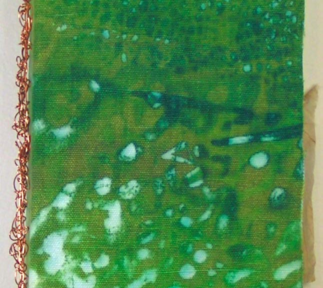
I told you in my last post that I had created a handmade book from deconstructed screen printed fabric and paper at our retreat. We followed this free tutorial by Jeanne Oliver. She has lots of free content on her site and some wonderful online classes. This is the book I created.
Here’s the book from the front. I used hemp canvas fabric that I had screen printed. The cover was constructed from the hemp canvas, book board and deconstructed screen printed paper.
The book was bound with pamphlet stitch and copper wire. I have created many books with pamphlet stitch but had never used wire. It was a bit tricky but I like the result, plus it’s very sturdy.
Here are the inside front cover (L) and inside back cover (R). I really love the organic feel of the screen printing. I made three signatures and used plaster on canvas pages plus additional pages of various papers and a bit of fabric. The main pages were created with canvas, plaster and gesso.
I didn’t take photos of all the page spreads but wanted to show a range of what was included in the book. The brown paper on the left is a “faux rice paper” that I made with tissue paper, walnut ink and matte medium. The photo on the right shows the inside of the copper wire binding.
These next photos shows a variety of papers that I used in addition to the plaster and canvas pages. Some were painted, some eco printed and I used some specialty rice papers as well.
Here are a few more page spreads. Besides paper, I also added in some hand dyed canvas as well. The book is fun in itself and could probably be left as is. But I want to make it into a book about the forest with sketches, additional ephemera related to trees and whatever else reminds me of the forest. So I will be working on this slowly and adding bits and pieces to it over time.
These are a few of the types of things that I might add. Paula kindly gave me the pieces with definitions and the labels. She has loads of ephemera and is very generous. Thanks Paula! You could easily make this type of book with felt as the cover fabric. I would love to see your results if you give it a try. You can submit photos of your work here and we will post them.
My local group had our annual retreat in early September. We go out to a lovely lodge on Little Bitterroot Lake and spend a couple of days creating and playing with art stuff. This photo is from sometime in the past. Sadly, this year, the air was full of smoke and you could barely see the mountains across the water. This year, our activities included deconstructed screen printing, making a book and creating some “faux” rice paper.
These are a few of the paper prints that I created. Deconstructed screen printing is done with a previously prepared screen in which the thickened dye has been left to dry. Then you use more thickened dye or plain print paste to release the dried dye from the screen. It is a serendipitous process and you are never sure what you will get in the final prints. I teach this process on felt in my online class.
I usually use fairly thick paper so that I can wash out the thickener that is left on the paper. That way I can do other processes on top of the paper without it running. These are similar to some of the papers that I used in my recent collage challenge.
One of the fun things about the paper is that you can end up using either side. The photo on the left shows the front side of the printed paper and the right photo is the back side.
Here are some of the fabric pieces that I printed. If you click on the individual photos, you can see what type of fabric I used. The little scraps on the top left photo are what was left over after I used a piece of printed hemp canvas for the cover of my book.
These prints are all on silk. The left side is silk habotai, the middle is silk organza and the right side photo is the silk organza layered over the habotai. You could print on many types of silk and this would be a great way to create your own fabric for using in nuno felting.
I will be using these for my upcoming classes that I am taking as backgrounds for stitching, in collages and wherever else suits my fancy.
Next time, I will show you the book that I created while at the retreat. It’s not entirely finished but you will be able to see the deconstructed screen printed canvas as the cover and a piece of printed paper as the inside covers.
Teri Berry has two online classes that start in a couple of weeks. Registration opens today so you can sign up now. Choose between learning how to make a felted concertina hat or a more complex felt bag.
The Felted Concertina Hat class teaches you the basic skills of making a concertina type felt hat. Then the course progresses into further variations of creating felt hats and Teri helps your ideas transform into hats that fit well and develop your own style. Read more about the class and register here.
Here are just a few of the hats created by students in Teri’s class. You can see more here.
Felted Bags online class will teach you how to use multiple resists, introduction of nuno felting into bag making, and learn how to make a closure entirely from wool. You will progress on to how to add internal pockets, a magnetic clasp, adjustable shoulder straps and take shaping the bag to the next level so the bag has a flat bottom and stands up on its own. Again, Teri will assist you in designing your own bag style and moving your skill level forward in felt making. Register now for the Felted Bags online class.
As always, our Wet Felting for Beginners online class is available. For more information about this class, click here. Learn the basics of wet felting, how to use embellishments, all about shrinkage and even how to blend wool by hand. So if you’re curious about wet felting, this is the course to get you started.
Whenever I post or talk to people about Gail Harker’s classes that I have taken, I get inquiries about whether or not her classes are available online. In the past, I have replied that most of the classes were not available entirely online. However, that has changed. Many of the classes I have taken are available to people who don’t live close enough to Washington state to attend in person classes. (I receive no remuneration for sharing information about Gail’s courses.)
Online Art and Design (previously known as Level 3) is now being offered in a four module format. Each module has 8 to 12 sessions. The sessions include online lessons as well as individual online tutorials with Gail. The first two modules are now available and classes will start in December. Click here for information about the first module. The second module is also being offered for students who have completed module one.
There is so much information in Gail’s art and design classes. Take a look at the course brochures (links at the end of this post) for a comprehensive explanation of the classes. I never took any art classes in school and was woefully short on art related knowledge when I first dipped my hands into the fiber art world. After taking Level 3 Art & Design, I was much more confident in my design skills and abilities to create my own compositions. I not only learned many techniques to express my creativity but also how to “see” as an artist does and to evaluate different compositions to understand what made the design more interesting, what needed to be edited and what additions a composition needed.
I can remember many times when if someone asked me if I could draw, I would say “No, I can’t draw, I’m not very creative.” Since taking Gail’s classes, I don’t hesitate to draw or paint or sketch or just try a new technique. I do something creative nearly every day and I am delighted to be taking Level 4 classes.
If you are interested in developing your own art and design skills, I would definitely recommend these classes. They are well worth the investment in yourself and in your growth as a creative person.
I had showed you this background a couple of post ago and was planning on free motion machine stitching a meadow scene.
I started with some background grasses in a couple of rows. If I do this again, I think I would stitch only one row and make the grasses longer.
Then I began couching down some different yarns with machine stitching.
I decided I should go ahead and stitch in the main focal flowers now so I wouldn’t fill up their space with grass. I couched down the green yarn for stems and then stitched heavily over a piece of purple felt for the flowers.
I decided the piece needed some more skinnier lines and some darker values. So I stitched the weedy bits in dark brown. These would have been easier if they were stitched before the larger grasses.
I then added some dark green weedy bits to the left hand side and couched some lighter green yarn down across the foreground. As you can see, I started looking at the piece in a “frame” since that was how it would be presented. What else did I need?
I decided the flowers needed some leaves so I used more of the same green yarn and pulled it apart a bit to get more width for the leaves. Was it finished? There was something bothering me on the right hand side. Do you see the brown grasses forming an ellipse? It seemed to draw my eye too much. So a bit of unstitching was necessary.
Now here it is after a bit of grass removal. Is it finished? I will leave it hanging on my design board for a few days to decide. I think I will add a bit of darkness to a couple of stems just right of center. Probably with a marker or a bit of paint.
My local art group doesn’t meet over the summer but we decided to do a collage challenge. The challenge was to create a collage every day using at most 3 pieces of paper and to only take 12 minutes to create the collage. I started the challenge on May 24th and reached my goal of 100 days on September 5th. The hardest issue I had with the challenge was the time restraint. Even with choosing my paper in advance, I had a hard time completing a collage in 12 minutes. So I ignored the time limit but tried to keep it under 30 minutes. No waffling around on how it went together.
Today, I’m showing you some of my favorite collages. There were some that turned out good and others, not so good. But it was a great way to work on color studies, composition and to do something creative to start out my day. If you would like to see all 100 collages, you can check them out on my Instagram account here:
In case you’re wondering, I have a huge plastic tub filled with paper that has been gelli printed, screen printed, hand painted, printed with block prints and whatever other techniques I have done in the past. So I have a wonderful source of papers to use for collage. If you are thinking of trying this challenge, you can use whatever paper sources you have. Many artists use magazine photos, open source online photos, wrapping papers, or whatever they have on hand.
So here are a few of my favorites. You can click on the photos to enlarge if you’d like to see them closer. I had a great time searching through my papers and creating a different collage every day.
Have you tried this type of daily challenge? We’d love to see your results and hear about the challenge. Let me know if you’d like to write a post about a challenge you have participated in.
And speaking of challenges, our third quarter challenge using botanicals as a theme is over at the end of this month. I think a few of my collages meet the guidelines! If you have something botanical to share for the challenge, please submit your photo here.
I have been thinking about creating a meadow themed landscape for a while so I decided to do a smaller piece (about 8″ x 10″) to try out some different ideas.
I found a nice background from my stash, that is nuno felted and has an upper plain felt portion. The only problem was it wasn’t 8″ wide. I want to be able to frame this piece with a standard frame so that it doesn’t have to have a custom frame. Looking through my boxes of felt pieces, I found the upper darker blue piece that would add enough to the total to get to 8″ in height. I think it is a screen printed piece but I really can’t remember. Some of the stuff in my stash is really old and needs to be used up.
Now to connect them together. The simplest plan was to needle felt them together. I made the light blue felt uneven by cutting it as I didn’t want to see a straight line working it’s way through. Then I needle felted the two together and this is the result.
Next, I looked through my many boxes of yarn bits. These are the ones that I decided to try. I want the scene to look like autumn grasses and seed heads. Some of the choices didn’t get used but now I needed to sample them and see how I wanted the stitching to look.
Luckily, I have more of the nuno background to use as a sample. This piece is about 3″ x 6″ as I only wanted to try out the different colors and practice a little free motion machine embroidery before I started on the main piece. I did put a thin interfacing on the back to stabilize the felt. I like most of these ideas for grasses and seed heads except for the one that looks almost white. I think I will skip using that one. The purple one on the far end is a small piece of purple felt that I stitched down with a lighter thread color. I’m only going to have a few flowers that are still blooming in this piece. The tentative name at this point is “Late Bloomers”. Hopefully, I will finish this before my next post.
Before I get started on my new nuno felted landscape, I wanted to share the changes that I made to First Light, which I posted about several weeks ago.
This is what it looked like on the last post. I had a comment from Ann B. that it lacked shadows. I had hemmed and hawed about adding shadows. I had convinced myself that the marks on the background could serve as shadows as it was a bit abstract. But the more I thought about it, the more I agreed with Ann that it was lacking something. So I decided I would audition shadows with sheer fabric. And once I saw it, I knew the shadows were necessary. How could I call it First Light if I ignored the shadows?
And here it is after adding shadows. What do you think? Better or worse? I would suggest that you don’t rush whether a piece is finished or not. It was a bit of a challenge stitching the shadows down after the piece was already laced to backing board 😉
Now on to this piece. It definitely had beautiful autumn colors, so I decided I would add some silver birch trees with their fall leaf color. You will notice that I turned this around so the darker area was closer to the top of the piece.
I cut out some tree trunks from silk paper that I had made a while ago in preparation for trees. I hand stitched these in place.
Then I added some branches so the leaves would have somewhere to live.
Next up, I needed some background foliage. I didn’t want it to be too dominant but just needed some texture. I decided to use nylon organza and then burn it back with a wood burning tool to give it a leafy feel. Then I stitched it in place. You can click on the photo to enlarge it so you can see the details better.
Next up was to cut out a bunch of leaf shapes in two colors of silk organza. I hand stitched these in place but the leaves were still too transparent and weren’t giving the effect I wanted to achieve.
I looked through my stash and had this bright yellow in silk habotai. That would perfect from a more opaque leaf. Once cut out, these leaves were stitched down. The photos above show the progression from left to right. Then, I put the piece up on the wall and studied it. That leaning tree trunk on the far left was bugging me. I didn’t like that it took your eye off the edge and it matched the same lean as the tree towards the middle. So I did a bit of unstitching and removed it.
So here is The First Leaf. I haven’t found the correct background fabric for it yet so I will have to go shopping for that. But that gives me a bit more time for it to hang in the studio and make sure that it is really finished!
The ‘Bachelor Buttons’ in the midst of setting up the exhibition. (Maureen couldn’t be there, but her beautiful work was.)
I recently completed Level 3 Advanced Studies in Experimental Stitch at the Gail Harker Creative Studies Center and we held an in-person and online exhibition. Gail’s courses are similar to City and Guilds in the UK. If you’re close to the Seattle area, there is a new session of Level 3 Stitch beginning in September. Just click on the link above for more information. (And you really don’t have to be that close, I live almost 600 miles away.)
Gail Harker’s Center
The Reception Area as You Enter the Exhibition
Ruth and Val Hanging Bobbie’s Artwork
Alana and Sheila Arranging Flowers
We had a busy few days setting up the exhibition and I thought you might like to see a few set up photos.
Photo by Gail Harker
During the Exhibition
During the Exhibition
And then it was the day of the exhibition. We had around 80 people attend over the two days in early July. It was wonderful to be able to see all the hard work accomplished by my fellow students and to share our work with other interested people.
I asked my fellow students if I could share their work and I’m happy that everyone agreed so that you can see some amazing fiber art. These are just a very few examples of their work produced in class.
Maureen Goldsmith
Maureen Goldsmith wasn’t able to come to the in-person exhibition but was able to send her wonderful work.
Covid Birds by Maureen is a framed wall hanging, you can see it in the first photo behind the group photo on the wall, to understand the size of the piece.
Bobbie’s lamp was created with machine and hand stitching and cut back applique. She found it interesting to work with light during this process as it changed the colors immensely when the light was turned on behind the fabric.
Alana Koehler was inspired by a row of bottles on her windowsill. As she worked through the process, she became intrigued with the difference between the hardness of glass and the translucent fabric that she ended up using in Ethereal Bottles.
And lastly, there is me. The Language of Trees is based on the concept that trees and other forest plants, have a vast communication network underground.
This wall hanging is mostly machine stitched on a dyed and painted background. The little bits of orange are words that I selected from tree poems to express the trees communicating with each other.
And because I have had a few people asking, I have also included my book about my dog Edgar. Here is “The Book of Edgar”.
Thanks to all my classmates for their camaraderie and support. Thanks to Gail and Penny for all your expert guidance and perseverance through a challenging three years of class.
This is the nuno background I showed a while back. Surprise, surprise, I created another landscape!
I started by adding some yellow orange sheer fabric to indicate the sky and then started auditioning trees cut from dyed silk organza. The trees went through many forms as I went along auditioning colors, sizes and placement.
I began making the foreground trees darker and the background trees lighter. It felt like the sun was coming from behind the hill. So I continued to emphasize that light perspective as I went along.
I was getting closer, adding more shadows and light.
Then I decided that the ground felt too light in the foreground. So I auditioned some sheer scarves in this area. These are light nylon scarves, you can see the edge hasn’t been removed here. Once the edge is cut off, the scarf can be easily frayed to blend into the background. Then on to stitching everything down.
Here’s the piece after I finished hand stitching the applique pieces in place for the trees. I also use a very small seed stitch to stitch down the sheer scarf pieces.
I decided I need something more in the foreground. The darker marks in the middle foreground reminded me of these plants. I think these are a type of wild orchid. This is a photo I took on one of my morning walks in the woods.
Here are the foreground plants. They are a combination of torn black tulle, couched yarns and pistol stitch in perle cottons.
I felt that the bottom of the orchids was a missing something so I added in some grasses which were couched down.
Here is the final piece on it’s fabric background. I have decided to call it First Light. The coloring in this last photo is the closest to the original. Now all it needs is framing.