My year in review; 2025
Belated Happy Solstice, Happy Hanukkah, and Merry Christmas. I hope you are still enjoying the festive season (hopefully with fibre and felt!)
What in the world did I get done this year? This should be interesting, since most of this year was a blur of post-surgery and anaesthetic recovery (including a few very tiny but powerful pain pills – I have no idea what they were, but I vaguely think they may have been green?), I am extremely curious to see if I actually got anything done this year. If you are curious too, let’s take a look!
January: I was trying to get organised after getting bad medical test results (I was never good at tests) and found out I was going to have another surgery at the end of the month. Then be out of commission for a lest a couple of months afterwards. I focused on getting notes ready for the other librarians to take over running the whole Guild library while I was out of commission. I also taught an inkle weaving workshop and took a workshop on tablet weaving.
A big cheer up was the felt Christmas card from Eleanor. I was not feeling well after diagnostic testing and dreading the impending surgery, so perfect arrival timing!
 1.1) Above the card from Eleanor, below was the card I sent to Eleanor
February 1st found me getting a drive home from the hospital rather than going to the Spin-in in Chesterville, Ontario. I have photos of the guild’s February meeting, and a few shots from other guild members of some of the things I missed. I know I was doing things, but I don’t remember any of it.
March was also a write-off. Anaesthetic and my brain are not friends. Luckily, Ann and Ann were running the library.
By April, one of the Librarian Anns had to step away from the library due to illness. I returned to work, a bit early, Glenn dropping me off and picking me up (driving was not an option yet), it was unfortunately shorter than normal hours. I was not really up to speed; it took all day just to keep the library running. I brought in felting to work on if I got my library work done, but no luck. 2.1) Moose head and moose landscape bag. At this point, it was still probably a good idea not to be doing a lot of stabbing with sharp objects.
April was not all frustrating and forgotten, I also got a surprise to cheer me up! I was watching Marie from Living felt on YouTube and had been commenting on her videos (not that I remembered doing so shortly after each episode), one of which was her store’s Birthday party. My anaesthetic brain at the time did not remember winning anything, so I was so happy and surprised when one of her deluxe wet felting kits arrived! Thanks, Marie, that really cheered me up! (and I got to try it for workshops much later in the year).
 2.2)A surprise from Living Felts on line Birthday party
May arrived, but was still mostly lost in the fog. I seem to have worked on the Library report, and I am pretty sure it was Glenn who drove us down to the fibre festival at Spencerville (south of Ottawa). I have vague memories that I was very sore getting there and back, but it was so nice to get out and see friends and look at shopping.
 3.1) Spencerville Fibre Festival
The long weekend in May (Friday to Sunday) was also CanGames and ghelting convention, which I have told you about before. I finally thought it might be safe to try a needle felting project. I may have been a bit premature in trying that. I somehow wound up with 6 fingers on one hand, and my under structure wrapping was not as tight as it should be.

 3.2-3.3) Oops, still can’t count!
 3.4) I somehow forgot we evicted another garage dweller. He was not impressed.
By June, I was feeling safer to make expensive decisions, but I limited it to one new camera. The old one was over 13 years old and was needing an upgrade. I still don’t really remember much unless I am looking at the photos from what I was up to. (I am glad I took pictures, or I would not remember doing anything!)
 4.1) new Nikon bird watching camera with sneaky powerful zoom feature.
 4.2) I continued to putter on the Mer-Boyfriend I was creating for the missing Miss Mer.
June 07, we tried to be in two places at once, the Lamsdown Fibre festival and the Dickonson Day Demo. I was doing shopping and photography, so no felting!
 4.3) Demo at Dickonson Day
 4.4) one of the vendors at Lamsdown
I had been trying to be careful about large perchasess with anesthetic-brain but I had been waiting for a stock tank of about this size to go on sale, so I bought it!
 4.5) A 75-gallon stock tank becomes a perfect fleece washing station.
With the addition of a fleece washing station in the side yard/Driveway, I got to work washing my way through the fleeces from the last couple of summers I had not felt up to working on.
 4.6) Glenn was very helpful working the spin dryer for me. (It’s an old RV hand washer/spin dryer)

 4.7-4.8)the Father’s Day weekend brings a blacksmithing workshop to the Glengarry Pioneer Museum in Dunvegan Onrario (East of Ottawa).
This was a great chance to do some photography of blacksmithing, and do a bit more felting, on the young mer I had started last month.
 4.9)There was also a demonstration of finishing a blanket by walking it. (walking is likely spelt differently when applied to a wet blanket thumped repeatedly on a table.)
July continued fleece washing, a bit at a time. I still seem to keep over-exerting myself, but I was feeling so far behind.
 5.1) 3 more bins to sort and wash.
 5.2) Trying to sort without a skirting table.
This month, I was back to the Glengarry Pioneer Museum to demo felting for them at their Fibre/Textile day.
 5.3) 3 of the Mer Family and their pets get out to a demo. It was an extremely hot day, and they seemed happy to be in the shade of the porch.
In August, the guild had a workshop on Cyanotype printing with felt. It was a half-day workshop and ran twice. I took lots of photos, which reminded me of playing with the enlarger in the dark room.
 6.1)Cyanoprinting with felt
August is also the time of the very large fibre festival Twist, about an hour away in Quebec. Glenn came with me as my attendant, and I filled in at the guild demo table with the Mer boyfriend I was working on. I missed getting a roll of garden felt, so I went back on Sunday. (We had the comfy duck sandwiches twice this year!)
 6.2) I missed out on this size, but got a piece from the big roll
There was more shopping, a bit closer to home, at Stash-it Fibre Festival in Kempville, Ontario (about a half hour south of Ottawa)
 6.3) I seem to be focused on fibre acquisition again; I see more fleece washing in my future.
September is Almonte Fiberfest (about half an hour west of the west end of Ottawa). I again did a “few” photos for the Mississippi Valley Textile Museum, who run the event (I hope I remembered to send them!)I am pretty sure I showed you the Booth Birds of a Feather by Catherine
 7.1) Birds of a Felter booth, at Almonte FiberFest
A few more fleeces to wash, the stock tank has been helpful, and fall seems to be holding off, so I may get these done before snowfall! One was a lovely but horribly dirty ram Shetland fleece
 7.2) big Shetland fleece (looks like he took a mud bath before shearing)
In October, I tried a wet felted Slipper workshop with Ann. I was sure I could make a simple pair of slippers in a day…. No, not quite yet, it seems, but I had lots of fun, stayed reasonably dry and am looking forward to finishing up the slippers when I have another burst of energy.
 8.1) Jan’s almost finished slippers at the end of Ann’s Class.
This month, I also spotted a cottage for sale, very close to my brother’s cottage. It had just had a major price drop, which might have potential, so worth taking a look at it. There is also a Quonset hut, on about an acre of land, not too far from that’s for sale too. One is better for spin and felt in’s the other would be better for blacksmithing. At least neither is attached to a piece of protected swamp, which was almost everything I have looked at for the last few years!
 8.2) cottage option
October is also the month for KanataCon Board game and Felting convention! They are the gaming convention with the HUGE second-hand game sale where I found a game about alpaca and one about lamas! I also got a lot more work done on the Mer-Boyfriend for Miss Mer.
 8.3) Fibre-related board games
 8.4) Glenn with the young Mer-sturgeon now with bumps!!
The day after the gaming/felting convention was a new Fibre festival in Merrikville Ontario. It was a nice drive down, fabulous weather for photographing the locks and a bit of good shopping.
 8.5) Fall colours and the locks at Merrickville
October was very busy. The day after Merrickville, we jumped in the car and headed for Toronto. We did a couple of shopping stops on the way to Oakville, but made it through all the Toronto Traffic! (Rush hour may be nearly 24 hours long!)
On Tuesday, Glenn and his brother did legal stuff, and I had a lovely day staring at architecture, photography, and felting.
 8.6) Happy with his hand upgrade
The next day, we stopped to shop with Monika at the Olive Sparrow on the way back to Ottawa. By the time we made it home, I felt wiped! I think I could have slept for at least a week.
November arrived, and it’s time for the Guild Sale and Exhibition. This event is run by Ann, and I help where I can. I am still noticing I am not back to full steam yet. I usually can photo-document the event as well as run the music and demo felting. Not this year, photos and music were all I could manage. Most of the signage and layouts could be updated from last year, so not as much pre-work either. We had a couple of good felters with booths this year. If you check back in the blog, you will see the photos.
 9.1) Ann showing how a drop spindle works (she is wearing her new name tag).
At the end of November, I ran the needle felted landscape workshop. We look at wool in a painterly approach. Ann took this workshop and has been having fun with mist and trees!
 9.2) November students and their felt Paintings (it looks like they had fun)
The next day, I got up nice and early and headed back to the guild. This time Ann was teaching, and I was the student. I was oddly tired (as if I had been very busy the day before) even before we started, but it was fun (and dangerous, you could get wet). I was able to get all the rolling done by the end of the class. I still need to do a bit more shaping to finish off, oh, the want of free time!! I am not sure where all the time goes, but I seem to be missing more of it this year than usual!!!
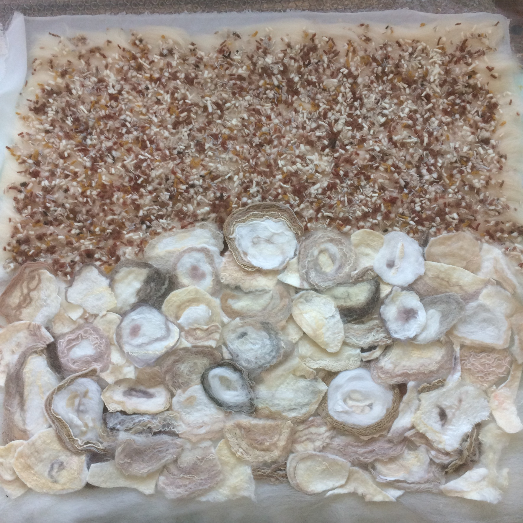
 9.3) My odd-shaped black hat in progress. (Can you guess what it will look like?)
It’s finally December, and I’m not sure I was ever going to make it to the end of the year, but I am happy I did. I had a workshop teaching beginning Inkle weaving, with great students again!
 9.4) Inkle weaving workshop
Inkle looms make straps, belts, trim, ties, and narrow woven band. It is usually woven where only the warp is showing, and usually the colour order of warping will determine your pattern. There is the option of Pickup (for which there are other better teachers), and I have taught the “inkle Two” class of many of the truly weird things you can weave on an inkle loom, but may or may not want to.
Throughout the past year, with the help of the other librarian, I have continued to volunteer at the guild library. I usually put in over 500 hours each year. I am about to get to the number crunching for the library year end data. (which, considering my lingering deterioration of math skills, may make this more of a challenge this year)
I am glad this year is almost behind me. It was interesting to see what I did, even if I didn’t remember doing it, until I saw the pictures. The heavy fog seemed to go on for more than the first half of the year, with mini fog attacks even up to recently (I will be able to add again any time I want to soon). I am going to try to avoid having any anaesthetic for as long as I can in hopes my spelling improves, and my little bit of math comes back!!
I am optimistic that you are as excited and hopeful about 2026, it’s a pleasant shape, for a number, so I am optimistic. I also have some wet felting to finish and some dry felting to find! Have fun and see you Next Year!!!