Now that i have sat and thought for a while, lets get back to felting fun!!
Monday, July 22nd: I have spent some time to consider, looked at my digitized progress felting, and have decided what to do next. The shadow is not deep enough in the sweatshirt, the spinning wheel needs more definition, and the suggestions of flowers, need more suggestions. Let’s see if I spot anything else I need to improve.
I had a short-staple small batt of yellow that had tiny nepps in it. I would not have had fun spinning it but a tiny pinch and a pair of embroidery scissors shortened the fibres even further and I got the nepps to look a bit more like yellow flowers.
17) adding the suggestion of yellow wildflowers
I had some carded top in white that I pulled off a staple length, then cut it into short bits about ¼ inch to maybe 1cm long. I then opened out the fibre creating more of a cobweb, that, was positioned where I wanted bits of white flowers to be.
18)Top cut with scissors
That’s a bit better….
19) the wisps of short fibers of white, teased into loose cobwebs to suggest many little white flowers amongst the various greens
The yellow is still a bit too intense…yellow can do that, I laid over a light spiders-web-whips of white. It’s getting better. Now let’s try to define the wheel a bit better.
20) I like the wheel, but let’s fix the pink top it had deeper shadows.
21) adjusting the Pink Sweatshirt
Hum. No the edges are too strong but I like the tonal values, they are a little darker looking in the photo than the felt.
The angles are not quite right yet, let me fix that. There is something odd with the shorts too, they’re too short.
22) a few more spots that need work
Ah, looking at the angle of the back is not right. I think it was a wisps that extended themselves a bit wider when I wasn’t watching. The angle at the elbow is also a bit off… I can fix that too. This may be due to not putting a reference frame in as I was transferring the image and the image slipped a bit as I was using the Sharpie. I will remember to use pins and more reference points next time.
Oh now I have to do a bit of touch-up on Ann’s Sheep so I will get back to this later this week.
Wednesday, July 24th:
Marie is having another woolly Wednesday on YouTube, so while I wait for that to start I am continuing to fix the sweatshirt, I am almost done, I think…
23) I have nudged the wool over a bit to fix the angle on the back and have lengthened the shorts. still fussing a bit with the hint of flowers too. the sweatshirt looks much better, I’m almost there.
Hum, still missing the highlights
24) fixed the highlights on the sweatshirt and I think I may have it to my liking.
That’s close I think I should look at the picture in a mat.
25) adding mat and frame floating the felt by pressure so I can assess it. Drat! bits of black flecks on mat!
The frame is lint-ing bits of black paint onto the mat, the Yellow arrows show specks on the mat from the frame paint chips. they were very obvious to me in person and they will annoy me if I leave them (13 years of picture framing coming back to haunt me!!!) I will take it apart and clean it again.
Yes, I think that’s better let me think about it for a bit but I may be done!
26) re-matted with a cleaner mat.
I will look into a better mat. it’s a standard size so it should not cost the price of a full sheet of mat board for an 8×10 mat. I wonder if I can find a piece of acid-free 2py to go with it?
I am going to leave it in this mat and frame for a bit and see if it still feels finished.
I wonder if Maureen will recognize the picture! I am so glad she posted it! You never know where you will see an image or idea that inspire you.
In December I was trying to supply lots of different places with felt things. In truth, I was a bit over-stretched. I decided to focus on making plant holders, with a few tea light holders and a couple of vases. Oh, and some cards. Here’s an overview of the things I made.
PLANT POTS AND VASES
First I made four plant pot covers from merino wool and silk pre-felt and incorporating different pieces of vintage lace
Strips of vintage lace laid verticallyVintage lace flowersTatted flowers from a vintage dressing table setA broad strip of vintage lace with textured flowersPlant pot covers with different types of recycled vintage lace
Next a couple of vases, also with a pre-felt base
Strip of broad vintage laceRecycled crochet pansiesThe left-hand one works both as a vase and a large tea light holder. For the vase on the right, I attached the pansies to the felt by felting over the strings that joined the flowers. I had to add a couple of stitches to the flowers on either end to secure them as there wasn’t any string to work with
On to some plant pot holders. When cutting the resist out of the vessel, I use the smallest hole I can that will allow me to fit the plant and its pot inside. All of these have a water proof plant pot holder inside, plus the plastic pot with drainage holes that the plants are supplied in. I like to start by looking at a plant and ‘asking’ it what sort of pot cover it might like.
A festive plant pot holder with green merino and red locks reflecting the leaf coloursA large nuno felted plant pot holderLayout of the under-side of the vesselLayout of the top of the vesselTop view finished pot holderSide view of finished plant pot holderRecycled silk from a very sheer silk beach dress I found in a £1 charity shop bargain binNesting bowls inside each otherNesting bowls separated out
These nesting bowls were made using a carded merino and silk batt and are very lightweight
A display of my work in Creek Creative gallery, Faversham
One of the galleries where my work was part of a month-long Christmas local makers market
PICTURES
Now we’re into the new year and I really have to focus on making some pictures. I mentioned at the end of my last blog that I’m delighted to have the opportunity to fill the walls of a lovely local Michelin starred pub / restaurant (The Sportsman in Seasalter) with felt pictures for 6 weeks in April / May this year. The ‘fill’ bit is something of a challenge. I tend to make enough work as I go along for my normal sales and exhibitions. Making an extra 35 to 40 wet felted pictures for this exhibition will take a lot of work. I’m finding the prospect of making all those pictures both exciting and rather daunting.
In preparation for the picture making, in November I ordered 2 batches of solid beach handmade frames from my lovely local frame maker: 10 at 63 x 63cm (approximately 25 x 25 inches) and 10 at 35 x 35 cm (approximately 14 x 14 ins). I will have to order more soon but I thought this would give me a good start. I had some serious studio-tidying to do last week before I set about the pictures… and finally I was ready to start. Where to begin?
First I made a ‘big wave’ picture for one of the larger frames. I say ‘big wave’ in inverted commas as the waves round where I live are generally very small so we’re not talking surfing potential. I’m endlessly intrigued by wave and sea patterns and have made this type of picture several times before. They always end up looking very different. I’ve taken lots of reference photos such as this one……
Example of a wave reference photo
…..that I use as a starting point.
Here’s the layout using lots of colours of (mostly) merino wool for the water; merino and kid mohair top, silk hankies, mohair and sheep locks and some vintage lace scraps for the wave; and hand-made pre-felt cut into pebble shapes for the beach. These were laid on 4 layers of merino for the base. I’m not really sure why I did 4 layers – it makes a lovely firm base but it’s a lot harder work to felt than 2 layers and as this is going behind glass, it was a bit over-kill. I’ll try not to do that again.
Once it was felted and dry, I used a small metal tool to pick up some sections of wave, to make it more 3D. Here’s the final picture and the picture sitting on top of its frame, waiting for me to get round to framing it.
Finished picture ‘ blue sea, big wave’Picture lying on top of its frame
I’ve worked on this for more than 12 hours spread over 4 days, not including making and cutting the pre-felt pebbles, which must have taken another couple of hours, and I’ve still got the framing to do. I’m very conscious of how many pictures I’ve got to make, so I decided to go smaller and quicker for the next 3.
One of the ways I can speed things up is to use recycled silk fabric to provide the pattern (and texture) for the water and the beach. As an avid buyer of silk scarves from charity shops, I have 2 huge bins of material to rummage through and upcycle.
Picture two – which I’ll call leopard print – I chose a sheer leopard print scarf for the beach and a small blue striped one for the water. Because the blue scarf is not very wide, I have to join two pieces of fabric. To reduce the visibility of the join, I first cut into one of the pieces so that the join would be staggered. You can see it in the layout but hardly at all by the time it’s fully felted.
Joining the silk picture layoutfinished picture finished picture sitting in its framePicture two – leopard print wave
I’m reasonably happy with this, though I think the wave is a bit too solid-looking.
Picture three – ‘dark blue sea’ – I go with a rather lovely dark blue patterned scarf for the water and a pale patterned beige one for the beach.
layoutfinished picture Picture three – dark blue sea wave
Again, reasonably happy with this. I like the sea effect and the less solid wave but the blue cobweb felt strip I put in front of the wave to look like the remains of a previous wave is a bit dense and straight.
Picture four – ‘reversible silk’ – I’m rummaging around for a different piece of silk to use for the water. I find one I like but I’m not sure quite how it will felt. It’s also reversible and I’m not sure which side to use. I decided to make a very small sample to see how it felts and it occurs to me also to see what happens if I cut strips to alternate the two sides of the fabric.
Here’s the sample layout. I’ve run out of merino wool in this pewter colour but fortunately have some Corriedale. I felted it very quickly and forgot to take a picture of the finished sample but it was enough for me to conclude it felted well and it was worth trying the reversed strips thing.
Quick sample layout to test the silk and laying out in strips
The beach fabric is also a little different – with a bigger and higher contrast pattern.
Here’s the layout and near-final picture. I say near-final as I only finished fulling it yesterday afternoon. It’s still damp (I think the silk will become a little lighter and shinier when fully dry) and I haven’t yet picked up any of the fibres in the wave.
Reversible silk sea big wave layoutReversible silk big wave near final picture – not quite dry
This is my favourite actual wave so far – I definitely like the variation in colour and greater impression of transparency. I’m pleased with the way the cut up silk worked for the water too. I’m not yet decided about the beach pattern – interesting or too much?
And finally, a photo of the large and a small picture side-by-side, so you can get some idea of scale
I’m framing the three small ones without glass and the large one with. People react differently to this. Some like to see (and feel) the texture and not have the reflections you get with glass. Others worry about dust. A few (me included) worry about moths. Most of the pictures will be behind glass but a few won’t. I’ll review this as I go along
By the time I write again in March, I should have lots more pictures made. Wish me luck! I will be making some large ones with sea birds but these take so long, I’ve decided to make some less complex ones first to see how long I’ve got to spend on the most time-consuming ones. I’m having to step-up my levels of planning and organising to try to make sure I have enough work to fill the venue.
Happy new year everyone. I hope it’s full of joy, peace and creativity.
This year we all decided to do a Christmas card exchange within the Felting and Fibre Studio group. It is just so lovely to make for another creative! It’s a bit frightening too as I wanted to give it my all. I also thought it might be a nice time to try something new and experiment – no personal pressure at all! I was so excited to be partnered with Leonor who I know has received her card at this point.
So, I put my thinking cap on. My first attempt was, and I am being perfectly honest here, an unmitigated disaster and the memory is probably best confined to the bin in which it quickly landed. So it was time to move on and put the thinking cap back on.
Okay so, by way of background. I had a poinsettia plant which I managed by some miracle to keep alive for about 5 years. I will quickly add that this had nothing to do with green fingers, it just liked its position in my sun room with my orchids as companions (again the orchids like the room). This summer the poinsettia developed a honey fungal disease which is a total disaster if it hits orchids so we had to part ways. I managed to stem the spread of the disease and the orchids are safe for now.
As a tribute to that most beautiful poinsettia, I thought it could be my focus for the card exchange. I wanted mixed media so I felted each petal, then I did some free motion embroidery on each one. I hand sewed it onto a felted backing and added hand dyed stamens to the centre. It was then mounted on the Christmas card. It was a little too big for the card so I decided to mount it in a frame before posting it off. The postal service can be a bit dodgy but I am pleased it worked on this occasion. From Leonor’s message to me, I think she likes her card and I have made more since.
Here is a little slide show of the highlights of my process. Sorry, I forgot to photograph the hand sewing so you will have to use your imagination for that part. Some of the photos are slightly distorted so apologies for that too.
I laid out merino and viscose for the petals
Wetting down the petals
The rolling stage for the petals
I dried the petals on a baking rack
I prepared the petals for free motion embroidery. I started with tear away stabiliser but it was proving difficult to get all the bits of paper out of the sewing!
I changed across to Solvy for the machine embroidery
It only takes a few seconds to dissolve the Solvy
Dissolving the solvy
Nearly there!
The template was actually a circle. The photo is distorted
The base, again a circle
Here is the finished Poinsettia after I hand sewed it onto the base
As the finished flower was a bit too big for the card, I mounted both in a frame.
Here’s a close up of the stitching and the stamens which I hand painted
This was a fun make with a bit of learning thrown in for good measure. You might like to make some too. If you do, I would love to see it! Also if you have any questions on the making just pop them in the comments section and I will be glad to answer them!
Wishing you peace, love good health and happiness and, of course lots of creativity over the Festive Season and for 2024!
We have three public houses in Sturminster Newton (at one time there were 11 in our small market town!) and The Bull Tavern is one of the oldest. The building consists mainly of a 3 roomed 17th Century cottage with an attic room, built of old timber infilled with wattle and daub. Some additions were made in the 18th Century. Records show that the cottage was definitely an alehouse by the late 1700s. Apparently there was a slaughter house at the rear and a Pound where straying animals were kept until collected – upon payment of a fee of 1 shilling (which must have been a fortune when you consider that a married man’s weekly wages at the Town’s Workhouse were all of 9 shillings and a single man’s only 6). Part of the C18th additions was a stable block (which eventually became a skittle alley and later part of the restaurant of the pub). It is rumoured that the horses stabled there were used to help get carriages and carts up the adjoining steep hill leading to Sturminster Common and the small community of Broad Oak.
About 18 months ago, after our then favourite landlords moved from the White Horse Inn in Hinton St Mary, the pub was closed for refurbishment. Hinton is a village about 1.25 miles away, where the Pitt-Rivers manor house is situated. We used to walk there 3 times a week – our exercise with benefits – but since the benefits had disappeared we decided to patronise The Bull – for our exercise of course. The only trouble with that was that it’s uphill on the way home whereas it was down hill from the White Horse.
During that time we had come to enjoy the chats with Marianne and Lance, the Bull’s managers. Lance being the very good chef, and Marianne “Front of House”. Early in January 2021, they announced that on Christmas Day they had got engaged.
One of my felt paintings – commissioned by a mutual friend – had been given to the White Horse landlords as a wedding present a few years ago, and Graham, my husband, suggested that I do something similar as a wedding present for Lance and Marianne.
My interpretation of an early image of The White Horse, Hinton St Mary
Although The Bull itself is a very interesting building, I wondered if I should do a picture of an actual bull for them. No date had been set for the wedding at that time, but I thought I should at least start collecting reference pictures, both of the pub itself, including some of their Pub sign and of some animals. I thought about breeds that might have been around in the 16th Century – White Park Cattle and black Gloucesters; and also looked at Herefords since that was the breed on the Pub sign.
The Bull Tavern and it’s sign
Gloucester and Park White Bulls
3 Hereford Bulls. I eventually picked the one at top left.
In the end I decided on a Hereford bull. After a lot of thought and manipulation of pictures, and also starting on a background field for the bull to stand in, I still could not come up with a layout that I was happy with. One idea was to surround the image of the bull with cameo pictures of nearby local landmarks – the water mill and the mediaeval bridge – with perhaps an image of the pub itself as well.
Initial composite picture
Second go at composite picture
Then, just after Christmas 2022, Marianne said that they had set the date for the wedding – 10th June 2023. Now I had to get my ideas together and get on with it. The picture would need to be simplified if I was going to get it done and framed in time.
It was about then that my picture of the horse on the hillside in Devon was finished and it occurred to me that I could use a similar method of producing a figure with more depth.
Detail from my Glorious Devon picture showing the horse added to the finished landscape.
I finally decided upon a cameo type picture of the bull’s head and shoulders and I would use the background which I had made back at the beginning of this saga. I would paint (with wool) the shoulders and neck and outline of the head on to a piece of flat wet felted core fibres. With a separate face and ears, and a further separate set of horns and the nose on another piece. I would cut all of the pieces from the backing when these were substantially finished. I would fix the torso and neck onto the original background and layer on the face and ears, horns and nose, then I would do the final titivating and framing. I made a start and here are the initial progress pictures:
This slideshow requires JavaScript.
As I said earlier, it was intended that this picture would be a wedding present for Lance and Marianne, but at the beginning of April this year, they told us that, because of various unforeseen difficulties arising out of successive pandemic lockdowns (which included them catching Covid between lockdowns so having to shut the pub again) they had decided to give up the tenancy of the pub. They had obtained a job, with accommodation, managing a Touring Caravan Park in Cornwall. Marianne was leaving almost immediately and Lance would stay on for a couple of weeks, with his last trading day on the 19th April. So the picture was going to have to be a leaving present.
That caused a bit of a panic at home as you can imagine, so I had to get my head down and finish it NOW! These were the final steps;
This slideshow requires JavaScript.
I managed to finish the picture and, with Graham’s help, I mounted it in a deep box frame in time to hand it over to Lance on the 19th, when we went in for a final lunchtime meal.
So here’s the completed and framed picture – my entry for the 2023 Third Quarter Challenge – Something Special About Our Town.
Looking back at this link, I realise I sold the sea picture I used as the blog header this week. Happy times! A couple of people asked in the comments if I’d also show how I’ve made beaches, so here we go.
The beaches where I live are mainly pebbles, but there are sandy beaches a little to the east and I’ve used both types of beach in my pictures.
Whitstable West Beach: the pebble beach at the bottom of my road
Here’s a picture of two Sanderlings at Minnis Bay: a lovely sandy beach with chalk rocks embedded in places in the sand.I’m starting with this as it was an early picture and the first time I thought of using a blue cobweb felt overlay to represent a wet beach reflecting the sky. It’s a technique I like and use quite a lot.
Layout for and final picture “2 Sanderlings, Minnis Bay”
There’s a pewter-coloured base for the sand and light prefelted sections and silk fabric pieces for the chalk with a bit of darker shading around them
Here’s another Sanderlings picture, also at Minnis Bay. This time I’ve used a few different sandy shades to add the idea of shade and texture in the sand.
3 Sanderlings, Minnis Bay
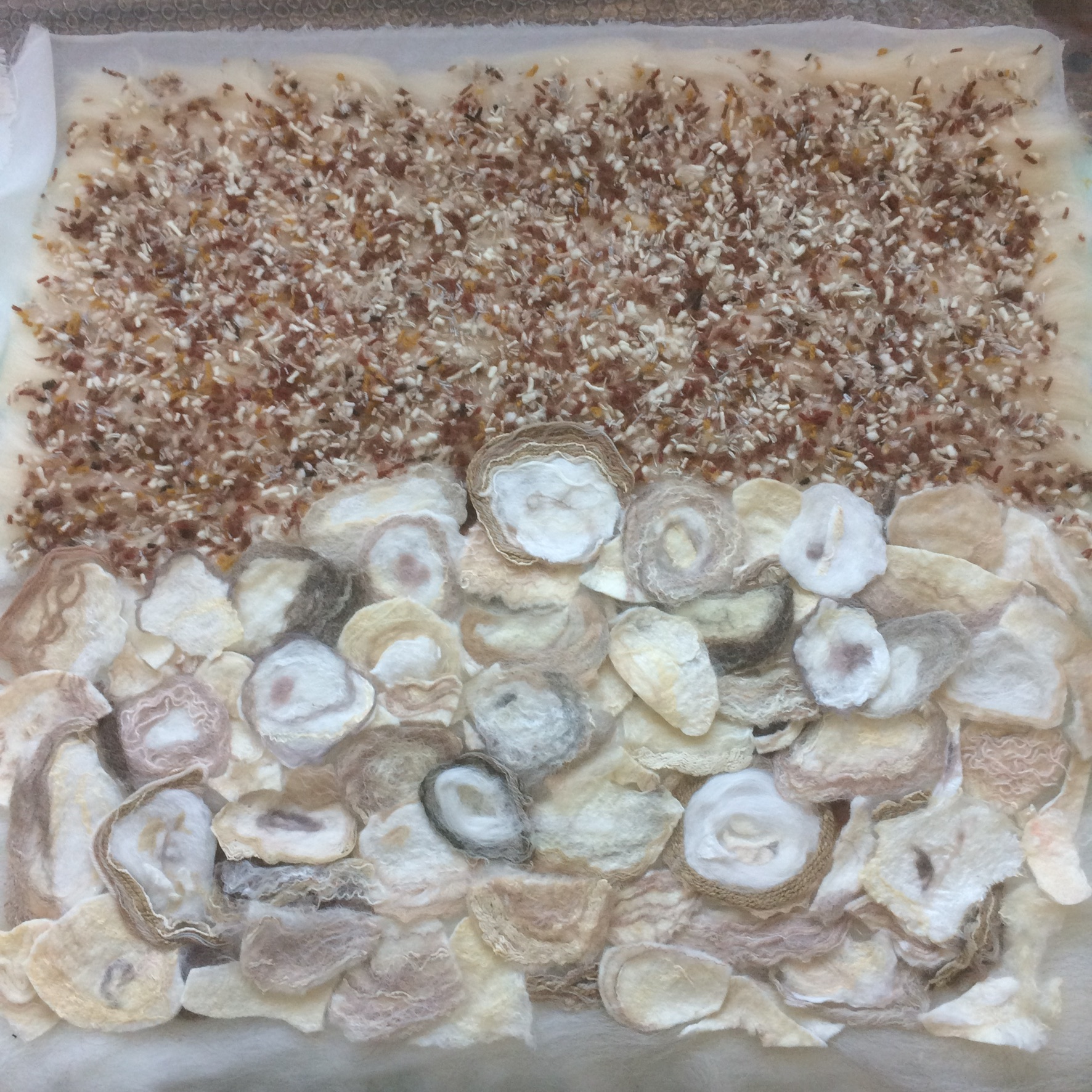
Pebble and shell beaches are more common in my pictures as this is what I see when I walk near home. There are quite a lot of variables in how I create them. Some choices are for ‘artistic’ reasons (how do I want this to look and feel?), some for experimental reasons (what would happen if?) and some are entirely pragmatic (what suitable bits of prefelt and felt offcuts do I have kicking around at the moment?).
This is a Big Wave picture that is now owned by a friend of mine. Here I have cut up felt and pre-felt into pebble shapes and put them on a base of several layers of sandy coloured wool tops. I then laid a bit of blue cobweb prefelt and silk over the pebbles nearest to the wave to give the impression of the remains of a previous wave over the pebbles before wet felting everything together
This is a similar picture where I’ve added more patterned silk scraps (recycled charity shop scarves) which are topped with wisps of wool to help them felt in.
Here I’ve taken a different approach. Whitstable is on the north Kent coast of the UK. It’s famous for oysters and has a very long history of oyster catching and farming. Empty oyster shells are piled up on the beach next to a local restaurant to be reused for farmed oysters. When it’s quiet, turnstones pick over the shells, ferreting out bits of left-behind oyster. I love the turnstones! You can see one in action in this video and hopefully see where they get their name from.
Turnstone picking over the oyster shells
I’ve made a few turnstone pictures. In this one I prefelted lots of oyster shells for the foreground then snipped up loads of different coloured tapestry wool for the beach as I wanted a more distant background impression rather than individual pebbles. The tapestry wool is all from charity shops: I really like recycling old and second hand materials.
It took a surprisingly long time to snip all that wool into a large plastic washing up bowl ready to mix it up and lay it out on top of sandy wool layers. It also made a bit of a mess as the felting threw up lots of loose wool strands because the fibres were very short.
“Turnstone Dining at the Royal Native Oyster Stores”
Another experimental approach was a picture I made earlier this year using pieces of recycled silk (cut from charity shop scarves, of course) on top of a couple of layers of wool tops with some wisps of wool on top for colour and to help attach the silk. This gives a different feel – more impressionistic – but still (I hope!) the impression of a pebble beach.
This penguin picture was a commission. Unusually I was working from someone else’s photo rather than my own observations and pictures. By necessity the felt picture is similar to the original photo (though I had to give the penguin on the right a proper head!). I custom made various sheets of light grey pebbly prefelt which I cut up to make this beach as there’s quite a lot of it so I couldn’t just rely on scraps.
And finally, I think this is my favourite beach so far (maybe apart from the oyster shells). It includes several of the techniques I’ve described. I pre-made some shell shapes and used prefelt pieces for pebbles. There’s lots of silk too – I think I may have put down a whole sheet of silk on top of wool layers then added the rest on top of the silk. This gorgeous ringed plover was standing on a shingle spit that juts into the sea just along from my house and I felt this was a good representation of that particular terrain.
Do you have a favourite? Or anything you don’t think really worked? I’d love to hear your views.
I made my first felted picture maybe 8 years ago. It’s a seascape with a curlew based on a scene I’d photographed. I realise now I haven’t ever completely moved away from the sea and the birds in my felt making. The picture is still hanging on my living room wall, though it’s not really my favourite. I can see too much that I’d want to change.
Looking at the dark water I see I included strips of ribbon as well as nepps, locks and some non-wool fibres – probably bamboo. A little while later I made a second curlew which I much preferred. In this one the sea is slightly more abstract with silk hankies representing sea foam.
Second Curlew
I live by the coast and seem always to return to the theme of water – specifically the sea and even more specifically the water near where I live, some of which is technically an estuary: the mouth of the river Thames. I’ve been looking recently at how I’ve tried to represent the sea in felt, then trying out some new water experiments.
In my last guest blog I showed how I made the watery background to my dark-bellied Brent goose. Here’s a reminder
This technique of laying cobweb pre-felt on top of base layers was something I worked out for myself and often use as I really like the effect
The first picture, ‘Winter Sea’ I made entirely using this technique. For the second picture ‘Big Wave 3’ I used straightforward tufts of different coloured wool for the darker water but a cobweb strip in front of the wave to suggest water from a previous wave.
‘Wide Sea Pattern’
For ‘Wide Sea Pattern’ I’ve added some silk fibres to enhance the foamy effect.
I’ve also tried nuno felted seas using large pieces of fabric. I’ve made two pictures of a lovely little ringed plover I watched a short distance from my house.
In the left picture I used a UK charity shop wool scarf that already had a crimp. I ran pewter-coloured merino wool on the back in only one direction to enhance the crimp, which I hope gives a distant wave-like pattern. In the one on the right I used some very dense silk (from a US thrift store sarong) which I only partially felted in as I wanted to keep as much as possible of the sarong’s watery pattern (also, the silk was VERY dense!).
Thinking about how to represent sea patterns, I have spent a little time recently looking at photos and videos of how people do this when drawing or painting the sea, and wondering if I could use some of these ways of looking at and representing sea water in wet felt making.
Experiment one: I laid out two pewter merino layers then a fine horizontal layer of blues, which I pushed apart with 2 pencils hoping to evoke a choppy sea. Then, I suppose because I thought the darker tones may get lost, I added some more dark wool into the gaps.
I ended up with something that looked very flat – perhaps like dappled water but not what I had in mind. I wish I was more strict in sticking to my original intentions: I think it would have been better without the dark wool I added at the end. Maybe I’ll come back to that in the future and do the experiment properly.
Experiment two: Estuary Water. Next I wanted to experiment with the dark colour of the water. Out came the trusty drum carder and I blended pewter, beige and green wools which I laid horizontally on a vertical layer of mixed pewter and beige. I made a single layer of mixed blue prefelt that I pulled apart and laid on the top.
I call the result ‘Estuary Water’ as there’s often a lot of muddy sediment in the estuary which gives it an opaque, brown look. I like it but haven’t decided what to do with it yet – its dimensions don’t fit any standard canvases or frames. Maybe I’ll use it as the background to something else.
Experiment three: I decided to made some smaller felt pictures that were just sewn onto stretched painters’ canvases rather than being framed behind glass. Focussing on the sea water: this time I snipped into the prefelt blue layer with scissors after I’d laid it on the background.
I like this effect and could maybe take it a bit further in the future: make some bigger cuts or more of them. I stitched these onto pre-stretched canvases that are slightly smaller than the felt so the canvases aren’t visible when looking head on.
Experiment four: Harbour Water. I took a photo of the water in the harbour a few months ago that I found interesting and wanted to investigate in felt.
‘Harbour Water’ Photograph
I’ve thought for a while I’d like to blend just two colours with each other and black and white and this seemed like a good opportunity. I used the drum carder to blend duck egg and teal merino wool with charcoal grey and natural white in various proportions.
I then made prefelts which I cut up and placed on a background of teal (1st, vertical layer) and duck egg (2nd, horizontal layer)
Quite interesting but I liked it a lot better before I’d felted it. I had a second go, using a piece of the duck egg prefelt as the base, which I like slightly better.
I like the shimmery water better than the round sections, which are a bit too round. Again, I’ve stitched the pieces of felt onto smaller canvases so they can hang but appear to be floating. I will look at them for a while until I decide how and if to develop the ideas further.
Experiment five: Choppy Whitstable Waves. In July a customer asked me to make her a picture similar to one I had but in a smaller size. I tried to use some of the things I’d seen in videos of how to paint water using acrylics and adapt them to my local sea colours and patterns and the medium of wet felting. I laid out darker ‘windows’ at the front of the waves with some water being pulled upwards by the wave (with the top fibre running upwards) then blue sky reflections made from cobweb prefelt sitting behind the wave foam.
I feel this has some potential. I particularly like the wave second from bottom and am tempted next to make a single long wave using this technique.
At this point I had to break off to set up my harbour hut exhibition for a week. Interestingly, the customer didn’t like the smaller picture I’d made as much as the original and decided to buy the bigger original instead.
I still find sea patterns endlessly fascinating. Each experiment seems to ask more questions than it answers and produce new avenues to investigate. I have no doubt I’ll keep on coming back to sea patterns (and birds) again and again.
Are there any effects here that you particularly like or don’t think worked so well?
Do you have a theme, subject or colour-way you keep going back to in your work?

 17) adding the suggestion of yellow wildflowers
 18)Top cut with scissors
 19) the wisps of short fibers of white, teased into loose cobwebs to suggest many little white flowers amongst the various greens
 20) I like the wheel, but let’s fix the pink top it had deeper shadows.
 22) a few more spots that need work
 23) I have nudged the wool over a bit to fix the angle on the back and have lengthened the shorts. still fussing a bit with the hint of flowers too. the sweatshirt looks much better, I’m almost there.
 24) fixed the highlights on the sweatshirt and I think I may have it to my liking.
 25) adding mat and frame floating the felt by pressure so I can assess it. Drat! bits of black flecks on mat!
 26) re-matted with a cleaner mat.