Browsed by
Category: felt art

When things don’t go as planned, improvise

When things don’t go as planned, improvise

Imagine this: you’ve planned that project in your head. You’ve gone through all the steps and know what needs doing. You have all the materials, and you’re getting ready to work on it. It’s going to be epic!

Except… something goes terribly wrong and the end result is nothing like what you expected.

Sound familiar?

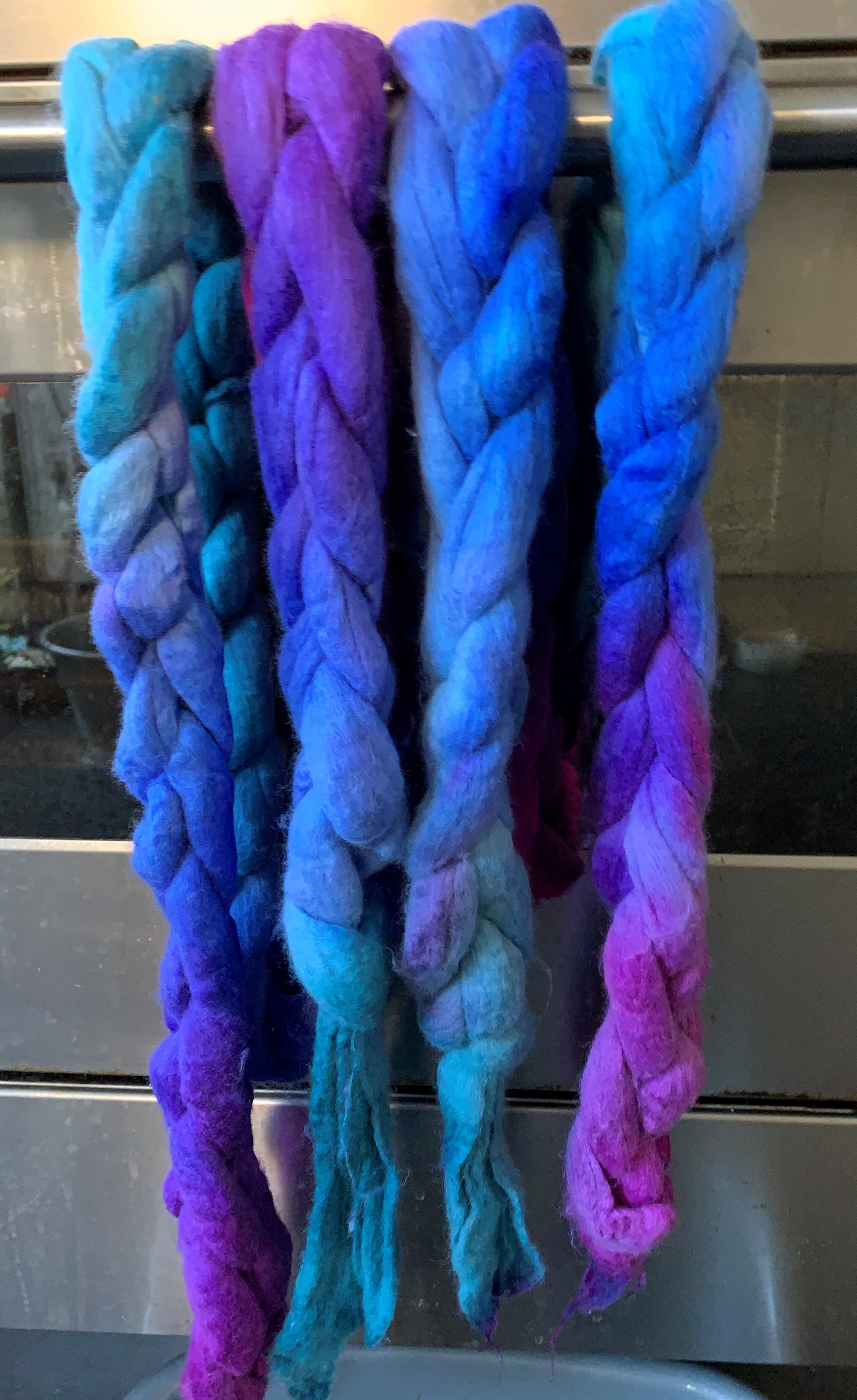
Hand dyed yarn by Eleanor Shadow
This hand dyed yarn looks great at first glance, but in reality it’s “muddy” – the colours have somehow blended into each other in a not-so flattering way.

I’m sure we’ve all been there. Craft long enough and, be it due to bad luck or simple statistics, something will go wrong.

The problem: The yarn above is a colourway of mine called Love Heart Meow. At first glance, it looks exactly as it should, except something went wrong during the dyeing process and the end result is “muddy.” You can’t really tell in the photo, but in real life I can definitely see it and it’s driving me mad.

The solution: I’m going to overdye it. I find that when things don’t go as planned, a blue overdye can save things around. Who knows, maybe I’ll create a new colourway?

(Shameless plugin moment: I’m getting back to blogging in my own website and I’ll be sharing the over dyeing process over there very soon! I’ll of course still be working on new content for our lovely blog here.)


Silk cocoons


A while back I was doing an exchange with a dyer friend of mine and decided to send her some hand dyed silk cocoons. Silk comes at a price for the poor silk worm, so I was very keen to “make it count” (yes, I’m the soppy type).

I carefully dyed each cocoon, making it so that the exterior and the interior were slightly different and adding variation in shade/colour. I was rather chuffed with the result.

Of course, I then proceeded to ruin things beautifully. I don’t know what happened in my brain but I decided to set the colours with more acid… by dunking the cocoons in hot water.
If you’ve ever dyed these precious things, you’ll know they need to be steam set if you want them to retain their shape. Hot water is most emphatically not the right thing to do, as I remembered even as I was dunking them in the H2O.

The problem: I had a hot mess in my hands, the cocoons all melted into each other, were soft and (to me, at the time) completely useless.

The temporary solution: Remove from water and back away from the project! Make some tea. Curse out loud. Come back later.

The real solution: After keeping whole thing away from sight a while, I looked at it again. It was a mess, but I could make it into something different. The colours were pretty. Then it hit me…

Fibre wall artwork by Eleanor Shadow

Tah-dah, wall art to the rescue. The colours are actually brighter in real life.

I sewed the Cocoon Combo to some black felt, added some beads and shiny embroidered stars in gold and silver. The shape of the thing was asking for an oval embroidery hoop, so I bought one in a suitable size and Bob’s your uncle.

It looks like something done on purpose, doesn’t it? It’ll be our secret.


Now, this wouldn’t be a post by yours truly if I didn’t add a little sewing, would it?

While perusing one of my usual fabric supply sites I stumbled upon the most fun cat fabric. As with most things in the crafty brain, I had the “button” sorted but not the “suit,” so to speak. I had to come up with something to create with that fabric!

I decided on the Metamorphic Dress by Sew Liberated because it looked comfy and, best of all, asked for two complementary fabrics (the cat fabric had a “friend” that I thought made the cats look even cuter. Aaand, I’ll stop using metaphors now.)

Metamorphic Dress by Sew Liberated, sewn by Eleanor Shadow

I love this dress. It works great on its own or as a top layer, making it good for more seasons. It’s meant to be reversible, but this one isn’t (there are reasons but I shan’t go into them).

One great thing about being short is, I never need as much fabric to make something as the pattern says I do. After careful calculations, I knew exactly how much to buy and order it I did.

The bad thing is, if you don’t have extra and make a mistake… well.
I was on the phone with my other half and got distracted. Instead of cutting the top layer a specific way, I did it wrongly. I immediately noticed the disaster, but it was too late. My soul hurt. I didn’t want to order more fabric because of this!

The problem: No extra fabric and the huge unwillingness to buy more. I was doomed.

The temporary solution: The same as with the cocoons! Back away from the project. Make some tea. Curse out loud. Come back later.

The real solution: I had a little extra of the gingham fabric. Patchwork to the saving.

Detail of Metamorphic Dress by Sew Liberated as sewn by Eleanor Shadow

I had only made a mistake with one half of the fabric, so that became the back. I cut that piece in two and added a strip of the under layer fabric to the middle. It almost looks like it’s a proper feature, at least to my eyes.

I’ll have to confess I felt rather smug after this. My solution worked, I didn’t have to buy extra fabric and my dress is perfectly wearable.

My smugness was somewhat abated after my mum saw the dress and said it looked like a maid’s apron, but that’s another story…


That’s it, three examples of things that didn’t go as planned but had a solution. If you let your brain think about it for a while in the background, I bet you’ll come up with alternative endings for your “mistakes.” Like the cliché goes, mistakes can be opportunities to do better later. Beats giving up, right?


Finally, the random photo of the day:

Sheep from the Shetland Islands

My lovely osteopath Jane went on holiday to the Shetland Islands and I asked her to send me some sheep pics. She obliged and I thought I’d share them with you.

Enjoy your weekend!

Do you take commissions?

Do you take commissions?

This question sends a chilled shiver through my heart. 


My first felt picture commission was about 4 years ago for a friend who wanted a view of a mountain in France for her husband’s 60th birthday. They have a house there and love the views. I really didn’t know what to do. It was very different from the pictures I had made to date and not somewhere I know or have ever been. After some soul searching I agreed to do it. I think I let the flattery get the better of me. 


The request was to do something similar to this but ‘a bit snowier’.   

Things really did not go at all as I’d hoped. Firstly, the time I’d set aside to do it was taken up when my parents, who were staying with me, both became ill. Fortunately everyone recovered but I had to do lots of hospital visiting and home caring so wasn’t able to do any work on the commission. 


Then I realised as I was working on it that I really didn’t understand the mountain from the photographs I had. Which bits were shadows and which bits ravines? Normally I felt local birds and seascapes that I know and love.  I struggled. To cut a long story short I delivered the picture but so close to the deadline I don’t even have a final photo of it. This was it nearing completion ……

I really didn’t enjoy the process & I wasn’t that happy with the result. Fortunately my friend liked it & her husband loved it but I vowed never, ever again to take a commission…….I had learned my lesson…. hadn’t  I?, 


A little while later another friend who was travelling sent me a photo she’d taken of a pair of African penguins and asked if I could make a felt picture as a birthday gift for her partner. “OK”, I thought, “birds and a beach, I should be ok with this.” 


Learning from my first experience, I allowed loads of time. I made samples and did lots of planning. I looked at a lot of penguin pictures online as the penguin on the right was at an odd angle and I felt it needed a clearer head. I made lots of prefelt. It took a long time but I enjoyed it and was pleased with the result: I thought it was true to the photograph.  I was there when the gift was presented. There were happy tears; probably some of them were mine. 


Then came an email. My friend’s husband, who’d been so happy with the French mountain he’d been given: it’s now her birthday one year on and he’d like to commission a companion picture for her of the local valley view in France. “Noooo” I thought. “I vowed never, ever to do another commission after that one”.  I tried diplomatically to explain that I wasn’t sure I could do it justice but agreed to look at the photos and let him know. 


More soul searching and much wringing of hands. I really didn’t want to refuse, but I really didn’t want to go through the same thing again. On balance, I decided I probably could and should do it, so I said yes.  


I was happy with the outcome and my friend, and her husband, loved it. So, maybe commissions were ok. 


Next, someone locally saw a picture of a little egret I’d made for my mother’s 80th birthday and wanted something ‘similar’. 


My Mum’s picture was based on a bird she and I had enjoyed watching together at a Yorkshire nature reserve. I didn’t want to copy it. The commission would be based on another little egret I’d seen just up the coast from where we live. I quizzed the woman in great detail about what she liked about my Mum’s picture and what she wanted her picture to include. I described what I was going to do. But it made me realise how difficult it is to understand what someone else sees in a picture and whether I can understand it enough to translate into something I can make. Previously I at least had reference photos but there was no photo for this one. 


I decided to give this client the option of not buying the picture if she didn’t like the finished image. It was, after all, a picture I would readily have done anyway. It was the best way I could think of of getting round the struggle of making what I can and want to do and meeting someone else’s expectations. 


The client seemed very happy with it and did buy it though I’ve really no idea if it’s what she had in mind. 


Another local woman saw at an exhibition a more abstract sea picture I’d made.  She’d like something similar but smaller. Surely I could do that? 


Well, you would have thought so but I guess I took my eye off the ball. I’d been thinking a lot about how small waves break and although I used similar materials, it really didn’t come out very similar at all: the original being semi-abstract, the second being more realistic.  I’d allowed my own interests to take over and really hadn’t met the brief. I decided to show her the second picture anyway, explaining it wasn’t that similar to the first one, but I’d be happy have another go if she wanted. 


She thought the new picture was ok but preferred the original and decided just to buy that one instead. A fortunate outcome and I’ve since sold the waves one but it all felt a bit precarious. For me, commissions are tricky. I’m flattered by the request but not necessarily comfortable in the execution! 


I’ve asked three painters if they take commissions.  One absolutely does not on the grounds that she wants to pursue her own creativity and doesn’t want to be influenced by others’ ideas. She does give the potential client an early view of her new work but that’s as far as she will go.  Fair enough.


The second  said, “I do, but I don’t really like it. It’s so difficult to understand what’s in someone else’s head.”  I’m with her on that.

The third does take commissions but he charges more for the work, to reflect the fact that he’s working to their brief. He takes a deposit and, when pressed, said if someone decided they didn’t like the outcome he’d keep the deposit but not insist they buy the picture. Fortunately that has never happened. 


For me commissions raise a lot of issues. Does the client have to buy what they’ve commissioned? Would I want anyone to buy a picture they’re not happy with? How do I know what they are imagining? Do I enjoy making them? Does it matter? 


So, do I take commissions? Um, sort of. I’m still not sure. I’ve realised that when I watch my local sea birds and look at the sea, water and beaches there’s a lot going on. I look at where the birds are, how they stand and move, what they’re doing.  I try to capture the colour, light and movement of sea water and waves.  As I create the felt I have images, sounds, smells and feelings about the scene that I hope in some way influence the picture. I do work from photographs but I rarely copy them. So, if someone wants a particular view, location or bird that I know and can experience then probably, yes. Otherwise, I’d like to think I’d say no.  But then I don’t have a very good track record of saying no, do I?! 


What do you think? Would or do you take commissions? If so, how do or would you manage them?

OVWSG Fibre Poker Felting Challenge

OVWSG Fibre Poker Felting Challenge

You’ve seen the piece I was working on for this.

I still have not decided what I what to do. It was suggested that using some stabilizer on top might help keep the stitches on the surface and not have them sink in and look quilted. so I thought I would make a new background and give the stabilizer a try.

I picked some colours and carded up a little bat to use to felt a new background.

When it was finished I thought it looked like the water in Monet’s pond. I decided to add a waterlily. I looked up some google and traced the outline onto some was away stabilizer.

For thread, I decided to use some maybe real and maybe artificial silk. some of it says silk on it and some Artsyl rope. I got this thread in a barely started embroidery kit at a garage sale. I don’t know how old it is but the company that made it stopped manufacturing silk in 1911. It does seem to have continued to sell thread and ribbon but I don’t know if they also sold artificial silk. I haven’t burn tested it.  I don’t mind if it’s artificial, it’s pretty.


The thread is “2 ply” in appearance but each ply is made up of 5 individual threads. I used one ply for the outline and 3 of the smaller threads for leaf definition.

Onto the petals

As you can see my stabilizer started to fall apart. I am sure it’s because the underlying piece is so soft and squishy, it tears. I had the reference picture so it all worked out.  I pulled most of the tattered bits away. the last thing was the yellow center.


And after washing away the rest of the stabilizer. Not too bad if you don’t look too close. that should be just about the actual size of the piece.

I was happy with it even if it was a little plane. than after sowing it to some friends on Zoom, they suggested a dragonfly or some bead water drops. I didn’t feel like making a dragonfly so I decided on fish.

I added 3 koi fish around the lily. I think it worked well. I decided against the water drops because it’s an outline. Seeing it as a picture I can see I need to rub out the needle marks.


I enjoyed making this piece and the stabilizer did help keep the stitches on the surface so that was a good idea. I want to try the other kind of stabilizer. The stuff that looks more like plastic wrap. After chatting with a friend we think perhaps a layer of the plastic stuff and a layer of my stuff might work best. Now I just have to find some of the plastic stuff.

Theatre Textiles Part 1

Theatre Textiles Part 1

After I had retired from full time work in 2006 I was finally able to join SNADS – our local amateur dramatic society. I live in a small market town in Dorset and SNADS was the main source of entertainment for our area at that time (as it had been since 1930, although newspaper archives indicate that it was around at least as early as 1883). I had seen most of the productions which they had put on since we moved there in 1999 and longed to join in, not only on stage, but behind the scenes. During any one year there are at least 4 productions – Pantomime in February, Spring Play in May, a Variety Show/Revue in the summer and the Autumn play in early October, and as soon as that was over, the round started again with preparations for the following year’s Panto.

We had a fantastic wardrobe mistress, but she needed help with costumes, especially at Panto time as there was so much to do.

My first foray into costume was to make a full head cat mask for the summer review. Two of our members were to sing Rossini’s Cat Duet and the director decided that it would be fun to have a disreputable tom cat watching them from the side-lines. I had recently learned to wet felt 3D items using a resist, so I made the mask from wet felted pieces and needle felted details. I didn’t want the actor’s eyes to show through and anyway, I needed to give the cat it’s proper “slit” irises. So I stitched into the eye holes a piece of doubled yellow organza and just painted the vertical slit. (It is quite possible to see what’s going on through organza if it is held close to your face.) How to give him a proper nose? I needled the correct shaped nose on the mask, then I painted on some artist’s gesso, let it dry and added some more. Gesso is textured so it was necessary to file the nose to make it a bit smoother, also the gesso is white, so I painted the nose with black enamel paint which I nicked from my husband’s paint store (he’s a model maker). After a couple of coats of that, Tom had a shiny(ish) black nose. Add some “bitten” ears and “wonky” whiskers and he was nearly done. The cat’s mouth was open – it allowed the actor to breathe and gave Tom naughty grin. Finally I gave him a pink tongue and white tips to his ears.

Disreputable Tom Cat

The next production that I was involved in was the pantomime Cinderella, written and directed by one of our members. I was asked by the wardrobe mistress if I would dress both the Fairy (“Fairy Nuff”) and Buttons’ dog, Beau. The director wasn’t quite clear about what kind of dog Beau should be, except that he was to be comic. So I did a sort of 3D needle felt sketch of the dog’s head as I saw it – black and white with one ear cocked.

“Sketch” for Buttons’ Dog

However I’d got it wrong – Beau was to be a black poodle. 

After some discussion with the wardrobe mistress, we decided that the actor would wear a black polo necked top, thick black tights and black gloves. I managed to find a piece of curly black faux fur to make a short jacket, with enough left over to make pompon for the top of the head and the end of the tail, the long dangly ears and wrist and ankle rings to simulate the correct style poodle cut. I was to make a full head mask. For this I made a wet felt hood using a resist and a further piece of flat felt incorporating some of the curly faux fur trimmed from the bought fabric. A lot of that moulted out though because it was nylon or polyester and very slippery. Enough was fixed in however to give the right effect.

I made a needle felted muzzle – again with the mouth open to reveal the red tongue and white teeth, and to allow the actor to breathe.  The nose I made in the same way as for the tom cat – shaped with the felting needle, gessoed and painted.  The muzzle was attached to the hood/face with stitching and felting needles.  Some of the flat felt was cut to represent the dog’s lips and attached by stitching and needle felting to the muzzle.  The “Disney-esque” eyes were again painted organza and were stitched on the inside of the mask. 

The ears and head pompon were also stitched on.  I added a piece of brown fabric and a belt buckle around the dog’s throat to simulate a collar and allow the mask to be firmly secured over the actor’s polo necked top.  I have worn this costume myself a couple of times in subsequent Carnival processions – great fun.

Beau

Since the actress cast for the part of Fairy Nuff had a figure which could easily cope with a glamourous costume, for the base I was given a basque that fitted her. She was to appear out of a compost heap at the edge of the stage, so I set to and made lots of autumn coloured leaf shapes – mainly oak – out of different brown bronze and gold metallic organzas. I sandwiched sparkly bits between layers of organza. I machined stitched around the edges and along the veins of each leaf and then cut out the shapes with a soldering iron. This sealed the edges and prevented fraying. Then, with the basque on a dressmaker’s dummy I attached large pieces of bronze organza for the tail, and then added the strategically placed leaves.

The wings were made from two lengths of flat wire (originally from a pop-up fabric laundry container) covered with more organza, this time creamy white but with sparkles and sequins added. These were attached to the back of the costume by stitching the wire to the shoulder straps of the basque and covering the join with some dark bronze/gold chiffon.

The crown was made from bronze Christmas decorations (that year bronze was in fashion over here – UK). I used bronze plastic icicles, some foil stars and some more organza leaves attached to a head band. I can’t remember what the wand tip was made from – possibly a bunch of tinsel.

I actually got a speaking part in this Panto – only a couple of lines but a step up from what I’d had before.
I don’t have a proper photo, this was before my husband had a digital camera, however I’ve managed to extract a clip from the video we had made of the show. It’s a bit fuzzy if enlarged but I think you can get the gist. I’m in the gold dress with my exclusive “Toilet Duck” perfume, and my punchline? “It drives the men Quackers!”

Guests at the Ball with “perfume”!

After this show, we had one final “adult” Revue and then we moved to where we are now based. Try this link it should show you the hall we left, Sturminster Hall, and eventually the Community and Arts building, The Exchange, which is now our home. https://stur-exchange.co.uk/about/
Unfortunately it seems that a second link, on the above page, may not yet be working – this is a new website in the process of being fully set up so here’s the brochure which was produced the year after it opened.

The Exchange Brochure 2008

The staircase balustrade is wrought iron made by a local craftsman and represents the river Stour which runs through our town. All the Rooms in The Exchange are named after rivers and streams running close by, and it is just beginning to open again to live theatre as well as community groups.

We at SNADS started off our return with an Adult Cabaret a couple of weeks ago, for once without a male Balloon Dance or a ladies Fan Dance, but there was a Pole Dance!

More about my exploits with SNADS (including an explanation of the picture of the wicked queen) later. Watch this space.

My Second Poker Challenge: Felting.

My Second Poker Challenge: Felting.

Last time I showed you my spinning poker challenge. https://feltingandfiberstudio.com/2021/07/26/spinning-poker-challenge/ This time it’s the felting poker challenge

In case you didn’t see it the idea is you pick a card from felting four different category card decks. With felting wool is a given.

My picks are:

Fibre: use thread or fine yarn

Colour: use cool colours

Structure/Technique: needle felting

Other: No Larger Than An Index Card ( 3inches by 5inches, 7.5cm by 12.5 cm)

This one took me a while to figure out. I kept thinking of a cold picture even though I do know cool colours doesn’t mean a cold picture. I don’t usually do needle-felt pictures I usually wet felt and then do a little needling and stitching. I am glad it’s only a small piece.

To start I cut the right size piece of prefelt for the base. I got this to try out From Monica of The Olive Sparrow. I have to say so far it is very nice to use. It’s quite thick and nice to needle into, not too hard and not too soft. Just like baby bears bed.


Next, I picked my colours for a nice scene. Most of it is merino except the two-tone green. It is corriedale.


Laying it out. and tacking it all down. I wanted sky and water and a clifftop.


The sky and sea are blending together. I went online and had a look at some sea and sky pictures. There seems to be a definite dark line where they meet but when I added it to the picture, it looked odd. I decided to pop an island in.

That looks better but it looks lonely so I added another one and greyed them out a bit to make them look a little farther away.

That is where it stands now. You will notice there are no threads or fine yarns. That will be next. I will probably add some grasses and flowers to the foreground with stitching and maybe a tiny lighthouse on the rock. I am not sure yet what I want to do.

Second life

Second life

Anyone who tell you they don’t have a box, draw or even cupboard of failures or “ not going how I wanted to” is either in denial or hasn’t done enough yet. My tale is about one such piece. I don’t even have a full original photo to show you so dissatisfied was I. The picture below is the starting block. To explain the original context of the piece it was two logs of wood at the forefront with a tree and mountain scene as the back drop. The second picture is of the top of the piece. I am sure you can visualise them before the chop.

I already had in my minds eye where the piece was going ,as previously having done a rock pool scene ,I wanted to achieve something similar on a woodland setting.

Although in my minds eye I could see the finished piece getting there was unknown. The piece was a wet felt project using dyed silk to create the logs and silk and fibres to create the moss and ground. I then needle felted to create depth and texture.

After studying it for awhile I decided if I established the proportion in the top left hand corner the rest would flow from there. I knew I wanted it to be multi dimensional but wasn’t sure if it would work. I stand here honestly admitting I am not the best embroiderer in the world but best foot forward added grasses in wool yarn and stalk and leaves in silk yarn to the existing blue flowers which I added at the wet felting stage with nepps. Still at this point I wasn’t happy as it still felt “ flat”. I decided to see if I could have a play and make dandelions which I could sew on top separate thus creating the second dimension I wanted.

But how? Out came my trusty stash of bits and bobs where I found some green and yellow prefelt I had made. With my embellishing machine I added further wool in differing shades of green. I then made a template of a dandelion leaf and cut them out. A final run over with the machine to strengthen them and a trim up and they were ready. I did the same with strips of yellow which I sniped and rolled. Sewing the base tightly together made a very pleasing dandelion shape , well in my eyes at least. After positioning them on the piece I was happy and created the stem with string and couching stitch.

I was happy it was now taking shape. The only area I was unhappy with was the blue flower in the foreground was knocking the whole piece out of proportion. After a tentative test decided to remove part of it completely. With this area removed ( the area between the two logs) it made more sense.

I made more leaves on my embellishing machine in different shades of brown and green and along with stones ,which I had needle felted, I added to creat the woodland base. I also embroidered some clover with bullion knots ( don’t look to closely, I have already explained about my lack of skill and this was my first attempt at this stitch).

And so to the foreground. More leaves were made and added to the blue flower. I’m afraid this flower is not a true but made up flower but at least I had free reign to create. I added french knots to the nepps to add depth.

I must admit the piece is not yet complete as I am now adding french knots to create the moss and will be adding more stones and maybe another clover ( if I can master bullion stitch that is).

All in all I am quite pleased with the piece

My point is never give up on a piece. I find some times just moving a mount around a piece of work completely changes you appreciation of it and can send it off in a completely new and pleasing direction.

If anybody would like to see the finished piece I will give a quick update when next I post.

A Redshank and Other Felt

A Redshank and Other Felt

As shops, galleries and exhibitions start to reopen in England and I have quite a few sales & exhibitions coming up, I decided to make another picture based a local coastal bird.  I’ve seen quite a few redshanks recently walking along the shoreline and haven’t done a redshank before so I think that would be interesting.

I start by making some prefelt for the back and tail feathers in a muted pewter and white tone, plus some firm felt I will use for the orange/red beak and legs. (I forgot to take a photo of these.)

I have a composition in mind and I make a quick sketch to get the shape, stance and size of the bird then lay out the bird’s body using a base of white merino tops and the prefelt feather shapes.  There’s not much detail as I will needle felt this in later.  I haven’t tried this before but I needle felt in some of the feather detail part way through wet felting then finish fulling the bird.

I’m not sure what I was thinking (if at all) as I’m not happy with the loopy-ness of the needle felting or the direction of some of the feathers.  I park it for now and get on with the background. One of the many things I love about felting is that you can usually continue to work on it until you’re happy with the result.

Redshank body: wet felted with some needle felting added part-way through

Onto the background: I have bits and pieces of natural coloured prefelt that I cut into pebble shapes ready to form the beach.  The redshanks I’ve seen recently have been walking close to the water’s edge, either in the water or on the pebbles.  Thinking about the water experiments I did last year I lay out 2 layers of pewter-coloured merino for most of the picture with a white and rusty orange section where the wave and beach will sit.  I put long strands of blue tops in two colours running horizontally to represent the light reflecting off the water.  I leave a darker section near the top with some of the pewter wool laid at an angle as if there’s a small wave coming in there, though in the final picture you can’t see most of this because it’s behind the bird.

Next come the pebble pieces and finally the foreground wave, as it sits on top of both water and beach.  I haven’t tried using mohair for wave crests before so I run a wiggle of mohair tops along the water’s edge and onto small sections of the sea as if small waves are cresting there.  I’ve spent a lot of time looking at the water in my local sea / estuary so I know the colours and shapes well.  The water is often choppy like this with small waves.

Background layout, ready for wet felting

I wet felt the background then try out the bird body to see how they’re going to fit.

Background and Bird body – trying things out for size

I needle felt the redshank’s body onto the background then add the legs and beak which I’ve cut from the red/orange felt. Then I add the eye and fiddle for a while until I’m happy with the bird.

The final redshank picture ready to frame

The finished picture is about 50-55 cm square and will go into an oak veneer box frame that’s 64 x 64 cm. I took this photo in the evening, with electric light, so it’s a bit less yellow in reality.

As I didn’t take a lot of progress photos for my Redshank, I thought I’d add a few other things I’ve made recently. Like my felting friend Antje (who posted here recently) I took Judit Pocs’ milkweed pod workshop on 1 & 2 May. I direct dyed some 18 mic merino tops and some fine ponge silk for my pod.

It was a good workshop and I’m happy with the result. I got my dye ratios wrong which resulted in a lot of bleeding and dyed hands but thankfully it’s not a wearable so it shouldn’t now be a problem. I hope to use this silk pleating technique in future projects.

I realise the colours are very similar to the ‘hippy trippy’ Corriedale bag I was making when I last posted. It’s still work in progress but I’ve done some additional ink work on some of the silk patches and am part way through adding some stitching. I’m now adding some french knots in the rectangle near the top left. This combines some of the techniques I learned in Terri Berry’s bag class with some from Fiona Duthie’s Ink + Cloth workshop and my new venture into direct dyeing (using the Felting & Fiber Studio tutorial).

Previous picture on the left, current on the right.

As part of Fiona Duthie’s Paper + Fibre workshop I made a lamp shade (actually a sleeve that fits over a lamp). It’s interesting how the paper sections are barely visible when the lamp is off. I think I will make more lamps when I have time.

Finally, I’m making some smaller pictures to take the little beach hut gallery in Whitstable Harbour where I often sell my work. I’m in there from next Wednesday for 2 weeks. I’ve wet felted some mussel shells and am making backgrounds to set them into small box frames (without glass). They’re about 19 x 19 cm. Here’s one that’s nearly ready to go. The background is nuno felted with recycled silk and old curved lace. I just have to decide where to stitch the shell. What do you think?

Felt Painting – Glorious Devon by Ann B.

Felt Painting – Glorious Devon by Ann B.

This is a guest post by Ann B, one of our fabulous readers and forum members. She is planning on updating us as she makes progress on her project.


Having decided that I needed (and I do mean needed) to make another picture, I hunted through my design source photographs and fell in love (again) with the picture I took of a horse grazing on a hill in Devon. This was typical Devon, lots of hills and trees and (best of all in my mind) no people or buildings in sight. This is the original picture above. What appears to be sky at the top is in fact distant hills. There is no sky at all in the photograph. I was a little disappointed as I love using silk fibres and neps to produce a realistic sky, but the distant hills would be a good challenge in colour blending and matching. I also felt that the photo was a little dull, there having been plenty of clouds about on the day that I took the picture, so I decided to “photoshop” it a bit to brighten it up.

This is the result. There isn’t a whole lot of difference – I still wanted it to look natural – but you can now
see the fields on the hill right at the back, and in fact I think that there is a building on
the hill on the right. Next I decided that I needed to work on the composition a little. The horse isn’t quite in the best position for either a “Golden Ratio” or a Fibonacci spiral composition. So I took the dimensions of the picture – I would do an approximate A4 size – and I worked out the Golden Ratio figures. I had (I can’t find it now) a book on art which showed how to do this and I made myself an
Excel Spreadsheet with the formulae and formatting which would work out the proportions for me once I had input the height and width measurements.

That would be measurements A-B and A-D on the diagram above. This diagram is not to scale, it merely serves to show where the measurements that the spreadsheet throws up will be. Below is the Fibonacci spiral which largely reproduces the Golden Ratio on one side of the page only. A second, flipped, image imposed on it would produce the Golden Ratio. The Golden Ratio calculations make it easier to get
the right proportions for a non standard shaped “canvas”.

The measurements of my picture are approx. A-B 26.5 cm A-D 20cm so not far off a square. The Golden Ratio figures would then be: A-G 9.9cm; G3-G4 6.1cm; G4-B 10.5cm, across the top and A-G1 6.9cm; G1-G2 5.5cm; G2-D 7.6cm down the side (I usually work in “old money” but it is easier for this purpose to use metric).

In fact I sub-divided the left hand and right hand sections again, drew out the lines on a piece of A4 paper and then sketched in how I wanted to lay out the various parts of the picture. I moved the horse further to the right; I placed the stream on one of the vertical lines; I placed the trunks of the trees on the left onto two of the vertical lines and various other changes of level and subject on or near to intersections of the lines. (This is the composition technique used by Constable in his paintings.) Here is the sketch.

Just to see what would happen I put a tracing of a single Fibonacci spiral on top of the sketch and found that it worked too. The horse was right where the centre of interest should be. The sheets moved a bit when I tried to scan them together but I think you can see what I mean from this:

So now I will sort out my backing felt and start to lay out the picture on it. I had tried to lay out the background colours on some white commercial prefelt and wet felt it but I had overlooked the fact that the prefelt would not shrink as much as fibres from tops, so that was a failure because the size was not right for my measurements. I have therefore cut out a correctly sized backing felt, again made from white prefelt, but of a much larger size so that I’ve got some left over for the next picture(s). I have made a tracing of the sketch and will use that as a template to mark out the placement of the main features by stitching through the tracing. Then I will need to blend some colours and start “painting”. (Click on any of the photos to enlarge.)

Lyn and Annie’s first quarter challenge entries

Lyn and Annie’s first quarter challenge entries

Lyn – Neubronner’s Pigeon in the style of Delauney

I’ve taken inspiration from both Neubronner (an inventor) and Delauney (an artist) to make a picture for the first quarter challenge 2021.

Dr Julius Neubronner developed a miniature pigeon camera to photograph the earth from above and the patent for his invention was granted in 1908.

How cute does Neubronner’s pigeon look?  All dressed up and ready to go to work.

I wanted to make a picture of the pigeon but not an exact copy.

So I looked for inspiration in the works of artists during the first decade of the 20th century and I found this painting by Robert Delauney, “Portrait de Metzinger “, painted in 1906.

Robert Delauney used bold blocks of colour in oil paint to create this portrait …… hmmm …… how about making the pigeon from blocks of colourful pre-felt?  They would look like brush strokes of oil paint on canvas.

My pre-felt stock is low,  I had some colours I wanted but not all, so the first job was to make some more.  I like to make it in batches to save time and effort and I like the mix of colours where they overlap.  This is the dry layout.

Then I made the ‘canvas’ for my picture from 4 layers of white merino,  pre-felted to the same stage as my pre-felt.

I cut coloured pre-felt into small rectangles, then using a photograph as a guide, I started to ‘draw’ the pigeon.

The only things not made from rectangles were the beak, eye and feet.

I didn’t copy the camera.  It looked too complicated for me to try!  So I made up a simple one that I hoped would be recognisable as a camera.

I added yellow variegated pre-felt rectangles, to imitate broad brush strokes, for the background.

But I didn’t like it.  The background overpowered the subject.  So I removed the yellow to leave just the pigeon.  I then added a little purple pre-felt to the front of the camera because it looked too plain.

I wet felted the pigeon then when it was dry I added the background by needle-felting rectangles of ‘Noro Rainbow Roll’ pencil roving around the pigeon.  The ‘Noro’ pencil roving is so fine (see photo below) that it’s almost see-through and it made a soft, complementary background.

The purple pre-felt bled a little bit during felting giving a pale pink tinge to the white background but I can live with that!

A couple of white stitches to put a glint in his eye and he’s done – the finished picture is 30 x 23cm (12″ x 9″).


Annie – Imaginative Flowers inspired by Odilon Redon

I felt inspired by many of the things that happened between 1900-1910, and was having trouble choosing what to do. Then I came across Odilon Redon’s floral still life work and it caught my eye, here is an example: ‘Bouquet of Flowers’ circa 1905.

And I also found a quote from him that appealed to me:

“I have often, as an exercise and as a sustenance, painted an object down to the smallest accidents of its visual appearance; but the day left me sad and with an unsatiated thirst. The next day I let the other source run, that of imagination, through the recollection of the forms and I was then reassured and appeased.”

I had planned to do something a little less in my comfort zone and a bit more adventurous like mum did, but then I thought oh well I like making flowers from my imagination so I’ll just go for it!  It is still a work in progress but here’s what I’ve done so far….

I laid out a big square of white fibres with the intention of making several small sample pieces to start with but got carried away and just went straight for one big piece in the end.  I placed the vase right in the middle at the bottom which I wouldn’t ordinarily do as it seemed that’s how he did most of his.


I got a little way into laying out and although it was OK I decided it wasn’t working for me so I pulled up all the colour except for the yellow background and started again.


I made the flowers into a big bunch and then left some space at the bottom.  I had thought I’d leave space all round to include some “fronds” but hadn’t made my “canvas” big enough and ended up overdoing it so not enough room!


I haven’t finished it yet, but this is where I am so far.  I’m going to attach the vase after felting because it is very fine fabric which stretches and frays and I think too much yellow will come through because it is rather open weave too.  So I’ve ironed it on to some glue stabiliser for now and laid it on the picture temporarily. 

The fabric is a nod to Redon’s butterfly paintings and use of butterflies in his floral works.

I will undoubtedly faff about a bit more with the flowers, and possibly put some shadowy darker yellows in the background, before felting it.  It’s 52cm x 58cm (21″ x 23″).

Also, lesson learned, I didn’t check the dates properly on all of the reference pictures and only 1 of the 3 in my photo falls before 1910, but they are close enough 🙂

I’ll show the finished picture on the forum in the Challenges section.


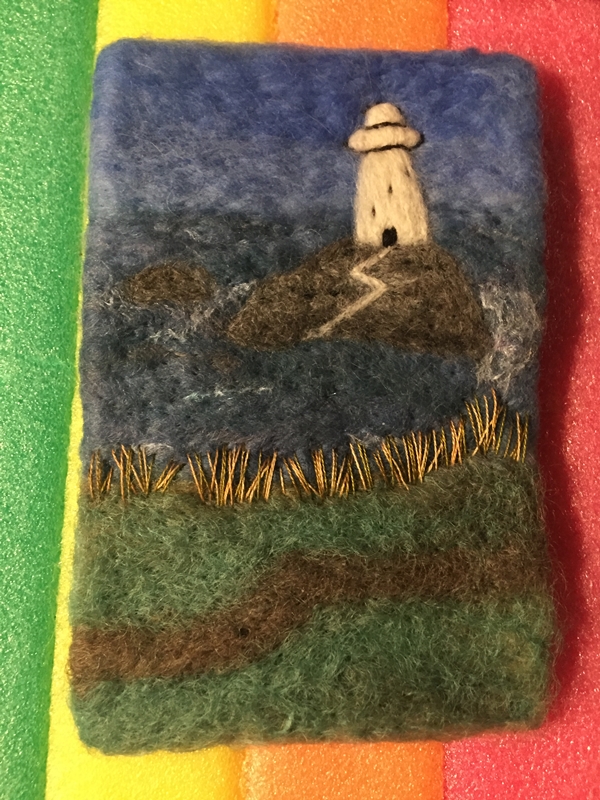
A new picture: A lighthouse

A new picture: A lighthouse

I seem to be in picture mode. I wanted to do something with water but not necessarily as the main feature. I thought about a beach and that was my intention as I started but as was looking for pictures and some of the cliff-top pictures really took my eye.

I used a nice thick piece of wool prefelt that I bought at the Almont Fiberfest a few years ago. It is 4inches by 6 inches, 10cm by15cm  I think it is wet felted on a flatbed machine. It is course wool and more solid (felted) than the thin needle felted prefelt we usually get. It is much closer to being felt.  I would love to get some more but don’t know where to find it.  If you know let me know.

I start with what is farthest away, sky and water. When I do sky, it’s always cloudy and I have to do a google search to remember if the sky is darker or lighter near the horizon. The wool I used for the water has a few bits of sparkle in it. I think that’s what is making the white dots in the picture.


Then some land and the rocks. I used a mix of 3 grays so the rock wouldn’t be flat.

Added the lighthouse and the path


Then I used throwers waist to make the white water around the rocks and some whitecaps. At this point I gave it a light felting mostly to sink the silk into the felt so it didn’t look so much on the surface. . There was still more needling to do though. I added the top of the lighthouse and started the stitching.


And as usual when you start stitching you start unstitching. The grass stitches here were much too small. The path needed changing as well as being far too straight it was much too wide.  you can see how all the extra stabbing pulled the piece in even though I was poking up and down and not sidewise.  I stretched it out.

Back to stitching. I am using 4 colours for the grass, 2 shades of gold and 2 of green.


I added some small blue dots for flowers.


Then the foreground grass


Then some french knots for more flowers. I used a couple of shades darker blue for the foreground.


This is a close up of the stitching.


That’s a lot of pictures but I hope you enjoyed seeing the progression.  Stitching really helps a picture pop. And as I promised picture without Sheep. I can do it. LOL

So a week has gone by since I wrote up this post ready for the 4th of February. After a comment from a friend, and looking at it after a break from working on it,  I decided to fiddle with it more.  First I ripped off the path it was far too white, I remade it with some light gray. I did want it to be distinct but not a lightning bolt from Zeus. I added a tiny little dock, not easy but that’s what I get for working small.  And the sky was too much open space so I added some birds, again very fiddley. I did add some slight shading to the lighthouse but it doesn’t really show in the picture the wight really reflects.

so here it finished again. I hope you like it.