
Tips for Taking Photos of Your Fibre Artwork
This is a guest post by Dani D. Thanks Dani for your photography expertise!
Part 1 of 3: Telling the story
Hi! I’m Dani and this is my first post here, though 2024 marks my 20th (!!) year of blogging. I started blogging about raising my family, and then about photography. Now that my kids have grown up, I’ve moved my bloggy thoughts to a new home at Curious Crone, so feel free to come visit me there some time.
Ruth generously invited me to share a few tips about digital photography and I had so many thoughts it turned into a trilogy. Today, we’ll talk about telling the story and basic tips on using your smartphone to take better photos of your fibre projects. In later posts, we’ll talk about the two most important factors that will affect your photos: light and colour.
In many ways, taking photos of your fibre arts projects is easier than photographing humans. The fibre art doesn’t stick out their tongue when mom is not looking (this happens rather a lot in my family photography business) nor do they give that tight-lipped fake smile while stage-whispering out of the corner of their mouth to the other subjects in the photo “if you don’t behave for this photos I will take away your devices for a year!”
First, a few words about smartphones and apps. For this post, I’m thinking mostly in terms of taking pictures with your phone. There are two terrific free apps for editing photos: Google’s Snapseed and Adobe’s Lightroom. (And yes, you really should edit your images to polish them – it can make all the difference in the world.) I use Snapseed on my iPhone and Lightroom for editing dSLR images on my Mac, but there’s a great version of Lightroom as a mobile app and as an online editor. Both Snapseed and Lightroom mobile apps are available for iOS and Android. Did I mention free?
As every photography teacher will tell you, getting the image as right as possible before you press the shutter saves you time and effort at the editing stage. So whether you’re taking photos of a wet-felted vessel or your adorable two-year-old nephew, take a second before you click the shutter and think about the following things:
- Is the background clear of clutter?
- Do other elements in the frame complement or compete with the subject?
- What story am I trying to convey?
- Would a different perspective tell a different story? (Try shooting looking up at the subject, looking down at the subject, zoomed in to fill the frame, zoomed out to show something as small in a large background, shoot down from overhead, shoot at eye level, shoot super close to illustrate a fine point of detail.)
If you start thinking in terms of the story you are telling, your photography will improve immensely. In fact, as a successful licenser of stock photos to Getty Images, I’d argue the story is more important than the technical criteria of the photo. Every successful image should tell a story, whether it’s about the texture of the piece or the shape, the colours or the light. The photo is not just a static thing, it’s an invitation to interact with your creation or your creative process.

How do you begin to tell that story? Don’t just snap the photo as soon as you have your subject trapped in the viewfinder – compose your image deliberately and thoughtfully. For more tips and ideas around how to compose your image, search up ‘rules of composition’ for ideas like leading lines, rule of thirds, etc.
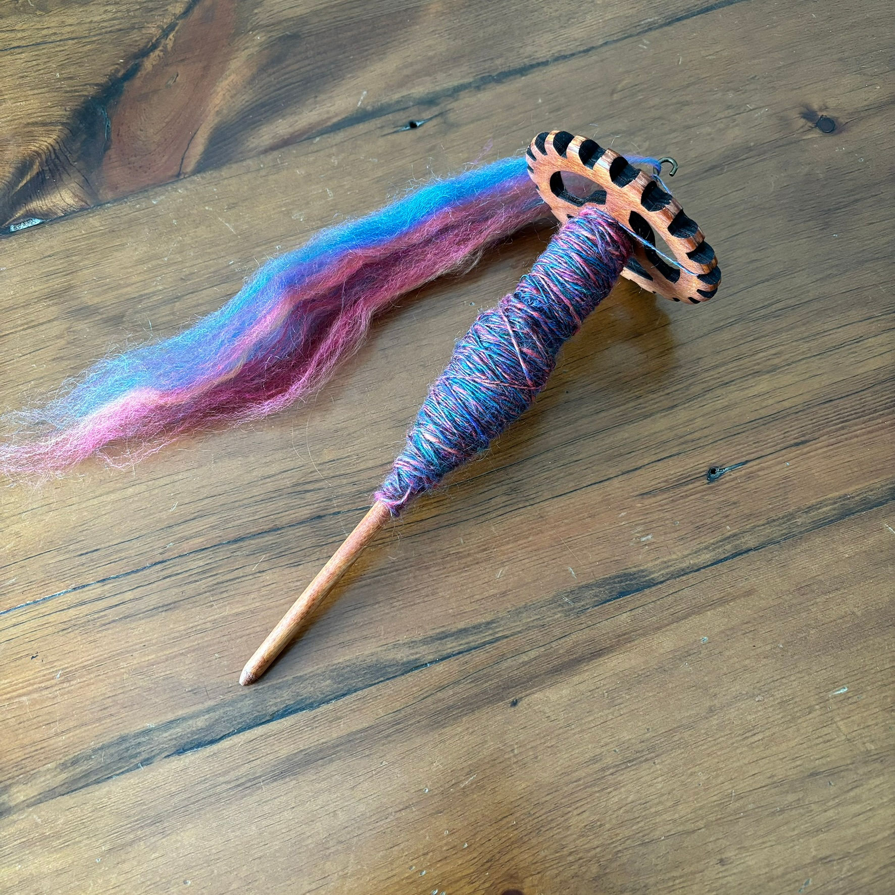
Here’s an example of me finding the story I wanted to tell. First photo, basic spindle and wool. Not very interesting.
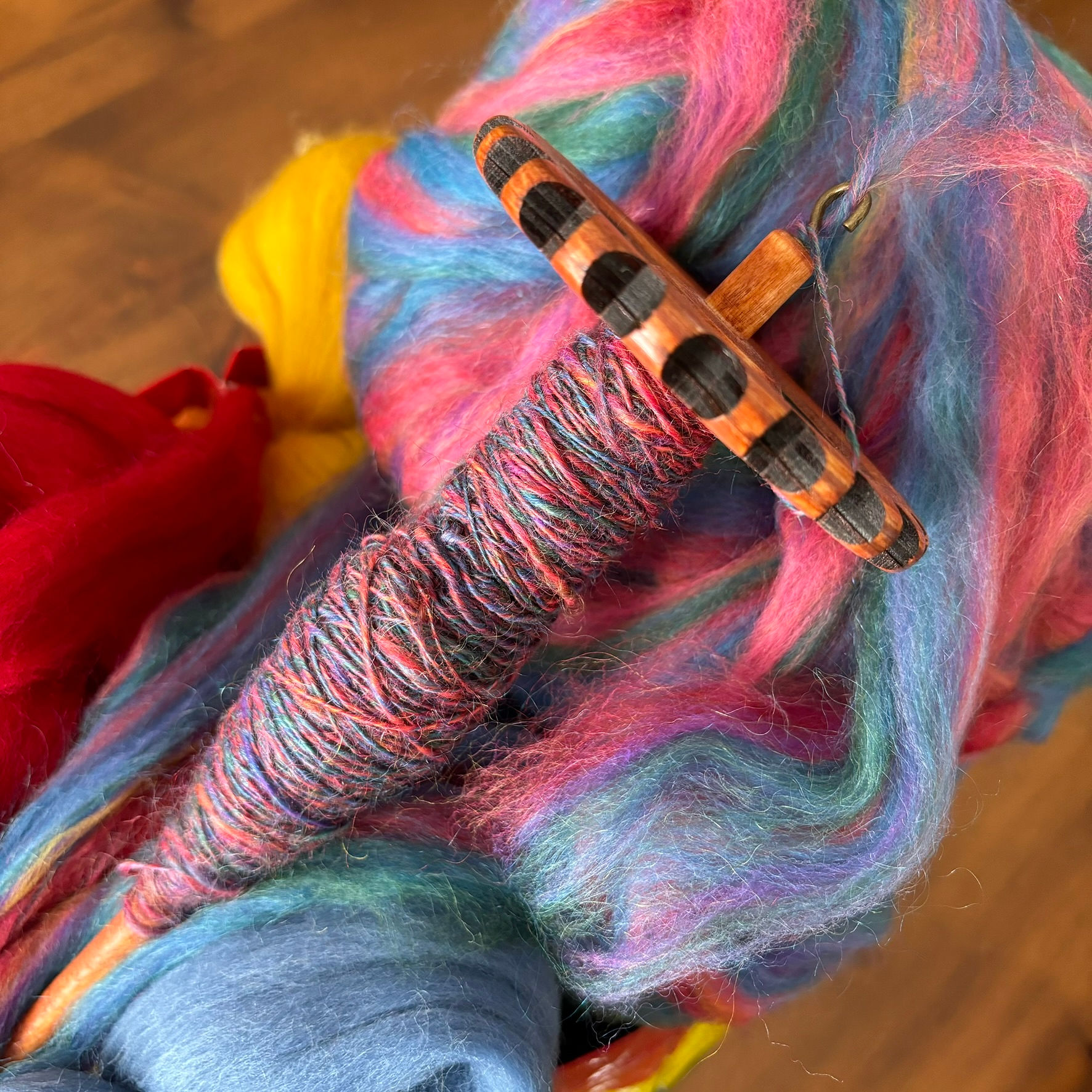
What if I added some fibre to flesh out the photo? Nope, too busy. Background is distracting focus from the subject.
I love this blue mason jar. I could use it to stand the spindle up for a better angle. Except the background is too cluttered.
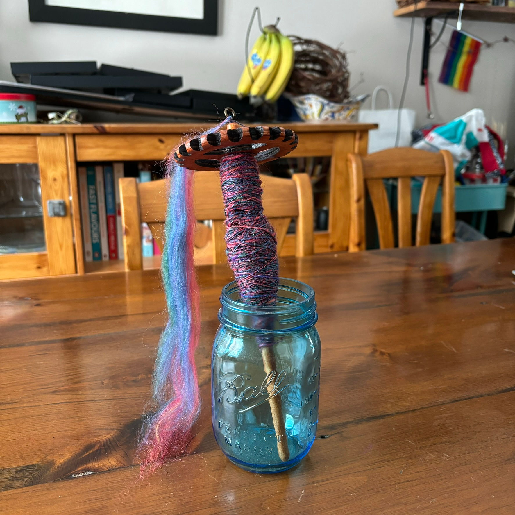
I’ve zoomed in and am playing around with the perspective.


If you’re making photos for an Etsy or other online shop, think about setting a mood with props and building a little tableau. An old piece of barn board and some cream linen evokes a sort of farmhouse chic mood, where a cup of coffee and an aloe plant set more of a lifestyle vibe. Just keep in mind that you want accessories to compliment your subject and not compete with it.
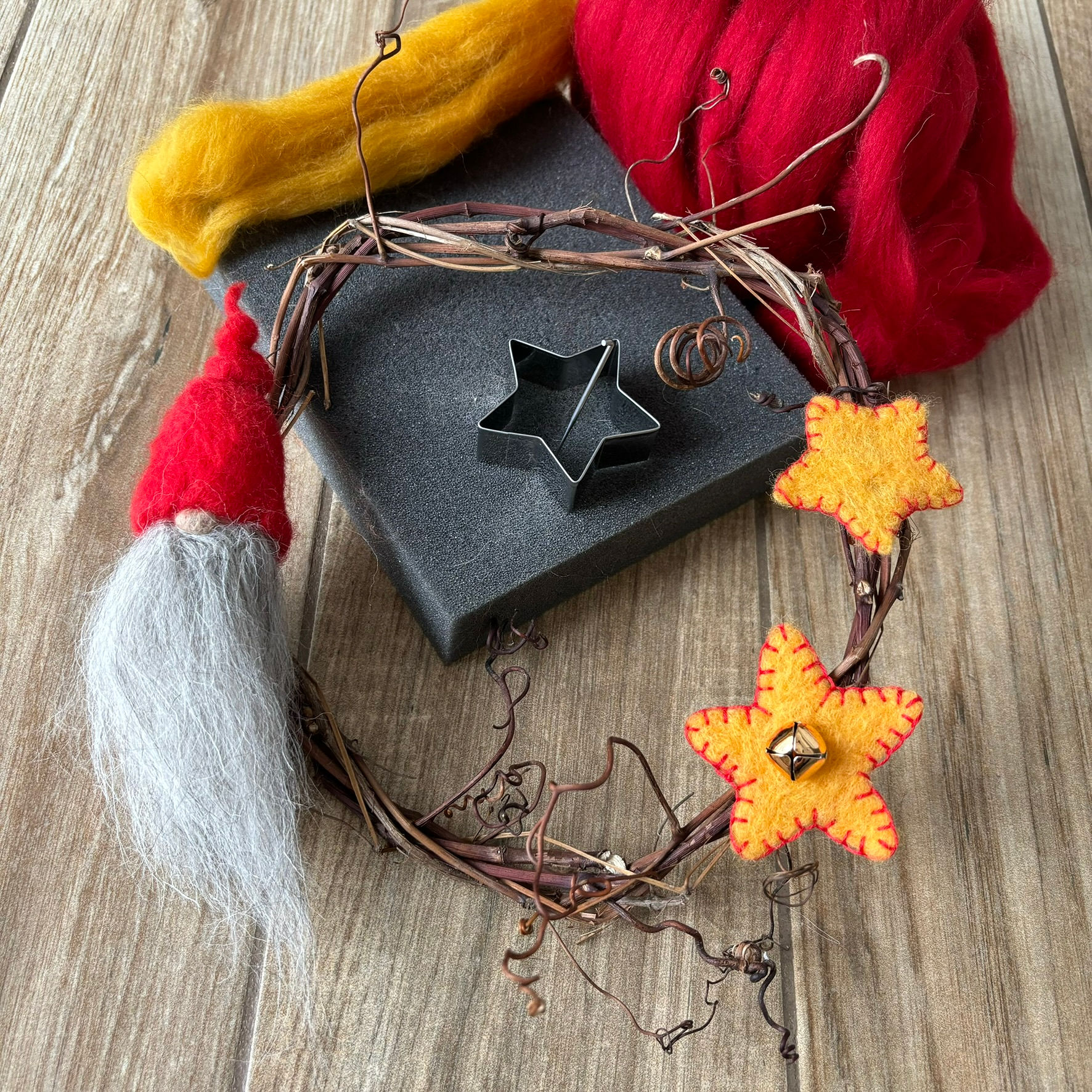
This is my kitchen floor, after a quick swipe to remove crumbs and pet hair. The first thing I noticed in the first photo was the seam down the middle of the wreath, which is a distraction. I played with the angles a bit but didn’t love any of these.
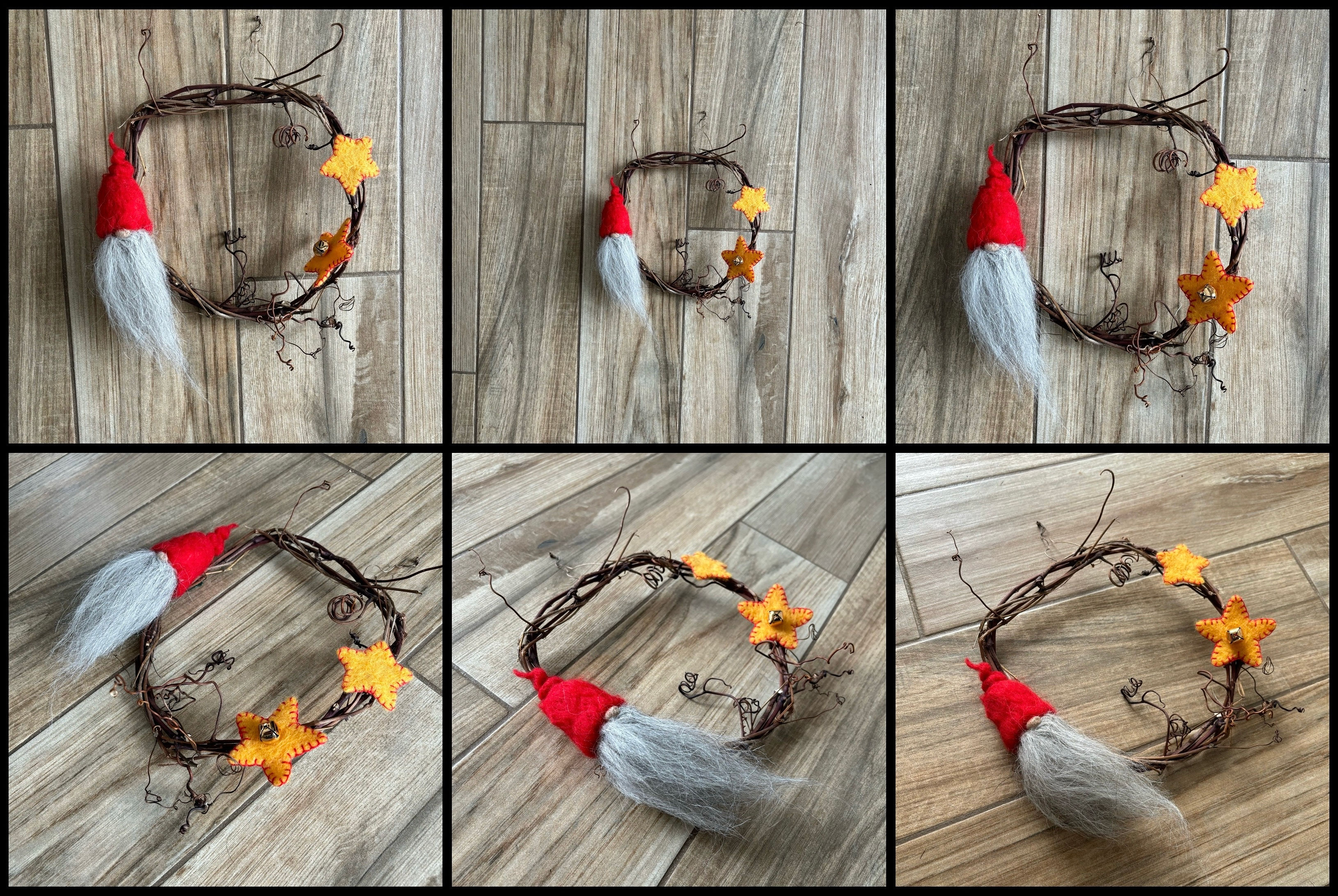
I pulled some loose wool and tools in to tell a bit of a how-to story. I liked that much more.

These last two photos show the difference editing can make. The first is straight out of the camera.
The one below has been edited for brightness (more), ambiance (more) and a slight rotation and crop to cut out the bit of gap at the top right to keep the viewer’s eye in the frame. Bright spots and colour will draw viewers’ attention, so use them deliberately.
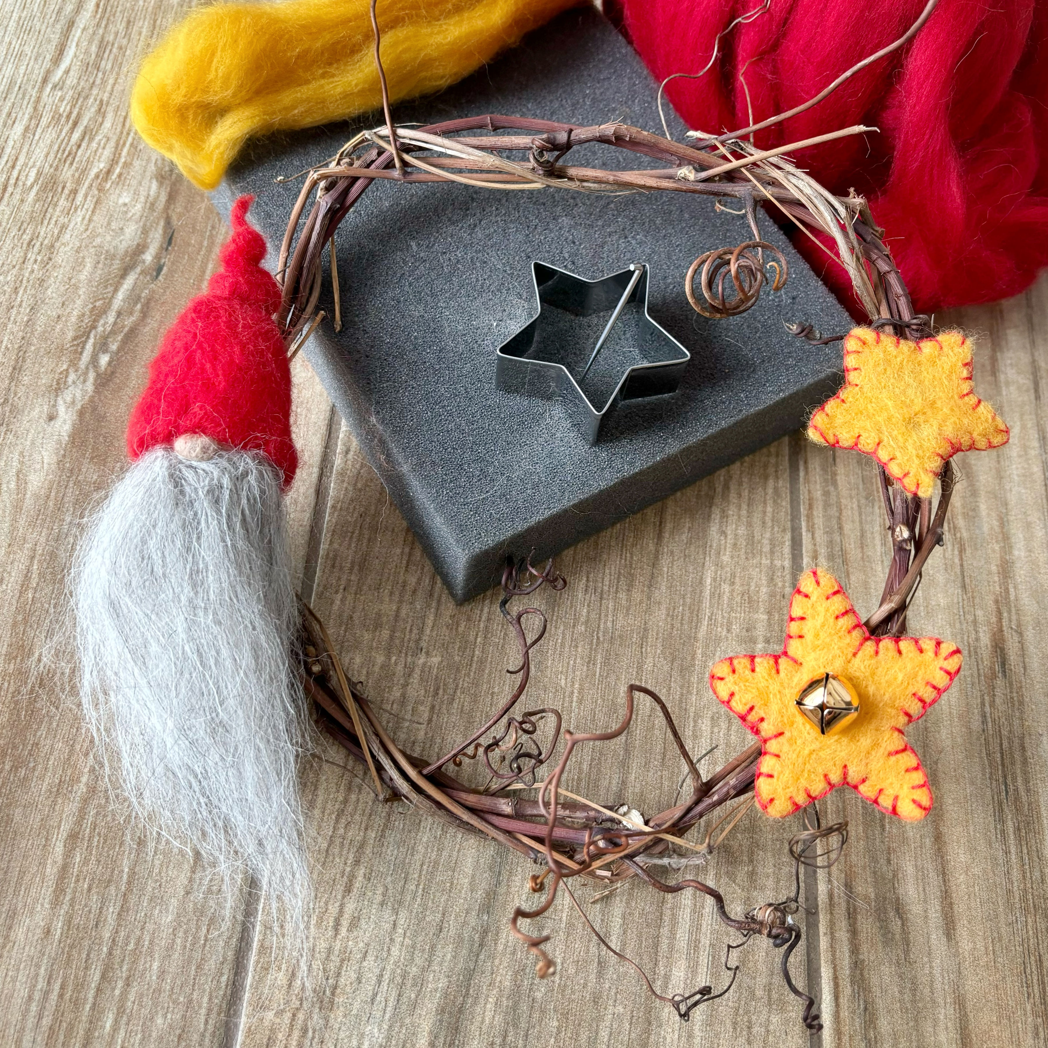
I don’t like that I cut out a bit of the tips of the curly bits of grapevine, and I would have liked the gnome closer to the ⅓ line, and that the top of the felting needle doesn’t reach over the cookie cutter. But, if I don’t stop playing with this and get it to Ruth it will never get published!
Digital cameras love averages
A camera’s sensor pulls everything toward average, so it makes a bright scene more dull and a dark scene more light. The more dark the camera senses, the more light it tries to bring in, and vice versa. But on a sunny winter day, we don’t want it to turn all our lovely white snow to grey, and we don’t want it turning the closeup of our lush black felted hat to a murky grey either. Be aware of this and use the Brightness or Exposure setting in your editing app to make your whites bright (but not too bright!) and your darks proper dark.
There are three basic edits that will significantly improve most photos. In Snapseed, all three of them are under “Tools” (at the bottom) then “Tune Image” at the top left.
Swipe down to find Brightness (I often lift the brightness a bit since I am usually inside where the light is dimmer), Contrast (a touch more contrast is often pleasant), and Ambiance. I love the Ambiance slider. I’m not entirely sure what the special sauce is, but it’s mostly mid-tone contrast, and it makes colours pop. Just a little swipe to the right is often enough to give you a lovely bit of extra magic.

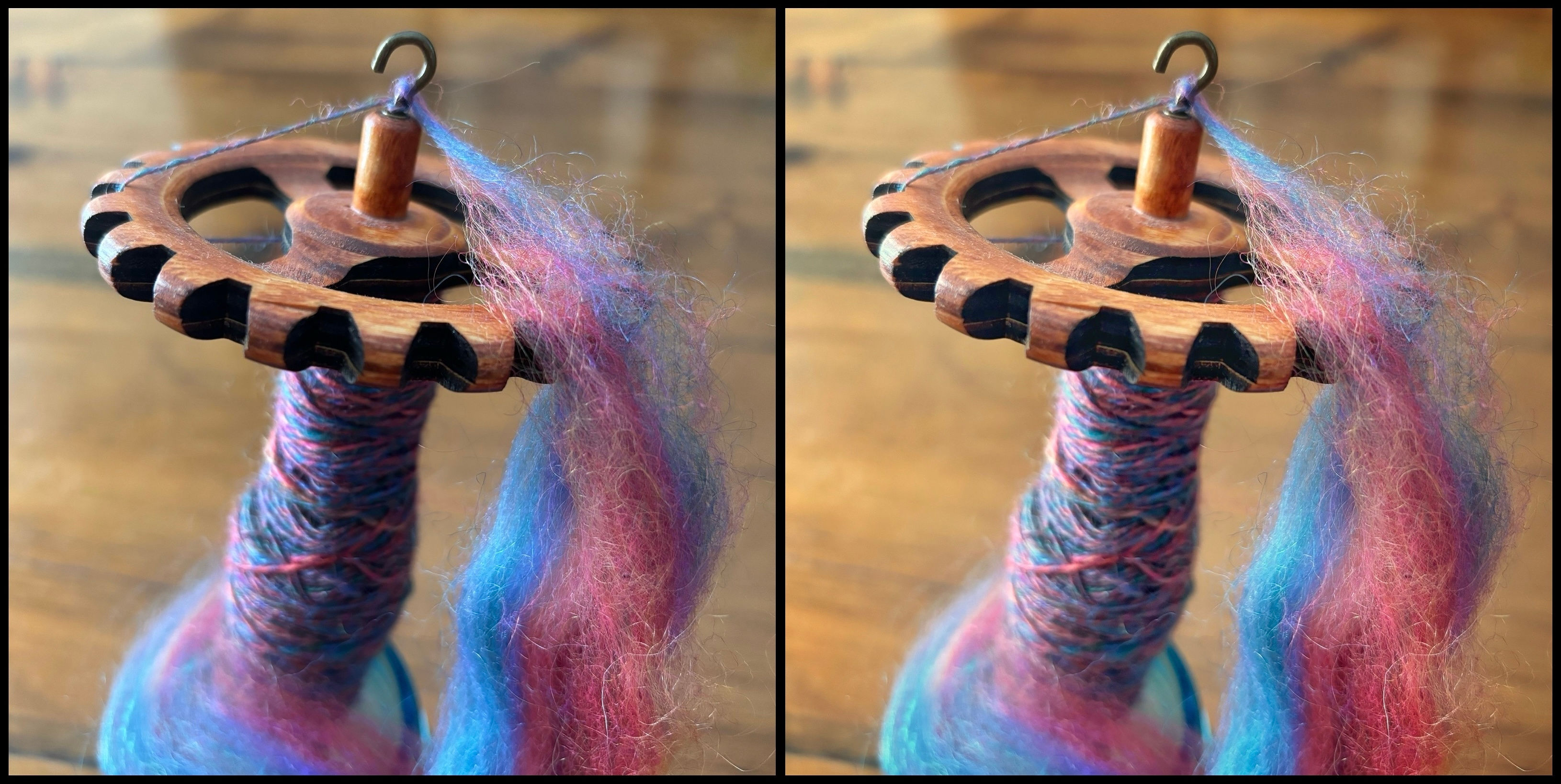
Here’s one of the photos from the series above straight out of the camera (left) and edited (right). I tweaked Shadows (less) , Ambiance (more), Contrast (more) and white balance (warmer). We’ll talk more about white balance in a later post.
So that’s my introduction to making the most of smartphone photography. First, think about the story you want to tell. Next, compose your image thoughtfully, and pay equal attention to what you include and what you exclude. And finally, give it a little polish with a photo editing app. But not too much!
Next time we’ll talk about the number one most important thing that can make or break your photos.
 1
1

 2-4
2-4 6 the original.
 7
7 8 this is 5×7 it’s not quite as intense but it still is very piercing. Yes, this would be fun.
 9
9 10
10 11
11
