Part of my homework for the second session is looking up different forms of applique and doing a few samples of different applique techniques. One of the suggestions on our list was Resht work. Having never heard of this one, I decided to see what it entailed. I found several wonderful examples and learned that it was a Persian technique that used mainly chain stitch to attach cut felt pieces to a background, sometimes felt and sometimes wool cloth. That sounded like a perfect reason to make some felt and give this technique a try.
I printed out one of the examples that I had found. This one was on 1860-1960 One Hundred Years of Fashion and Accessories. I picked out some short fiber merino batt in similar colors to create my background and the pieces that I would cut and applique.
Here’s the felt pieces I created. I didn’t worry much about the edges as I was going to cut them anyways. I did want fairly thin felt as it gets a bit thick to stitch when layered. I did great with this except for the yellow orange piece. It was a bit thick.
Next I worked out a simpler design in the size that I needed. The final piece will be 7″ x 7″.
I traced the main design on tissue paper and cut out that as patterns to cut the felt. Originally, I thought I would overlap the pieces. But once I had them cut, I decided that would be too thick. I didn’t make any pattern for the yellow orange leaves. I just cut those free hand.
Here are the pieces all cut out and pinned on to the background. Now I needed some threads for the chain stitching.
Here are some of the hand dyed thread choices. Now on to chain stitching. I will show you the results in my next post.
When Lyn and Annie announced the Third Quarter Challenge, I definitely felt challenged. The challenge is to create a Cityscape. I tend toward natural inspirations instead of man made inspiration.
It’s not that I don’t have photos of cities, I do. We have been to New York City three times and I do have photos of the city. But the skyline just doesn’t excite me much, especially attempting it in felt.
I then thought about doing something with graffiti. That might be interesting but again, I wasn’t very inspired.
I even considered using a photo like this with rusty bits and natural stone that was taken in NYC but this really doesn’t say cityscape.
Then I started thinking about how I could relate a cityscape to Montana and my surroundings. Perhaps I could do a cityscape of Whitefish, where my store is located? But that seemed too touristy and overdone to me. Then I thought about old west and what constituted a city in the old west. Perhaps I could use a ghost town as an inspiration. I know I’m stretching it a bit but…
Since I have visited Garnet, Montana, a ghost town, I decided to use it for inspiration. You can read about it’s history here. You can also see some photos of the buildings on that site as well.
I googled Garnet Ghost Town for images and found quite a few of the buildings. But the ones that intrigued me were the night sky photos. And this was my favorite. I ended up printing out several night sky photos as well as some of the daylight photos that showed the main buildings better.
Using the inspiration photos, I drew a sketch of where the buildings would be placed. I also needed the approximate scale of the buildings so I could create prefelt building shapes. The plan was to make the buildings in prefelt. All of the details would be added later with machine stitching. So I had my basic design for my “cityscape”. Not really much of a city but it would have to do! Next week I will show you the felting portion of the “cityscape”.
Have you tried one of our challenges? We’d love to see what you create. Show us over on the forum or if you’d like to write a guest post, just let me know.
Rhythm in art refers to the movement of the viewer’s eye, a movement across recurrent motifs providing the repetition inherent in the idea of rhythm. It is based on repetition and involves a clear repetition of elements that are the same or slightly modified. Most often we think of rhythm in the context of shapes and their arrangement.
Flowing horizontal curves give a feeling of relaxation and calm or connecting and slowing. The rhythmic pattern chosen will quickly establish an emotional response to a piece. If the shapes are rigidly defined with sudden and startling value changes, you will achieve a feeling of abruptness and dynamic contrast. If the rhythm is consistent or regular throughout the composition, the mood will also be consistent. However, if the rhythm is in an irregular pattern, it may be unsettling to the eye.
Alternating rhythm consists of successive patterns in which the same elements reappear in a regular order. This is seen many times in the natural world. Alternating rhythms and rhythmic variety can relieve predictability in a design.
Progressive rhythm gives a feeling of a sequential pattern and is achieved with a progressive variation of the size of a shape. This is seen in perspective changes when we look at buildings from an angle. The perspective changes the horizontals and verticals in to a converging pattern that creates a regular sequence of shapes gradually diminishing in size.
Questions to get you started:
Rhythm is usually associated with music. Can you make a composition that is based on your favorite piece of music? How does the repetition of the shapes you are using remind you of the music? How can you use the various elements i.e. line, shape, color, value, texture to form the rhythm and feeling of the music?
Can you use rhythmic repetitions in your work to show movement? How can you depict sequential patterns? Or alternating rhythms?
I had been trying to do these Composition and Design posts on a monthly basis but somehow I missed four months. Oops. But here goes the next one on Scale and Proportion. I only have one more post after this so hopefully, I will get it done in September.
Scale and proportion basically refer to size. Scale means size i.e. large scale means big. However, unless you have a standard of reference, the term “big” is meaningless. Proportion means relative size as in size measured against other elements or against some mental norm or standard.
Scale and proportion are closely tied to emphasis and focal point. Large scale makes for an obvious emphasis especially in proportion to other elements of the composition.
The scale of art can be considered in several ways:
• Human scale – consider the scale of the work itself in relation to human size; Unusual or unexpected scale is attention getting. Sheer size does impress us.
Thanks Ann for the use of your photo of your hat on display
• Context – consider the surroundings and the circumstances in which the art is displayed – does the scale of the work affect the meaning in that particular context?
• Internal proportions – scale and size are relative to the overall area of the format of the work; changes in scale within a design change the total effect of the design. The choice of scale and proportion should help to achieve the artist’s intentions.
• Contrast of scale – scale can be used to draw our notice to the unexpected or exaggerated, as when small objects are magnified or large ones reduced. A sudden change in scale draws attention.
• Scale confusion – deliberate change of natural scale to intrigue or mystify the viewer rather than to clarify the focal point – surrealism often uses this technique.
Proportion is linked to ratio. The proportion is judged to be correct if the ratio of one element to another is correct. The ancient Greeks sought to discover perfect proportion and developed the golden rectangle. This has influenced art and design throughout history and is found in growth patterns in nature.
Questions to get you started:
Do you usually make pieces that are small or do you always work in a large format? How does switching to a different size format affect your work? Can you make three separate works about the same subject but vary the scale and proportion in the work? How do you think the viewer will feel about the change in scale/proportion and it’s affect on the meaning of the work?
Can you use contrast of scale or scale confusion in your composition? How does this exaggeration make you see your work differently? Do you use the “golden rectangle” in your proportions? What happens if you deliberately make a piece based on the “golden rectangle”?
Unity is the presentation of an image that is integrated; an agreement exists between the various elements and they look as if they belong together. Another term for this is harmony. If the various elements are not harmonious, if they appear separate or unrelated, your design is not cohesive and lacks unity. An important aspect of unity is that the whole of the design should be dominant – you should see the whole before seeing the individual parts. Creating visual unity is made easier by the fact that the viewer is looking for some sort of organization, something to relate the elements. Viewers tend to group objects that are close into one unit; negative spaces will also be organized. Objects of similar shapes will be grouped together by the viewer’s brain. Our brain looks for similar elements, and when these elements are recognized, we will see a cohesive design.
Unity can be achieved by the following methods:
Proximity – put the elements close together
Repetition – repeat various parts of the design to relate the parts to each other
Continuation – continue an element from one form or another to draw the eye
Organza squares
Continuity – the planned arrangement of various forms so that their edges are lined up i.e. using a grid to create serial designs (thanks for the use of your photo Zed!)
Using repetition to create harmony and unity is often seen in traditional quilt patterns. Shapes are repeated and colors are repeated to give a pleasing unity to the quilt. I don’t make many quilts and the piece above is made from selvages that are repeated. Often the quilting is repeated over the quilt’s surface and that may create a unifying factor.
However, you don’t want too much unity as it can be boring. Thus you must consider adding variety. Shapes may repeat, but perhaps in different sizes; colors may repeat, but in different values.
Any of the design elements that I have discussed before can be repeated. This is a simple pattern of repeating lines based on frost. Think about how to use the different elements in your composition and how you can repeat them to create harmony. Should you use repetition of line, shape, color?
And the shapes or lines that are repeated do not have to be the same. Similar shapes and lines that are related still give repetition and a feeling of unity without being too boring.
Questions to get you started:
Can you produce a design that is only of one subject repeated many times? How do you keep this design from becoming boring?
Practice making small compositions with a variety of geometrical shapes. How do the elements look scattered randomly across the surface? What happens when you move the items into groups that are close together or overlapping? What does your design look like with similar shapes repeating in a pattern? How can you move the viewer’s eye from one shape to the next? If you use a grid as your format, how does this affect the design?
I seemed to have missed the Composition and Design post for September but I will just move on to the next element of design, color. I have discussed color many times here especially the year that we had color as the focus of our quarterly challenges. But it’s always good for a review and to think about how you use color in your compositions.
Color occurs when light in different wavelengths strikes our eyes. Objects have no color of their own, only the ability to reflect a certain wavelength of light back to our eyes. As you know, color can vary in differing circumstances. For example, grass can appear gray in the morning or evening or bright green at noon. Colors appear different depending on whether you view them under incandescent, fluorescent or natural sunlight. Colors also change according to their surroundings.
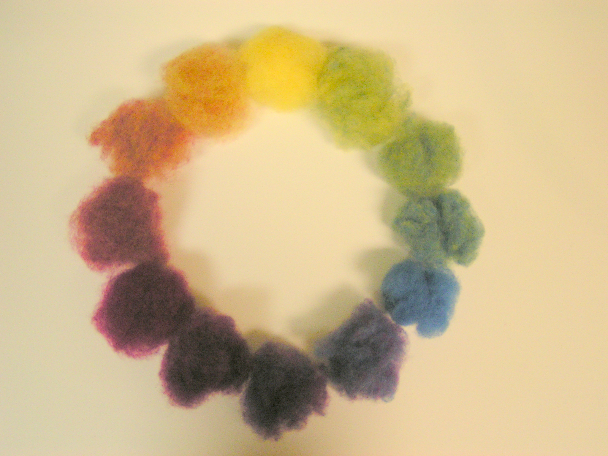
There are three properties of color which are hue, value and intensity. Hue refers to the color itself. Each different hue is a different reflected wavelength of light. White light broken in a prism has seven hues: red, orange, yellow, green, blue, indigo and violet. Remember Roy G. Biv? White light occurs when all the wavelengths are reflected back to your eye, and black light occurs when no light is reflected to your eye. This is the physics of light.
Color value refers to the lightness or darkness of the hue. Adding white to a hue produces a high-value color, often called a tint. Adding black to a hue produces a low-value color, often called a shade. Value can be used for emphasis. Variations in value are used to create a focal point for the design of a piece.
Intensity, also called chroma or saturation, refers to the brightness of a color. A color is at full intensity when not mixed with black or white – a pure hue. You can change the intensity of a color, making it duller or more neutral by adding gray to the color. You can also change the intensity of a color by adding its complement (this is the color found directly opposite on the traditional color wheel). When changing colors this way, the color produced is called a tone.
Certain colors have an advancing or receding quality, based on how our eye has to adjust to see them. Warm colors such as red, orange or yellow seem to come forward while cool colors such as blue and green seem to recede slightly. In the atmosphere, distant objects appear bluish and the further away an object appears, the less colorful and distinct it becomes. You can use this tendency to give an illusion of depth, by using more neutral and grayish colors in the background.
Various color schemes can be used in your work. A monochromatic color scheme involves the use of only one hue. The hue can vary in value, and black or white may be added to create various shades or tints.
An analogous color scheme involves the use of colors that are located adjacent on the color wheel. The hues may vary in value.
A complementary color scheme involves the use of colors that are located opposite on the color wheel such as red and green, yellow and purple, or orange and blue. Complementary colors produce a very exciting, dynamic pattern.
Or how about triadic? (Thanks to Ann for the photo above.) This color scheme involves the use of colors that are equally spaced on the color wheel. The primary colors of yellow, red and blue could be used together in a color scheme to produce a lively result.
What’s your favorite color scheme? Do you push outside of your comfort zone occasionally and try colors you normally wouldn’t use?
How can you use color to evoke different emotions? Do you connect certain emotions to certain colors?
What does using a monochromatic color scheme do to your composition? Complementary? Analogous? Or Triadic?
How do you choose your color scheme? Is it affected by the subject of your composition? The mood you want to achieve? What is the impact of choosing a color scheme that is the opposite of your normal choice?
What would your composition look like with all the same values? How can you use value changes to improve your focal point?
I’d love to hear about how you use color and whether you think about it in advance or just jump in with your favorite colors.
We’re off to our next design element, shape. So what can shape do for you? Or perhaps the better question is what can working through these design elements do for you? Are you ever dissatisfied with how a piece turned out but aren’t sure why? Do you ever wish that you had planned ahead a little more instead of just throwing more embellishments at it? Learn more about design now because you’ll really be able to use what you learn every time that you make something new. Yes, it takes some effort but I’ve found that it’s fun once you get started!
A shape is an area that is separate from other areas and/or its background. The separation can be by a boundary line or a change in value/color, texture or any other difference that lets you see that the shape is different. The boundary can be an outline or a distinct edge like cut paper, a rough edge like torn paper or a soft edge like a smear of charcoal.
Mechanical shapes are those made with straight lines, circles and/or parts of circles — the shapes you can make with a ruler and a compass. These are man-made shapes sometimes called geometric shapes. They can be simple or complex. Think of the inside of a clock or other piece of machinery. The feeling mechanical shapes give is of control and order.
Organic shapes are shapes found in nature — the shapes you draw freehand. They are generally complex and have a natural, spontaneous feel to them. Think of the enormous variety and complexity of plant and animal life.
Forms and shapes can be thought of as positive or negative. In a two-dimensional composition, the objects constitute the positive forms, while the background is the negative space. For beginner design students, effective use of negative space is often an especially important concept to be mastered.
Some artists play with the reversal of positive and negative space to create complex illusions. The prints of M. C. Escher often feature interlocking images that play with our perception of what is foreground and what is background. Other artists take these illusions of positive and negative images to even greater lengths, hiding images within images. Perception of form and shape are conditioned by our ingrained “instinct” to impute meaning and order to visual data. When we look at an image and initially form an impression, there is a tendency to latch on to that conclusion about its meaning, and then ignore other possible solutions. This may make it hard to see the other images. Training the eye to keep on looking beyond first impressions is a crucial step in developing true visual literacy. (photo from the M.C. Escher site).
A shape or form can be open or closed. An open form involves placing an element in the work so that it continues beyond the frame, either literally or figuratively. If the main subject of our piece is shown in its entirety within the frame, it is a closed form.
OK, so now you know a little more about shape. What can you do with shape in your work this month?
How does the composition change if you emphasize the positive shapes? How about the negative shapes?
With one main shape in a composition, would your piece be more interesting if the main object was integrated into the background?
What do you see when you look at abstract shapes? Does the shape represent or symbolize something to you? How does this affect your connection with the viewer of your work?
How can you move the shapes around in your composition to affect the depth perception in a piece?
How does the size of the shape change where it appears to your eye? Does a larger size bring the piece forward? Smaller size?
What does overlapping shapes do to your composition?
How does making a shape an open form change your composition? Closed form?
Leave me a comment about shape and how you use it in your work. If you want, you can share with everyone on the forum how you use shape in your work.
The first element of design that we’re going to play with is line. There are many different types of line – horizontal, vertical, diagonal, dotted, jagged, thick, thin, wavy, straight, long, short – the list could go on indefinitely. How many different types of line can you find? Take photos of as many of the lines as you can that you see during your day. Now go through the photos. Which of the lines do you like better and why? How can you use these lines in your work? How can you use them to organize? Texturize? Guide the eye? Provide movement?
Now I love organic lines but I purposely looked for some line that wasn’t from nature and more geometric. Do you have photos with line? What kind of line do you like best?
Be aware of what the shape of lines can convey. Sharp edges could indicate tension, crispness, hardness, formality, or high-tech. Soft edges and curves may be softer, flowing, more casual, or more personal. Even small changes in line thickness, endings, or shape changes can alter the look and feel of a design. Try drawing sets of patterns using only black or white lines that illustrate static, dynamic, or random line patterns. Experiment with line width, spacing, and using horizontal, vertical, curved, and even diagonal lines. In the exercise above (click on the photo to see it a little better), I picked opposite words and then drew various lines to signify that word.
How can you use line in a composition to make it more active? Or still? What direction of line conveys more action? Or serenity? What emotions can you evoke with line alone? What does changing the weight of the line do to your composition? Or changing the texture of the line?
Here’s a before and after line set of photos. Does the line make it more interesting?
And again, do you think the addition of silver line adds interest?
Here’s a sketch I did from a photo. The reason I took the photo was because of the lines of the branches against the trunks and the snow. I simplified my sketch a bit but the eye is still drawn to those branches against the background.
And when does line become shape?
How do you add line to your work? With hand or machine stitching? With dye or surface design techniques? With paint or pen?
Here’s another exercise I tried. Click on the photo (it’s not really good, sorry) and see how I used just straight lines with varying widths between the lines as I go down the page and create shapes where the line isn’t.
Machine Stitched Grizzly on Felt
Here are some examples of machine stitched line on felt.
Try thinking about and using line in your work this month. I’d love to see what you come up with. I am creating a new thread on the forum so everyone can post photos of line, working with line or work you have created with line. So that’s your “design challenge” for the month. Let’s see some line folks!
Zed and I were having a discussion about artistic talent and having “an eye for art” when she asked about the mini landscapes that I painted. Many people think that they are not “talented” and “can’t draw or paint” and have never been to art school. I too have never been to art school and I used to think that I couldn’t draw. But I have since learned that you can teach yourself (or learn) these skills and you can also learn the basics of design as well as practice creativity. Once you start practicing those skills and add in the elements and principles of design, you too can have “artistic talent”. I truly believe that everyone is creative but most people let their creative muscle turn into a couch potato. Zed was interested in learning more about art and design and I hope that the rest of you are as well. (All the photos are mono prints using acrylic paint and a gelatine plate that I have pasted into my journal.)
I am planning on writing a post about composition and design once a month or so. I am certainly not an expert on the subject but I have found that if I write about it, I learn a lot myself too. I will give lots of references of both online websites and books that can be found in your local library (hopefully). If you can’t find a specific book, don’t worry, just look in your library in the art and painting section. There are lots of good books available that can help you improve your “artistic eye”. I am actually updating some posts that I wrote over on my Permutations in Fiber blog that were called Design Focus Friday. I started writing those back in 2010. If you’re in a hurry, just go over there and search under “Design Focus Friday” and you’ll find all my old posts there.
When I looked up the definition of design here are some of the answers I got:
make or work out a plan for
create mentally
an anticipated outcome that is intended or that guides your planned outcome.
Now I think that we all have done that sort of thing when we created a piece of fiber art. I also have heard many people say that they want to create spontaneously and creating a design first would put a damper on your creativity. I think that you can do both because once you know the basics of design, even though you are creating “spontaneously”, you are using what you’ve learned in the past to create a piece that has a composition that works due to the elements and principles of design. What do you think?
Here is an overview of design elements and principles. These are pretty standard and although there are some variations noted in different sources, I’ve tried to provide a comprehensive list. To develop a composition, you will be using design elements arranged with the principles of design in mind. There are no really hard and fast rules but the design principles can guide you to create a piece that draws the eye and keeps the attention of your viewers so that the message you are trying to express comes through in your art. Think of the elements as your building blocks and the principles as guidelines to follow in how to place your elements to achieve your best work.
Elements of Design
Line – A mark on the surface that can be thick or thin, smooth or jagged. There are many types of line such as vertical, horizontal, diagonal, actual or implied, contour etc.
Shape –A line that comes together to form a 2 dimensional object which can be geometric or organic.
Form – A 3 dimensional object such as sculpture with real volume or thickness. It can be implied 3 dimensional shape using shading, lighting or other techniques in a 2 dimensional work.
Texture – The surface quality of the object whether it is rough or smooth. This can be actual texture or it can be implied by various techniques.
Color – This refers to the hue used from the spectrum of colors. A basic color wheel can be used to determine a variety of color schemes in including monochromatic, complementary, analogous or triadic.
Value – A property of color, value refers to the lightness or darkness in a composition. Contrast can be depicted by changes in the values you use.
Principles of Design
1. Center of Interest – Also called the focal point or emphasis, it is the way to catch the viewer’s attention. The center of interest is more important in the composition compared to the surrounding areas.
2. Harmony/Unity – The presentation of an image that is integrated and pleasing to the eye. Agreement exists between the parts and provides visual connection.
3. Balance – The distribution of the visual weight in a composition provides equilibrium to the piece. This can be symmetrical, asymmetrical, crystallographic or radial. All of the elements of design can be used to create balance.
4. Scale/Proportion – This refers to the comparative sizes of the components of the composition. It is relative, size measured against other objects or against a “normal”.
5. Rhythm – Refers to the movement of the viewer’s eye over repetitive patterns in the composition. It involves a clear repetition of an element in the piece.
So if you’d like, do a little research. Look at the links I’ve provided below. If you can find it, the book Design Basics by David A. Lauer and Stephen Pentak is wonderful. I found a copy in my local library and it was the first design book that I’ve been able to read through without falling asleep. Do you have a sketchbook or studio journal? Do you use it much? Here’s an opportunity to start. Take a look at artwork that interests you either online, at a museum or from a book of your favorite artist’s work. How did that artist use the elements of design? Are the principles of design evident? Go through the list above and ask yourself how the artist used each of the elements and principles in the work. Why does a certain piece catch your eye and another doesn’t? Print out some of your favorite artwork and paste them into your journal. Write down your ideas about why you like the pieces. Let me know how it goes and check back next month for the next post on using line in your work.