2nd Quarter Color Challenge
I have been thinking about Ann’s 2nd quarter challenge for a while now but didn’t have much time to get anything done. But I finally did it. I used the Color Adobe site to create a palette from a photo. It allows you to use a color wheel or a photo. The other thing I liked about it was that it had several choices of palettes from a photo plus you could create a custom one. I used a photo that I took in Mexico.
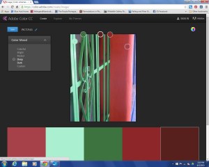
The photo above show what the screen looks like with my photo, where the colors were taken and then the palette below. The problem I have with these programs is that the colors of what I saw are nowhere near this palette. The colors were bright green, orange and a cornflower blue. I think the camera changes the colors and then the palette takes that several steps further. So that what I saw in Mexico has little to do with the palette that the computer generates.
But it’s an interesting process. So the first photo was the “colorful” palette and this one is the “bright” palette.
Here’s the “muted” palette.
This one is “deep”
This one is the “dark” palette.
And then you can move the little circles around to find the colors you want. At least this has a little bit of “orange” in it. I decided I would use the “dark” palette to make a wall hanging in felt.
Here are the colors I chose from that palette. Obviously, these colors are not quite the same as the palette. But I used what I had.
I had a piece of pre-felt left over from the Monet challenge last year and used that at the top of the piece. Then I created this piece based on my morning walks and all the wildflowers I see.
This is what it looked like after wetting it down.
And here is the piece after felting. I really like how it turned out but again, I don’t think it has any relation to the photo I chose.
Here’s a detail photo. I think I will add some hand stitching. Have you tried to use a computer generated color palette for inspiration? It is an interesting process and I do like how the color scheme worked. I wouldn’t probably has used the pinky-peach color but I do think it goes well with the color scheme.
Don’t forget that there is still time to sign up for our online course Wet Felting for Beginners starting June 19th. Just go here to sign up.


13 thoughts on “2nd Quarter Color Challenge”
I think stitiching is a good idea as it will enhance the pretty wildflower picture you’ve made. I really like the organic shape – it’s perfect for the subject.
I like the options of different palettes in Colour Adobe Site (dark,deep,muted). It can be difficult to choose colours for a new piece but sites like this give you a good starting point.
Thanks Lyn – I did like playing with the website – it was interesting to see the different palette options. I started the stitching and it is looking good. I’ll show the final piece when it is finished.
Fabulous! I admire your patience to spend time developing a ‘computer’ palette…it certainly paid off…..of course your felting skill made it happen!
Thanks Mary – it didn’t take all that much time to develop the palette. The site is fun to play around with and think up new color combinations.
I really like the end result, even though I agree, the colours end up not having a lot to do with the initial photo. However, if it got you to make something new, then it was an absolute win 🙂
PS – I often wonder how these pieces might look in a glass frame, without felting – your photo of the fibres put together before wetting them down already look so nice!
Thanks Leonor! I really like the colors so I guess it doesn’t matter that the original source was so different. Yes, the layouts do look nice without felting. There is an artist that does all of her work that way but I have forgotten her name at the moment. I like to be able to stitch on the felt so under glass wouldn’t work with stitching 🙂
The palettes are really interesting, but so is the photo. I like how your piece turned out, knowing your stitching, I’m sure whatever you add will look gorgeous 🙂
Thanks! Playing with the different palettes was interesting.
Gorgeous flowers, Ruth. And I do think the hand-embroidery will fill in the details nicely. Ever since hearing about the color palette finding, I have used it to identify the colors I don’t always see in a landscape. It’s always surprising to see the variety of colors, but I usually just choose what I like. Look forward to seeing your completed piece.
Thanks Cathy! Palette finders are useful to be able to see some colors your eyes might miss. It just gives you another tool to use in choosing a palette.
I really like the landscape, the color generator and its choices.
Thanks Marilyn!