
Playing with Color Mixing
I finally had a little time to play with color mixing wool. I don’t usually buy commercially dyed wool but I had some on hand that Patti from Dream Felt had given me when I was writing The Complete Photo Guide to Felting. The wool is Norwegian C1 batts and I had a variety of colors. One of the reasons that I like to dye my own wool is that much of the commercial wool is very saturated in color and therefore really bright. Most of my inspiration is from nature, I don’t see those saturated colors in my landscapes, trees, rocks, lichen etc. A lot of my inspiration is in colors that aren’t as bright and many varieties of one color such as a multitude of greens.

So these are the three “primary” colors I started with. I didn’t have a really true red, more of a magenta leaning towards red violet. The blue choices were either this slightly grayed blue or a blue leaning very much to the green side. So these are the colors I chose to mix a color wheel. I used an equal amount of each color and mixed them by hand and carding with hand carders.
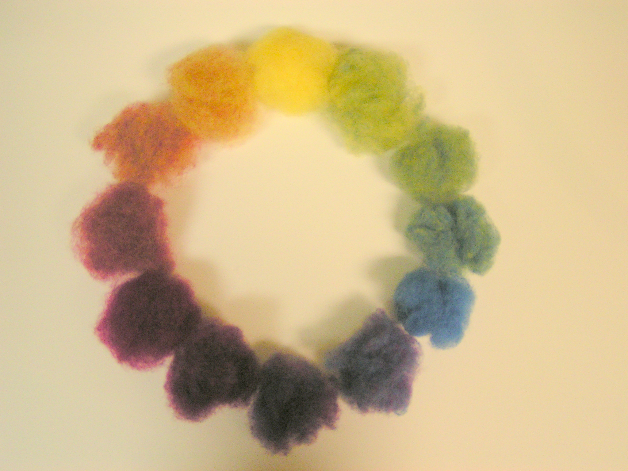
Here is the resultant color wheel. Up close, you can still see the individual fiber colors but because your eyes tend to mix the colors, from a distance it looks more like a solid color.

If you look at the yellow-green, you can still see some blue bits in it. Norwegian C1 is a fairly short fiber with what seemed like little neps mixed in. So the colors didn’t blend together all that easily.

I wasn’t all that happy with the greens in my color wheel. So I thought I would try the blue that was almost blue-green and mix that with the yellow. You can see the two different blues on the top row. The two greens that resulted are below the blues.

Compared together, the green on the right looks more of a true middle range green to me. What about you?

I didn’t have any black or white to make tints and shades, so I thought I would try to “neutralize” some colors using their complement (the color on the opposite side of the color wheel). Here I started with light green and a bit of magenta. I used much less magenta than green.

And here is the result on the left compared to the original green on the right. Do you think this would work in a landscape for spring trees? Would it look more natural than the solid light green on the right?

Then I thought I would try mixing the pink with a little dark olive-green. You can see I didn’t use very much.

And here is the new pink on the right compared to the original pink on the left. Which pink do you think would make a more natural skin tone?

Next was orange and blue. I used a small amount of blue to mix into the orange.

And here are the results with the mixed on the left and the original orange on the right. One of the things I have learned from reading books about painting is that if you want to paint a shadow, you should mix some of the original color of what is making the shadow with its complement. That gives you a darker, more neutral color of the original color for the shadow instead of using grey or black to make a shadow. So for example if you were making a wool painting with pumpkins and had used the orange on the right for the pumpkin, do you think the color on the left would make a nice shadow on the side of the pumpkin that was away from the light?

Here I mixed yellow with a light purple. Just a little purple into the yellow to get the color on the top left. Many times when you look at something, say a banana, your mind tells you that it’s yellow. Is a banana truly the color on the top right? Or perhaps it is a more neutral color like the one on the left. If you take a piece of paper and cut a square hole out of the middle, put the paper over the banana to isolate the color, then place your wool next to the open hole in the paper to compare colors, you will probably find that the banana is not as yellow as you think it might be. Different parts of the banana when isolated will be different yellows.

Next I wanted to see if I could make a brown or grey by mixing two complements in equal amounts. So I tried the magenta and dark olive-green.

Here’s the result. What color do you see in the middle? Brown?
I had fun mixing colors and hope you can see why it might be useful to know what wool colors look like when mixed together. I’m sure I must not be the only one that didn’t have the exact color that I needed when making a project. But if you know how to mix color, you can create the color you need by mixing the colors you do have to make an entirely new color.
Have you tried anything for the 1st quarter color challenge? We’d love to see what you’ve done over on the forum.
23 thoughts on “Playing with Color Mixing”
Great post, Ruth 🙂
I’d forgotten that about mixing the opposite to make the shadow colour. I don’t know why commercial wool has to be so saturated, it must have to be carded and/or combed after dyeing, I’m sure most people would prefer it not quite so flat or solid. I’m getting bananas later so I’ll check back 🙂 I see a rich burgundy tinted brown at the bottom, would that be ‘mahogany’ in wood terms?
Thanks Zed – I guess with commercial wool they always want it to be an exact match to a color and if you had a variety of colors in it, it would be hard to replicate. Do let me know on the banana sample 🙂
And it is definitely a reddish brown. Had to keep adding more green to get it to that as the red was stronger than the green.
I forgot and ate the banana! I’ll try to remember tomorrow.
Great job, Ruth. When I get a carder I’ll try that too. I agree with you that if you want to make landscapes and have all those shades you cannot work with market available wool. Thanks for posting this, very interesting.
Thanks Nada – I actually mixed most of it with my hands/fingers. I used the carders occasionally but you don’t need them.
Ruth, this was a terrific lesson on mixing colors with wool! I do agree that purchased wool roving colors are so saturated that they are not very useful in landscapes. I often use needle-felting with landscapes in an attempt to create various colors that you do see in nature. Your samples clearly show that sometimes you just need a bit of one color to increase the “naturalness” of a second color.
Thanks Cathy – glad you enjoyed the “lesson”. It is pretty easy to achieve a more neutral color this way.
I love mixing wools together to get great colours and you have some good ‘uns up above in your post.
Even when you mix the fibres until your arms drop off you can see the indivdual colour fibres if you look closely, but that’s exactly what makes the wool colour so interesting when used in felting.
Yes, I see brown.
Thanks Lyn – It is fun to mix colors. I agree about the individual strands adding dimension to a felted piece.
Very illustrative colour mixing Ruth. Thanks! I really understand what you mean about mixing colours for shades now, using a complement colour instead of grey or black. And the different coloured fibres will become even more blended after wet-felting.
Thanks Zara – I like using the complementary color as it seems to give the color a bit more “life”.
I have never really used a colour wheel, just gone with what I feel but your post is so interesting, especially about the neutralising. I need to go and have a play myself now!! Thanks for the inspiration!! Sharon Xx
Glad to inspire you Sharon! Many people just go with colors that they like but I think learning more about the color wheel and how it works really improves your creations 🙂
I’ve been doing the same thing, mixing fibers by hand to make the color wheel. It is much more time consuming than I imagined. I do see a reddish brown on the last pic. I’ll have to try the banana test when I get some.
It does take some time but I do like the blended colors. Let us know about the banana.
A great illustration of how to bled colours Ruth. when I took my first dye class I learned there were 6 primaries 3 painters colours and 3 printers colours. the painters colours are the more natural ones that would have been made by painters and the printers came later to work better in printing. When I first started I liked the clear colours now I like mixed colours even if they are a mix of one colour. It gives the wool more depth or life as you say, instead of being flat.
Yes, colors are different when dyeing and painting and in light. And I agree – more depth is a good way to put it.
Thanks for writing about this, Ruth. I think you’ve shown us all how to tone down some very saturated colours to make them suit our projects. I know a few felters who are afraid of mixing colours because they’re afraid of what might happen, so I’ll direct them to your post!
You’re welcome Leonor – no need to have fear about mixing colors – it’s loads of fun and gets great results 🙂
Very interesting and illuminating post Ruth – thank you for that. It will inspire me to try more colour blending – normally I’m too impatient to get on with felting. 😉
I’ve just received some Norwegian Pels/C1 blended batts, which I haven’t used before, so will be interested to see how they felt.
It does take a bit of time but I think it is worth it. I bet you’ll like the blended batts – they are a little hairy but felt well.
I’m going to be working with a group of 8 year olds at an art camp and would like to do a color blending exercise with them. Is this too young to introduce them to the color wheel ? I’d like to let them make something with the new colors they have created – the most obvious is a color wheel on a paper plate, but do you think this could be expanded a bit more into a simple picture? I’m a master spinner and weaver so work with fibers a lot, but want to make it a real learning experience for these kids.
Hi Zelma, good luck with your art camp project. I am not an expert on child development by any means. But I think that 8 years old would be a great time to learn about the color wheel and color mixing. It’s much easier to see this quickly using paint but can be done with layering if you are wet felting as long as you are using the same fiber throughout your mixing process. Depending on how much time you have, making a picture would certainly add a more challenging project. Have fun!