Browsed by
Category: Wet Felting

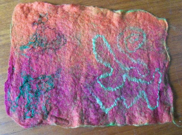
Exciting News – New Online Classes!

Exciting News – New Online Classes!

We have two new online classes available, one for newer felt makers and one for more experienced felt makers.

The first online class, Wet Felting a Vessel Using a Simple Resist, is taught by Helene and will teach newer feltmakers how to use a resist. If you know how to wet felt a flat piece of felt but want to move on to making 3D felt objects, this class is for you. The class is online and can be started and accessed at any time. You will have continual access so that you can keep coming back to the class videos and PDF’s at any time as you progress in your felt making. Students will also have access to a private Facebook group to show their work and ask questions of Helene.

You will learn about making resists, what materials to use, how to layout your wool, prefelting and felting over the resist as well as fulling and shaping your vessel. Helene will also show you how to progress from a simple shape to other options only limited by your imagination. Click here for more information and to register now.

The other new online class which will start October 17, is 3D Multi-Part Resist by Ann M. This class is designed for intermediate felt makers who have made vessels or other items over a resist. If you have seen more complex vessels and wondered how they were made, this class will teach you how to create a “book” resist and create a multi-part vessel.  Ann will be posting more about her class soon. If you’re interested, you can fill out our contact us form to get on the email list to notify you when registration opens.

If you are just starting on your felting journey, our Wet Felting for Beginners online class is always available. If you take this class first, you will be ready for Helene’s vessel class and then move on to Ann’s more complex vessel class or Helene’s hanging spiral class.

FELT SWAPPING

FELT SWAPPING

The International Feltmakers Association has been running an annual Felt Swap – setting a theme and linking members who’ve elected to join the challenge with a “swap partner” from somewhere in the world – since 2020.  I spotted the invitation to join in the 2025 swap on one of the regular emailed Newsletters and decided to have a go.  I started to write this post about the entry and remembered that I’d entered the first Swap and had posted about it.  However, when I trawled back through my posts to find the link for you, I found that I hadn’t actually written the post, let alone published it.  So we’d better start there.

The subject of that challenge was “Light”.  I thought a lot about this as it seemed such a wide subject and I didn’t know where to go with it.

To begin with I listed as many things as I could think of that could have anything at all to do with light and came up with: Light bulbs;   Bright light – dazzling – blurred;   Rainbow;   Prisms and light splitting;   Dark area with light coming in from one side;  Sun beams from behind clouds;   Fire light;   Moon light;   Lighthouse;   Northern Lights.

Clouds and especially stormy skies fascinate me and I thought that I could do something with this idea.  Initially I went for a sun low on the horizon just showing through some dark clouds but with rays going upwards behind the clouds.  For some reason this was not a success so was abandoned.

Then we had a thunderstorm and I had a lightbulb moment!  So I looked through some of Mr Google’s images just to remind myself what forked lightning looked like and then went for a storm over the sea, and used this image for reference.

dark sea, dark stormy clouds with forked lightning running from clouds to sea
Lightning at Sea

I have a collection of fibres, yarns and fabrics in my “stormy” project sack – too big to call a bag – and my first thought was to use some of those in the picture I had in mind.  I had already made a mixed media image of a storm at sea using various textiles and fibres and thought of doing something similar.

Mixed media picture of stormy clouds, rough sea, rocks, spray and wind tossed seagulls
Storm at the Coast

So I looked out some of the fabrics and yarns and other bits and pieces to see what I might use.

But in the end I decided that I wouldn’t use these for a couple of reasons: 1. this was supposed to be a “felt” swap; and 2. using the mixed media would possibly need a larger picture than I was making – we were limited to A5 size – 5.8 x 8.3 inches (sorry I don’t work in “the foreign” if I can help it).  I did use my stormy fibres though.

I was reasonably happy with the picture after it had dried, but decided to do a bit of tidying up and embellishing with some needle felting.

This is the final result

completed felt picture of storm at sea with dark clouds and forked lightning running down into the sea
The swap picture of LIGHTning


My swap partner, from Denmark,  sent me a felt bag, which was really good.  I didn’t want it to get dirty or damaged before I was able to use it and show it off so I wrapped it up and put it in a safe place.  So safe that …..!

Anyway, back to this year’s swap.  The theme for this one is “Inspired by an Artist”.

Again this was a very wide subject, first choose your favourite artist then find a piece of their work that sparks an idea.  I don’t actually have a “favourite” artist, I love the work of many: Constable; Canaletto; Turner; Rowland Hilder; William Morris and most of the Arts and Crafts artists and architects; Rennie Mackintosh….  I could fill up the page with names.  I trawled through works by most of these, bearing in mind the maximum size of the piece I was to make (8″ x 8″) the while.  In the end I decided that I would go with Charles Rennie Mackintosh.

I searched google and found several stained glass windows, one wall carving and a draft fabric design that I liked.

In the end though, I decided to go with a section of the last one, which I squared up and manipulated to make it the right shape and size.  The window is typical of the Art Nouveau period and “attributed to Mackintosh”.  I could not find out if it is actually his design but it is certainly very like his work.

I picked the centre of the window to work on and the enlarged and reshaped (slightly) design was printed off in greyscale and laminated.  I would be able to use the laminated design as a base on which to lay out the fibres.

a monochrome image of the window section covered in polythene sheet and the original image in colour
All ready to lay out the fibres

While I was looking through my stash for suitable fibres and pre-felts for the project I  happened to glance at the design which was inverted.  I immediately saw a face with an extremely runny nose!

the monochrome image rotated 15 80 degrees
This was when I spotted the runny nose!

Nevertheless I thought it would be fun to use the design of the face, since we were to produce something “inspired by” a favourite artist, rather than copy what s/he had produced.  This would allow me to get rid of the runny nose and I also wanted to change the colour scheme.

I had decided to use a piece of pre-felt which I had bought from Wingham Woolwork some years ago, especially as it was slightly moth eaten and I could use what I might otherwise have to throw away.  This was a lovely strong purple colour so I decided that my colour palette should be purple, turquoise and orange.

various fibres, yarns in purple, orange and turquoise, and an orange chiffon scarf
Picking colours and materials

The basic design was laid out in reverse, that is with turquoise knitting/felting yarn “face down” on  the design, with some fillings-in of orange fibres on top and two squares of turquoise where the “eyes” would be.  The purple pre-felt backing was placed on top of that and the whole wet felted.  Unfortunately this resulted in the straight lines becoming distinctly wavy – a good job this wasn’t a straight copy of the original!

After the piece was rinsed, dried and ironed, the remainder of the design was added by needle felting (which, together with the shrinkage during wet felting, had effectively removed the moth holes) and finally some simple embroidery stitches.

The piece has been mounted on foam board for stability.

finished face - orange eyebrows, nose and eyes with turquoise moustache, and facial features on a purple background
Finally – the Swap piece

This is the piece I received from my Canadian (Calgary) swap mate.  It is inspired by “Violet Poppies” by Emile Nolde https://arthur.io/art/emil-nolde/violet-poppy

Isn’t it gorgeous?

3 felted poppies with dark leaves on a yellow felted background, displayed in a circular embroidery frame
Swap piece received from Canada
A Sample for my Seat Cushion

A Sample for my Seat Cushion

I decided to make a sample before plunging into making a seat cushion. I decided this for 2 reasons. First, I am not sure where most of the batts are hiding, so I only had a small batt handy. Second, I needed to do some quick felting for the blog today. The sample fit the bill perfectly.

This is a Swiss Mountain batt. I got it off Etsy a few years ago.

I decided 10 inches by 10 inches is a good size for a sample and makes shrinkage easy to calculate. Please excuse my dirty-looking table; it’s some sort of glue that won’t come off.

The edges a thin, so I folded them down to make it square.

I added a layer going up and down.

Once it was wet down, I folded the thin edge top and bottom to square it to 10 inches. That would have been enough to make a sample, but it would also be very boring.

I got out some balls of my handspun and made a spiral. Who doesn’t like a spiral?

I spent longer than normal rubbing so the yarn would stick without moving too much. My impatience usually results in wobbly lines.

Then, of course, lots of rolling to full it properly.

The finished sample ended up just about  7 by 7 inches

It ended up fairly sturdy. The spiral ended up holding its shape very well. However, it is quite hairy and I think it would be a bit prickly to sit on with thin pants or a dress. Once it is dry, I will try shaving it, but I don’t think it will work. There will still be short, strong fibres on the surface. I may have to try some Blue-faced Leicester or maybe some Corriedale. What’s your favourite strong wool for sturdy applications?

Felted Cat Cave, a quick how to -revisited.

Felted Cat Cave, a quick how to -revisited.

I am supposed to have the summer off. So far, I don’t seem to have stopped running. So I have nothing new to tell you about. So I am going to share this with you again. I hope you enjoy it again if you have already seen it.  I am at a Demo today. I plan to take lots of pictures and blog about it on July 23. It sounds so far away, but I am sure it will be here the day after tomorrow.

I have been wanting to make a cat cave for some time now. I decided it needed to be bright. I picked some Blue Faced Leicester wool so it would be strong and dyed it chartreuse. Then I picked some purple and magenta for the spikes.

Spikes and Wool

I wanted an oval cat cave. I used my oval hat form to get the shape and gradually sized it up.

Drawing the Resist

I laid out 4 layers of wool for strength and even shrinkage. I put the first side aside, and after laying out the second side, I poked holes to put the spikes through.

Spikes in the Wool

After wetting it all down, I wrapped each spike in plastic wrap so it would not get felted down flat.

Spikes all Wrapped Up

I covered it with a sheer curtain and rubbed both sides for a while and rolled it for a while, and then wrapped it up, put it in the dryer twice, changing the position of the felt each time.  It was starting to shrink, so I cut out the resist and switched to rolling it in a stick blind. I find the stick blinds to be very aggressive and shrinks the felt quickly.  I did do some throwing, too. Finally, I rinsed the cave out in a bucket of alternately hot and cold water, being quite aggressive with it. I then had to stretch the top so it would be domed. I steamed it to heat it and make it easier to stretch. Mostly, I used a wooden spoon to push in a sliding motion to get the shape. Here it is on top of the resist, so you can see how much it shrank.

Finished Cave on top of the Resist

Here it is in use; it didn’t take long for one of my cats, Wu, to take up residence.


Cat in Cave

As a footnote, Wu (the queen of all things) is no longer with us. This is one of my favourite pictures of her. She really liked the cave; we buried her in it, here on the farm.

Quicker and Cheaper?

Quicker and Cheaper?

For some years now I’ve been selling my work in local galleries and from a  ‘fisherman’s hut’ in Whitstable harbour market.

For many traders in the harbour market, sales seem to have been down over the last year, and I’ve noticed that people are frequently buying smaller and cheaper things from everyone, like smaller pictures, or prints rather than original pictures. Sales in the galleries have held up a bit better for me so far.

I decided to see if I could produce some felt pictures more cheaply without compromising on quality.

I wrote here last September about having to make a lot of pictures for a big exhibition. I developed a new line of work that I could produce at speed. https://feltingandfiberstudio.com/2024/09/05/the-mother-of-invention/

I decided to take my nuno printed tree pictures one stage further to make them a little smaller (less felting time, fewer materials) and offer them unframed (lower material costs).

I’ve realised that using recycled silk or fine wool scarves is a quick way of creating patterns within a felt picture. It can significantly reduce layout time as your fabric does a lot of the work for you.  I then thought that I could cut down on fulling time as well if I made two pictures at a time. 

I then had a presentation question.  I normally have my frames handmade by a local maker. Would I go down the mass-produced frame or the no frame route? I decided to start with the no frame option. I found a provider of inexpensive but good quality picture mount kits that include a back board, mount and cellophane bag.

I made the felt for four pairs of pictures; cutting them apart before printing a different tree on each. I took these photos as a record rather than to present so they’re not the best, sorry.

Do you have a favourite? I think the one top left is mine.

I had 5 weeks of sales / exhibitions in June (one of two weeks and one of three, overlapping – I know, poor planning) and sold 4 of the 8, so I’m pretty happy with this experiment.  What next? I will probably make a few more of these and I might source some sample frames to go along with them. Maybe I’ll get my local frame-maker to make one then buy a couple of cheaper mass produced ones so people can see what the options are.  Framing is much more expensive than many people realise. I’m also offering photos of some of my bird felt pictures, and prints of some of my (non-felt) photographs in the same unframed format. I’ve sold three of these so far so will see how they go.

I thought I’d finish with a follow up to my sample making blog from March. https://feltingandfiberstudio.com/2025/03/09/auditioning-fabrics/

I made each of the samples into cards and here they are.

Mostly just a question.

Mostly just a question.

School is almost finished, this is the last week. I hope that school ending will let me get back to my felting life. I have managed to finish the first part of my planned book resistance workshop, but haven’t had time for much else.  I want to get your opinions on the best background to take the pictures for the next part of the workshop. I can’t use my tabletop as it is much to reflective.


I will be using pink wool for the workshop. Please ignore the fold lines, I will wash and iron the cloth before using it for taking pictures. Here are the choices

Grey

Blue stripes

multi coloured stripes

and Poka dots


I am leaning towards the grey. The white resist shows up well, and the pink does too. I kinda like the blue stripes (they look grey on my screen)as it gives me something to line up with.


I will need to add something to the background to let me know I am in the frame properly. I think just some painter’s tape will do it. This is the view from the tripod, right now.


Jan bought me this doohickey to extend my camera further away from the tripod. It works with the ring light, but the ring light is too tall.  The screw on the tripod is to short to add the ring light I have. I will have to find out the name of this thing and see if I can find one with a hole at one end and a screw at the other. It adds about 2.5 inches of reach for the phone/camera.

Back to the original question, which background do you like best?


Miniature Wool Landscapes

Miniature Wool Landscapes

A few posts ago, I showed you some painted miniature landscapes. Why not try the same idea in felt? So off to my stash to figure out what I had to create these.

Supplies for wool paintings laid out on work bench including various colors of wool roving, locks and colored prefelts.

I found a variety of green wool as well as white, grey and blue for the skies. I also had some locks in black and dark grey and thought they might work well for tree trunks. I had a few sheets of various colors of commercial prefelt to use as a base.

5" x 7" colored prefelts for wool paintings laid out on work bench.

I cut the prefelt into 5″ x 7″ pieces. I thought any smaller might really get difficult getting the wool to cooperate.

Beginning layout of wool on pink prefelt for mini landscape.

I decided to try one first before I made all of the landscapes. I used the pink prefelt and laid out a variety of greens for the foreground and white with a tiny bit of blue and grey for the sky.

Final layout of wool on pink prefelt for mini landscape.

I then laid out the trees with a very small bit of locks for the trunk and a bit of green for the leaves. Now on to wet felting it.

Mini wool painting of landscape after wet felting.

I wasn’t particularly happy with the locks after felting. They went right through the merino and I wasn’t careful enough, as they moved about. Now I had really hairy dark spots that looked nothing like tree trunks. But I was happy with the rest of the landscape. These shrank down to about 4″ x 6″. I probably could have shrunk them down further but since it’s a “painting” and not functional, I decided 4″ x 6″ was a good size. They will fit into 5″ x 7″ frames easily.

Mini wool painting after shaving off excess "hairy" fibers.

Since I wasn’t happy with the hairiness, I decided to shave the piece. I think it looks a bit better now. So on to the other six landscapes.

Final layout of wool on various prefelts for other six mini landscapes.

I laid out the other prefelts and added wool to create more landscapes. Then wet felting them all at the same time. The entire process took me about four hours.

Here they are completed. I like seeing them at thumbnail size as it doesn’t bring out any small details. But I will show you them in a bigger format for those of you who would like to see the details.

Wool mini landscape on red prefelt after wet felting.

Wool mini landscape on yellow prefelt after wet felting.

Wool mini landscape on red prefelt after wet felting.

Wool mini landscape on green prefelt after wet felting.

Wool mini landscape on yellow prefelt after wet felting.

Wool mini landscape on white prefelt after wet felting.

The plan is to get some frames for these and take them to the gallery. My bigger pieces haven’t been selling very well lately so I thought a smaller size option might be an easier purchase for people.

Experimenting with household/garden stuff …… and fibre!

Experimenting with household/garden stuff …… and fibre!

I think I might have had too much time on my hands a while ago. As we say here ‘What’s seldom is wonderful!’ So I got a little curious about some things. Fibre of course had to be involved.

We don’t drink coffee in our house – my husband was never a fan and I found myself to be allergic to it after going cold turkey in China back in the 80s. I do love the coffee aroma and I can be sometimes found near one of our oldest coffee houses in Dublin, Bewleys, just sniffing the air.  At this point, I really have to post a link to their rather famous cafe in the heart of Dublin.  It’s a haunt of mine, even though I can’t drink it.  It is worth calling in to if you are on vacation (the food is amazing).  There can be queues so it is worth going early.  Besides the food, the original works of art are breath taking.  https://bewleysgraftonstreet.com/

What has this got to do with my post – absolutely nothing – but I just had to share so you have a special spot to add to your itinerary when you visit Dublin, Ireland.

But, I digress. We drink a lot of tea in the house and while I like lots of different flavours, I tend to consume mostly an Irish brand, Barrys. It, along with an Irish brand of crisps (potato chips) called Tayto are two products most requested when visiting ex-pats. We use tea bags rather than leaf tea and we compost the remainder as the bags are now biodegradable.

My first thought during this time of being busy doing nothing was, would the tea bags (without the tea) felt into merino fibre. Before I could experiment I had to empty the tea bags and wash and dry them. I have to admit this was not a favourite job. The smell of the used bags assaulted my nostrils, so I worked quickly (every cloud, silver lining and all that!). Once dry I divided the bags into two groups and I made marks on one group with what I thought was alcohol based walnut ink and let it dry. Then I went to work laying down the ‘marked’ tea bags and adding 10g of merino fibre on top (4 layers) I finished off with the unmarked tea bags, layering them so that I could see how thick it could make them before the fibre would stop permeating them.

It was a successful experiment. The bags fully felted into the fibre and the sample shrank by 45%. The marks, however disappeared, so I will add them again. It turns out the ink was acrylic – note to self: next time, read the label before buying!   

I do like the textural finish on this piece and it is good to see that something as mundane and ordinary as a used tea bag can yield a successful result.  Here’s a very quick peak at the bags and outcome:

Marking on teabags with ink

Felted sample plain tea bag up

Felted sample mark side up – lots of the marks washed out

Recently, I’ve been doing a bit of reading up on the science behind making felt. What we usually do is add soap to water, in my own case, I use olive oil soap which has a pH of 8. The paper I read maintained that wool fibre would felt once the pH value was moved from neutral. This meant that I should be able to felt a sample by adding an acid solution to the fibre. I was keen to try it to see what would happen.

First of all, I rinsed off all my equipment, my water bowl, ball brause, bubble wrap and fulling cloth to make sure there was no soapy residue around. Then I laid out my sample (4 layers). I checked the pH of the water, which was neutral. I then added a quarter cup of vinegar to my water and checked the pH value which was now 4. The water was tepid. I wet out the sample. The first thing I noticed was that the water did not soak into the fibre as it usually does when soap is added and it took a lot more water and pushing on the fibres to encourage them to soak up the water. When I turned the sample over, there were still dry patches so even more water was needed! That (plus the smell) were the only differences I noticed. It felted easily and shrank down 47%. When it came to fulling the sample, I heated up the water/vinegar solution in the microwave. One advantage of using the acid solution is that the ‘water’ could be used for the next project. That said, I reckon it could be very hard on the hands if this was my main way of making felt. So I am going to decant it into a spray bottle and use it to clean windows, no waste!

We have a beautiful Norweigan Spruce tree growing in our front garden.  I like to refer to it as the gift that keeps on giving because it constantly suprises us.  For example, last year, while I was mindlessly staring into the garden, it launched a pollen bomb.  For those of us (this included myself up to this  point) unfamiliar with the term, the tree released it pollen all in one go.  So the whole tree was suddenly surrounded by a yellow haze.  In an instant, the haze lifted into the sky and was carried off in the wind.  It was truly spectacular.  I have lots of allergies and pollen would be one of my nemesis but I would put up with the discomfort to see this again.  Here’s a short Youtube video on the topic.  Our tree did it on its own while this one was shook but you will get the picture https://www.youtube.com/watch?v=rh2Da8Ms45M

Anyway, back to my story.  I found I had lots of fallen pine cones at the base of the tree so I gathered only some of them and put them on to boil in my dyepot.  The house was filled with a gorgeous pine scent during this process. Once I had extracted the dye from the cones, I filtered the mix through some muslin to remove the resin. The colour was absolutely stunning – a jewel red. I used it for four experiments; first of all, I extracted a litre of the liquid to make a pigment, then I used the remainder of the dyebath to dye some fibres (unfortunately I do not have a photo of the results and they are now added to my mountain of experiments (unlabelled – what was I thinking!). Experiment number three involved adding some of the leftover dye bath to citric acid to make a pigment. In the last experiment I left the liquid alone and just added the alum and soda crystals to separate the dye from the liquid base. Once separated, I filtered the liquid out of the pigment, then dried and ground all the results. So, I ended up with three different pigments and some dyed fibre experiments. I have inclluded a photo of the pigment made last summer and the result of the latest experiment in winter. There is quite a difference in the colour as you will see from the slide slow:

There’s a back story to the last project. We have a number of fruit trees in our garden. Unfortunately we lost one of our plum trees last year. This was despite our eldest son’s (naturally green fingered which he inherited from paternal grandmother having skipped a generation) efforts to save it. Finally, there was no other option but to fell it. He also decided to remove the roots which was a big job as the tree had been there a number of years. It became the focus for my last household and garden project. I wanted to find out if the dye from plum tree bark differs from the dye from plum tree root. To find out, I decided to peel some of the bark off one of the branches. I did the same with the outer cover of the root. I soaked these in different containers for up to a week. Now, here’s what I found interesting. Whereas I needed to heat the pine cone liquid to extract the dye in my previous project, this was not needed for the bark/root projects; the dye naturally extracted sitting in its vessel and the high tannin level meant that all I needed to do was soak my fibres and fabric. It was like magic! I wanted to use the dye in some small vessels I made for the 10g challenge I spoke about in my last post. Then, I took what remained in the dye pot and made pigment from it. I found it interesting that the result from the plum bark dye yielded a lighter colour dye but a richer pigment – the root was the opposite. The fabric/fibre experiment produced is a lovely rich golden hue on the different surfaces. Also, it turned out to be another gift that kept on giving as each time I used up all the dye, I added more water to the two mixes and it kept extracting dye – I could not even notice if the dye was weaker in the second round than it was in the first. In the end I composted the bark and roots as I needed to move on with life (I got busy again!)

Here’s a quick run through in photos:

Do you use household or garden items in your textile practice? Have they ever surprised you? I would love to hear about your experiences.

Helene x

Vessel Class

Vessel Class

I taught a lovely and fun group of ladies how to make a vesel. One of the ladies made a really nice Instagram reel. I am going to try embedding it here. Fingers crossed. It was hosted here https://hookingoutsidethelines.com/  I will share stills of the finished vessels below it. If it doesn’t work, then try this link:

https://www.instagram.com/reel/DI7Voy2xnr2/?utm_source=ig_web_copy_link


Here’s a group shot,

Here are some closer pictures of the vessels.

This one was cut across the circle about 1/8 of the way down to get the resist out, so she has a flat coaster, too


This one was also cut about 1/8 of the way down, but she opted for a shallow dish.

This one was cut just about halfway. She has two similar-sized bowls. Here, I was showing her how she could reverse them to have the pattern on the inside.

A nice round green one with lots of sari silk waste

Pretty pink with silk hearts on it

Jan told you about the sale we went to a little while ago. I was much better behaved and only bought a few things. Two small sample rolags and 3 bags of slubs. I have been wanting to try slubs. I know the neps are very hard to keep in the yarn when spinning, and do not like to stick to a felting project. I am hoping slubbs will stick better in both. If they do, then I may have to order some and dye them myself. One more thing on the to-do list.

Edge Exhibition

Edge Exhibition

I live in a coastal town in SE England called Whitstable. As a member of a group called Made in Whitstable (a loose affiliation of local artists & makers) we had a group exhibition coming up with the title of “EDGE” at The Horsebridge – our wonderful local community arts centre. We needed to produce at least one item that fit the Edge brief, however we wanted to interpret it. The rest of our work was entirely up to us. 

I could have got away with explaining that practically everything in my wet-felted pictures happens at the water’s edge, and it therefore met the brief. But I was actually quite excited to think through some new and different work. I particularly like working 3D and it feels like a while since I’ve felt really energised by the creative process. So, I thought about what ‘edge’ might mean and I ended up making 3 different interpretations.

Edge 1

For my first piece I pondered the edge of the felt as a focus of a picture. 

I decided on a flat background with strips of felt jutting out to show their edges. I’ve made things like this using multiple resists to create flaps that then stand out. I wondered if I could pre-felt some strips before attaching, rather than creating flaps with resists in the lay-out stage. 

I selected some home-dyed Corriedale wool I had left over from an old project. Just as I’d decided to use this I noticed how well the colours went with a second-hand silk scarf I’d just bought so I decided to use some of that too. 

Home-dyed Corriedale wool and charity shop silk scarf

After I’d laid it out, leaving a fluffy edge to help attach it to the background, I realised I’d made it far too wide. “Oh well”, I thought, “I’ll cut it into strips once it’s prefelted”. I’d intended this to be a test for a more thought-through piece.

I decided to stick with what I’d done and move on to something else: I never made the more thought-through piece.

Edge 2

For my second piece I started to think about the outside edges of a shape. I decided I’d try using a book resist to make a vessel with a large surface area. 

I scanned the internet for book resist ideas that didn’t have too many ‘pages’. I alighted on an article Gladys Paulus (a felting hero of mine) had written for DHG comparing bergschaf and merino wools in which she included a 3 page book resist.

https://dhgshop.it/blog/article-compares-carded-wool-bergschaf-and-merino_88.php

I decided I’d use a similar shape using black and white wool but would cut and shape it differently from Gladys’s. 

I wanted to use carded batts as they’re much easier to lay out than tops / rovings when navigating complex shapes.  I had a good supply of white Norwegian wool batts but was struggling to lay my hands on anything appropriate in black.  I found a black merino batt and decided to go with that, though I wasn’t sure how the wools would interact, with the Norwegian being much more coarse than the merino.

Book resist
Starting to full the shape

The Norwegian wool was slow to felt and the black merino didn’t come through as much as I’d imagined. Interesting, if not surprising.  Eventually I ended up with something that looked decidedly anatomical: three lungs was the most polite thing I could think of.  I got a lot of comments about the anatomical possibilities of this one!

The vessel is an odd shape so I decided to embrace its oddness and bought some curved screw-in metal studs to add to the top of each segment. Given the brief was ‘edge’, I thought these would add a little extra edginess.

Edge 3

And, finally, I created a vessel using a circular resist that I would stand on its edge.  I’d recently bought a carded merino and silk (70% : 30%) batt from World of Wool that I was dying to use – it is deliciously soft and scrumptious to feel.

I laid out the first layer clockwise around the resist, and the second in circles radiating from the centre. 

Having wetted the fibre out, I turned it tightly over the resist then set about laying out another two fine layers in the same pattern.  Or at least, that’s what I intended. Looking back, I think I got distracted and may have only laid out two layers on one side, as the reverse side feels decidedly thin and soft, despite long and patient fulling.  Distracted? When I’m making something I’m finding fun, I tend to add lots of “what if”s and “how about”s instead of sticking to my original plan. See the ‘ooh, shall I add some silk’ for Edge 1.  On this occasion my “how about”s included a stripe of mohair tops, a dark circle cut from Edge 2’s offcuts (one on each side) and a strip of curly locks.  Fun, but not very scientific.

Adding ‘stuff’

Anyhoo, here’s Edge 3.  It does feel lovely and is very light but I wish I’d paid more attention to the layout.  I’m tempted to make something similar with a 6 layer layout.

In the meantime, here’s my exhibition space. I was pleased with the results and had very much enjoyed making three experimental pieces. 

Before I leave you, I thought I’d show you a natural phenomenon I saw while I was making my edge pieces. Being lucky enough to live by the coast, I often have a speed walk in the morning by way of exercise and enjoyment. It was a clear and sunny early morning when I noticed some mist rolling in. I saw a puzzling white arc in the sky – sort of like a rainbow except it wasn’t raining. I decided it might be a ‘mistbow’ and looked it up when I got home. Turns out it’s called a ‘fogbow’. It’s unusual as you have to have very specific conditions: enough mist or fog to reflect the sunlight but a low sun behind you which isn’t obscured by the mist / fog. The water droplets in mist are very small so don’t refract the light like raindrops do, they just reflect it. It’s also called a ghost rainbow. I saw this photo while I was uploading the images for this post and thought you might be interested. I’d never even heard of such a thing but I found it really lovely.